


-
A Basic
-
A Condensed
-
A Compressed
-
Buy
AXIS FontBasic
UL
ゆたかな水の国が生み出した書体、AXIS Font 未来に託すためにデザインされた新しいサンセリフ書体です。 シンプルで風通しのよい、すっきりした文字の表情が特徴のモダンなフォントです。
-
Buy
AXIS FontBasic
EL
ゆたかな水の国が生み出した書体、AXIS Font 未来に託すためにデザインされた新しいサンセリフ書体です。 シンプルで風通しのよい、すっきりした文字の表情が特徴のモダンなフォントです。
-
Buy
AXIS FontBasic
L
ゆたかな水の国が生み出した書体、AXIS Font 未来に託すためにデザインされた新しいサンセリフ書体です。 シンプルで風通しのよい、すっきりした文字の表情が特徴のモダンなフォントです。
-
Buy
AXIS FontBasic
R
ゆたかな水の国が生み出した書体、AXIS Font 未来に託すためにデザインされた新しいサンセリフ書体です。 シンプルで風通しのよい、すっきりした文字の表情が特徴のモダンなフォントです。
-
Buy
AXIS FontBasic
M
ゆたかな水の国が生み出した書体、AXIS Font 未来に託すためにデザインされた新しいサンセリフ書体です。 シンプルで風通しのよい、すっきりした文字の表情が特徴のモダンなフォントです。
-
Buy
AXIS FontBasic
B
ゆたかな水の国が生み出した書体、AXIS Font 未来に託すためにデザインされた新しいサンセリフ書体です。 シンプルで風通しのよい、すっきりした文字の表情が特徴のモダンなフォントです。
-
Buy
AXIS FontBasic
H
ゆたかな水の国が生み出した書体、AXIS Font 未来に託すためにデザインされた新しいサンセリフ書体です。 シンプルで風通しのよい、すっきりした文字の表情が特徴のモダンなフォントです。
-
Buy
AXIS FontCondensed
UL
ゆたかな水の国が生み出した書体、AXIS Font 未来に託すためにデザインされた新しいサンセリフ書体です。 シンプルで風通しのよい、すっきりした文字の表情が特徴のモダンなフォントです。
-
Buy
AXIS FontCondensed
EL
ゆたかな水の国が生み出した書体、AXIS Font 未来に託すためにデザインされた新しいサンセリフ書体です。 シンプルで風通しのよい、すっきりした文字の表情が特徴のモダンなフォントです。
-
Buy
AXIS FontCondensed
L
ゆたかな水の国が生み出した書体、AXIS Font 未来に託すためにデザインされた新しいサンセリフ書体です。 シンプルで風通しのよい、すっきりした文字の表情が特徴のモダンなフォントです。
-
Buy
AXIS FontCondensed
R
ゆたかな水の国が生み出した書体、AXIS Font 未来に託すためにデザインされた新しいサンセリフ書体です。 シンプルで風通しのよい、すっきりした文字の表情が特徴のモダンなフォントです。
-
Buy
AXIS FontCondensed
M
ゆたかな水の国が生み出した書体、AXIS Font 未来に託すためにデザインされた新しいサンセリフ書体です。 シンプルで風通しのよい、すっきりした文字の表情が特徴のモダンなフォントです。
-
Buy
AXIS FontCondensed
B
ゆたかな水の国が生み出した書体、AXIS Font 未来に託すためにデザインされた新しいサンセリフ書体です。 シンプルで風通しのよい、すっきりした文字の表情が特徴のモダンなフォントです。
-
Buy
AXIS FontCompressed
UL
ゆたかな水の国が生み出した書体、AXIS Font 未来に託すためにデザインされた新しいサンセリフ書体です。 シンプルで風通しのよい、すっきりした文字の表情が特徴のモダンなフォントです。
-
Buy
AXIS FontCompressed
EL
ゆたかな水の国が生み出した書体、AXIS Font 未来に託すためにデザインされた新しいサンセリフ書体です。 シンプルで風通しのよい、すっきりした文字の表情が特徴のモダンなフォントです。
-
Buy
AXIS FontCompressed
L
ゆたかな水の国が生み出した書体、AXIS Font 未来に託すためにデザインされた新しいサンセリフ書体です。 シンプルで風通しのよい、すっきりした文字の表情が特徴のモダンなフォントです。
-
Buy
AXIS FontCompressed
R
ゆたかな水の国が生み出した書体、AXIS Font 未来に託すためにデザインされた新しいサンセリフ書体です。 シンプルで風通しのよい、すっきりした文字の表情が特徴のモダンなフォントです。
-
Buy
AXIS FontCompressed
M
ゆたかな水の国が生み出した書体、AXIS Font 未来に託すためにデザインされた新しいサンセリフ書体です。 シンプルで風通しのよい、すっきりした文字の表情が特徴のモダンなフォントです。
About Product
Overview
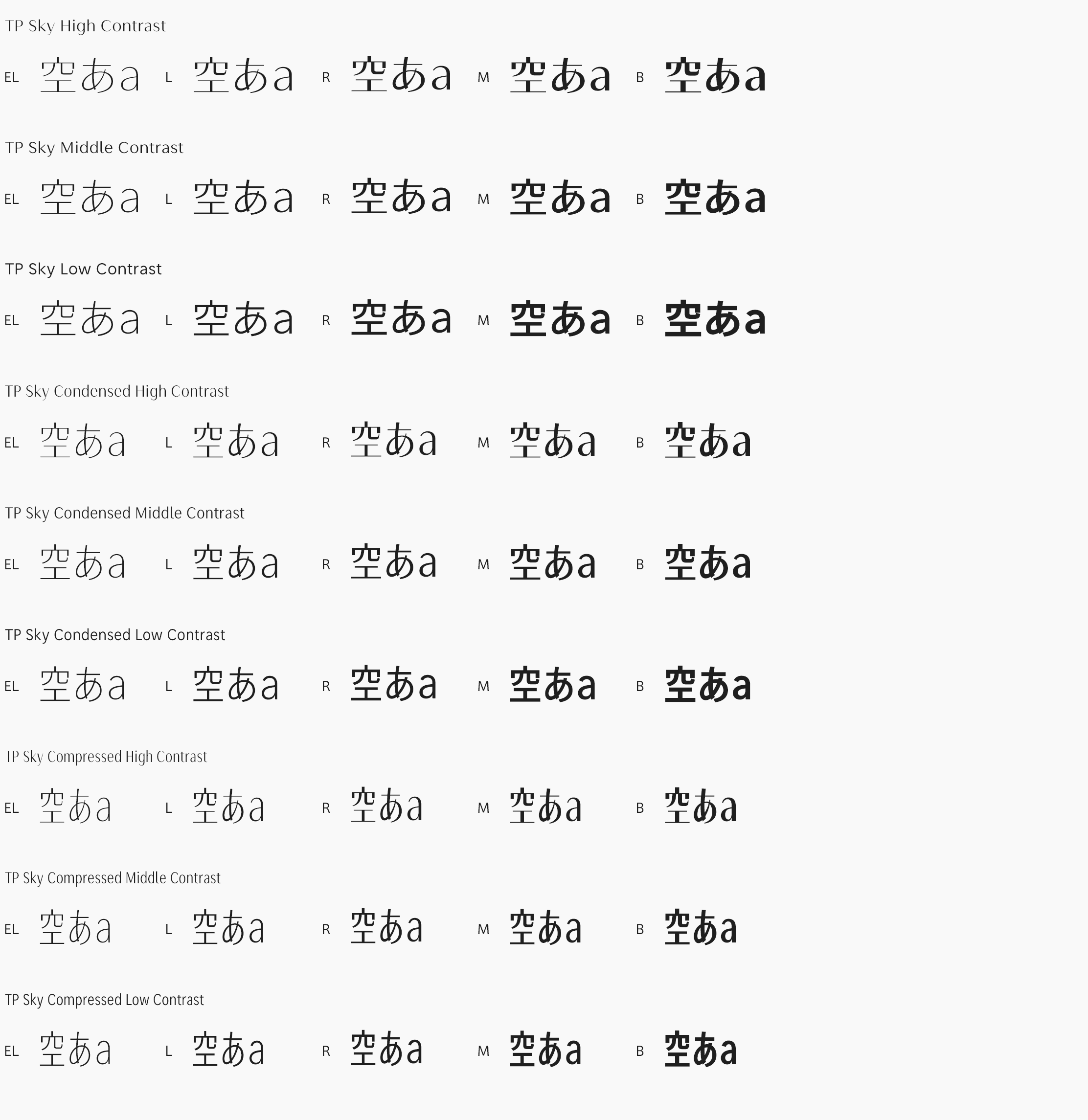
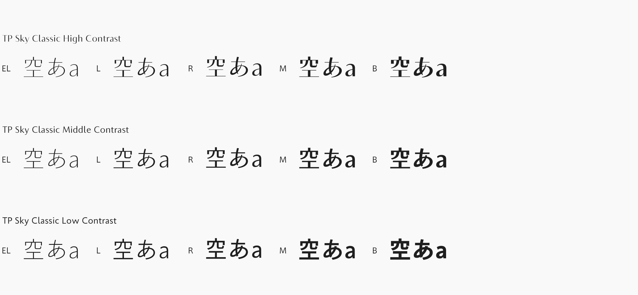
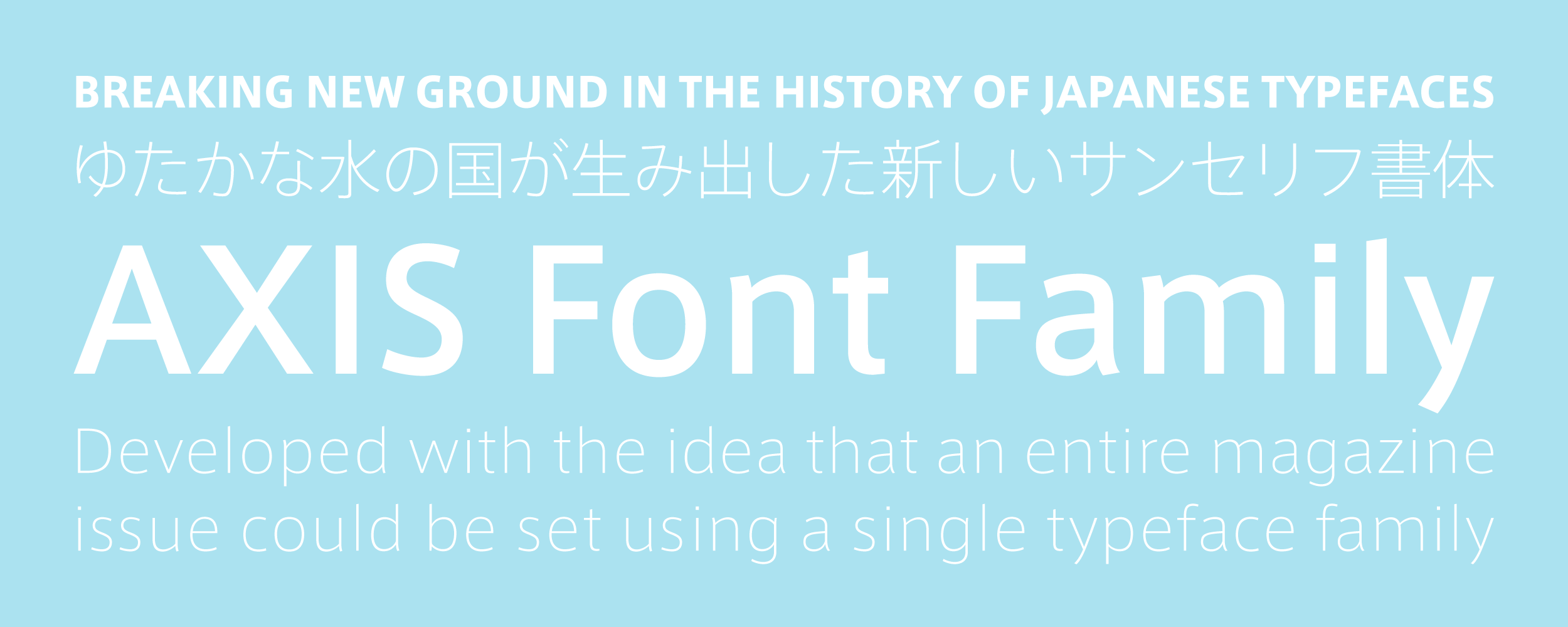
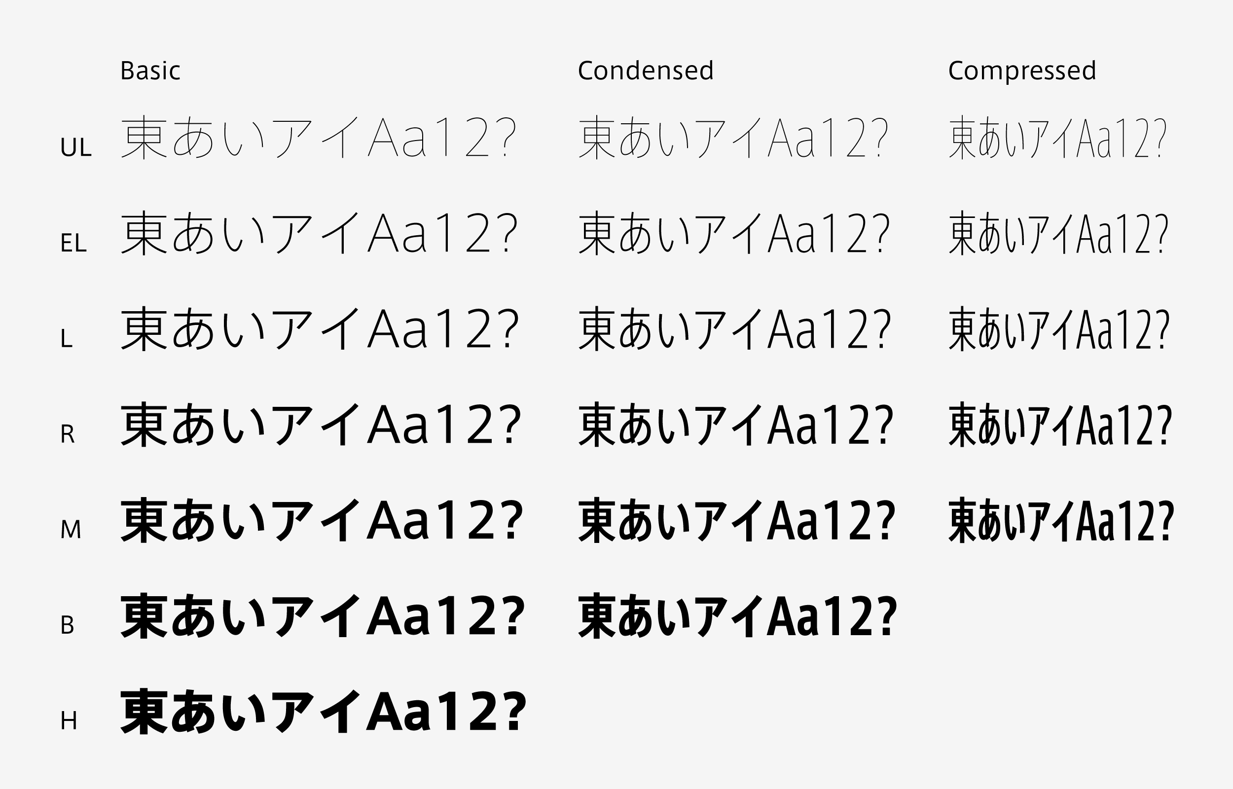
AXIS Font is distinguished for its simple, airy design, and for its availability in seven font weights: Ultra Light, Extra Light, Light, Regular, Medium, Bold and Heavy. As it was developed with the vision that an entire magazine could be set in a single typeface family, AXIS Font allows for the creation of a rich variety of magazine designs while maintaining a consistent sensibility. With our superfine Ultra Light font, completely new, fresh heading styles never before available with Japanese fonts are now possible. Moreover, excellent compatibility has been achieved between Japanese typefaces (for hiragana, katakana, kanji and other characters) and Latin typefaces. AXIS Font’s well-balanced design is particularly evident in cases of mixed typesetting of Japanese and non-Japanese text. We have realized a trim, tidy text appearance via a character surface ratio design that accents the background space. A simple and airy, modern sans serif typeface, allows one to set a character composition endowed with an articulate and erudite feel, and even in cases when Japanese and Latin characters appear together, there is no sense of incongruity.
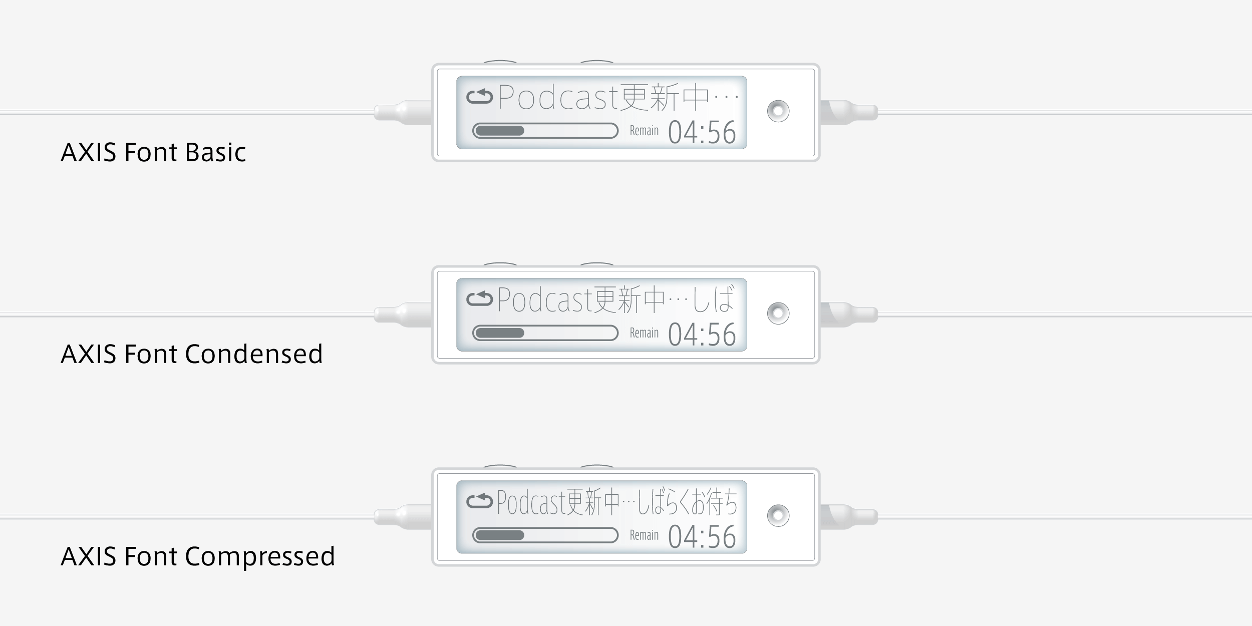
Font narrowing is a manipulation that spoils the basic elements of a typeface’s design, for example, line balance and character proportionality. The effect of this narrowing is particularly egregious in the case of Gothic fonts, which appear visually to have a uniform thickness of vertical and horizontal strokes. The AXIS Font Compact Series’ Condensed typeface features narrow kanji characters designed at 80% normal font width, with kana characters at 76%, while in the Compressed typeface, the kanji are designed at 60% width and the kana at 50%.
Concept
As the premise for developing AXIS Basic was its use in AXIS Magazine, our initial concerns were about what, exactly, a magazine typeface should be. In the case of AXIS Magazine, while it has a basic orientation toward product design, the publication covers a wide range of topics, including everything from architecture and traditional crafts, to information design. Another important aspect of the magazine is its bilingual format. With this complex, entropic mix of information, with its diverse topics and bilingual content, how could the typeface contribute to the task of creating something that had a sense of unity? It was with this basic concern in mind that our concept for the AXIS Font took shape. Another important factor that influenced the design of the typeface was the fact that the magazine is almost entirely horizontally typeset.
The spread of small digital devices in recent years has been accompanied by a rapid increase in demand for written characters that can be displayed at greater density and with superior text quality. While half-width kana (hiragana and katakana) characters have been used for display screens on mobile phones and digital cameras, and that half-width size does allow for a great deal of information to be fit into such limited spaces, it does so at the expense of readability and beauty of the text. With our AXIS Font Compact Series, instead of merely compressing the characters, we have succeeded in creating typefaces of superior density and text quality by designing the kanji ideograms, kana and alphabetic characters each with appropriate character widths. To maximize economic efficiency of information space without sacrificing text readability or beauty: this is the central design aim of the AXIS Font Compact Series.
Features
For AXIS Font Condensed, rather than merely narrowing down the basic typeface, we designed an exclusive narrow Japanese font with a focus on character width issues. Moderately slender widths were developed, responding to today’s high-density text communication needs with crisp, slim-bodied shapes. As these character widths have been kept to slightly under 80% of the width of the basic font, a single line of text can hold approximately 1.3 times more information. Even though this is a narrow typeface, we have succeeded in designing character widths that cause no visual strain, thus enabling smooth transfers from conventional typesetting compositions. More than just stylish, AXIS Font Condensed is a next generation font equipped with functionality for efficient usage of information space.
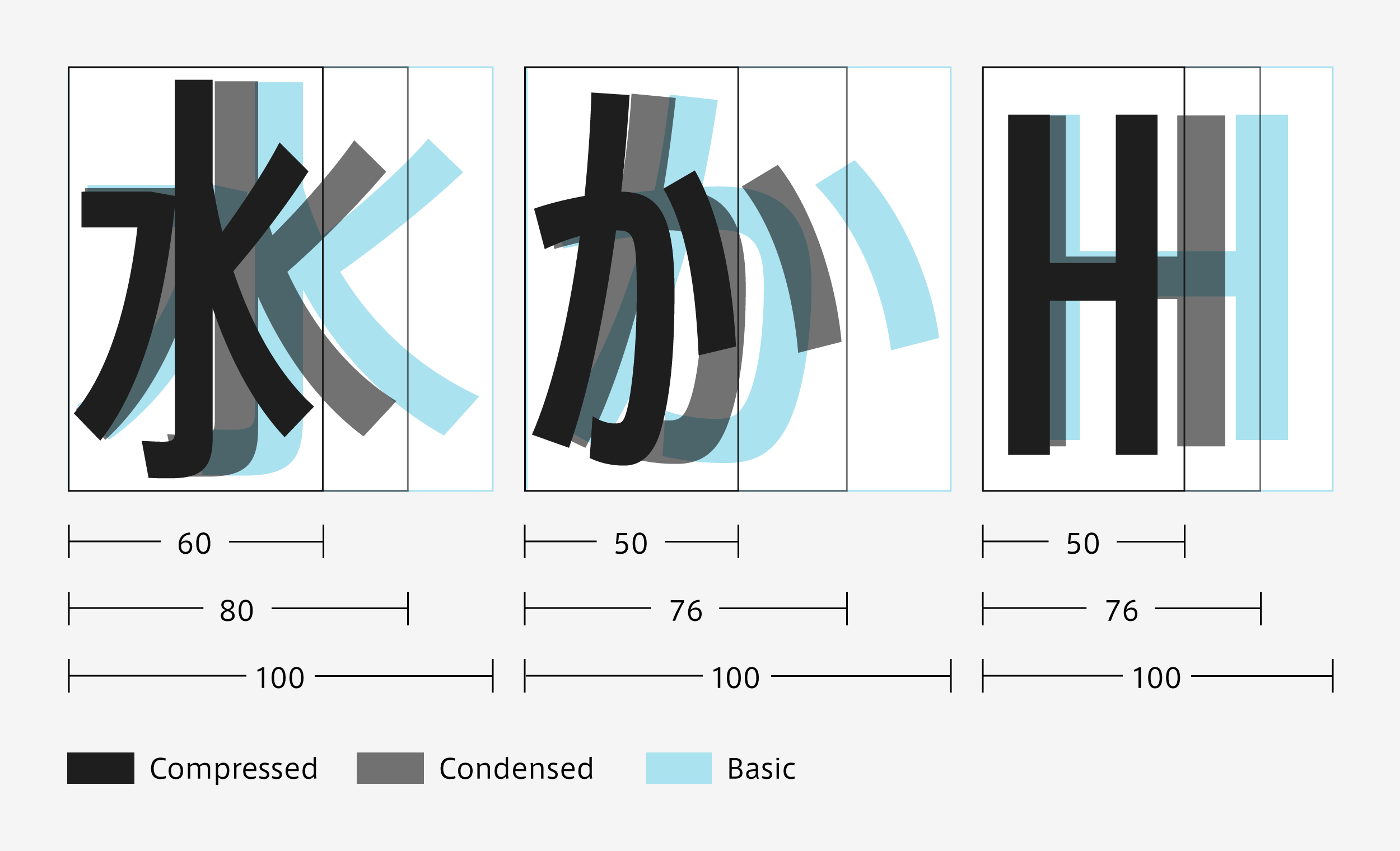
For AXIS Font Compressed, we have reduced the character widths almost to the limit feasible with a Japanese typeface. As these widths are slightly under 60% of the width of the basic font, a single line of text can hold approximately 1.8 times more information. Designed with separate values for kanji character width and hiragana/katakana character width (60% and 50% of basic font width, respectively), AXIS Font Compressed is a clear departure from conventional monospace, half-width fonts. With its superb high compression and high definition, which facilitate beautiful and open-feeling text compositions even in limited spaces, it is an ideal choice for the miniaturized interfaces on today’s mobile phones, music players and other digital devices.
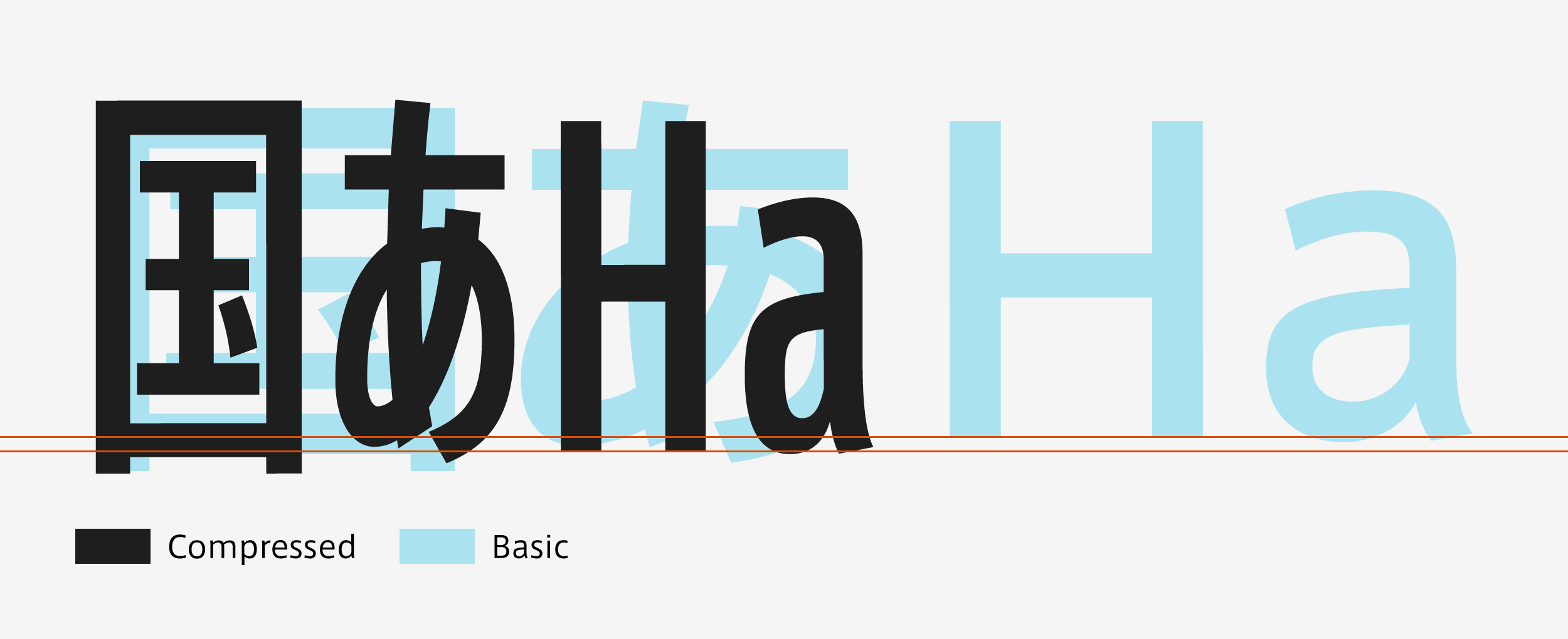
AXIS Basic’s Latin character typeface is being designed under the concept of realizing a new kind of atmosphere while conveying a sense of elegance and poise. By raising the x-height slightly and matching the size and counter level with that of the kana characters, we have created a Latin character typeface that is somewhat condensed.
Family
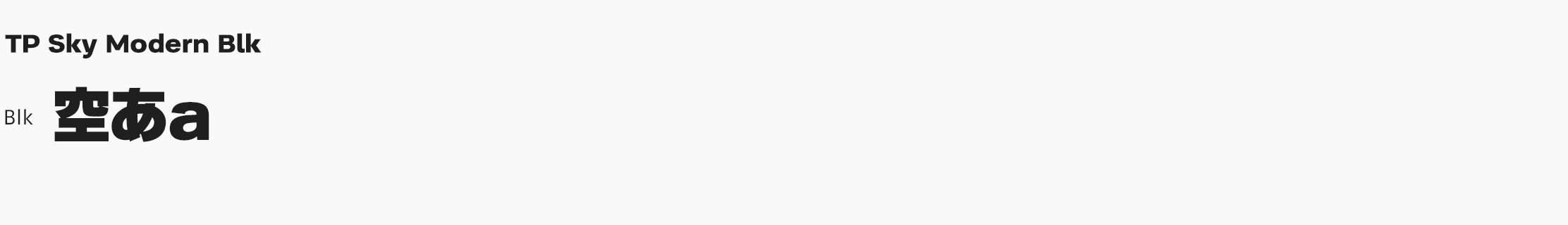
Ultra Light is extremely thin, so there is the tendency for lines to be lost at sizes below 10pt, and depending on printing conditions, at larger sizes as well. Extra Light was developed as a weight that would support Ultra Light. Our thickest font weight, Heavy, is made with a thickness that can handle all the typefaces previously used for headlines in AXIS Magazine. As the counters in Heavy are tighter than they were in those typefaces, and may therefore lead to loss of character integrity at small sizes, we created Bold for use in smaller headlines. * A ‘counter’ is the blank space enclosed by a character, for example, the four white areas inside the kanji ‘田’.
Specifications
| Main feature |
OpenType font Cross platform Extractable outlines PDF embedded Kerning information Dynamic download No resolution restrictions |
| Supported operating system |
macOS Windows 10/11 |
| Font set |
Standard(StdN) Basic/Condensed/Compressed:9,498 characters(Adobe-Japan 1-3+ N) Pro(ProN) Basic/Condensed/Compressed:15,525 characters(Adobe-Japan 1-4 + N, including Latin Italic) |
| Languages | Japanese font (Std/StdN) almost fully covers 30 languages shown below. Japanese font based on Adobe Japan 1.3 covers all ISO-8859-1 proportional characters and Š, š, Ž, ž, Œ, œ, Ÿ. Then AXIS Font Japanese version can be used as multilingual font when you compose text using proportional characters. However, not all corresponding half-width characters are included, only Latin font is covered by half-width characters.
Japanese (main script and covers JIS X 0208:1997) / English/ Icelandic (íslenska) / Irish (Gaelige) / Afrikaans (Afrikaans) / Albanian (Gjuha Shqipe) / Italian (Italiano) / Indonesian (Bahasa Indonesia) / Estonian (Eesti keel) / Occitan (lenga d’òc) / Dutch (Nederlands : U+0132 “IJ” and U+0133 “ij” shall be divided into I/i and J/j) / Oromo (Oromiffa) / Galician (Galego) / Swedish (Svenska) / Scottish Gaelic (Gàidhlig) / Spanish (Español) / Swahili (Kiswahili) / Danish (Dansk) / German (Deutsch) / Norwegian (Bokmål) / Norwegian (Nynorsk) / Finnish (Suomi) / Faroese (Føroyskt) / French (Française) / Brasilian Portuguese (Português Brasileiro) / Breton (Brezhoneg) / Portuguese (Português) / Latin (Latina : Classical orthography, without vowels with macron) / Luxembourg (Lëtzebuergesch) / Rhaeto-Romance languages (Rhaetian) / Walon (Walloon) *Full width version of Greek uppercase/lowercase (24 characters for each, excluding ending form of sigma) and Cyrillic (Russian) uppercase/lowercase (33 characters for each) are included as JIS Row6 and Row 7 (These characters are defined as full width in JIS spec) Japanese font (ProN) covers 78 languages shown below. Japanese (main script and covers JIS X 0213:2004 and partial variant characters for JIS X 0208:1997) / English / Afrikaans / Albanian / Asu / Basque / Bemba / Bena / Brasilian Potruguese / Breton / Breton / Cape Verdean Creole / Catalan / Chiga / Congo Swahili / Danish / Dholuo / Dutch / Embu / Estonian / Faroese / Filipino / Finnish / French / Galician / German / Gikuyu / Greenlandic / Gusii / Hawaiian / Icelandic / Indonesian / Italian / Kalenjin / Kamba / Kernowek / Kinyarwanda / Kirundi / Latin / Luhya / Luxembourg / Machame / Makonde / Malagasy / Malay / Manx / Mauritian Creole / Meru / Nkore / North Ndebele / Norwegian (Bokmål) / Norwegian (Nynorsk) / Occitan / Oromo / Portuguese / Rhaeto-Romance language / Romansh / Rombo / Rwa / Samburu / Sango / Scottish Gaelic / Sena / Shambala / Shona / Soga / Somali / Spanish / Swahili / Swedish / Swiss German / Taita / Teso / Tonga / Tswana / Vunjo / Walloon / Welsh / Zulu” |
About the Revised Editions
We began offering revised editions of AXIS Font in October 2017. The main revisions are summarized below.
AXIS Font ProN (Professional Edition)
Correction of hint data was performed. Screen display and printing quality have improved as a result. Revisions have been carried out for some of the glyph designs as well. Font and file names were changed in tandem with these revisions.
Examples:
Previous font name / file name: AXIS ProN R / AxisProN-Regular
New font name / file name: AXIS Basic ProN R / AxisBasicProN-R
AXIS Font StdN (Standard Edition)
Characters were added that are in compliance with and appropriate to the character forms specified in JIS X 0213:2004. The previous Standard Edition (Std) offered a Basic with 9,354 characters, and a Condensed and Compressed with 9,356 characters, while the new Standard Edition (StdN) contains 9,498 characters. Moreover, pair kerning data has been added to alphabetic and kana characters and the like, and some glyph designs have been revised as well. In Condensed and Compressed, character width and proportional metrics data have been changed for some of the characters. Font and file names were changed in tandem with these revisions.
Examples:
Previous font name / file name: AXIS Std R / AxisStd-Regular
New font name / file name: AXIS Basic StdN R / AxisBasicStdN-R
Interview
-
2022.09/12
Font to Express a Brand Image Bridgestone Corporation
-
2022.09/04
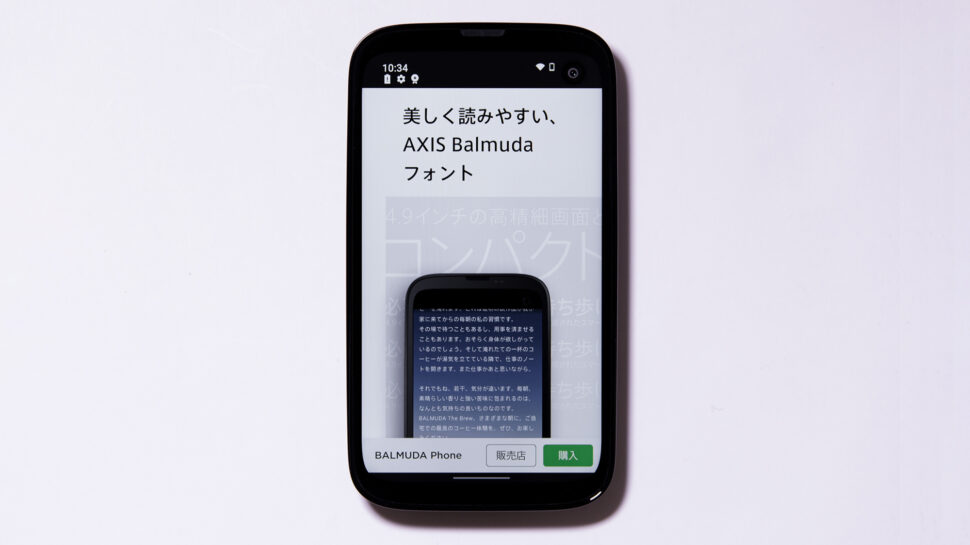
Improvement of Experience Value Through Lively Characters BALMUDA Inc.
-
2019.12/18
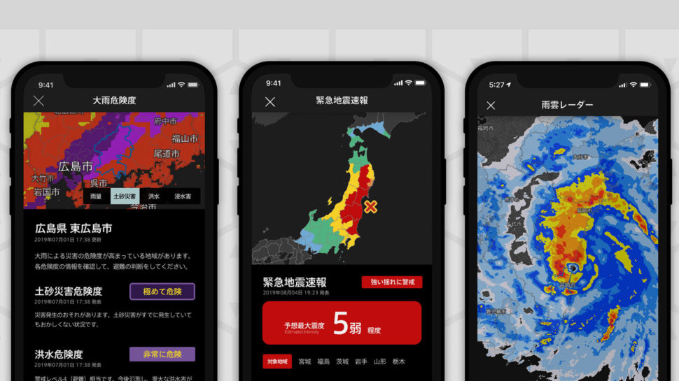
Best Font Chosen for Visibility
Gehirn Inc. Representative Director Daiki Ishimori / Executive Director Takashi Nukaya
-
2018.02/01

A Font used on ADC Grand Prix website
DELTRO Inc. Art Director Masanori Sakamoto
-
2017.02/07

Surface Layers, Structures and Type
Surface & Architecture, Inc. Yusuke Okamura, CEO & Founder/Nozomi Nagayama, Graphic Designer/Tetsuya Dota, Interface Designer
-
2016.10/26

A Typeface that Expresses Precision
D&DEPARTMENT Inc. Mitsuko Matsuzoe, Executive Vice President/ Sayaka Nakagawa, Designer
-
2015.12/11

Characters that live and breathe within a space
TERADA DESIGN ARCHITECTS Architect / Designer Naoki Terada
-
2015.09/28

Letter as a voice that speaks
Starbucks Coffee Japan, Ltd. Creative Specialist Satoshi Kawakami
-
2015.02/17

The character background is clear
Nippon Design Center, Inc. Yoshiaki Irobe / Art Director and Principal of Irobe Design Institute
-
2012.10/01

A Font to Harmonize a Brand that Proposes Lifestyles
Camper Japan Office Manager Naoko Okano
-
2012.09/01
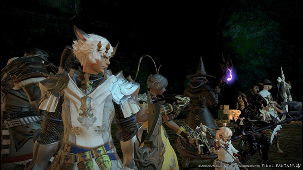
A Font that Supports Communication Among Users
SQUARE ENIX Naoki Yoshida Hiroshi Minagawa
-
2012.08/30

Positioning a Font as a Foundation for Branding
Toyo Kitchen & Living Co., Ltd. Masahiko Tsuji / Managing Director of Marketing
-
2012.07/31
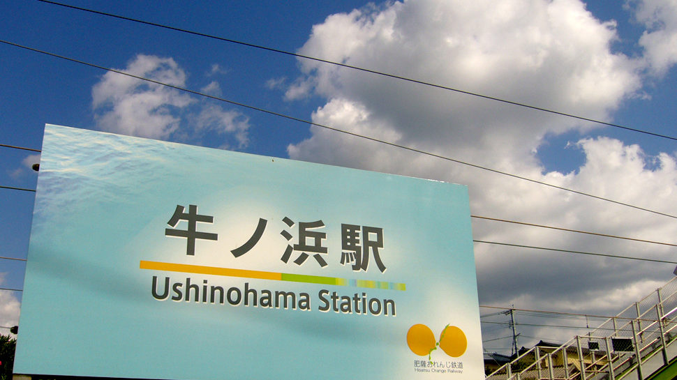
A Typeface that Functions in the ‘Public Space’ of the Train Station
Yasuyuki Kawanishi / an Architect
-
2012.06/01
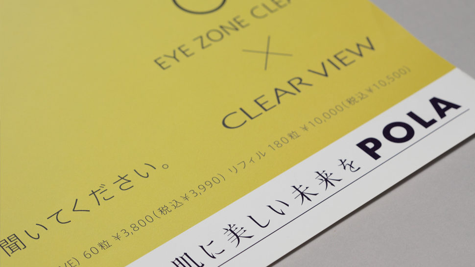
A Font that Supports Visual Identity and Conveys a Sense of Commonality
POLA INC. Satoshi Arita / Branding project leader
-
2009.04/01
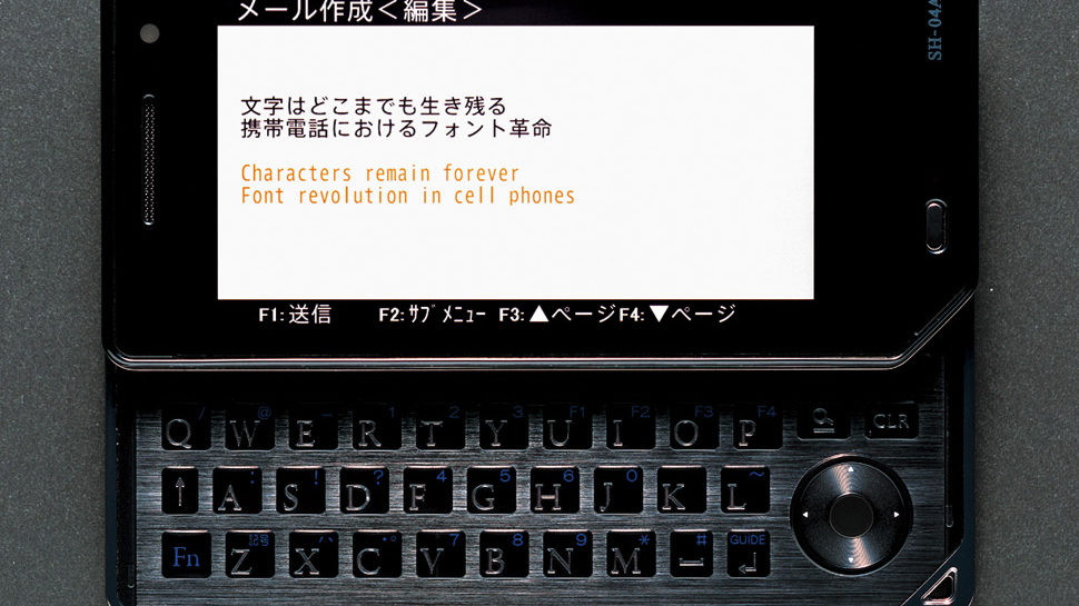
Characters Remain Forever
takram design engineering Kinya Tagawa / Co-Founder
-
2002.12/01

Q & A
Latin Typeface Designer and Type Director, Linotype GmbH Akira Kobayashi
-
2001.10/01

How I See the AXIS Font
Masahiko Kozuka / Type Director