


2015.02/17
The character background is clear
Art director Yoshiaki Irobe is the leader of Irobe Design Institute, at Nippon Design Center, which has produced many prominent creators during its half-century history. Recipient of numerous design awards, including the SDA Award, the JAGDA Award, the Tokyo ADC Award, the D&AD Award and the One Show Design Award, while also serving as a part-time lecturer at Tokyo University of the Arts, Irobe has made use of AXIS Font in a wide range of projects, including signage designs for Ichihara Art x Mix and Kachidoki View Tower, and graphic design for the Liquitex Art Prize.
“The first time I saw AXIS Font, it left a vivid impression on me. The background behind the rows of characters looked very clear. It had a kind of crispness that Japanese fonts had never had before. In many Japanese sans-serif typefaces, you can see elements that are essentially inspired by metal type, and are reminiscent of the ink’s tendency to accumulate at certain points. But with AXIS Font, I realized that an entirely new, different kind of character had been created.”

“Sometimes I choose characters as if I’m choosing wallpaper, for a certain texture, but other times the choice of characters is to allow for thorough readability. I think the important thing is to develop a whole world in which the characters and the background fit together perfectly.”
“The first time I saw AXIS Font, it left a vivid impression on me. The background behind the rows of characters looked very clear. It had a kind of crispness that Japanese fonts had never had before. In many Japanese sans-serif typefaces, you can see elements that are essentially inspired by metal type, and are reminiscent of the ink’s tendency to accumulate at certain points. But with AXIS Font, I realized that an entirely new, different kind of character had been created.”
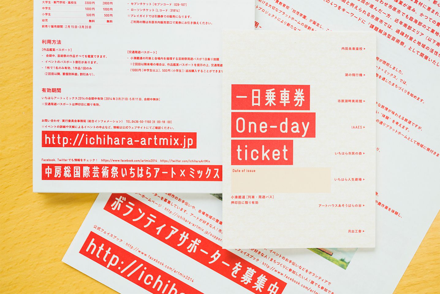
Ichihara Art x Mix, which Irobe handled art direction for, is an art festival held along the Kominato Railway, which runs through Ichihara City in Chiba Prefecture. The festival makes use of stations and railcars, as well as the grounds and facilities of four disused elementary schools. Irobe designed the festival logo based on the red band pattern on the railcars, which symbolizes the Kominato Railway, and drew up plans for a system that would carry various kinds of information on this logo-linked red band. He chose AXIS Font Compressed to convey messages on this red band in Japanese. “The alphabet lettering in the logo was patterned after the round characters on the railway plates. And the kana and kanji were adapted accordingly, by processing AXIS Font Compressed to get a rounded look. While AXIS Font Compressed has a unique feel, its legibility is excellent, and it also fit well with wholesome scenery of the Naka-Boso area, where the event was held. It takes a huge amount of information to manage an art festival that uses an entire district as its venue. The combination of the uniqueness of the written characters with the symbolic mark of the red band made it possible to communicate the necessary information effectively.”
Irobe’s signage design for Ichihara Art x Mix won the SDA Award of Excellence.
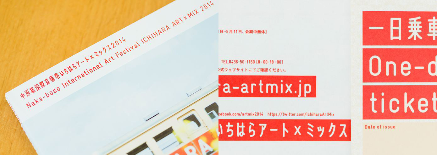
“This red band is a symbol that uses a color associated with the place, and it’s a medium for carrying a huge amount of information. And on top of that, it acts as a line connecting the venues of the art festival.”
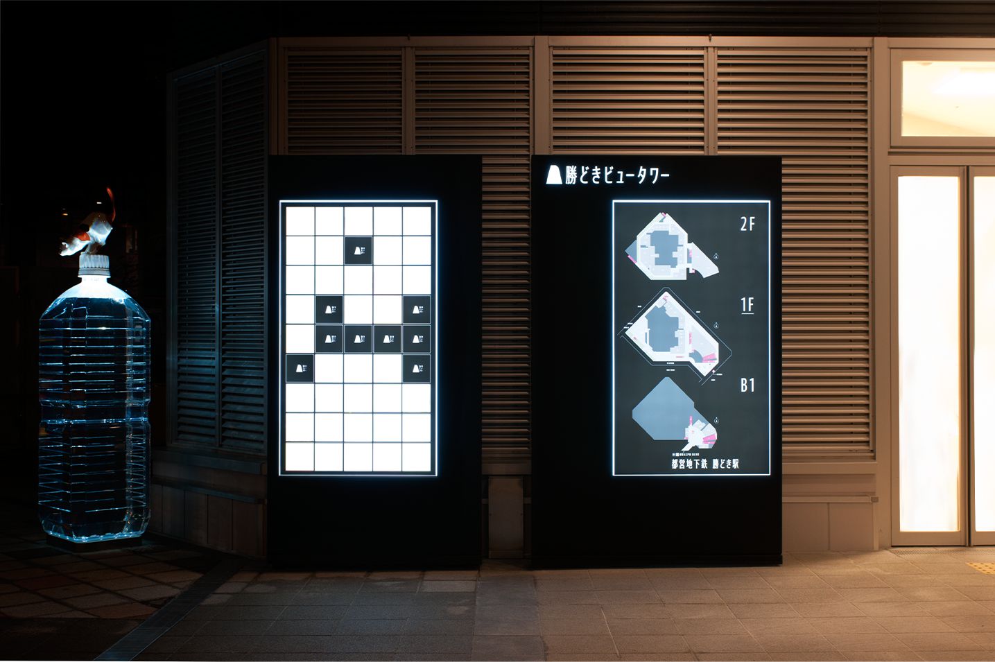
For the signage system of Kachidoki View Tower, a 52-story high-rise condominium, Irobe selected AXIS Font Compressed. This choice was based on his idea that each of the characters could be designed to convey a sense of tallness, in line with the building’s symbol mark, with its lofty tower motif. “Making something distinctive with only a logo mark isn’t a simple matter. That’s where the role of the written characters becomes crucial. With signs, for example, there’s a huge variety of information all around us that is embedded through written characters, and situations are created in which people semiconsciously share that information. For that reason, I think that taking advantage of written characters is a very efficient approach for branding.”
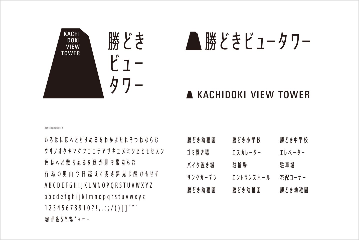
“It takes literacy to appreciate architecture, so the signage system has the additional role of being a starting point for conveying the value of the architecture.”
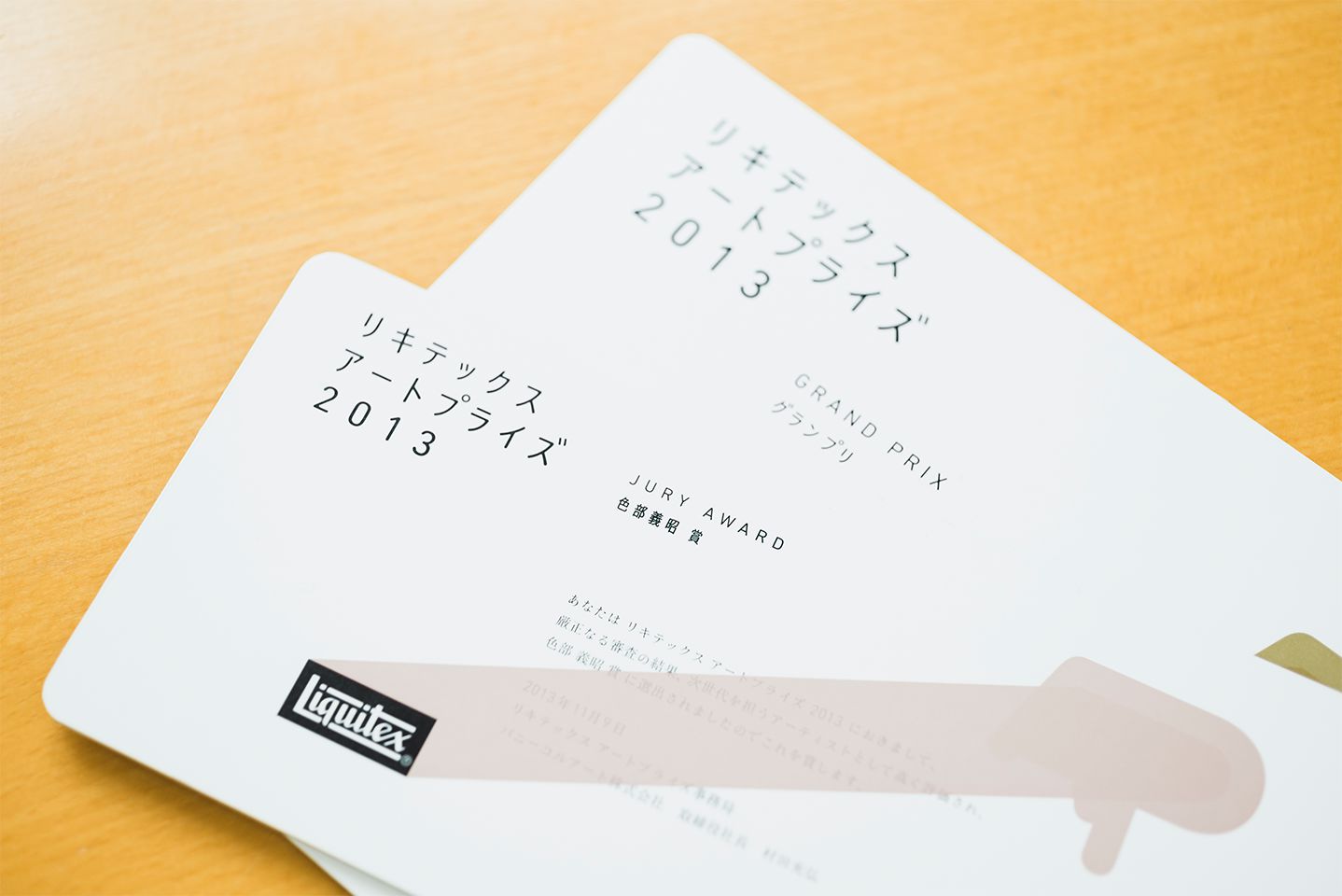
For the graphic design of the Liquitex Art Prize, an open competition and exhibition event, Irobe used AXIS Font Condensed and set it with a generous letter space. “Since this event targets young people, rather than opting for a tight and clear-cut design, we created an atmosphere that’s not too polished, that’s a little rough at the edges. I looked at the characters as textures, and I envisioned bringing out a feeling like someone’s sewing along with a thick thread. AXIS Font is reliable as a framework, so I’ve taken advantage of that aspect while also breaking it up just a bit, and adding a rough touch by rounding the angles.”
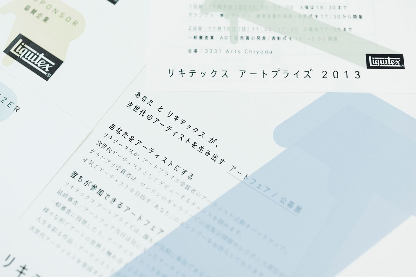
The Liquitex Art Prize is an open-participation art fair held with the aim of encouraging the next generation of artists. Irobe has handled graphic design and served as a judge since 2012.
(Photos by Junya Igarashi)