2018.02/01
A Font used on ADC Grand Prix website
The winner of the 2017 Tokyo Art Directors Club Grand Prix, out of a field of some 8,000 submissions, was the “INDUSTRIAL JP” website and video work made for six small urban factories. The art direction, design and front-end engineering of the website were executed by DELTRO Inc. art director/designer Masanori Sakamoto and technical director/programmer Ken Murayama.
Founded by Sakamoto and Murayama in 2009, DELTRO is a design firm that focuses primarily on advertising projects, creating websites, applications, digital signage and other onscreen media, as well as graphic design and installation work.
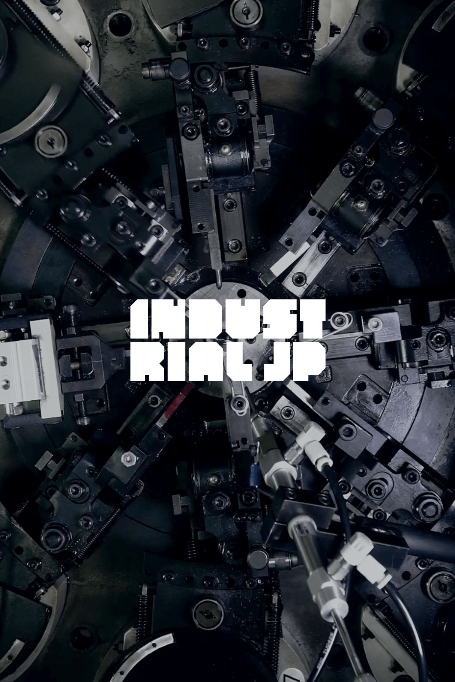
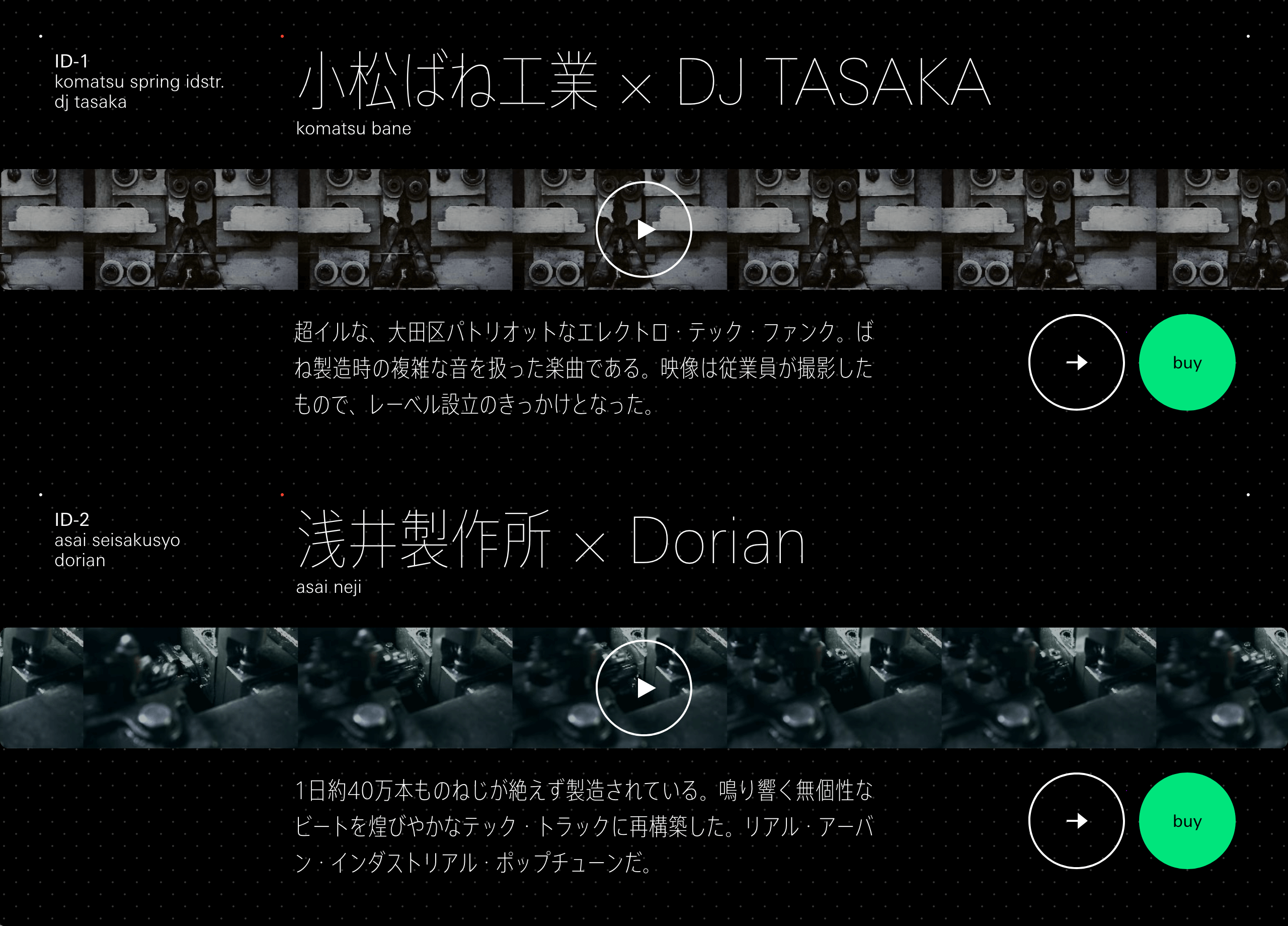
“INDUSTRIAL JP” was started with the aim of making a record label out of small factories in Japan’s urban areas. Machine sounds are collected onsite from the manufacturing equipment in these small factories, and musicians use these samples to create original works of music. Then, by incorporating visual recordings of the manufacturing processes, music videos are produced. The font used on the “INDUSTRIAL JP” website is AXIS Font Condensed.
This project emerged out of discussions with operators of small factories and creative directors at Dentsu, on the topic of “What can be done creatively to help small factories and small-to-medium-sized businesses”. Conceived in response to these discussions by art director and graphic designer Rintaro Shimohama, “INDUSTRIAL JP” has evolved into a core group of creators, including sound director Toshihide Kimura (MOODMAN) and others, who together carry out all aspects of project planning, video direction and management.
As Sakamoto says, “At DELTRO, we assist with website planning, art direction, design and front-end engineering. INDUSTRIAL JP’s music videos are made up of algorithms of repeating machine tool movements, and the fixed rhythms they generate transformed into techno sounds. On the website, I carried out art direction and design with a focus on those textures, and on bringing out a blend of textures of various components of that environment, such as industrial equipment, electronic circuit diagrams, DAW software and physical controllers.”
While still in high school, Sakamoto threw himself into the study of machine technology, learning everything from mechanical design (CAD) to welding and programming. He says that when it came to selecting a typeface, he envisioned using one that would call to mind the characters in the CAD fonts, technical drawing templates and metal plate stamps that he had seen on a daily basis during his school days.
“With its extremely spare ornamentation, geometrical appearance and minimal weight, Condensed can convey more information in a small space. Through this process of honing in on the visual impression made by the font, we arrived at a combination of Univers Next and AXIS Font Condensed. This selection was done with a totally different approach from that of the philosophy behind AXIS Font, but I saw this typeface as also possessing an industrial atmosphere, which could be realized with a Condensed look that was designed with an awareness of the display area constraints of signage and portable devices.”
Sakamoto has also handled the rebuilding of numerous websites for large corporations. One recent trend he has noticed is the need for designs that are compatible with diverse screen sizes and other conditions on PCs, tablets and smartphones. He fulfills client corporations’ requests both by embodying the philosophy and tone of each corporation or brand, and by verifying such aspects as usability, speed, staying power and consistency with regard to the changes of the times. Typeface and pictograms are very important aspects of branding. At DELTRO, for each project, the optimal pictograms for the client corporation or brand are created completely from scratch while also carrying out the development of a Latin character font.
“I had known about AXIS Font ever since its release. I think of it as a very rare example of a sans-serif Japanese font that works extremely well in mixed Japanese and Latin text situations, and that has excellent transparency and a neutral, refined feel that allows words to express themselves directly and without noise. I am continually amazed by Type Project’s ability to take on the daunting challenge of redefining a conventional concept, and realizing it as it should really be, as they have done with TP Mincho and FitFont. In part due to infrastructure-related demands, today’s Japanese language websites have an overwhelming need for device font display. While I feel there is still some work to do with regard to true text character-inclusive branding, I am anticipating that very soon we will see a future in which comprehensive print-to-website branding is standard practice. I have high hopes that Type Project will develop innovative fonts that are capable of a kind of multistage morphing from the ‘modern impressions of AXIS Font’ into ‘traditional impressions that have warmth, handmade feel, and a sense of history’, with its unique FitFont-style approach.”