2015.12/11
Characters that live and breathe within a space
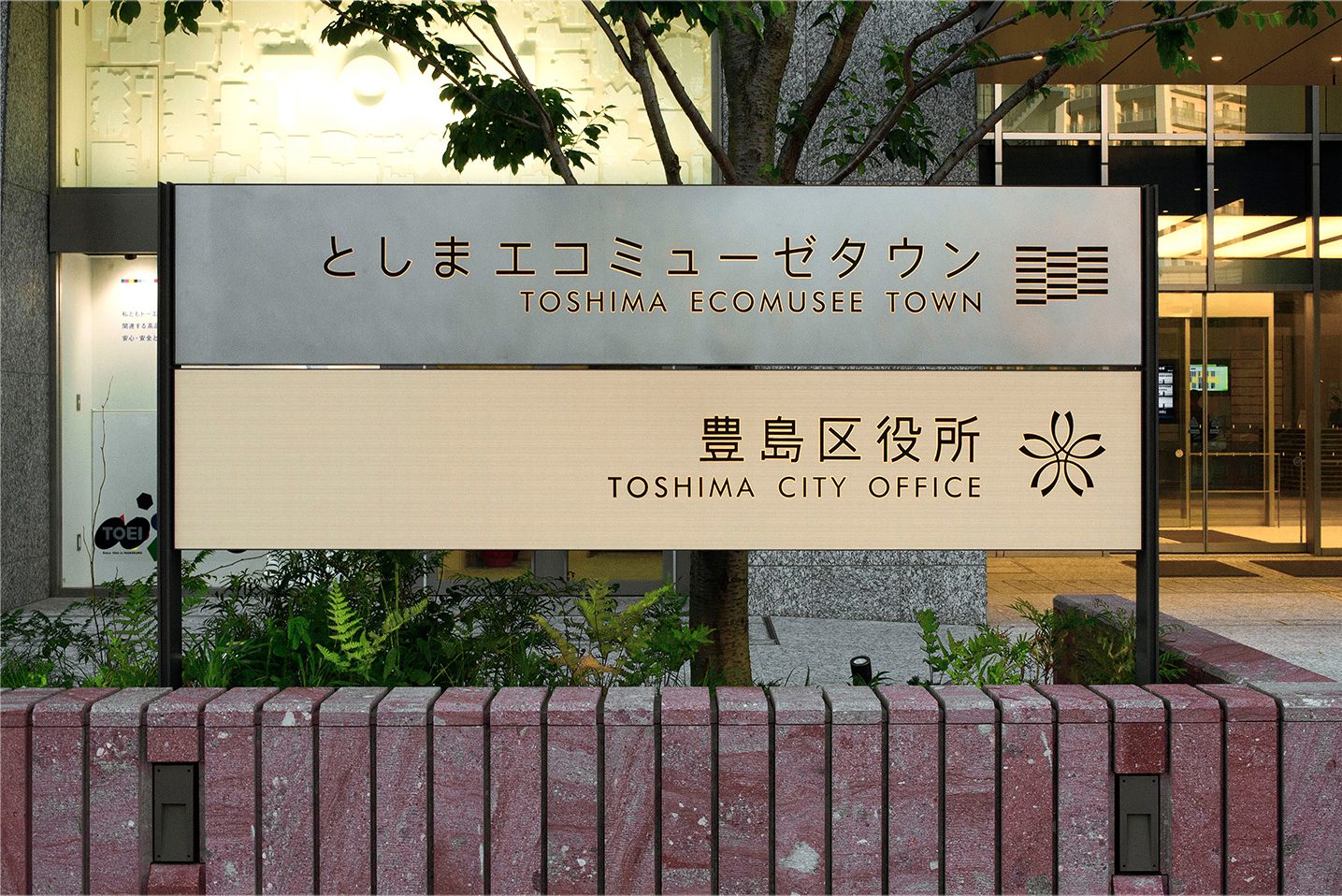
In March 2015 a new skyscraper was born in Minami Ikebukuro: Toshima Ecomusee Town. The first of its kind in Japan, the project brings city ward offices and ultra-high-rise condominiums together under a single roof. Sign panels, visible throughout the facility, serve to guide people to where they are going. The sign panels employ a variety of different materials, but all of the signs use AXIS Font.
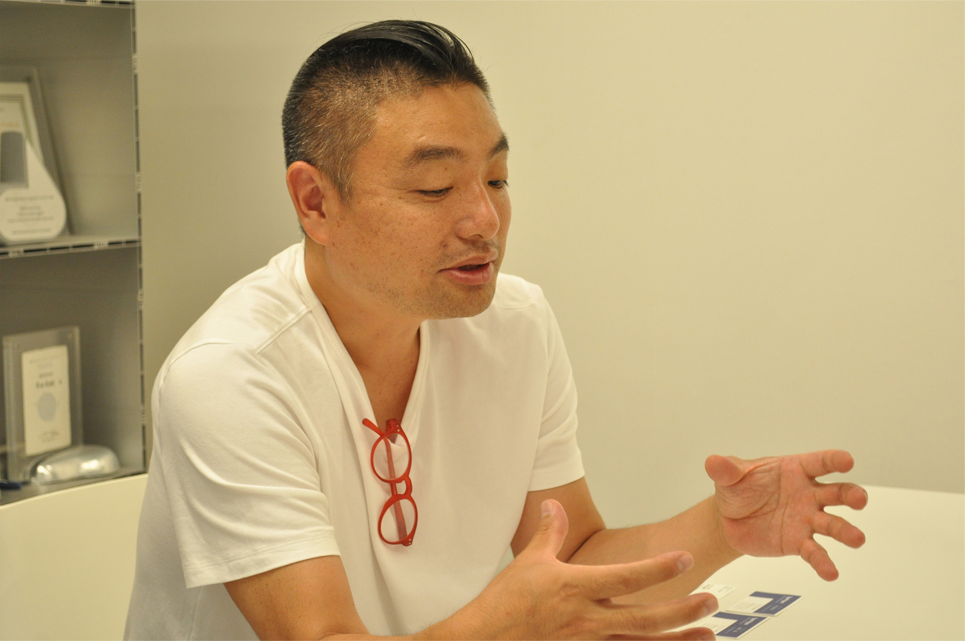
Naoki Terada, Director of TERADA DESIGN ARCHITECTS, created the sign panels for Toshima Ecomusee Town, also a judge for the Good Design Award and a part-time lecturer at Musashino Art University. His activities go well beyond the field of architectural design. For instance he designed the “15.0%” ice-cream spoon and he founded TERADA MOKEI, a firm which creates 1/100 scale models in paper.
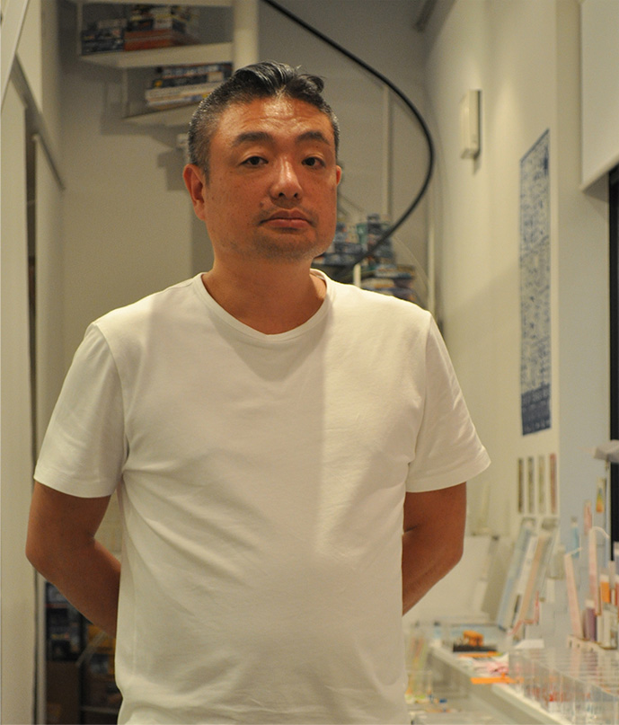
At the TERADA MOKEI shop, within his office, Terada reflects, “My role in branding is that of designer / brand director. My aim is to create markets that presently don’t exist. I am proud of the fact that using the power of design, in the case of both TERADA MOKEI and the ‘15.0%’ ice cream spoon I created markets that previously didn’t exist.”
“I studied at the ‘AA,’ the Architectural Association School of Architecture in London. In Japan people have this image that architects specialize in buildings, but in Europe the title ‘architect’ is applied to a person who designs any kind of three-dimensional object. If one is an ‘architect’ then one can make a wide variety of things. It’s because I wanted to become a person like that that I chose a school overseas. As a result my present work is not limited to architecture, since the design of space-related products makes up a large part of what I do. And the designing of signs is an extension of my work with interior products. For instance when you design a wall clock it is important that you have a clear image of every element of the space involved, such as the ceiling height of the area where the clock will be placed. And it is the same with signs. Architecture, interior products, and signs are all interconnected,” says Terada.
The overall design of Toshima Ecomusee Town was carried out by Nihon Sekkei, Inc., while Kengo Kuma & Associates was responsible for the external appearance. The exterior surface of the building is covered with an “eco-veil” consisting of greenery panels, solar panels, and sun-shading devices. Nihon Sekkei chose Terada and his associates to plan the signage, and TERADA DESIGN devised a plan in which the sign panels would have the same aspect ratio as the eco-veil panels and the material of the signs would vary according to the category of occupancy: wooden signs for the ward offices, glass signs for stores, stainless steel for common areas, and black stainless steel for the residential condominiums.
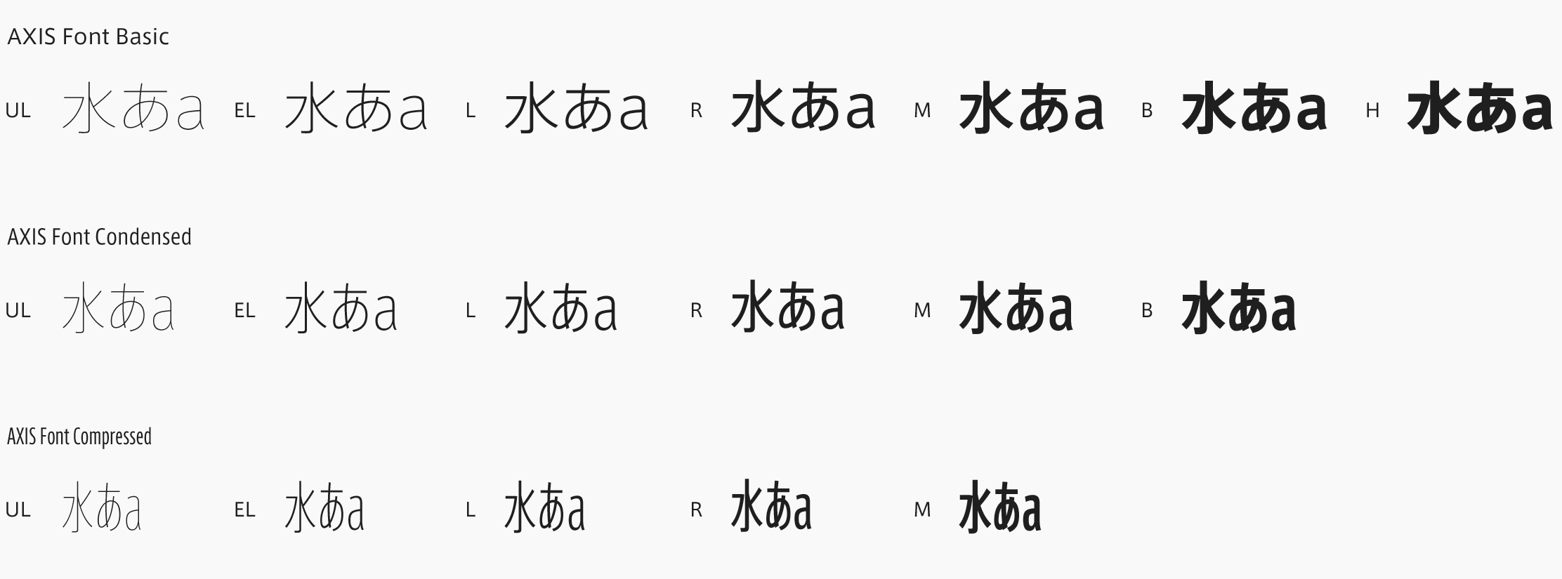
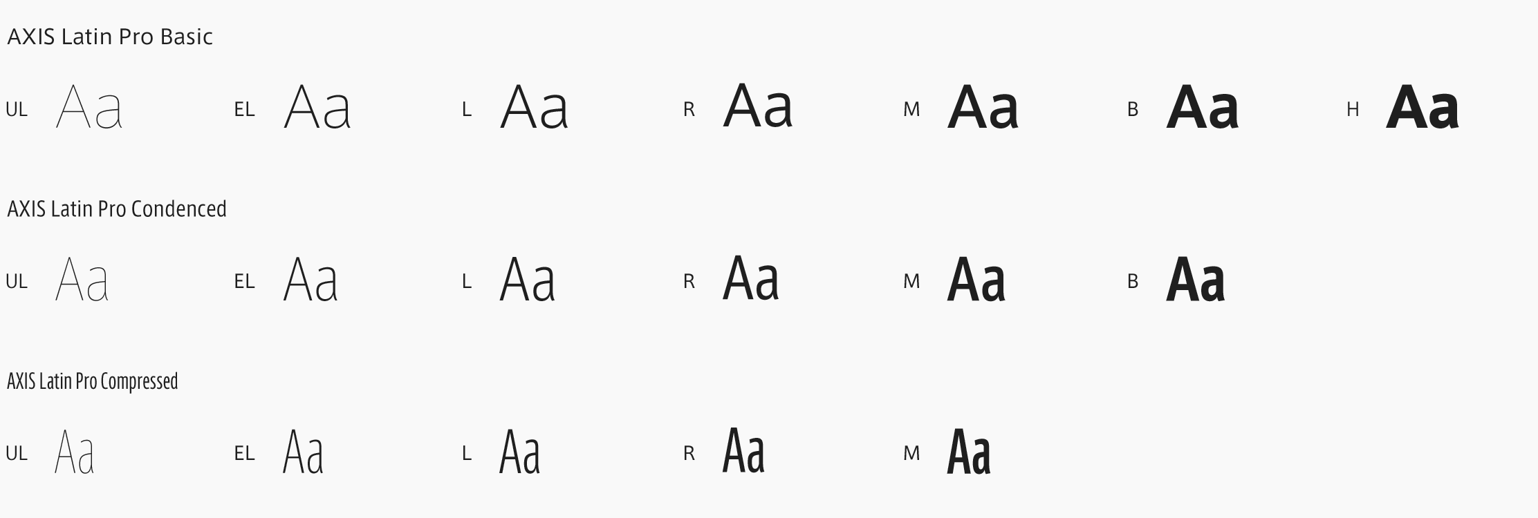
“When they made their request they said, ‘We wanted the signage to be done by an architect,’ which really made me happy. Thinking about how I could meet their expectations, I came up with the idea of designing the signs as though they were elements of the architectural finishing materials. In this system the sign panels, consisting of materials such as stainless steel, wood, and glass, would be placed into the floor or on the walls, with characters engraved into the signs. But if a quirky font were used for the characters then the visual impression would vary depending on the background material used. Wanting a font that would maintain a neutral relationship even across a variety of materials, I chose AXIS Font. AXIS Font was also ideal for another reason: when one wants to vary the weighting of elements within a single sign, AXIS Font doesn’t lose its feeling of unity even within a mix of multiple font weights.”

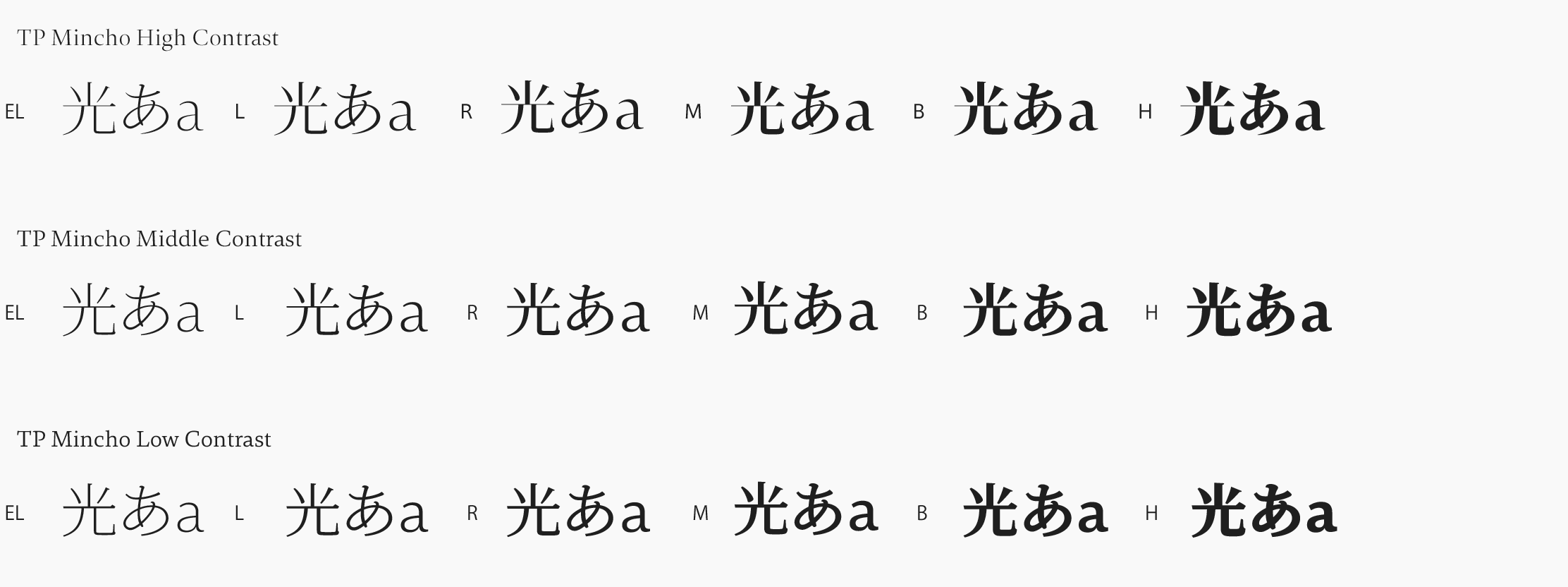
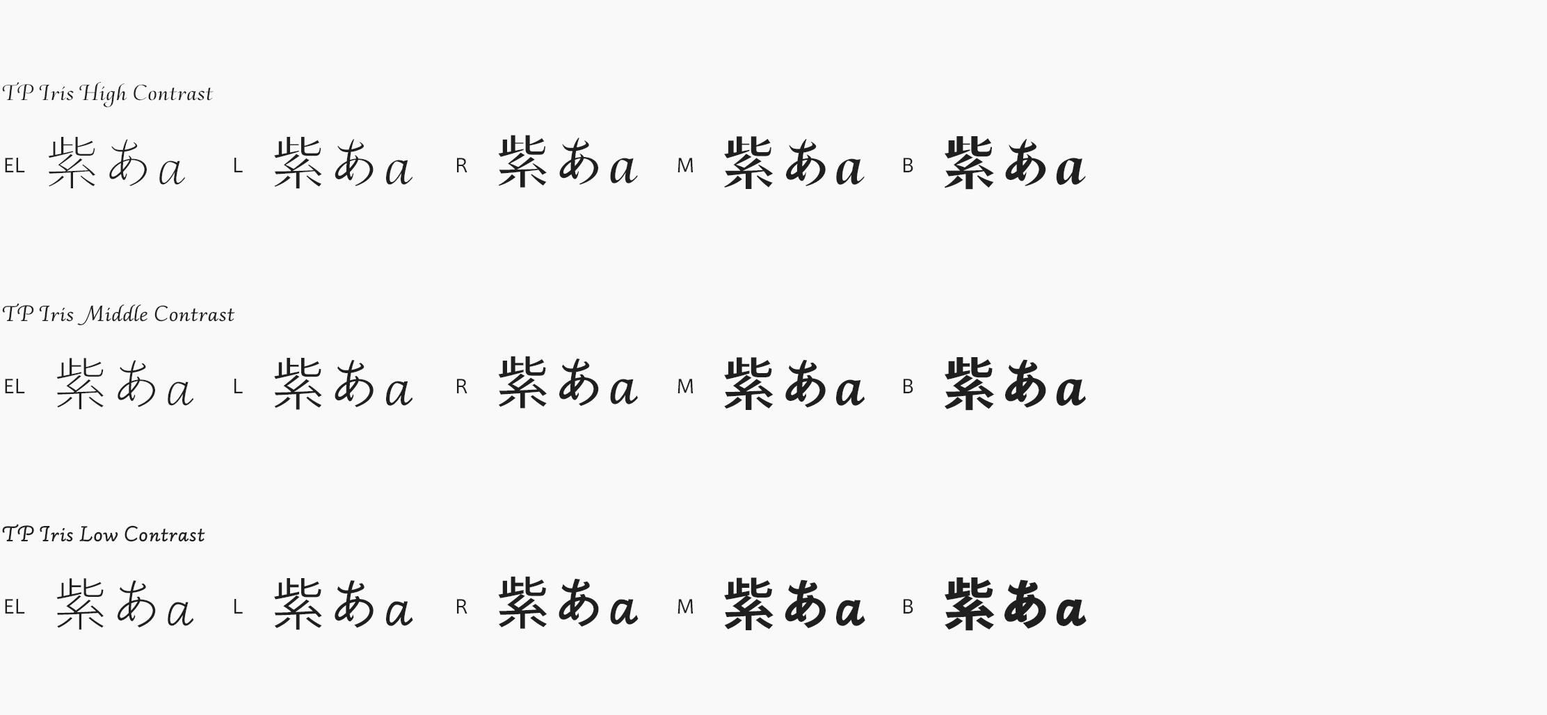
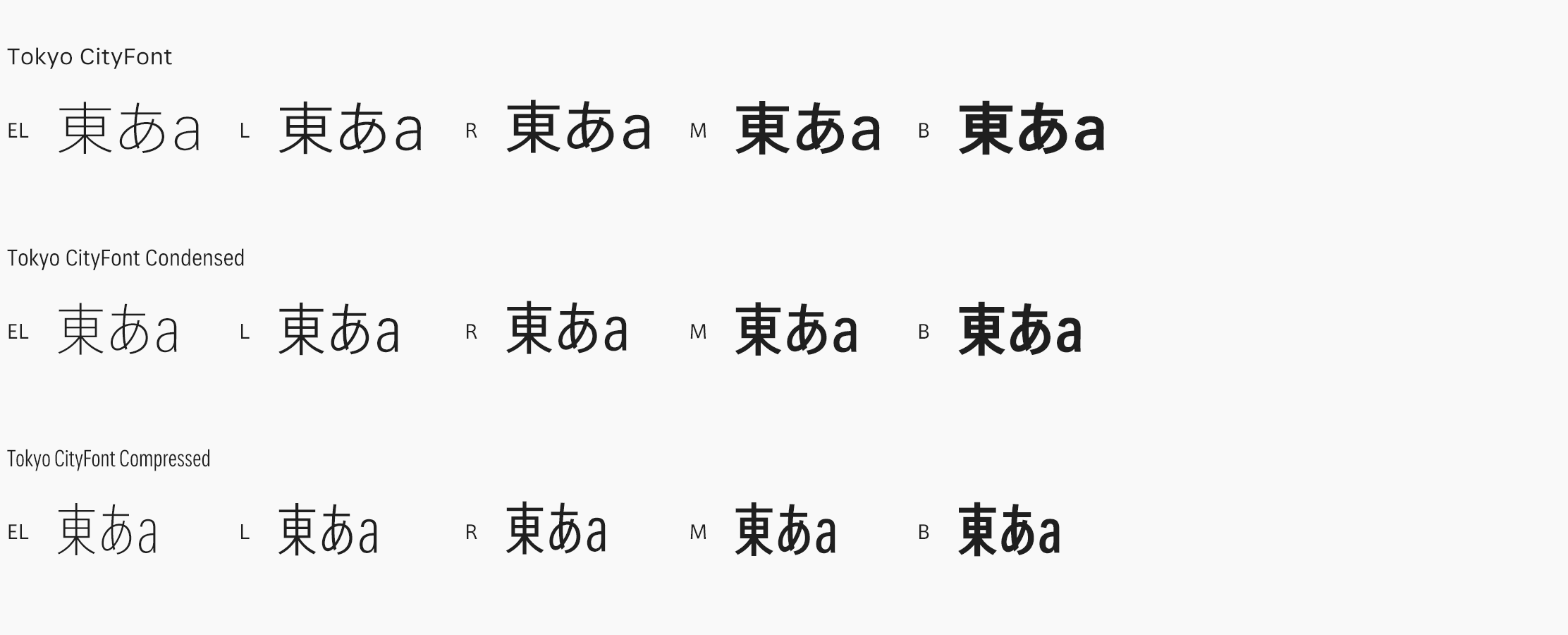
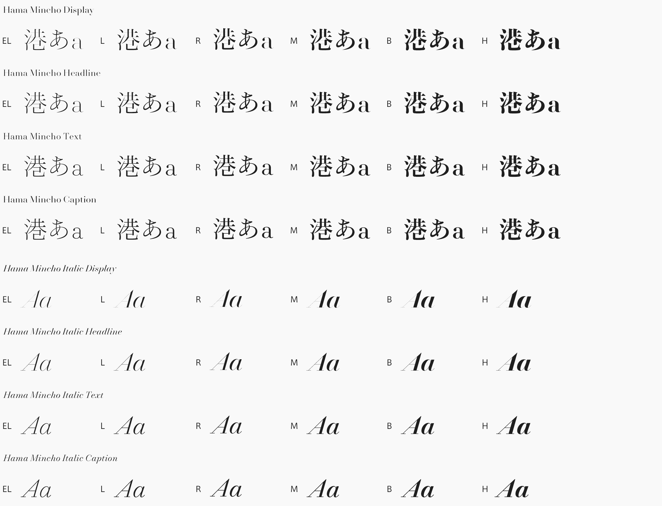
Terada is using AXIS Font not just in the signs but also in presentation materials. He says that what he particularly likes about the font is the way thin and thick font weights link up. “AXIS Font links up beautifully without the need for fine tuning, so for me it serves as my default font. With this font, using thin characters for the majority of the text and thick characters for accent makes for a very effective result. As for TP Mincho, it has an attractive modern feel that other Mincho fonts don’t have, so I am going to try using it in places where up to now I had reflexively been using Gothic,” Terada affirms.
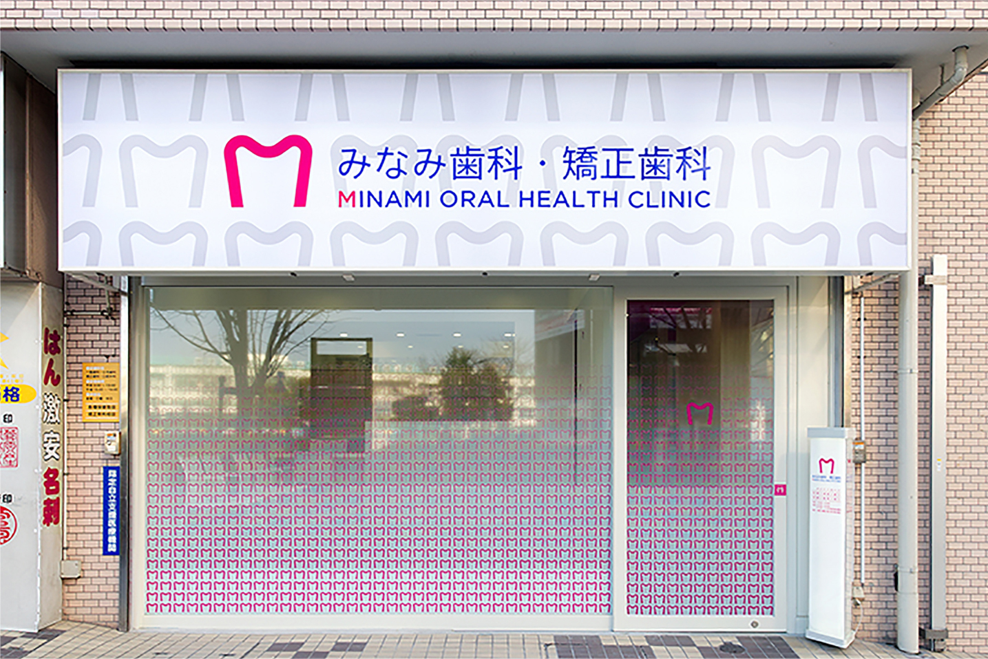
Minami Oral Health Clinic. Their design featured a simple “M” symbol that evokes an image of beautiful teeth, and they picked AXIS Font because it fits in nicely with the symbol and exudes a sense of cleanliness. This particular project was a winner of the Spatial Design Award of the Japan Design Space Association (DSA) for 2015.
(Photos by Yuki Omori)

