%20--%3e%3cpolygon%20points='24.7%201%200%201%200%207.6%208.5%207.6%208.5%2039.4%2016.1%2039.4%2016.1%207.6%2024.7%207.6%2024.7%201'/%3e%3cpath%20d='M34.1,32.4l-4.9-22.7h-7.9l9.1,33.1c-.4,1.7-1.1,2.9-3.7,2.9h-2.6l1.9,6.6h1.5c4,0,8-1.2,10.3-9.2,1.8-6.4,8.9-33.3,8.9-33.3h-8l-4.6,22.7Z'/%3e%3cpath%20d='M91.7,8.7c-8.7,0-12.7,6.5-12.7,16.1s3.6,15.3,13.8,15.3,7.2-.9,9-1.6l-1.2-6c-2.4.8-4.9,1.2-7,1.2-4.3,0-7-2-7.2-7.3h16v-4.8c0-7.5-2.9-13-10.7-13ZM86.5,21c0-3.3,1.7-6.4,4.7-6.4s4.1,2.7,4.1,6.4h-8.8Z'/%3e%3cpath%20d='M218,8.7c-8.7,0-12.7,6.5-12.7,16.1s3.6,15.3,13.8,15.3,7.2-.9,9-1.6l-1.2-6c-2.5.8-4.9,1.2-7,1.2-4.3,0-7-2-7.2-7.3h16v-4.8c0-7.5-2.9-13-10.7-13ZM212.9,21c0-3.3,1.7-6.4,4.7-6.4s4.1,2.7,4.1,6.4h-8.8Z'/%3e%3cpath%20d='M126,1h-10.7v38.4h7.6v-11.8h5c6,0,11.3-3.8,11.3-14.1s-5.5-12.5-13.1-12.5ZM125.9,20.9h-3.1V7.6h3c3.7,0,5.4,1.8,5.4,6.3s-1.5,7.1-5.3,7.1Z'/%3e%3cpath%20d='M150,12.9c-.2-1-.5-2.4-.8-3.2h-6.9c.5,1.9.7,4.6.7,7.9v21.8h7.4v-20.3c1.1-2.2,4.5-3,7.4-3v-6.8c-3.5,0-6.5,1.7-7.7,3.6Z'/%3e%3cpath%20d='M192.6,40.6c0,3.5-1.6,4-4.7,4h-1.5l1.9,6.6h2.3c6.3,0,9.3-3.2,9.3-9.8V9.7h-7.4v30.9Z'/%3e%3crect%20x='192.2'%20width='8.4'%20height='6.4'/%3e%3cpath%20d='M247.4,33.7c-4.8,0-6.6-2.8-6.6-9.6s1.9-8.9,6.2-8.9,3.4.4,4.9,1l1-6.4c-1.3-.5-3.7-.9-6.2-.9-10.6,0-13.4,6.7-13.4,15.9h0c0,10.7,4.6,15.3,12.4,15.3s5.9-.5,7.4-1l-.9-6.1c-2,.4-3.7.6-4.7.6Z'/%3e%3cpath%20d='M264.7,30.2v-14.2h5.4l1.4-5.8h-6.9V2.1l-7.3,1.9v26.8c0,5.3,2.4,9,8.2,9s4.9-.2,4.9-.2v-5.7h-2c-3,0-3.8-1.3-3.8-3.7Z'/%3e%3cpath%20d='M64.3,8.8c-3.3,0-5.8,1.6-7.3,3.4-.2-1.1-.5-2.1-.8-2.6h-6.6c.5,1.9.6,4.4.6,7.4v34.4h7.3v-13.8c1.5,1.5,3.8,2.4,6.2,2.4,8,0,11.2-6.6,11.2-16s-3.1-15.2-10.4-15.2ZM62.1,33.8c-1.6,0-3.1-.6-4.6-1.8-.3-1.6-.4-3.7-.4-6v-3.3c0-1.8.1-3.8.4-5.1,1.4-1.4,3-2.5,5-2.5,3.2,0,4.6,3.2,4.6,9s-.9,9.6-5,9.6Z'/%3e%3cpath%20d='M173.6,8.6c-9.5,0-13,6.7-13,15.7s3.5,16.1,13,16.1,13-6.8,13-16.2-3.3-15.7-13-15.7ZM173.6,34.2c-3.6,0-5.5-2.9-5.5-9.9s2.2-9.5,5.5-9.5,5.5,2.2,5.5,9.5-1.9,9.9-5.5,9.9Z'/%3e%3c/svg%3e)

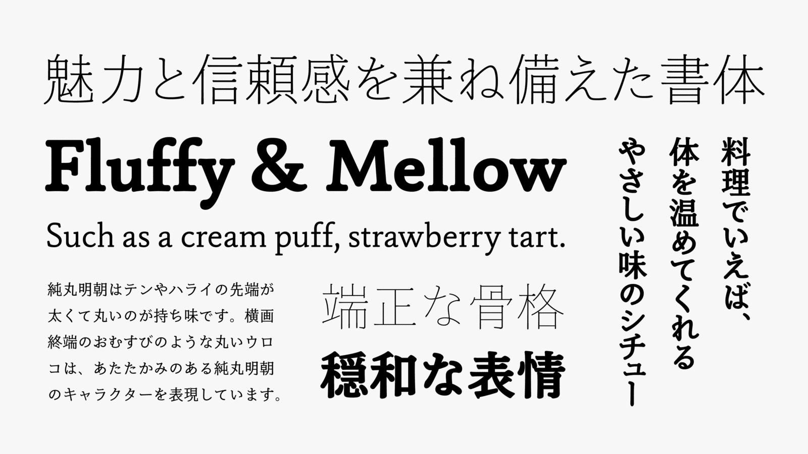
JunMaru Mincho is a typeface with a combination of glamour and reliability in its proper and tight character structure and familiar design. It can be used safely with various items from book titles to food and beverage packages, and pamphlets to posters, as it is easy to read and gentle with a mild and calm expression throughout, keeping the graceful silhouette of Mincho typeface.
Features
Fluffy and mellow expression
Based on Jun Mincho, which is orthodox, with high multiplicity, JunMaru Mincho has widened the expression of typeface in a unique direction to increase the expression. Compared to TP Mincho, which has widened inside space between strokes to enhance visibility, JunMaru Mincho’s structure has a classical atmosphere in the foundation of beauty of the typeface with tightened inside space between strokes and a high center of gravity. Also, compared to Jun Mincho Headline and Hairline, JunMaru Mincho gives off more human warmth. If it was cooking, it would be stew with a mild taste that warms your body, or it would be a typeface that matches sweet dessert after meal, such as a cream puff, strawberry tart. It is a Mincho typeface with a fluffy and mellow expression.
Minimizing the contrast of strokes
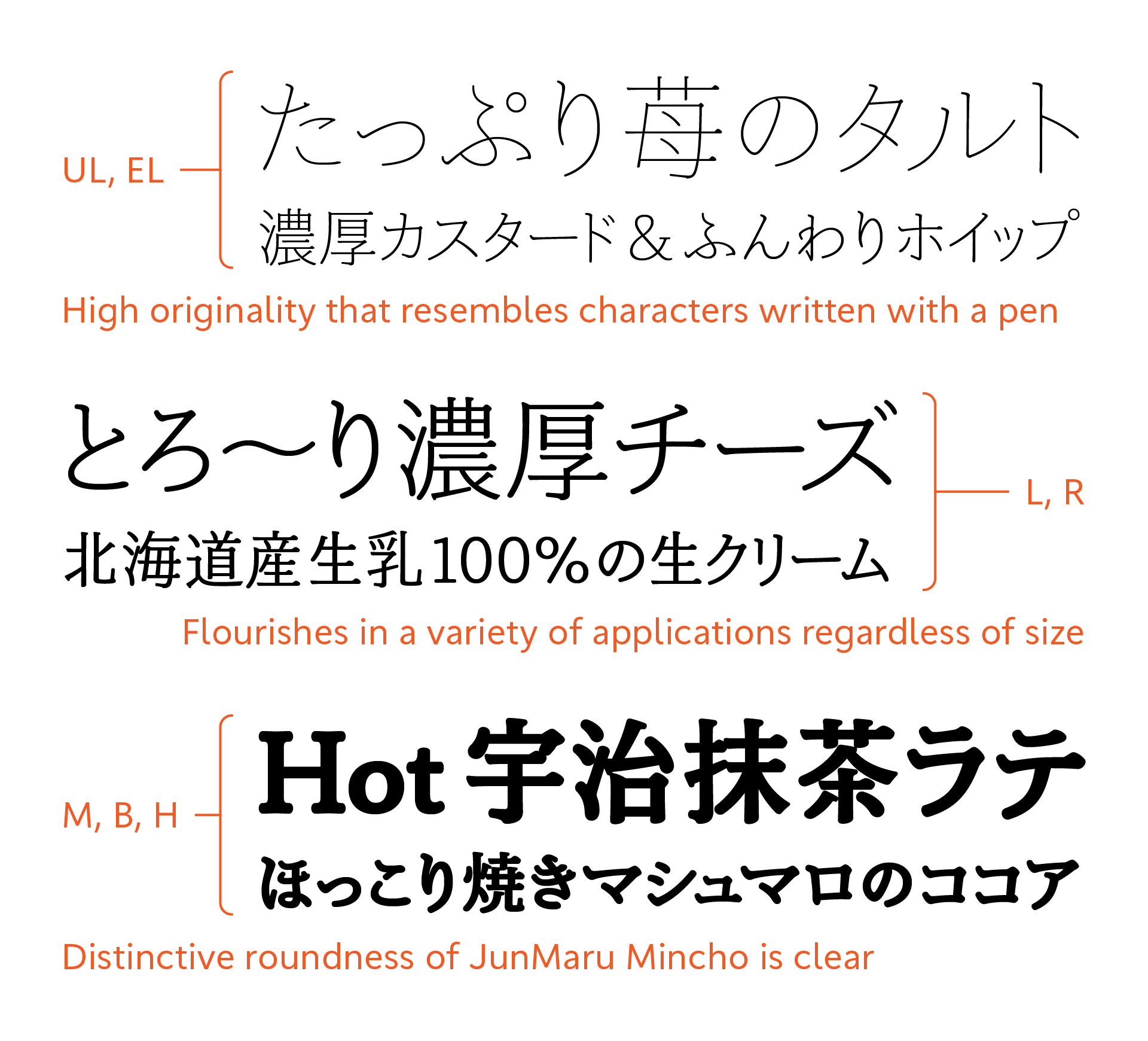
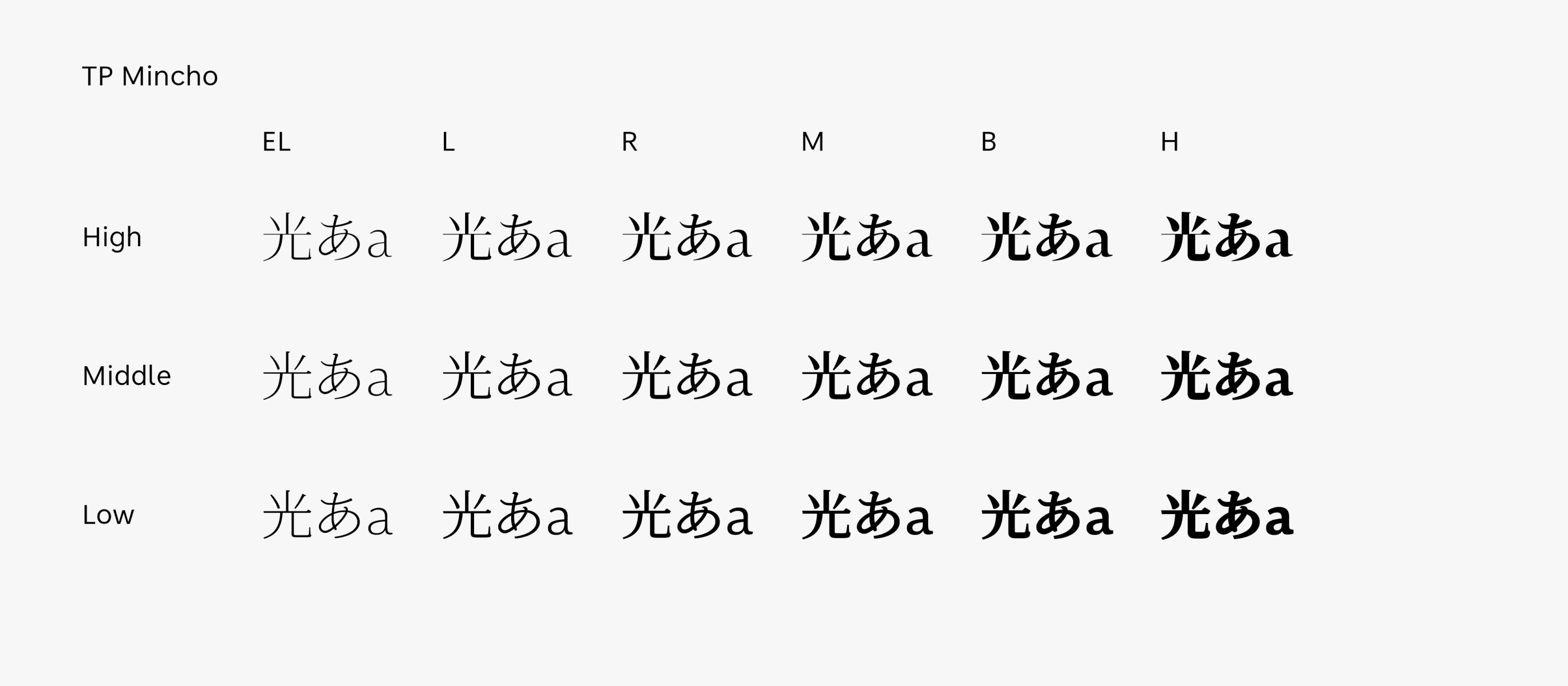
unMaru Mincho is a Mincho typeface that creates a mild and relaxed atmosphere with a proper structure. Flickering is suppressed by minimizing the contrast maximally between vertical strokes and horizontal strokes specific to Mincho; it enables the recognition of characters sufficiently even at a small size, achieving high displayability on screen. It can be used safely in formal settings. At the same time, it brings a gentle and calm air. While being a Mincho typeface, JunMaru Mincho maintains a block style appearance due to the fluffy strokes and well-balanced structure. All 7 weights have soft richness; the series makes you feel the familiarity with high reliability.

Rounded uroko like a rice ball
Thick and round tips of brush stops and sweeping are the distinctive qualities of JunMaru Mincho. Rounded uroko that looks like a rice ball at the end edge of a horizontal stroke expresses the warm character of JunMaru Mincho. Although the contrast between vertical strokes and horizontal strokes is set lower, natural modulation accompanying the movement of strokes is maintained. In TP Mincho Low Contrast, horizontal strokes and tip parts are thick. Having a different kind of solidity with contrasting mild properties is the feature of JunMaru Mincho. As it has the combination of practicality of being safely to use with everything from paper media to on-screen with an originality of design, reliability can be felt in its familiarity – it is also suitable for use in logotypes.
- WHITE MODE
- BLACK MODE
- A
Family・Specification
Font set
Standard(StdN)
9,499 characters (Adobe-Japan1-3)
Buy
TP Connect
Subscription service that enables
the use of all of Type Project fonts.
TP Connect is only available in Japanese.