2016.10/26
A Typeface that Expresses Precision
D&DEPARTMENT PROJECT is shop-style activity enterprise founded in 2000 by the designer Kenmei Nagaoka with the basic theme of “long-life design”. While expanding to 11 stores both in Japan and overseas, including Tokyo and Seoul, the Project has continued to branch out with a variety of activities, engaging in design consulting as “D&DESIGN”, for example, and publishing the sightseeing guide “d design travel”, which introduces to readers the distinctive qualities of each of Japan’s 47 prefectures.
As Matsuzoe explains, “The basic stance of our activity is this: Let’s stop do things that we would never think of doing for ourselves. We launched 60VISION soon after our founding, and we have served as consultants for long-established Japanese manufacturers who wanted to rebrand their industrial goods to target the younger generation. In order to devote our energies on our own projects, we refused to take on other work. But as there were more and more customers who agreed with the philosophy of ‘long-life design’, we decided to fulfill our customer’s requests. I feel that we are doing work that brings out the strengths of designers who own their own shops.”
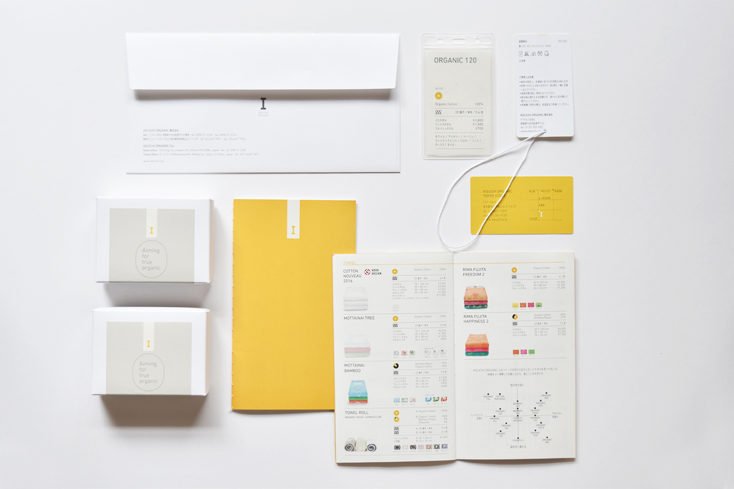
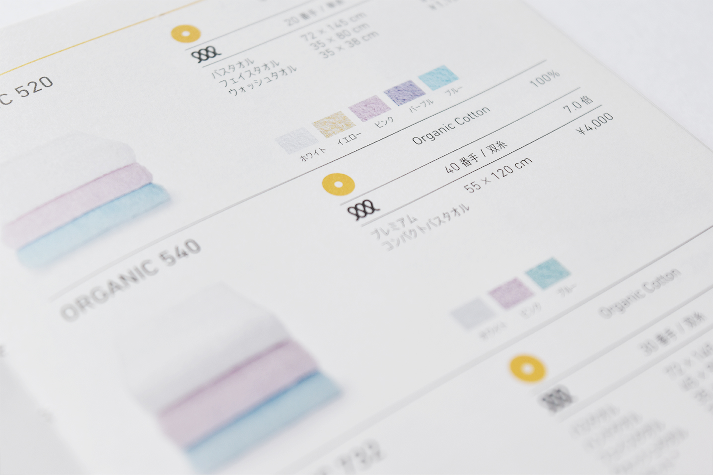
Ikeuchi Organic stationery, catalogs and labeling
D&DEPARTMENT was commissioned with the rebranding of the Imabari towel manufacturer Ikeuchi Organic, Inc., which was founded with the basic concept of “Organic with precision”. Ikeuchi Organic is a corporation that makes all its data on safety and environmental friendliness publicly available, from the sourcing of raw materials to the final manufacturing stages. AXIS Font has been adopted for the entire company brand, including catalogs, packaging and labeling.
According to Nakagawa, the reason for selecting AXIS Font Condensed was that “The catalog was filled with information for conveying materials and structures, and it was important to choose a typeface that could convey everything in a limited space. And the other thing we were looking for in a typeface was an expression of precision that would be evident when the towels were put on display.”
The philosophy of long-life design is at the core of all of D&DEPARTMENT’s projects. Whenever a new order is received, interviews are conducted in various parts of the client company to obtain a sampling of key phrases, and a brand book is drawn up detailing the company’s character and identity, which is then developed into everything from packaging and uniforms, to business cards, interior design and more. By assessing what each company has created and cultivated while also determining those aspects that need changing, they build long-lasting relationships with client companies.

“We have a wide assortment of fonts that we work with at our company. For Ikeuchi Organic, we had them purchase just two fonts – AXIS Font R and L. Having too many fonts to chose from is confusing for the client.”
D&DEPARTMENT creates branding-related elements such as logos, catalogs and packaging, and provides them in various formats through letters to customers and press releases. Moreover, D&DEPARTMENT proposes purchasing the minimum amount of fonts needed for day-to-day business, and thereby contributes to reducing the client company’s expenses.
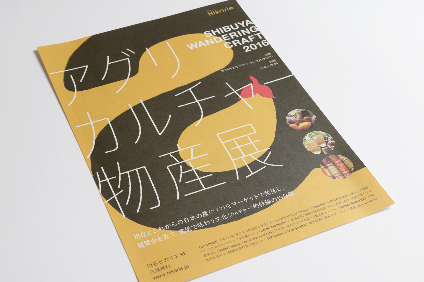
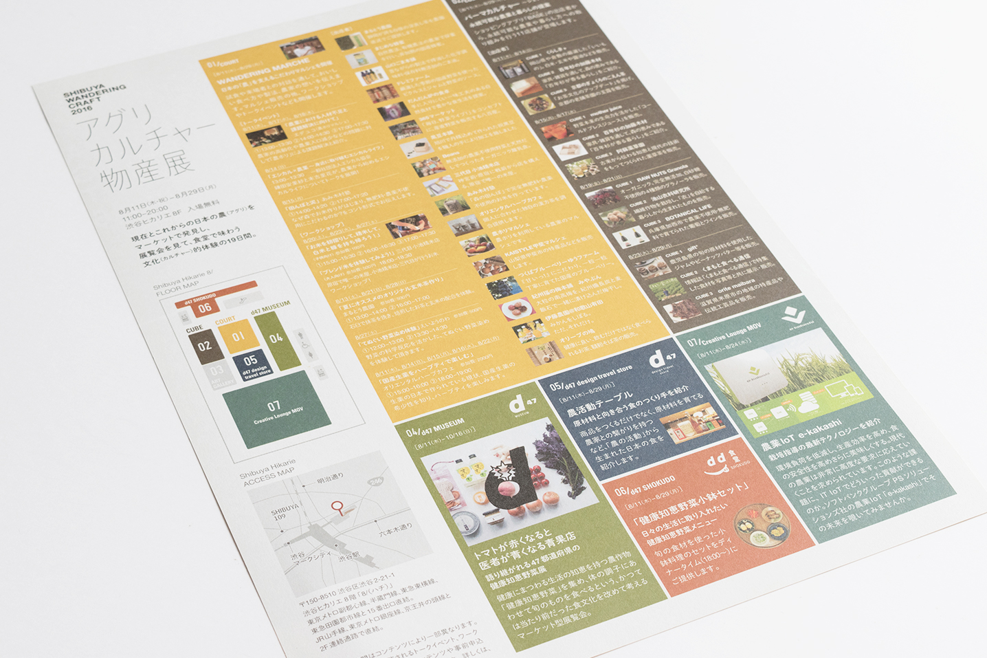
Since 2014, D&DEPARTMENT has been engaged in planning for regional food fairs organized by Shibuya Hikarie. In 2016, while bringing out the distinctive character of the Shibuya area, D&DEPARTMENT expanded this project with agricultural product fairs that offer basic agriculture-oriented “cultural experiences”, both through selling vegetables at food markets and by featuring them in restaurants and on talk shows and the like.

“AXIS Font is something I’ve been familiar with ever since I was student, and I always thought how great it would be to use it as a designer. These days I like to start off with AXIS Font to see how things look. I do try things out in Basic, but in most cases I go with Condensed, because I know there’s a large amount of information that has to be conveyed. TP Mincho is easy to read even at 5-point, so I am thinking of working with it for main text situations and websites.”
“It was a requirement that we use the words ‘アグリカルチャー物産展’ (Agricultural Product Fair) prominently in the main visual,” says Nakagawa. “We wanted something that wouldn’t get spread out laterally when laid out in a single line, but would have a well-balanced fit even when set on three lines with more space between the characters. It was clear to me that the only font that could really be developed in a tidy manner both vertically and horizontally, without getting in the way of the background graphics, was AXIS Font Condensed. In the ad copy, we’re using it with the corners rounded, so as to bring out a food-product feeling.”
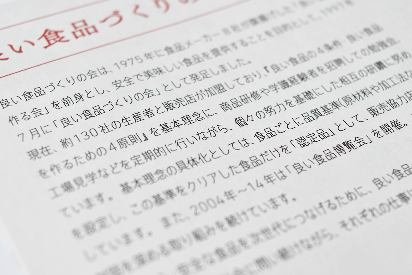
DIN Condensed and AXIS Font Condensed were also chosen for the Good Foods Expo hosted by the Association for Good Food Product Creation (Yoi Shokuhin-Zukuri no Kai).
“The aim of this event was to convey the depth of feeling that the producers put into the creation of their food products, which is something that goes beyond their wonderful flavor, and to point to ways of eating well through those products and their producers’ engagement with them. If there had been the intention of giving precedence to the food’s image, we might have leaned toward using some kind of enticing foodie font. But in this case we decided on a font that is straightforward and practical without hindering the food’s image.” (Matsuzoe)