2002.12/01
Q & A
What differences do you see between type foundries in Japan and in Europe?
In Europe, it is not rare for people to be able to speak three or four languages. So, whenever there is a seminar or conference going on somewhere, everyone will just head over and get down to information gathering and publicity. Everyone is really energetic.
At Linotype, you have been taking Latin typefaces that are established standards, and redesigning them one after the other. Could you talk about the significance of this work, and how it has been received in Europe and America?
Ever since my days as freelancer, I have felt that just because a typeface is an ‘established standard’ does not necessarily mean it is of high quality. The word that comes to mind is ‘makeshift’. This might seem a bit harsh, but there are definitely typefaces that give that impression. Desktop publishing environments have been improving rapidly year after year. Meanwhile, we’re still using digital typefaces that are for software and printers from fifteen years ago. It’s really peculiar if you think about it, and it only stands to reason that Linotype is re-creating its professional fonts completely from the ground up. Just the other day, the American graphics magazine Step Inside Design requested my cooperation for an interview and article on Optima nova, and I have the corrected proof with me. They have written up an accurate description, along with detailed commentary, of our stance that, since going digital has freed us from the mechanical limitations of phototypesetting and type casting machines, there is no need to keep dragging along with type designs that feel unnatural.
What would you say is especially attractive about “Optima nova”?
In a word, it has become more elegant and easier to use. We’ve removed all the undesirable character spacing issues found in the old Optima, and improved it overall. Graphic designers who worked with Optima in the past must have had a tough time when it came to adjusting character alignment. When undertaking the redesign of Optima, in my role as type director one of the first things that came to mind was this: We don’t have the limitations of the old machines any longer, so what sort of design should we give the new typeface that will reflect our current time? For this redesign, some characters were deemed to be best in their original printed type forms, so those forms were preserved. And then there are other letters that were completely redone in different shapes. Also, we added variations that weren’t available before, such as Condensed. The Optima we have succeeded in creating is the one that Zapf was after, and one that will satisfy the typesetting needs of professional designers. I am sure that professionals will notice that it is not simply a rehash of the old typeface.
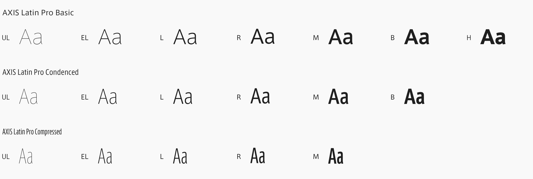
Could you talk about AXIS Font when you first considered it as a project?
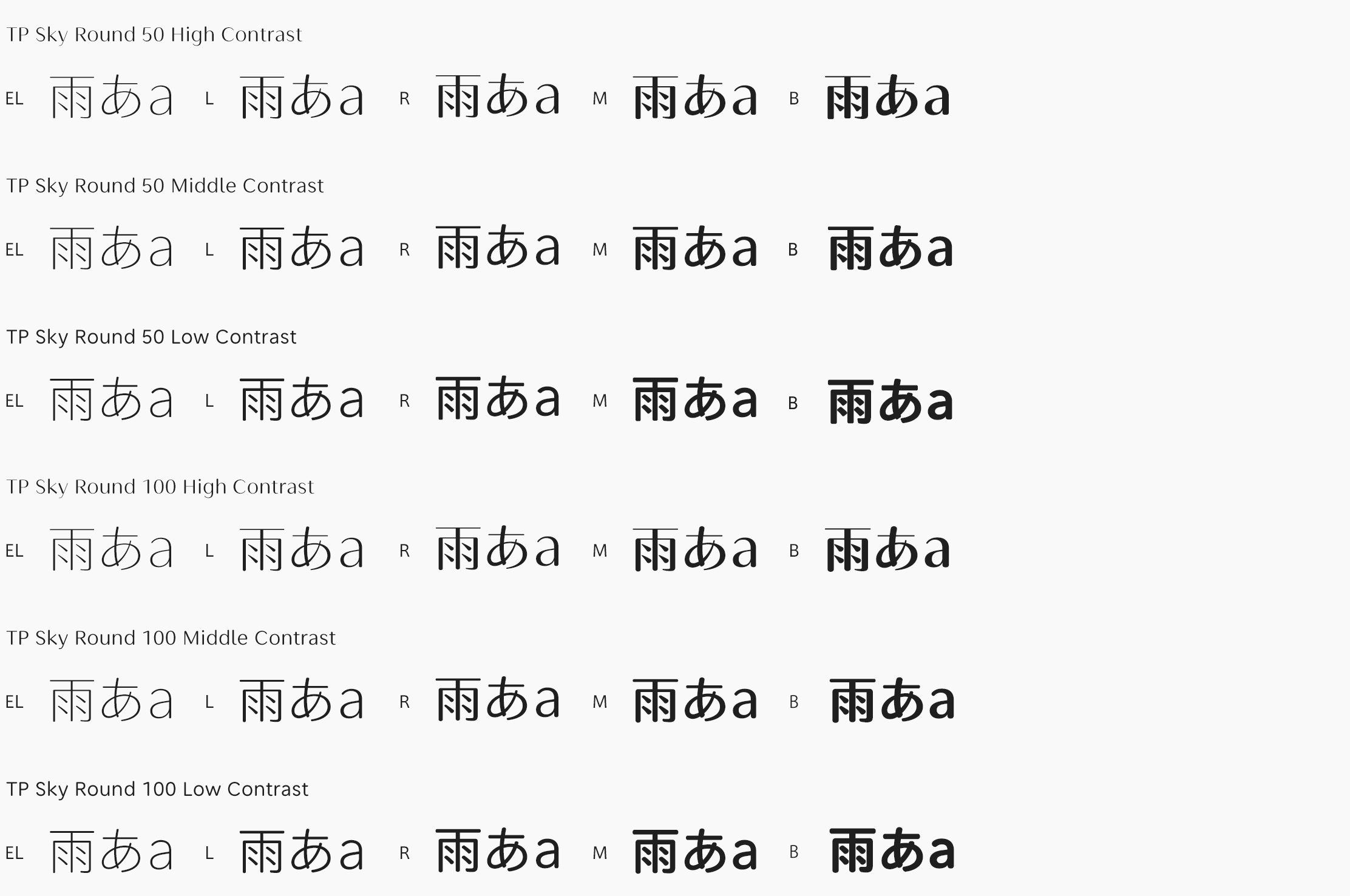
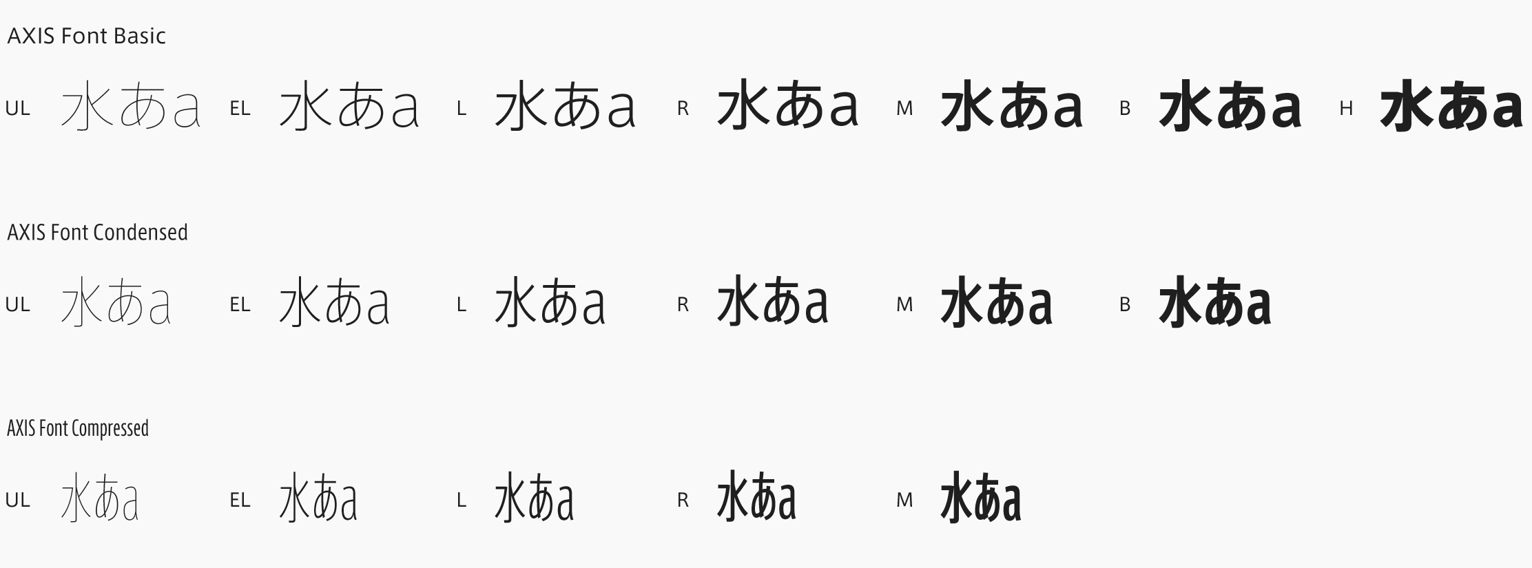
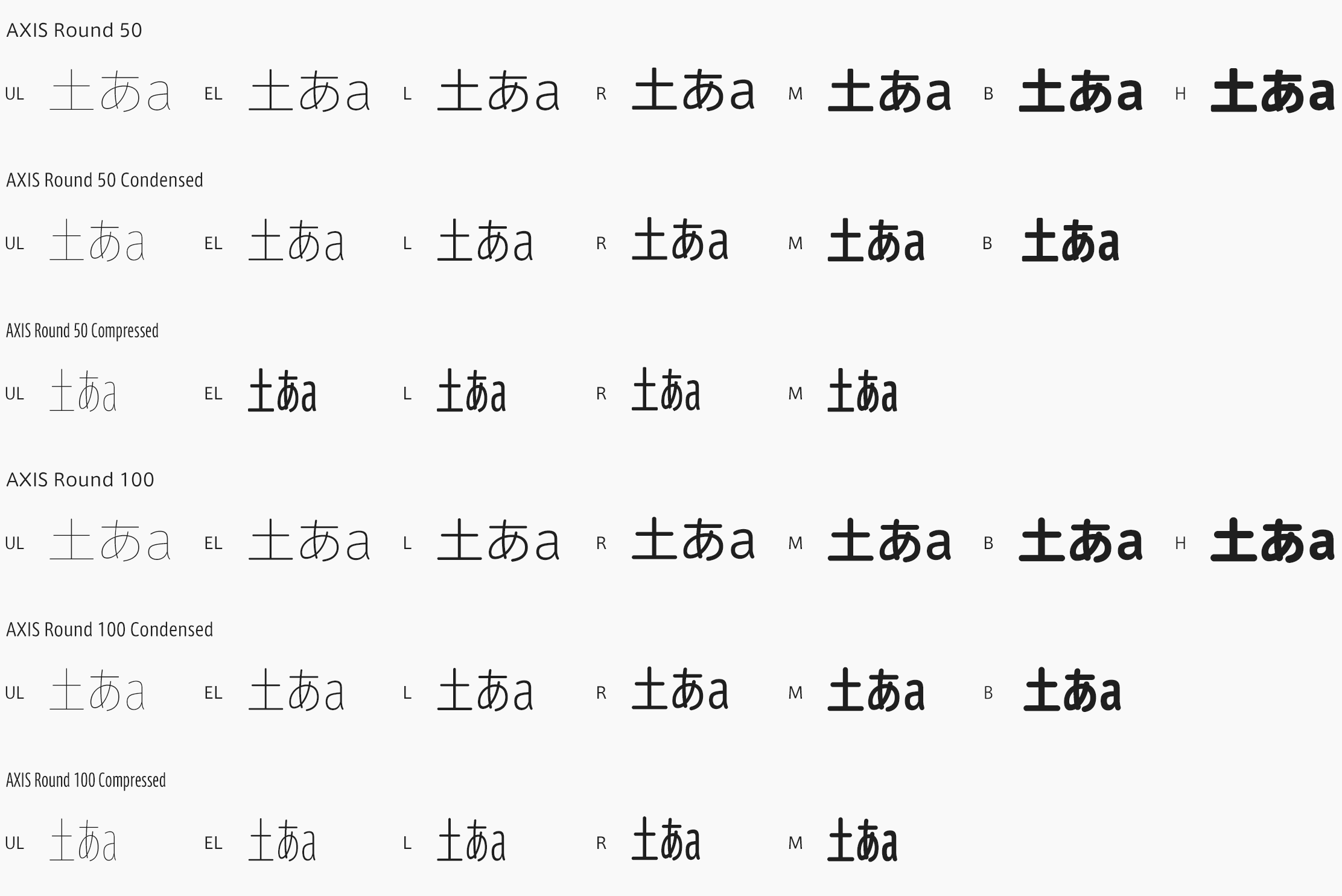
First of all, it was an epoch-making event in the Japanese typeface design world. Though this sort of thing was already being done in other countries a hundred years ago, and there have always been newspapers in Japan that have developed their own fonts, it was unheard of for an entire magazine to be set with an original font. It was important work, and it left its mark on the history of Japanese typeface design.
What is different about designing Latin typefaces for use in mixed-text situations with Japanese characters, as opposed to designing Latin typefaces to be used on their own?
First, there is the difference in the thickness of the basic stroke line. Standard Japanese typefaces for normal text use are made with much thinner forms than are Latin characters in comparable text situations. This point is obvious when you look at roman typefaces. So if you take a Mincho font, for instance Ryumin, and put it together with a heavy black typeface like Times Roman, only the parts with Latin characters are going stand out. Next, there is the difference of character spacing. With standard Japanese typefaces for normal text use, the kana characters are designed slightly smaller, and their spacing is usually set solid. When you look at a piece of writing, you notice large gaps between kana â and the gaps are also inconsistent, with varying densities in the same text. And as kana characters appear more frequently in ordinary writing than do kanji ideograms, we are accustomed to those large gaps between kana. So, in order to maintain a balance with the kana, Latin typefaces that are made for use with Japanese characters are designed with character spacing that is slightly wider than normal.
Taking into consideration your own evaluation of AXIS Font, and in comparison, the appearance of Latin text in all other Japanese typefaces, are there any unique aspects, design-wise, that stand out among the typefaces you have worked with in Japan?
You can get a clear evaluation of a typeface by making comparisons. Compared to the New Gothic available before, AXIS Font has a far better design. If New Gothic were brought back for readers today, I am sure they would be completely at a loss. One of the unique points about AXIS Font for Latin characters is that it has a new atmosphere never before achieved for Latin characters in a Japanese typeface. Back in the days of phototypesetting, when Latin characters were set in a Japanese typeface, as a rule it would be a Mincho typeface with Century, a Gothic typeface with Helvetica or something close to that. Though things changed with coming of the digital age, a conservative taste has remained the norm. So, for better or worse, our Latin typefaces have tended to be the safe, harmless sort. What was special about AXIS Font’s Latin characters is that we had an objective that was fundamentally distinct from that trend, and that was to bring out a kind of European ambiance. It was really due to the limitations of the magazine’s content, and thanks to the clarity of Isao Suzuki’s intentions, that the project came to fruition.
Could you share your thoughts on Japanese text in AXIS Font?
This is a typeface in which we took advantage of the properties of sans serif to create an ultra-light design, carefully considered the effect that would be made when used on a magazine page, and thereby succeeded in expressing qualities befitting a design magazine. While have a clean and contemporary style for use in headlines, it is also suitably restrained when applied to the main text of an article. I wouldn’t go so far as to say it’s perfect in every situation, of course. But for a design magazine like AXIS, it is the most appropriate typeface.
Could you talk about characteristics of the big type foundries versus the small ones, and what hopes you have for them in the future?
Things have changed since the days of printed type, and it is now possible for a single person to work steadily, and eventually complete and sell even a large family of typefaces. So, in terms of new typeface development, I don’t think there is much difference. But with big foundries like Linotype, since we own the rights to the ‘old standbys’ â typefaces such as Helvetica and Univers, for instance â we can redesign and bring back those original printed type fonts. I am hoping that Monotype will redesign its ‘old standby’ typefaces too, but unfortunately, it doesn’t seem likely for the time being.
What book would you recommend to aspiring type designers, and why?
There is a fairly well known book, which I am sure some are familiar with already: Walter Tracy’s Letters of Credit (Gordon Fraser, London 1986). If someone were to ask me to choose a single volume on pre-digital type design, without hesitation, this would be the one. It contains discussions on the mechanical limitations of phototypesetting and type casting machines, and its explanations with regard to character spacing are very clear.
What would you say is important for a type designer?
I think that you have to see a lot of good stuff, and keep it in your head. To identify what’s good and what’s not, the most important thing is to take up your pen or flat brush or what-have-you, and try writing out the characters yourself. The next thing is to look at a lot of typeface design books. They’ll give you a lot of tips on how to identify things.
(December 2002)
Akira KOBAYASHI
The Japanese type designer Akira Kobayashi was born in 1960. He studied at the Musashino Art University in Tokyo from 1979 to 1983, and six years later followed this up with a calligraphy course at the London College of Printing.
His first work experience in type design was at Sha-Ken Co., Ltd., a manufacturer of phototypesetting machines. Then Kobayashi worked as a freelance type designer, during which time he has won a number of awards. Since May 2001 He is the Type Director at Linotype Library GmbH. He recently completed the Optima nova family with the original designer Professor Hermann Zapf.

