%20--%3e%3cpolygon%20points='24.7%201%200%201%200%207.6%208.5%207.6%208.5%2039.4%2016.1%2039.4%2016.1%207.6%2024.7%207.6%2024.7%201'/%3e%3cpath%20d='M34.1,32.4l-4.9-22.7h-7.9l9.1,33.1c-.4,1.7-1.1,2.9-3.7,2.9h-2.6l1.9,6.6h1.5c4,0,8-1.2,10.3-9.2,1.8-6.4,8.9-33.3,8.9-33.3h-8l-4.6,22.7Z'/%3e%3cpath%20d='M91.7,8.7c-8.7,0-12.7,6.5-12.7,16.1s3.6,15.3,13.8,15.3,7.2-.9,9-1.6l-1.2-6c-2.4.8-4.9,1.2-7,1.2-4.3,0-7-2-7.2-7.3h16v-4.8c0-7.5-2.9-13-10.7-13ZM86.5,21c0-3.3,1.7-6.4,4.7-6.4s4.1,2.7,4.1,6.4h-8.8Z'/%3e%3cpath%20d='M218,8.7c-8.7,0-12.7,6.5-12.7,16.1s3.6,15.3,13.8,15.3,7.2-.9,9-1.6l-1.2-6c-2.5.8-4.9,1.2-7,1.2-4.3,0-7-2-7.2-7.3h16v-4.8c0-7.5-2.9-13-10.7-13ZM212.9,21c0-3.3,1.7-6.4,4.7-6.4s4.1,2.7,4.1,6.4h-8.8Z'/%3e%3cpath%20d='M126,1h-10.7v38.4h7.6v-11.8h5c6,0,11.3-3.8,11.3-14.1s-5.5-12.5-13.1-12.5ZM125.9,20.9h-3.1V7.6h3c3.7,0,5.4,1.8,5.4,6.3s-1.5,7.1-5.3,7.1Z'/%3e%3cpath%20d='M150,12.9c-.2-1-.5-2.4-.8-3.2h-6.9c.5,1.9.7,4.6.7,7.9v21.8h7.4v-20.3c1.1-2.2,4.5-3,7.4-3v-6.8c-3.5,0-6.5,1.7-7.7,3.6Z'/%3e%3cpath%20d='M192.6,40.6c0,3.5-1.6,4-4.7,4h-1.5l1.9,6.6h2.3c6.3,0,9.3-3.2,9.3-9.8V9.7h-7.4v30.9Z'/%3e%3crect%20x='192.2'%20width='8.4'%20height='6.4'/%3e%3cpath%20d='M247.4,33.7c-4.8,0-6.6-2.8-6.6-9.6s1.9-8.9,6.2-8.9,3.4.4,4.9,1l1-6.4c-1.3-.5-3.7-.9-6.2-.9-10.6,0-13.4,6.7-13.4,15.9h0c0,10.7,4.6,15.3,12.4,15.3s5.9-.5,7.4-1l-.9-6.1c-2,.4-3.7.6-4.7.6Z'/%3e%3cpath%20d='M264.7,30.2v-14.2h5.4l1.4-5.8h-6.9V2.1l-7.3,1.9v26.8c0,5.3,2.4,9,8.2,9s4.9-.2,4.9-.2v-5.7h-2c-3,0-3.8-1.3-3.8-3.7Z'/%3e%3cpath%20d='M64.3,8.8c-3.3,0-5.8,1.6-7.3,3.4-.2-1.1-.5-2.1-.8-2.6h-6.6c.5,1.9.6,4.4.6,7.4v34.4h7.3v-13.8c1.5,1.5,3.8,2.4,6.2,2.4,8,0,11.2-6.6,11.2-16s-3.1-15.2-10.4-15.2ZM62.1,33.8c-1.6,0-3.1-.6-4.6-1.8-.3-1.6-.4-3.7-.4-6v-3.3c0-1.8.1-3.8.4-5.1,1.4-1.4,3-2.5,5-2.5,3.2,0,4.6,3.2,4.6,9s-.9,9.6-5,9.6Z'/%3e%3cpath%20d='M173.6,8.6c-9.5,0-13,6.7-13,15.7s3.5,16.1,13,16.1,13-6.8,13-16.2-3.3-15.7-13-15.7ZM173.6,34.2c-3.6,0-5.5-2.9-5.5-9.9s2.2-9.5,5.5-9.5,5.5,2.2,5.5,9.5-1.9,9.9-5.5,9.9Z'/%3e%3c/svg%3e)
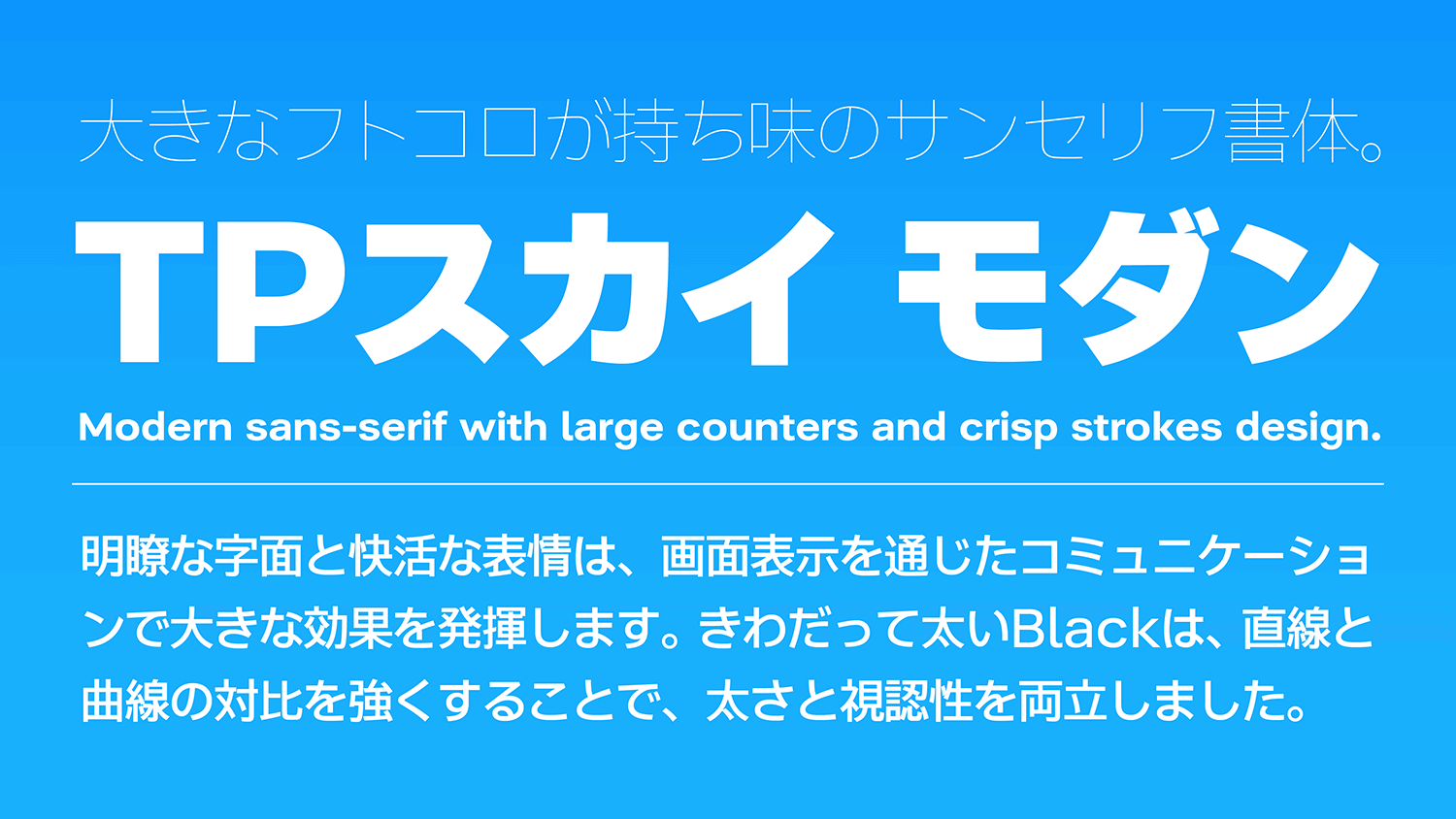
An extremely thick weight is achieved in TP Sky Modern by widening the inside space between strokes. This achieves expression with both thickness and visibility by strengthening the contrast between straight lines and curved lines, and making strokes longer to allow a generous structure designed with a silhouette close to a square extended in the type face.
Features
Large characters designed to fill up space.
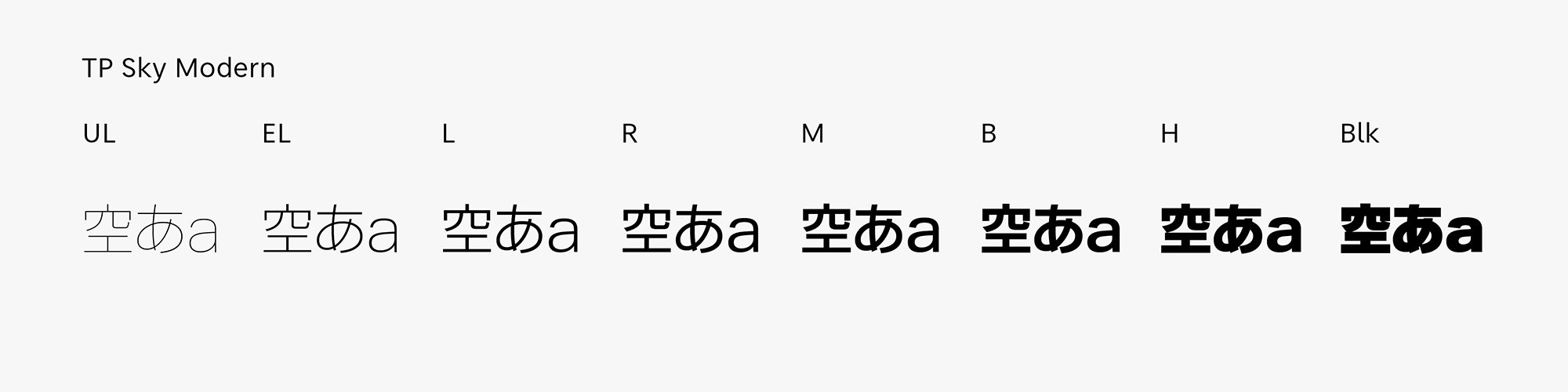
TP Sky Modern features large characters designed to fill up space. While widening the inside space between strokes, the type face is set at a large size at the same time, so the sizes of kana and kanji become closer. As the character size is arranged, it is a stable typeface that strongly inherits the plain and flat impression common to the TP Sky family. Kana of the thickest Blk (Black), Latin, and Chinese numerals with lower numbers of strokes feature extreme thickness, around 150% thicker than TP Sky Low Contrast B. In kanji characters with a large number of strokes, the main strokes are thickened, and the other parts are kept thin to prevent damage to the image of the character and black accumulation, and to maintain the balance of density with characters with fewer strokes.
Completely thick strokes.
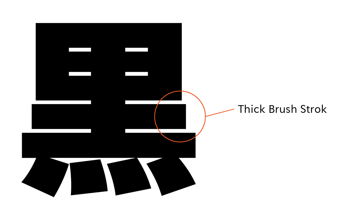
TP Sky Modern has the widest space between strokes among the Type Project fonts; it is a sans-serif typeface with a generous structure that provides stability. Large characters with wide inside space between strokes designed to fill up space convey brightness and familiarity, which creates cuteness and an impression of affinity. As each square space for full-width characters is used maximumly, the character spacing is constant, and it is compatible with solid typesetting; it also fulfills a function where crushing is less likely to occur. The strokes are completely thick, to the limit. Handling the main strokes thicker and the other parts thinner, the black wash is maintained while preventing crushing.

Relaxed, orthodox design.
TP Sky Modern is created with the awareness of generating a silhouette close to square, and achieving flat and orderly typesetting. The Latin has a relaxed, orthodox design. With a large inside space between strokes, and a generous structure similar to Japanese, it gives a strong impression while remaining simple. High visibility is also maintained in the thick weights by setting the x-height higher. Not only it is easy to read in Latin by itself, it is designed with a strong awareness of compatibility with Japanese. As the height is adjusted by weight, the appearance is well-balanced, achieving a natural appearance at the time of typesetting.
- WHITE MODE
- BLACK MODE
- A
Family・Specification
Font set
Standard(StdN)
9,499 characters (Adobe-Japan1-3)
Buy
TP Connect
Subscription service that enables
the use of all of Type Project fonts.
TP Connect is only available in Japanese.