


-
A Basic
-
A Headline
-
A Hairline
-
Jun MinchoBasic
UL
画面にうるおいを与える美しい明朝体 美しさと実用性を兼ね備え現代的な表情とクラシックな佇まい Deliver the full potential of beauty of Mincho typeface provides a charm on screen.
-
Jun MinchoBasic
EL
画面にうるおいを与える美しい明朝体 美しさと実用性を兼ね備え現代的な表情とクラシックな佇まい Deliver the full potential of beauty of Mincho typeface provides a charm on screen.
-
Jun MinchoBasic
L
画面にうるおいを与える美しい明朝体 美しさと実用性を兼ね備え現代的な表情とクラシックな佇まい Deliver the full potential of beauty of Mincho typeface provides a charm on screen.
-
Jun MinchoBasic
R
画面にうるおいを与える美しい明朝体 美しさと実用性を兼ね備え現代的な表情とクラシックな佇まい Deliver the full potential of beauty of Mincho typeface provides a charm on screen.
-
Jun MinchoBasic
M
画面にうるおいを与える美しい明朝体 美しさと実用性を兼ね備え現代的な表情とクラシックな佇まい Deliver the full potential of beauty of Mincho typeface provides a charm on screen.
-
Jun MinchoBasic
B
画面にうるおいを与える美しい明朝体 美しさと実用性を兼ね備え現代的な表情とクラシックな佇まい Deliver the full potential of beauty of Mincho typeface provides a charm on screen.
-
Jun MinchoBasic
H
画面にうるおいを与える美しい明朝体 美しさと実用性を兼ね備え現代的な表情とクラシックな佇まい Deliver the full potential of beauty of Mincho typeface provides a charm on screen.
-
Jun MinchoHeadline
UL
画面にうるおいを与える美しい明朝体 美しさと実用性を兼ね備え現代的な表情とクラシックな佇まい Deliver the full potential of beauty of Mincho typeface provides a charm on screen.
-
Jun MinchoHeadline
EL
画面にうるおいを与える美しい明朝体 美しさと実用性を兼ね備え現代的な表情とクラシックな佇まい Deliver the full potential of beauty of Mincho typeface provides a charm on screen.
-
Jun MinchoHeadline
L
画面にうるおいを与える美しい明朝体 美しさと実用性を兼ね備え現代的な表情とクラシックな佇まい Deliver the full potential of beauty of Mincho typeface provides a charm on screen.
-
Jun MinchoHeadline
R
画面にうるおいを与える美しい明朝体 美しさと実用性を兼ね備え現代的な表情とクラシックな佇まい Deliver the full potential of beauty of Mincho typeface provides a charm on screen.
-
Jun MinchoHeadline
M
画面にうるおいを与える美しい明朝体 美しさと実用性を兼ね備え現代的な表情とクラシックな佇まい Deliver the full potential of beauty of Mincho typeface provides a charm on screen.
-
Jun MinchoHeadline
B
画面にうるおいを与える美しい明朝体 美しさと実用性を兼ね備え現代的な表情とクラシックな佇まい Deliver the full potential of beauty of Mincho typeface provides a charm on screen.
-
Jun MinchoHeadline
H
画面にうるおいを与える美しい明朝体 美しさと実用性を兼ね備え現代的な表情とクラシックな佇まい Deliver the full potential of beauty of Mincho typeface provides a charm on screen.
-
Jun MinchoHairline
UL
画面にうるおいを与える美しい明朝体 美しさと実用性を兼ね備え現代的な表情とクラシックな佇まい Deliver the full potential of beauty of Mincho typeface provides a charm on screen.
-
Jun MinchoHairline
EL
画面にうるおいを与える美しい明朝体 美しさと実用性を兼ね備え現代的な表情とクラシックな佇まい Deliver the full potential of beauty of Mincho typeface provides a charm on screen.
-
Jun MinchoHairline
L
画面にうるおいを与える美しい明朝体 美しさと実用性を兼ね備え現代的な表情とクラシックな佇まい Deliver the full potential of beauty of Mincho typeface provides a charm on screen.
-
Jun MinchoHairline
R
画面にうるおいを与える美しい明朝体 美しさと実用性を兼ね備え現代的な表情とクラシックな佇まい Deliver the full potential of beauty of Mincho typeface provides a charm on screen.
-
Jun MinchoHairline
M
画面にうるおいを与える美しい明朝体 美しさと実用性を兼ね備え現代的な表情とクラシックな佇まい Deliver the full potential of beauty of Mincho typeface provides a charm on screen.
-
Jun MinchoHairline
B
画面にうるおいを与える美しい明朝体 美しさと実用性を兼ね備え現代的な表情とクラシックな佇まい Deliver the full potential of beauty of Mincho typeface provides a charm on screen.
-
Jun MinchoHairline
H
画面にうるおいを与える美しい明朝体 美しさと実用性を兼ね備え現代的な表情とクラシックな佇まい Deliver the full potential of beauty of Mincho typeface provides a charm on screen.
About Product
Overview
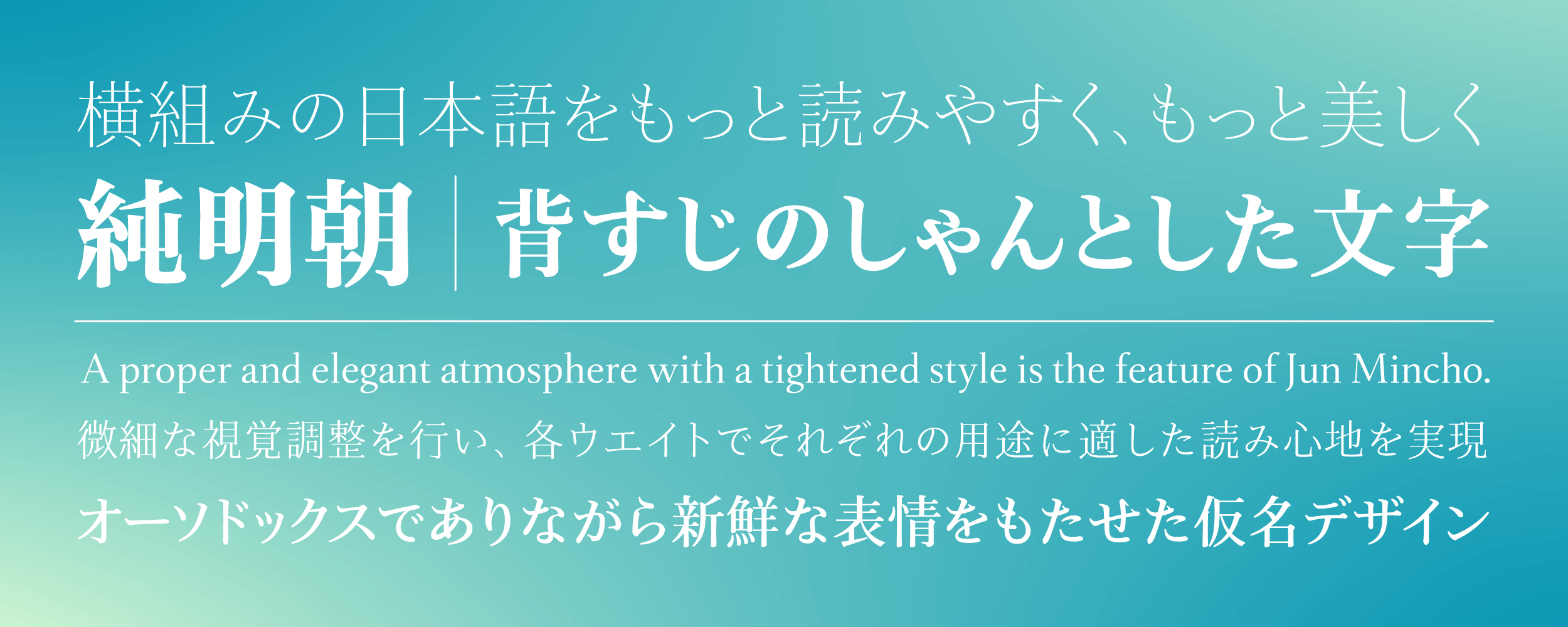
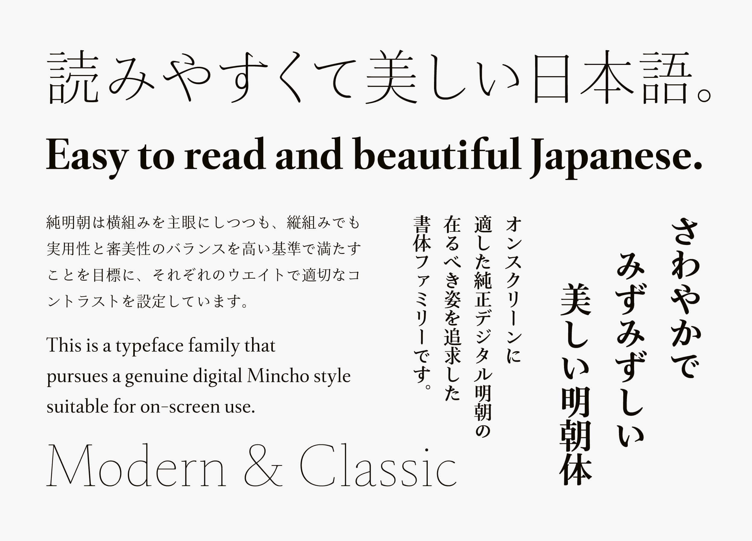
Jun Mincho is a font family with the theme of “making Japanese in horizontal typesetting more legible and more beautiful.” To obtain a stable feeling when reading, an appropriate contrast (ratio of thickness of the vertical strokes and horizontal strokes) is set in each weight. In addition to overcoming weaknesses with the Mincho typeface, which tend to be avoided on screen, the typeface is designed to deliver the full potential of beauty of Mincho typeface that provides a charm on screen.
While orthodox in design, a proper and elegant atmosphere produced by kanji with a tightened style is the feature of Jun Mincho. Similar to kanji, the kana has graceful strokes while maintaining a relaxed appearance. It provides both comfortable reading and aesthetics. Its Latin gives a modern impression with the combination of beauty and practicality; and a classical appearance that can be used with confidence in mixed typesetting of Japanese and Latin or Latin alone. Jun Mincho is a refreshing and fresh Mincho font family that suits digital environments.
-
-
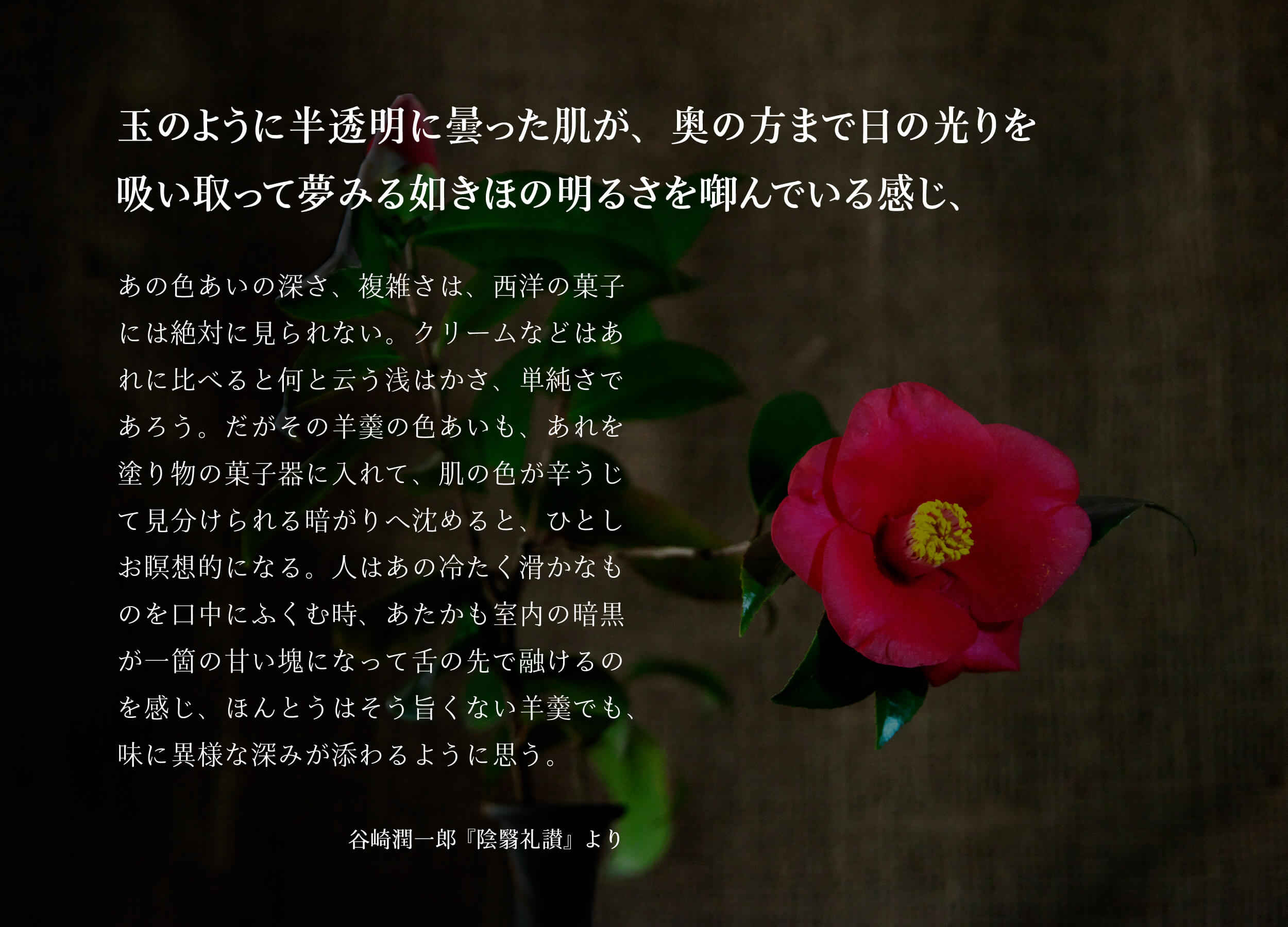
“In Praise of Shadows” by Junichiro Tanizaki
-
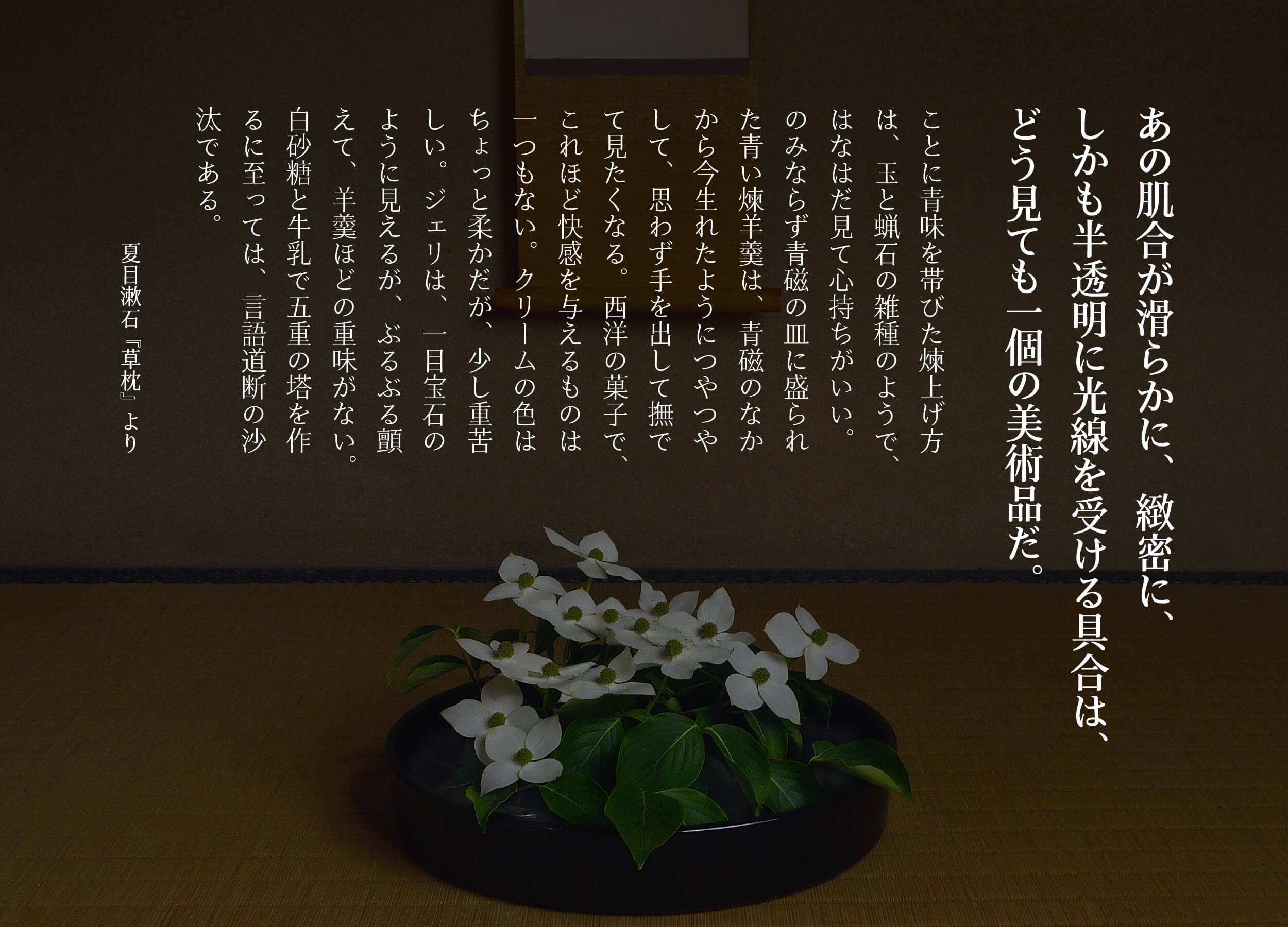
“The Three-Cornred World” by Soseki Natsume
Jun Mincho Headline and Hairline are developed to pursue higher aesthetics in the Jun Mincho series. While Jun Mincho is orthodox, with high multiplicity, Headline and Hairline highlight the beauty distinctive of Mincho typeface by thinning the tip part of the sweep and stop brush and increasing the contrast ratio between the vertical strokes and horizontal strokes.
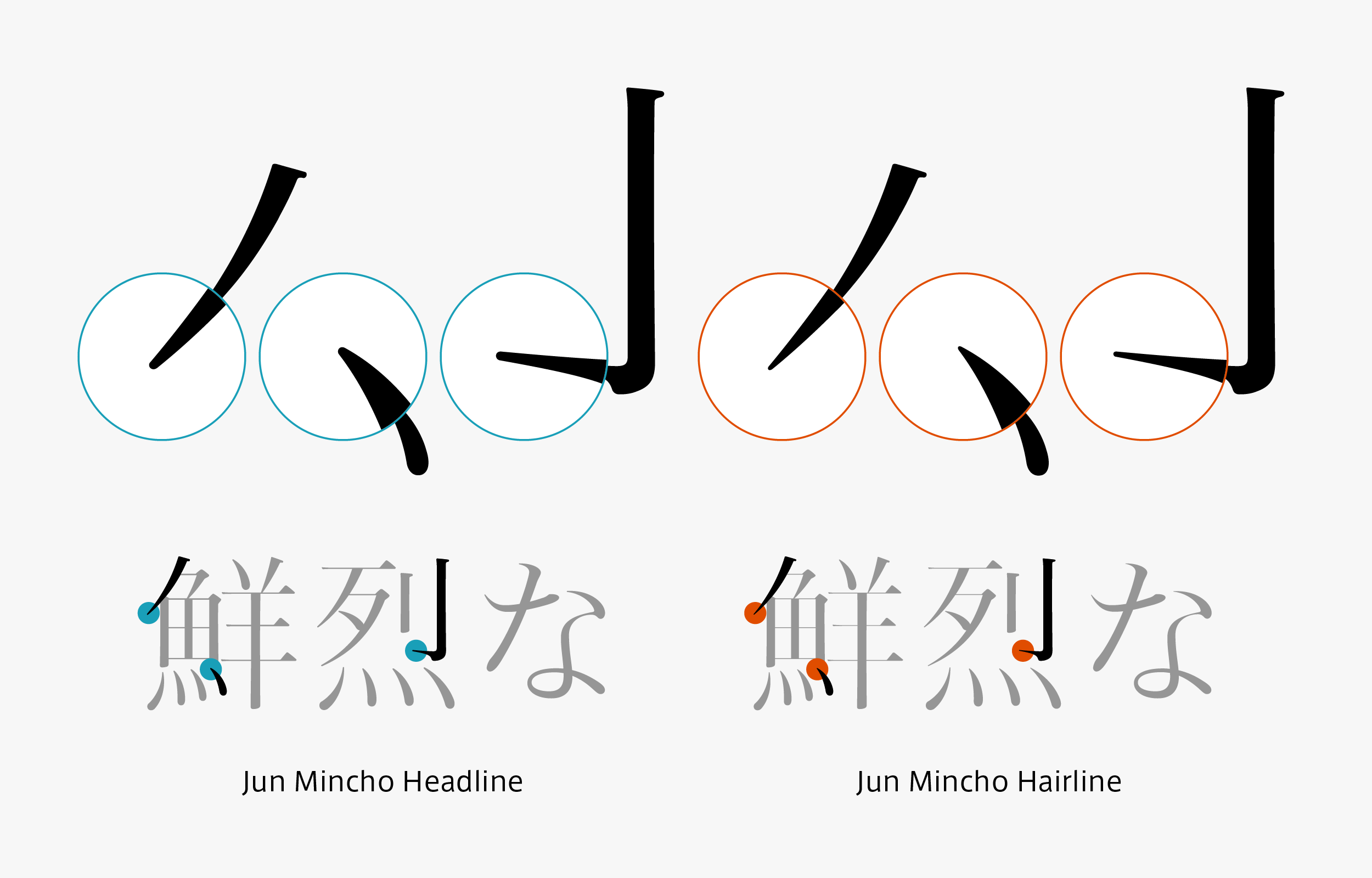
Jun Mincho Hairline is based on Jun Mincho Headline with thinner stroke tip parts. It shows more than the expected effect when a vivid impression with extremely thin strokes is desired.
The hiragana brush connection that remains longer represents the elegant expression of Jun Mincho Headline and Hairline. It is obvious that Kanji with narrowed inside space between strokes and the elegant Kana are very compatible. In addition, the classically designed Latin is in beautiful harmony with the graceful Japanese. It all comes together in the beautiful and natural Japanese typeface, maximizing each feature of Kanji, Kana, and Latin. Jun Mincho Headline and Hairline are typefaces that give a vivid impression, with specifications unique to the high definition, digital environment period.


Concept
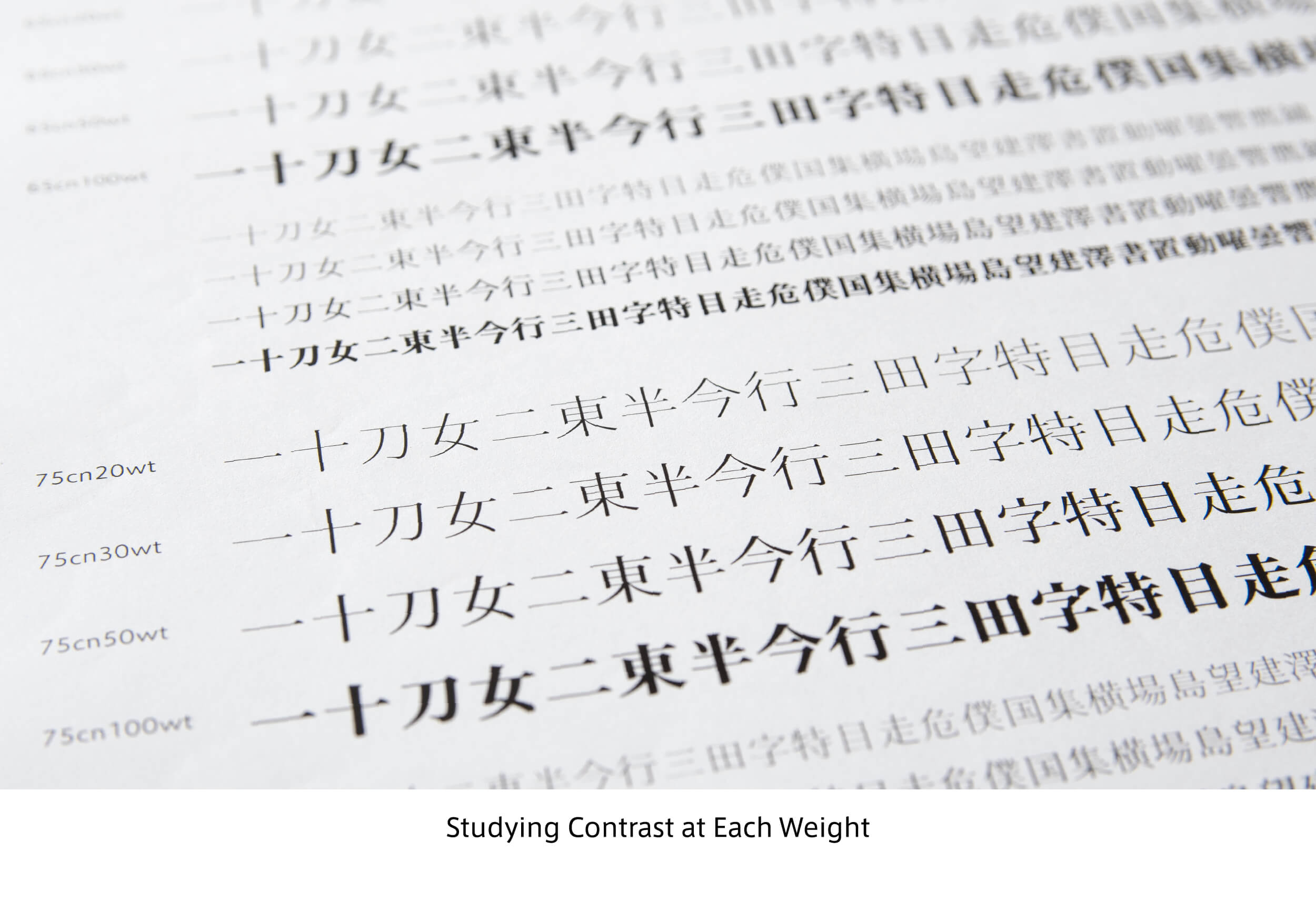
Based on the concept of legible and beautiful Japanese, Jun Mincho is a font family that pursued an ideal expression of genuine digital Mincho that is appropriate on screen. In TP Mincho, the character arrangement is thoroughly examined in a design policy that specializes in full-width horizontal typesetting. Adjustment is made to change the thickness of the horizontal strokes with three contrasts for vertical strokes with the same thickness. In contrast, the significant difference with Jun Mincho is that the appropriate contrast is set for each weight with the goal of meeting a high standard of balance in vertical typesetting with practicality and aesthetics, while focusing mainly on horizontal typesetting. So as not to overpower with an extremely strong personality, but to emphasize on a sense of stability, adjustment is made to give a similar impression with Jun Mincho in all weights by slightly changing the contrast value of each weight.
For Jun Mincho Headline and Hairline, drastic design is applied as a heading application. The thin weight in particular is one of the destinations of “extremely thin weight, and extremely high contrast” in which Type Project is proficient. Keeping the proper structure of the orthodox Jun Mincho series as it is, the contrast is increased to the limit in Headline and Hairline, giving a sense of freshness when used in a larger size.
Features
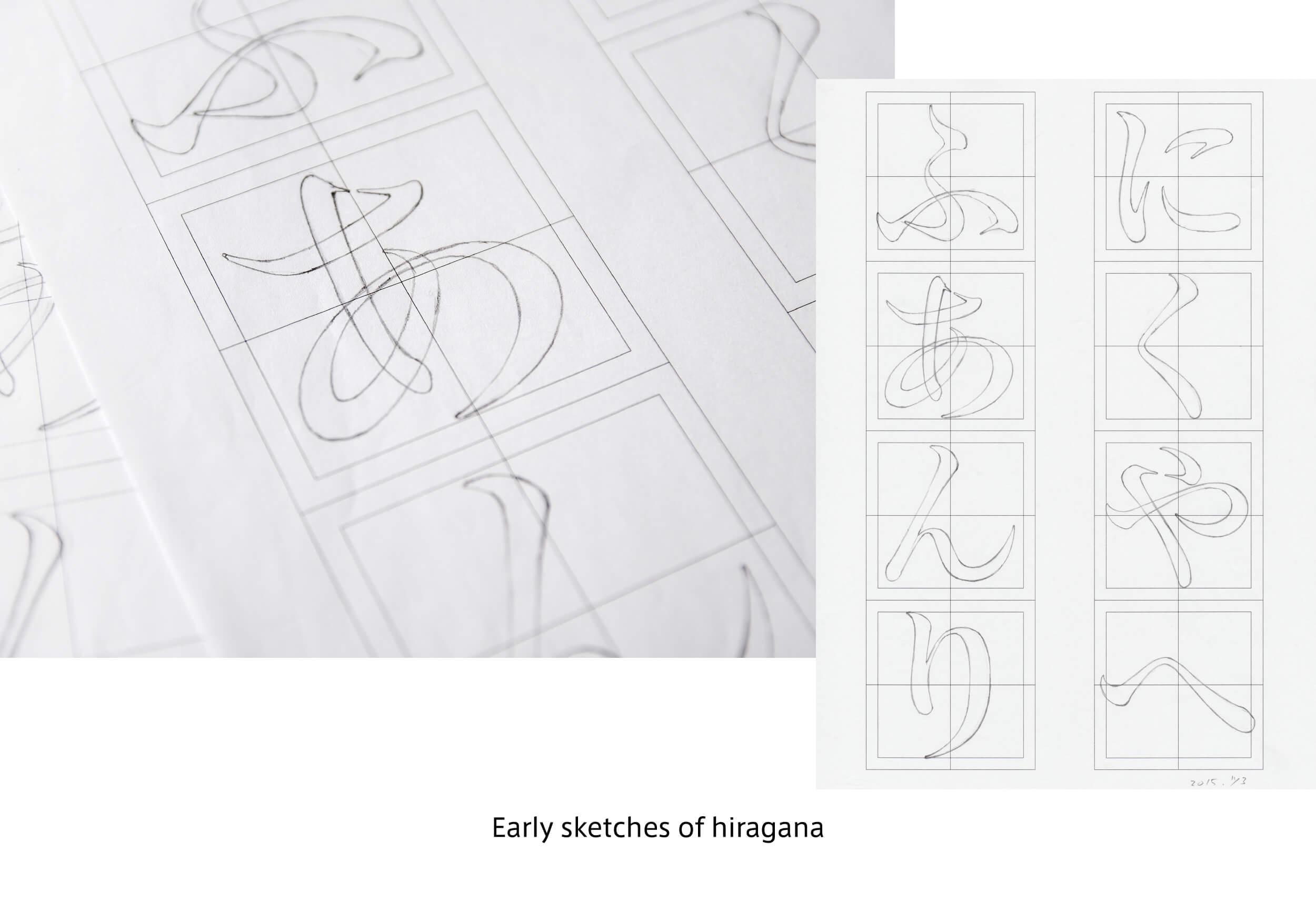
It has taken eight years from the start of prototyping in 2015 to make detailed visual adjustments to Jun Mincho. In the production of kanji in particular, trial and error were repeated from the details of strokes to the structure design. Kana design with an orthodox but fresh expression is matched in kanji.
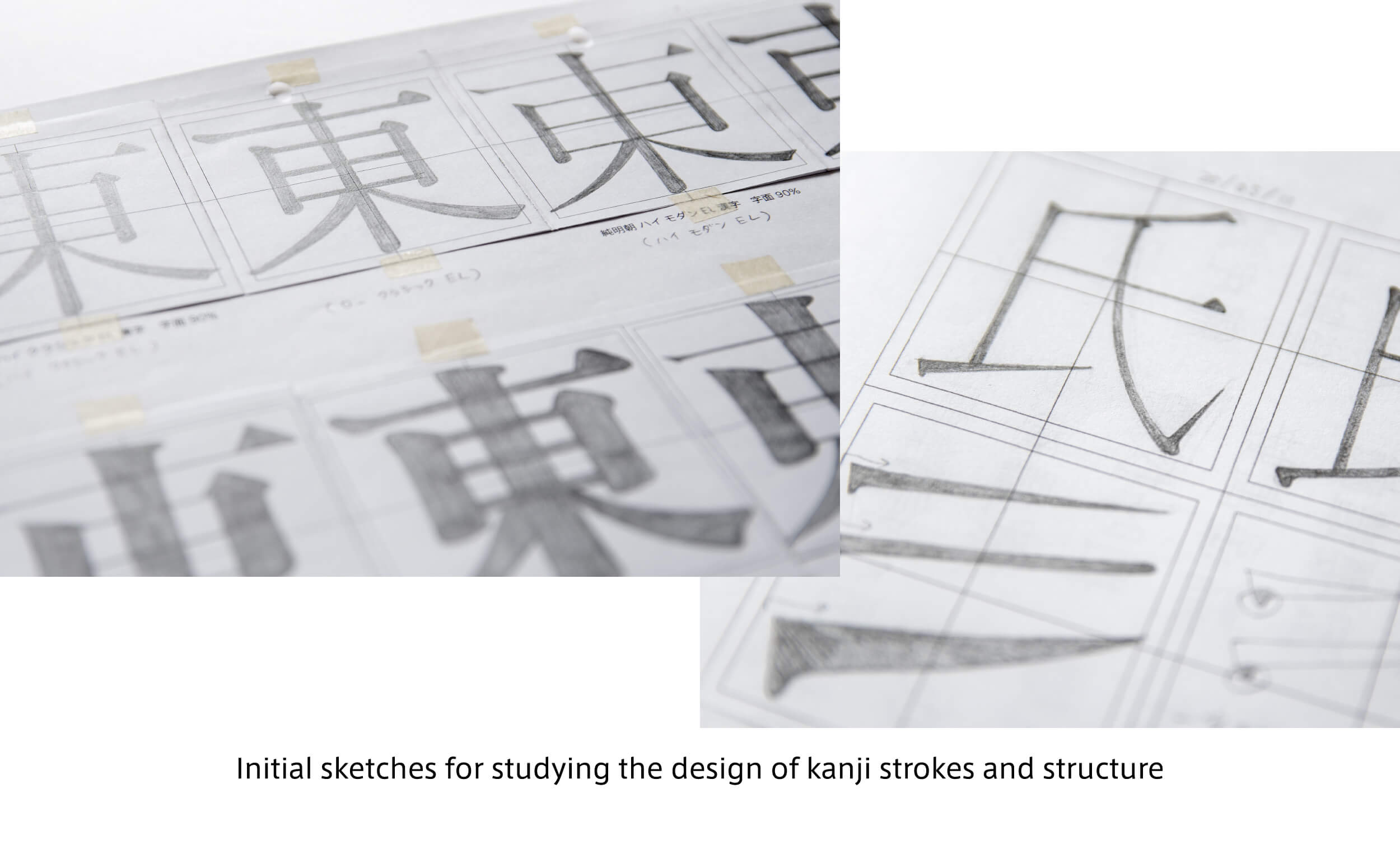
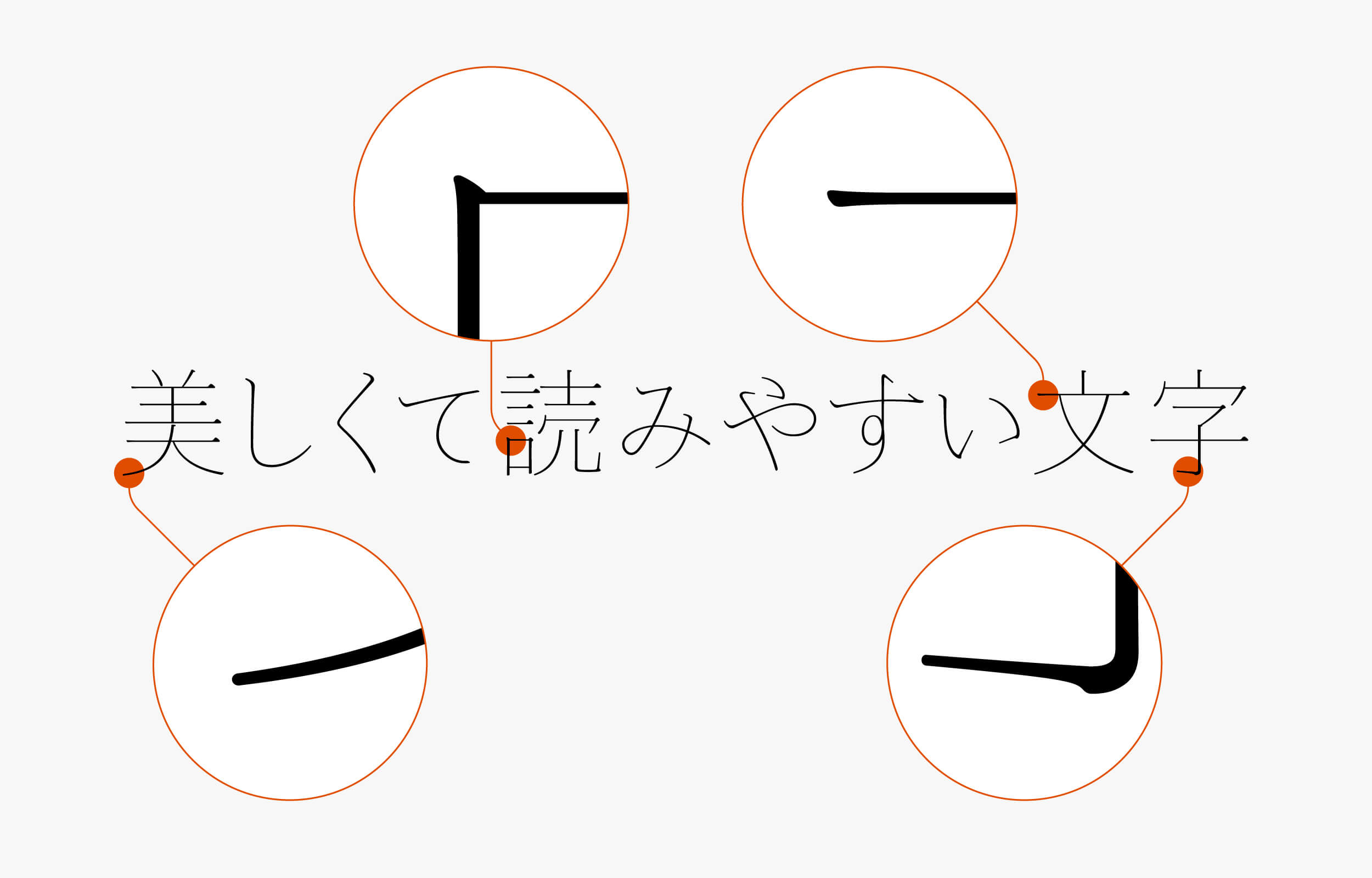
In UL and EL of Jun Mincho, which do not exist in the normal Mincho typeface, for example, having enough thickness in the horizontal strokes and sweep tip part even in the extremely thin weight can avoid difficulty in reading by skipping the stroke lines. The uniqueness of the Jun Mincho family is made with these delicate controls. Detailed visual adjustments are made in Jun Mincho, and a feeling of reading appropriate for individual application in each weight is achieved.
-
-
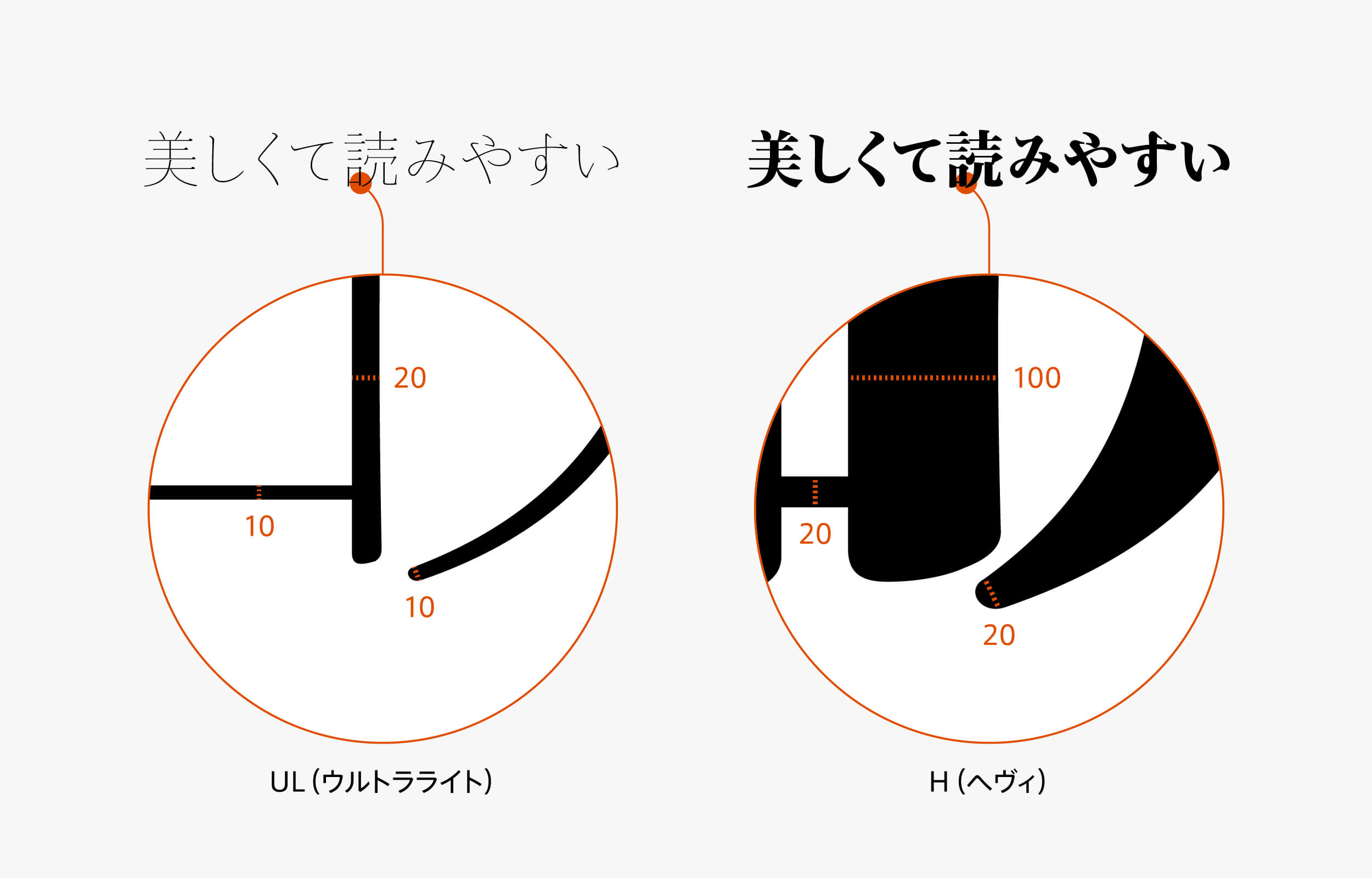
※The values are approximate.
The features of Jun Mincho Headline and Hairline are clearly indicated in the extremely thin horizontal strokes and the tip part of the strokes. As Jun Mincho, which has high multiplicity and fulfills practical roles, exists in the core, designing Headline and Hairline were designed in the direction of pursuing a high level of aesthetics. This is the reason all weights have the strong personalities and maintain the basically vivid impression.
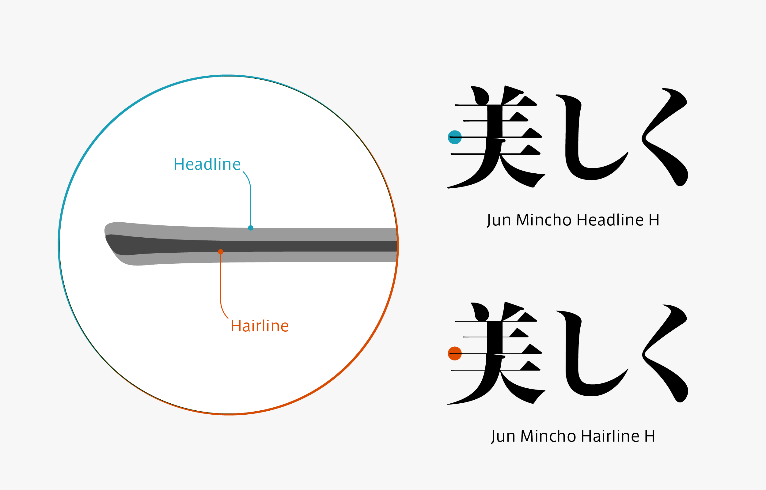
Jun Mincho Headline is a typeface with extremely thin horizontal strokes. The thinness of the horizontal strokes in Hairline H is 1/3 or below those of Headline H in comparison. As the name suggests, it is a Mincho typeface with the thinness of hair.
Family
The Jun Mincho family consists of 7 weights: UL (Ultra Light), EL (Extra Light), L (Light), R (Regular), M (Medium), B (Bold), and H (Heavy). UL and EL show the delicate beauty unique to the extremely thin weights in application, such as catch phrases, headlines, etc. L is a weight that is set with the appropriate contrast for text; it is the font that constitutes the core of Jun Mincho. R can be used with confidence in small size in captions, etc. regardless of being on paper or screen. B and H are the fonts that are useful when giving a fresh impression in the heading applications.
The UL and EL of Headline and Hairline have a strong impact with their thinness that no regular Mincho typeface has. Also, L, R, and M are practical and effective weights as heading applications. With their extremely high contrasts, B and H give a fresh impression that will make you feel unsatisfied with the conventional heading Mincho.

Specification
| Main feature |
OpenType font Cross platform Extractable outlines PDF embedded Kerning information Dynamic download No resolution restrictions |
| Supported operating system |
macOS Windows 10/11 |
| Font set |
Standard(StdN) 9,534 characters (Adobe-Japan 1-3, with custom glyphs added) |
| Languages | Japanese font (Std/StdN) almost fully covers 30 languages shown below. Japanese font based on Adobe Japan 1.3 covers all ISO-8859-1 proportional characters and Š, š, Ž, ž, Œ, œ, Ÿ. Then AXIS Font Japanese version can be used as multilingual font when you compose text using proportional characters. However, not all corresponding half-width characters are included, only Latin font is covered by half-width characters. Japanese (main script and covers JIS X 0208:1997) / English/ Icelandic (íslenska) / Irish (Gaelige) / Afrikaans (Afrikaans) / Albanian (Gjuha Shqipe) / Italian (Italiano) / Indonesian (Bahasa Indonesia) / Estonian (Eesti keel) / Occitan (lenga d’òc) / Dutch (Nederlands : U+0132 “IJ” and U+0133 “ij” shall be divided into I/i and J/j) / Oromo (Oromiffa) / Galician (Galego) / Swedish (Svenska) / Scottish Gaelic (Gàidhlig) / Spanish (Español) / Swahili (Kiswahili) / Danish (Dansk) / German (Deutsch) / Norwegian (Bokmål) / Norwegian (Nynorsk) / Finnish (Suomi) / Faroese (Føroyskt) / French (Française) / Brasilian Portuguese (Português Brasileiro) / Breton (Brezhoneg) / Portuguese (Português) / Latin (Latina : Classical orthography, without vowels with macron) / Luxembourg (Lëtzebuergesch) / Rhaeto-Romance languages (Rhaetian) / Walon (Walloon) *Full width version of Greek uppercase/lowercase (24 characters for each, excluding ending form of sigma) and Cyrillic (Russian) uppercase/lowercase (33 characters for each) are included as JIS Row6 and Row 7 (These characters are defined as full width in JIS spec) |