2022.09/12
Established in 1931, Bridgestone is a global leading company in the tire and rubber industry. The company is at its core a tire business, as well as a solution business utilizing the strength of the tire business, and working in diversified chemical engineering product manufacturing, such as quake-protection rubber, golf equipment, bicycles, etc.
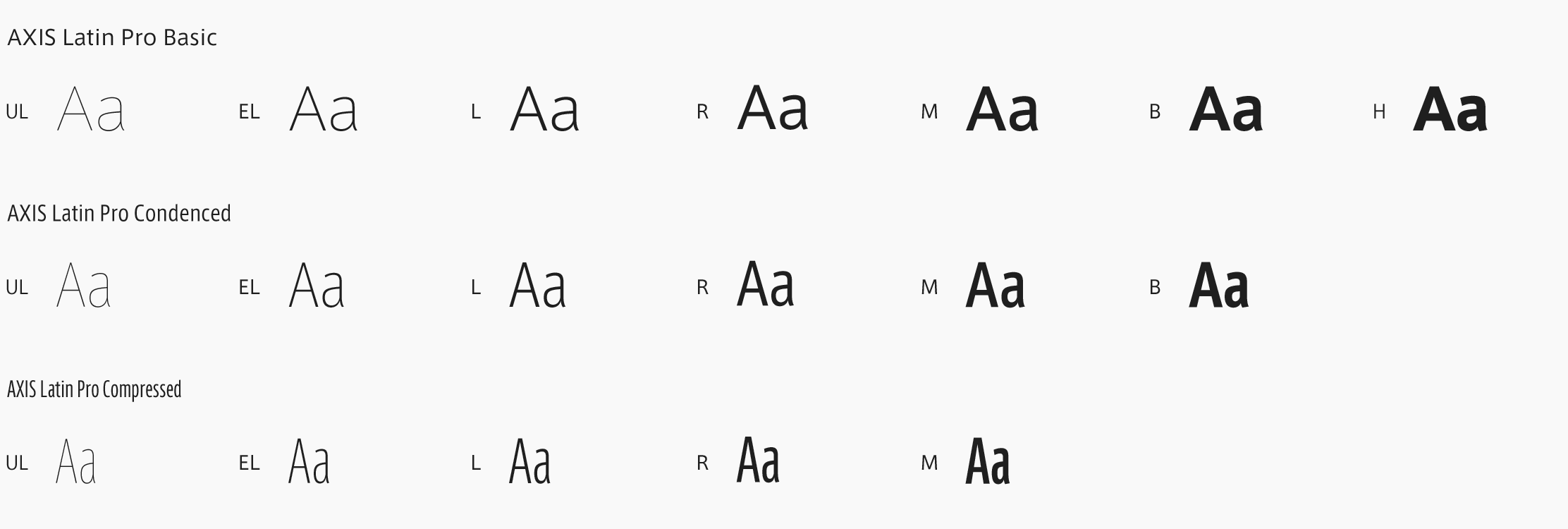
Although the recommended font was set in the brand manual at Bridgestone, its usage didn’t penetrate globally, and there was an issue where the brand expression was not unified. For that reason, the design division started to conduct research on an original font to represent the Bridgestone brand in around 2016. Upon implementing the new brand identity in 2020, the Latin typeface, Bridgestone Type, was developed with the cooperation of Monotype as a tool to express the individuality of Bridgestone.
“The main purpose of implementing the corporate font is to express the unified individuality and brand image of Bridgestone outside of the company. Yet, effects on the internal branding aspect, such as improved awareness of the brand, feeling of unity, development of the brand, etc., are also intended by letting the Bridgestone group employees to use it in daily work,” says Art Director Kohei Sakamoto at BRIDGESTONE DESIGN Department, Corporate Brand Division.
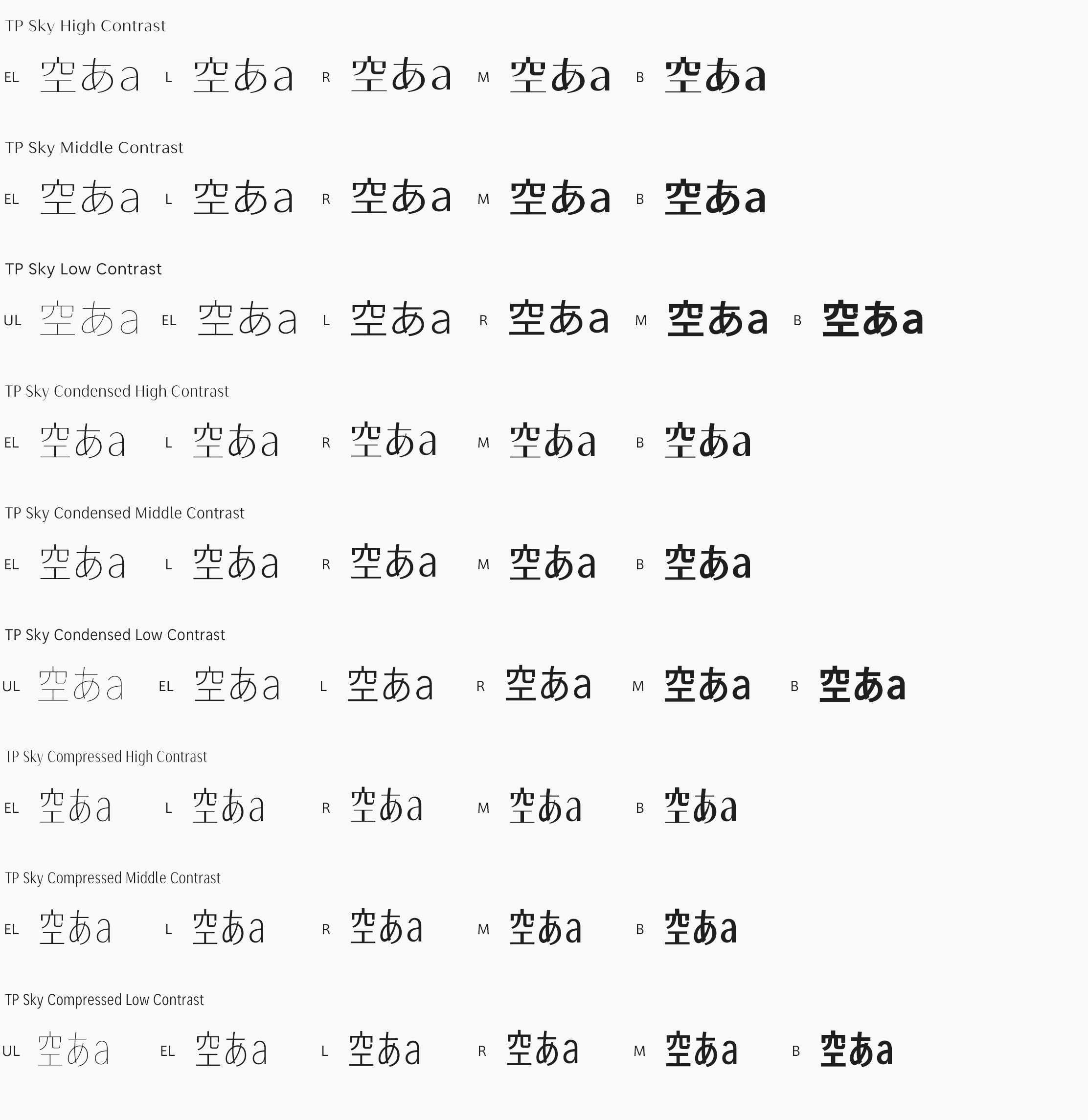
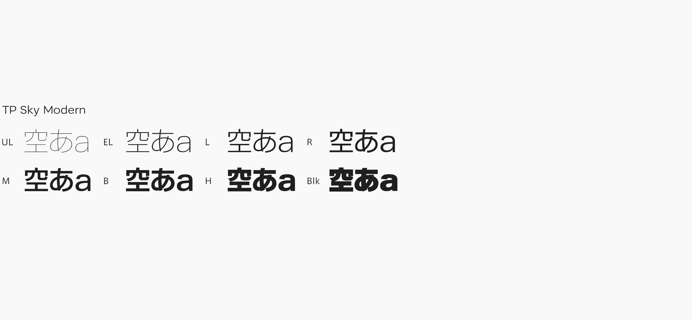
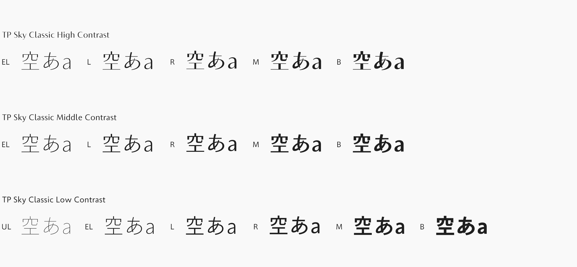
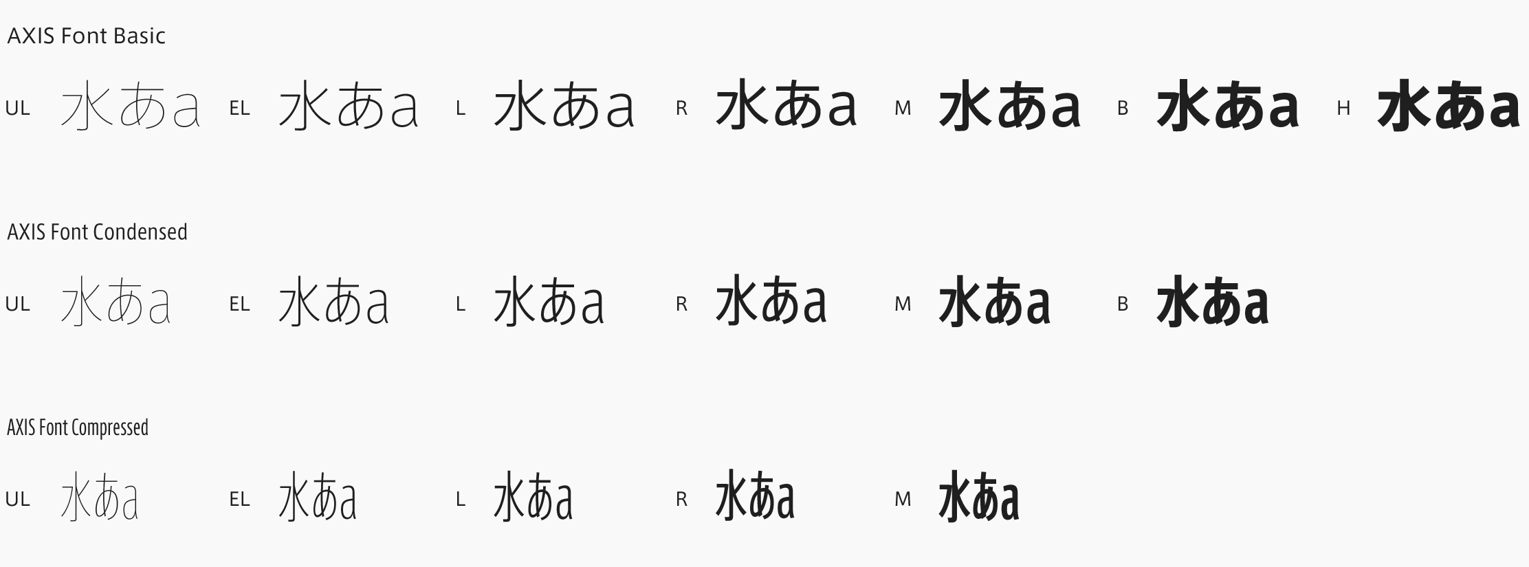
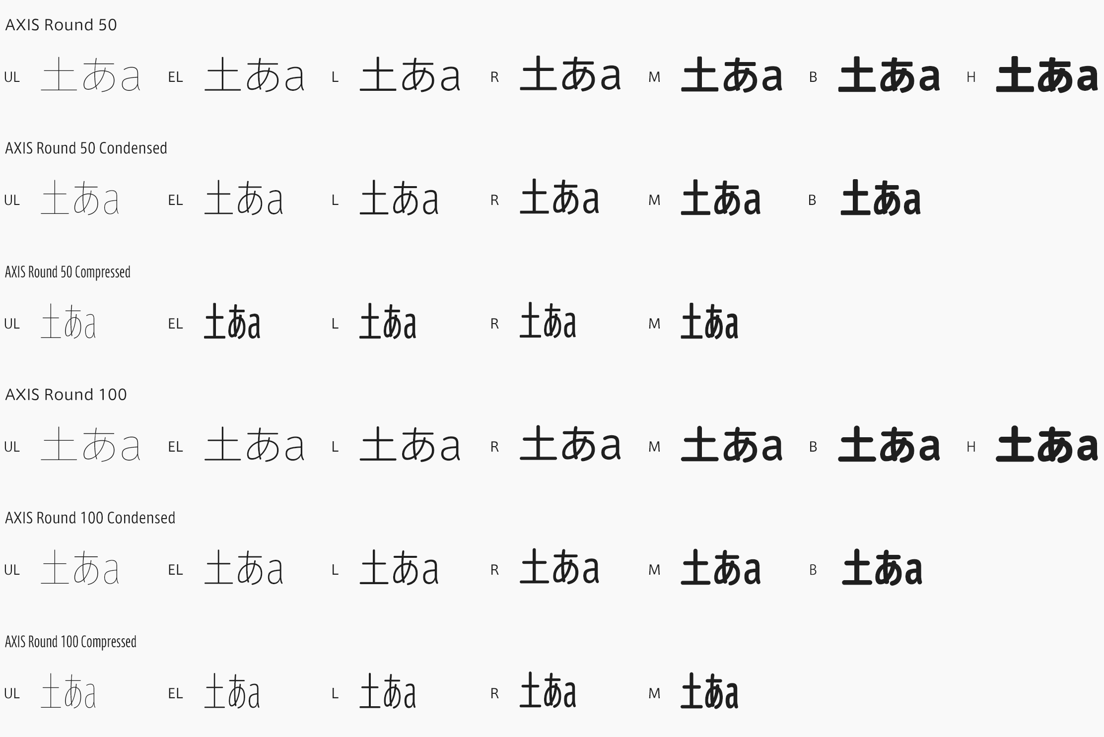
While proceeding with the global development of Bridgestone Type, the necessity to match Japanese typeface with Bridgestone Type was discussed for expressing the brand in Japan. As a typeface that satisfies the Japanese typeface conditions the most, including high multiplicity that can correspond to both signatures and texts in addition to matching the score of the character shape and the quality of having a condensed typeface, AXIS Font was selected. Using the FitFont technology, Type Project adjusted the weight of AXIS Font in accordance with Bridgestone Type, provided as “BridgestoneType TP.”
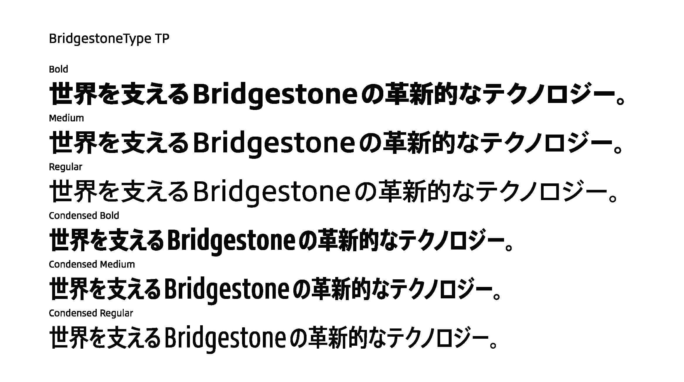
“In addition to affinity in design aspects, operation aspects, including Web Font, implementation cost, and other aspects were comprehensively judged in the end. As a result, we came to the conclusion that AXIS Font is ideal, and adopted it,” says Akinobu Morita at the Brand Management Section, Corporate Brand Division.
The individuality of Bridgestone is incorporated in Bridgestone Type with an original process called design code. In the Japanese typeface, this process was also used to conduct a wide range of research and verification. The usefulness of the corporate font was acknowledged within the related divisions at the time of consideration, and there was also evidence based on a close verification, so the implementation proceeded smoothly after the decision was made.

Kohei Sakamoto, Art Director at BRIDGESTONE DESIGN Department, Corporate Brand Division.
“In the case of Japanese language, it is difficult to complete a corporate font only with a Latin typeface. To utilize the valuable Latin typeface created, I thought it was necessary to combine it with an appropriate Japanese typeface. The impression AXIS Font gives is that of an elegant, sophisticated, and very modern Japanese typeface. For this project, typesetting was actually made for various texts for consideration; I additionally felt that it has an atmosphere of softness and gentleness. I felt there was an affinity with the brand expression Bridgestone aims at in terms of making us feel the flexibility that stays close to us in addition to the solid functions.” (Sakamoto)
The Latin typeface Bridgestone Type won the Good Design Award in 2021 as a corporate font that pursued functionality, multiplicity, and designability without compromise. The Japanese typeface BridgestoneType TP also inherited these features, and it is said that it has been well-received outside of the company with its feeling of long-term unfading universality.
“It has already been actively used in the company for various graphic design projects, logos, public announcements, etc. as a core element of the brand expression unique to Bridgestone – I think that is proof.” (Sakamoto)

Akinobu Morita, the Brand Management Section,
Corporate Brand Division
“I was moved to find the name Bridgestone in the font list. For my impression of usage, I felt that it is an extremely easy-to-read font for readers, as the characters are shown clearly and distinctly. Because the font to use in the company is decided, there were comments that it became unnecessary to worry about which font to choose at the time of creating a document.” (Morita)
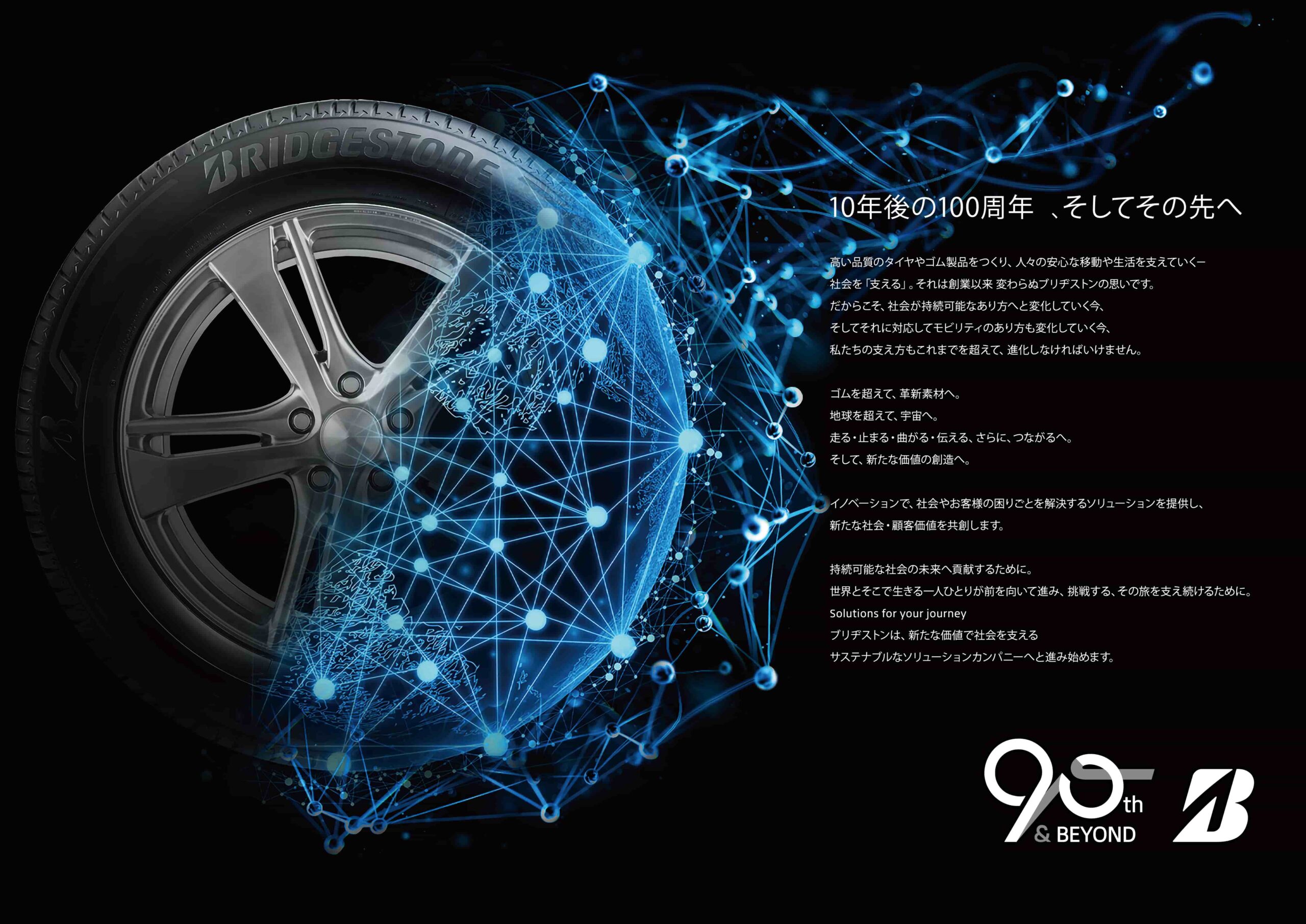
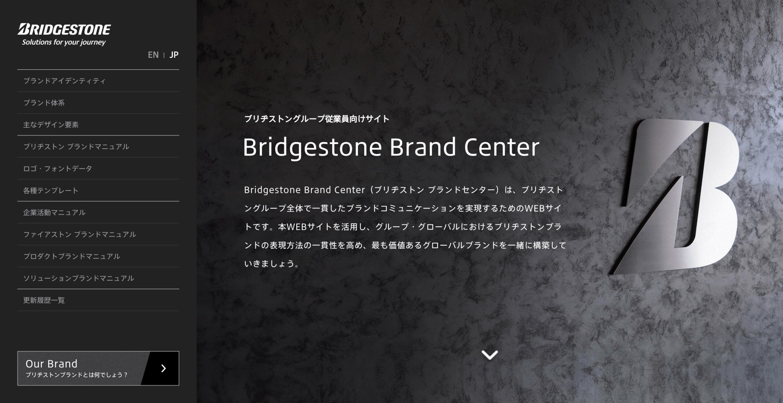
BridgestoneType TP is assumed for use in corporate items, such as business cards, envelopes, and various communications outside the company, including facility signage, public relations, events, sales promotion tools, and websites.
“Although it is still developing, I think that consistent brand expression has been achieved from printed matter, such as this piece, websites, to signature systems. Furthermore, I feel it is a huge success to unify the voice of brand globally, as well as in the affiliated companies.” (Sakamoto)
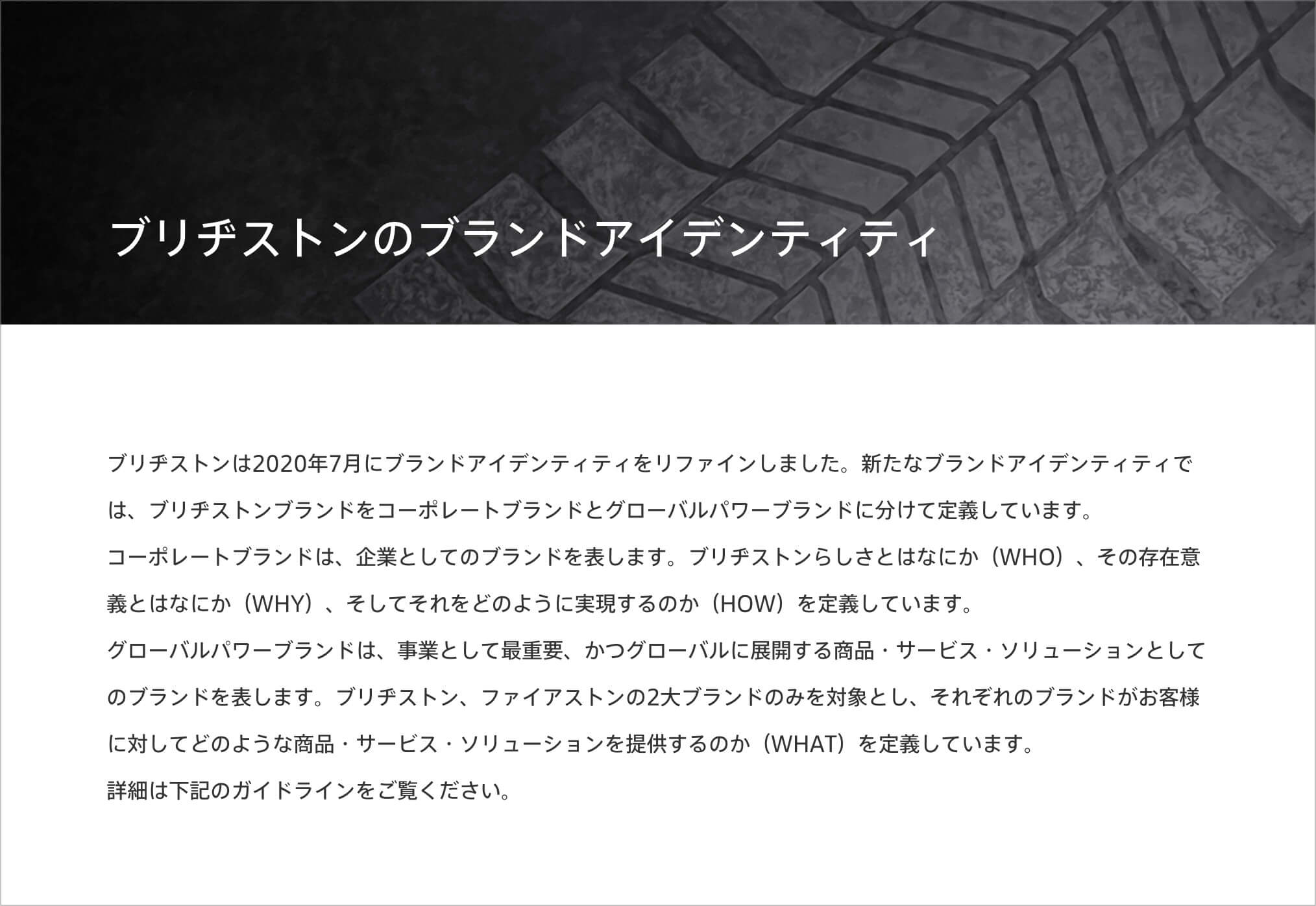
Web site

Corporate Governance Code Report
In addition to the brand expression unique to Bridgestone, the company believes that expression of a global perspective unique to the product brand, such as REGNO, POTENZA, is also important. By using a corporate font in the center of brand communications, consistency is added to brand expression. A good cycle is expected to be created in which expression unique to each product brand is utilized.
“Through this project, I learned that font is an extremely strong tool in terms of the brand expression and unification of messages. I also experienced the effect on improved brand awareness due to using an original font, which smoothened cooperation between company members and divisions worldwide.” (Sakamoto)
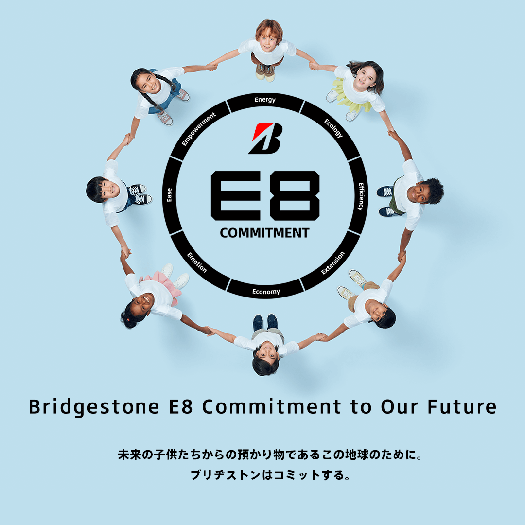
Bridgestone established the corporate “Bridgestone E8 Commitment” that stipulates eight values starting with “E” – Energy, Ecology, Efficiency, Extension, Economy, Emotion, Ease, and Empowerment – in March 2022, in order to realize the vision of “becoming a company that can continuously provide social value and customer value as a sustainable solution company through to 2050.”
“The Bridgestone E8 Commitment commits to supporting a sustainable society by creating alongside employees, societies, partners, and customers purposes and methods unique to Bridgestone. For the achievement of creating with a spirit of coexistence, it is important to continue being a brand that can be relied by stakeholders. We will work to develop the brand that can be relied on from the position of brand and design.” (Morita)
