


2012.08/30
Positioning a Font as a Foundation for Branding
Toyo Kitchen & Living (hereafter “Toyo Kitchen”) does not sell kitchens as mere sets of appliances; it positions them at the heart of social activity in the home on the theme “life in and around the kitchen,” and proposes a range of unique creations that are worlds apart from the products of other manufacturers. In recent years, Toyo Kitchen has also been introducing the furniture and lighting fixtures of overseas brands. In common among these products, in addition to functionality, is their high quality as interior objects.
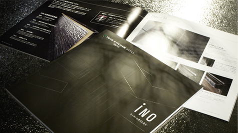
At present, Toyo Kitchen is using the AXIS Font for many of its productions, such as catalogs, digital media, banners in showrooms, point of purchase (POP) panels, and websites. Masahiko Tsuji, Toyo Kitchen’s CEO and supervisor of the marketing department, gives his reasons for using the font.
In 2004 Toyo Kitchen published a book titled At the Heart of Life and a catalog titled Kitchen is the Heart of Life. These occasions were the first time we used the AXIS Font. Although the decision was also made based on outside opinion input, I myself am a long-time reader of AXIS, am intimately familiar with the design of the magazine, and place a great deal of trust in it, so I gave my OK immediately.”
In 2003, Tsuji, who had been working at the company’s Milan design department, joined Toyo Kitchen’s marketing department when it was launched. Previously, the tone and manner of the company’s products was inconsistent, and Tsuji felt the need for something that could serve as the central core of the brand when presenting Toyo Kitchen’s image.
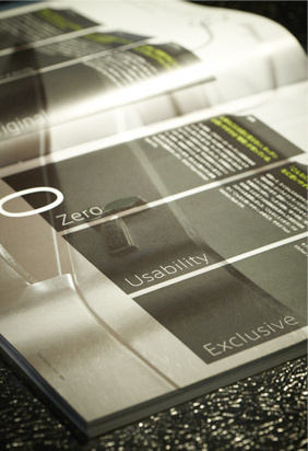
“The book and catalog we completed in 2004 were very fresh and refined compared with our past catalogs. They were cool, yet friendly. The AXIS Font is not only beautiful as a graphic, I felt it was perfect for the stainless kitchens we handled.”
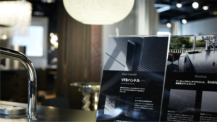
Use AXIS Font for banners or POPs in the showroom.
Masahiko Tsuji came up with the idea of using the AXIS Font as the foundation for Toyo Kitchen’s branding, and decided to introduce it into the company. He began with Toyo Kitchen’s website, which was being updated, and proceeded with standardizing all the fonts used by the company. Toyo Kitchen hires various design offices for catalogs and pamphlets, but the rule is to always use the AXIS Font.
The AXIS Font is also used everywhere in Toyo Kitchen showrooms. Tsuji explains that in shops with unique lighting, furniture, and mosaic tiles on display in the kitchen, it’s effective to match it all with the tone of the POP panels and their standardized fonts. There are cases where the alphabet and Japanese are both used, and the AXIS Font utilizes special characteristics developed with bilingual layouts in mind.
AXIS Font is perfect for the stainless kitchens.
“In the showrooms we use the AXIS Font for large catch copy expressions in addition to POP. The AXIS Font is available in various weights, and is very convenient as it’s not limited to any one particular expression. We also used the AXIS Font in designing the logo for our new showroom LUCE that we opened in Aoyama in late September. We expanded the space between the letters in the condensed font to impart a fresh, spacious image. The showroom itself was designed by Kazuyo Sejima, who linked it with that image of space.”
Toyo Kitchen has made it a rule from last fiscal year to use the AXIS Font for in-house documents and study group materials that will not be released outside the company. Tsuji says this is an attempt to raise the consciousness of the employees regarding the brand.
“At present the number of new homes under construction in Japan is under 800,000 units a year, less than half that during the peak. In this austere environment, many kitchen manufacturers have been forced into competition. Toyo Kitchen, however, showed increased profits in fiscal 2011. This is because we see the kitchen not as a cooking facility but as a broader context for living a rich, satisfying lifestyle. From here on, in order to galvanize our staff and propose greater affluence and added value, we intend to exert great care in realizing unity of purpose. I believe that the font we see can also be effective because of this.”
Tsuji says he would like to see the AXIS Font made in the Ming-style typeface. He believes the Ming-style typeface is suitable for powerful written invitations, and that there is a demand for this.
“I’ve gradually come to realize that fonts function somewhat akin to a voice for the customers who are reading our texts. Fonts have a characteristic tone, volume, and individuality. The voice of the AXIS Font is simple, yet flexible, refined, and of high quality. Those are precisely the qualities that it shares with Toyo Kitchen.”
(Text by Takahiro Tsuchida Photos by Yoshihiro Ozaki)
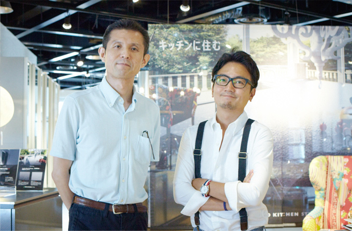
Masahiko Tsuji, Managing Director of Marketing of Toyo Kitchen & Living and Isao Suzuki, Type Direct of Type Project.