


2012.07/31
A Typeface that Functions in the ‘Public Space’ of the Train Station
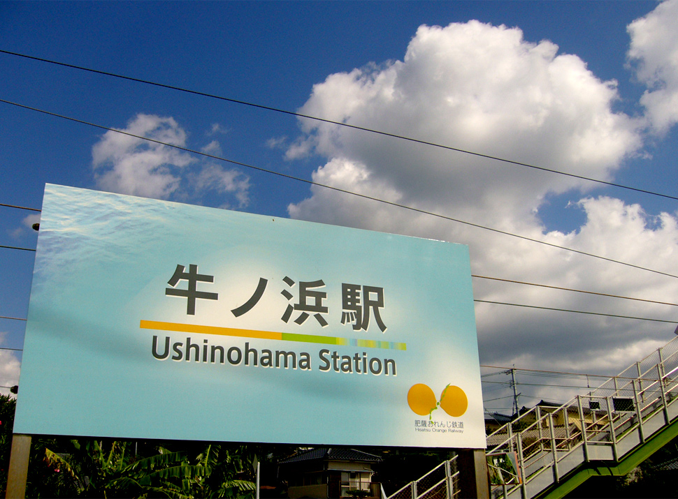
The architect Yasuyuki Kawanishi first traveled to Europe as a guest student of the Urban Design Program at the Royal Danish Academy of Fine Arts, and later entered the employ of DRFTWD Office Associates in the Netherlands and the Urban Design Division of AREP Ville, a research and design subsidiary of SNCF (French National Railway Corporation). Then in 2004, in Japan, Kawanishi undertook a logotype and signage project for the Hisatsu Orange Railway (from Yatsushiro Station to Sendai Station).
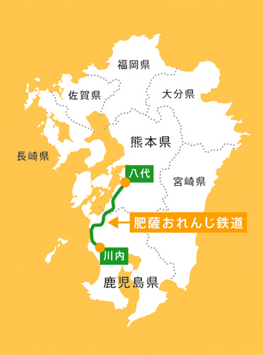
When the Japanese National Railways were privatized, it was decided that this train line, formerly the part of the JR Kagoshima Main Line that links Yatsushiro in Kumamoto Prefecture and Sendai in Kagoshima Prefecture, would be reopened as a ‘third-sector’ railway company (a semi-public, joint venture with local municipalities). The fresh, effervescent name ‘Hisatsu Orange Railway’ was arrived at by combining the first kanji characters of Higo and Satsuma, the old provinces that became today’s Kumamoto and Kagoshima, and then by referring to the citrus fruit that are cultivated along the railway line. Kawanishi’s hope was that by introducing high-precision written characters and railroad-appropriate designs, new viewpoints could be incorporated into the spaces of train stations and the experience of rail travel. And with this in mind, he proposed not simply a logotype, but a fully integrated signage project.
The typeface Kawanishi chose to accomplish this was AXIS Font. It seems that he knew intuitively that this simple and warm-feeling typeface would be suitable for the station building spaces, which are surrounded by picturesque natural scenery and composed of only the most basic components.
“When I thought about what would be best for the user, the only thing I could imagine working with was AXIS Font, which stands out crisply against a white background. Not only does AXIS Font have an amazing level of completeness as a typeface, it also demonstrates exceptional balance when Japanese and English characters appear together in the same text. When a station name is displayed in kanji and hiragana, and Latin characters are added too and arranged in the same space, nothing feels strange about it at all. Though I am an architect and have never specialized in the study of graphic design, I feel that it is really thanks to AXIS Font that the character compositions could be realized with such a high degree of completeness.”
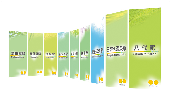
Design of the station banner for Hisatsu Orange Railway.
Kawanishi also worked on the renovation of Nakamura Station, one of the main stations on the Tosa Kuroshio Railway, another part of the former national railroad that was reorganized into a third-sector company. In 1988, the railway took over from the former JR Nakamura Line and continued operations. Today, with the addition of the Sukumo Line and the Gomen-Nahari Line, it has become popular among local residents and tourists alike as the central public transportation system of Kochi Prefecture.
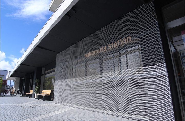
New Nakamura Station of Tosa Kuroshio Railway. Kawanishi’s design for Nakamura Station has received great acclaim, with over ten awards to date.
In 2010, the new building designed by Kawanishi for Nakamura Station was completed. Kawanishi’s design takes into account not only the railway company’s standpoint, which was focused on having a space in which the flows of traffic through the station building could be controlled to allow for more efficient movement, but also the point of view of the user â that the station should function not just as a place to catch trains, but as a public space. In constructing that public space that would serve as the station building, an abundance of locally produced Shimanto hinoki cypress was used, and an environment was thereby created that is ideal for studying and book reading. Moreover, the effective placement of lighting has helped make it into a relaxing space for both women and the elderly. Kawanishi’s design for Nakamura Station has received great acclaim, with over ten awards to date, including the Good Design Award: Special Prize from the Director-General of the Small and Medium Enterprise Agency, and the Japan Railway Award: Special Mention for the Renovation of a Regional Railway Station Building.
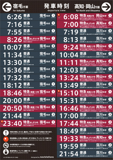
Timetable inside the Nakamura Station which use AXIS Font.
A station building is constantly crisscrossed by a complex web of information items. Most important of these are those pieces of data that concern the running of the railroad itself, such as route maps, timetables and fare charts. In order to indicate levels of priority, Kawanishi set rules whereby route maps and timetables would be installed at above eye-level, while advertising for local enterprises and government notices and the like would be placed at below eye-level.
“AXIS Font was used even for the timetables and fare charts, and I really felt the great potential of AXIS Font this time, even more strongly than I did during the Hisatsu Orange Railway project. Especially when it comes to timetables, the numbers have got to be clearly readable in a limited layout space. With AXIS Font, legibility and readability are high even when conditions are unfavorable. At Nakamura Station, they have been trying out digital signage, and using it on digital devices poses no problems, either.”
Route maps and timetables are the backbone of a railway. Kawanishi is of the opinion that the degree of importance of a typeface such as AXIS Font will naturally increase in proportion to the number of trains in operation. And this is all the more the case due to the abundance of variations and modes of presentation that are possible with this typeface, with its unique narrow forms such as Condensed and Compressed, or the italics and other options available in AXIS Latin Pro.
“As is particularly obvious in our urban areas, there has been a rapid increase in examples of signage that are printed in simplified Chinese and Korean hangul, in addition to English. It is quite possible that Asia-focused multilingual typefaces are going to become a necessity. I have high hopes for such development in the near future.”
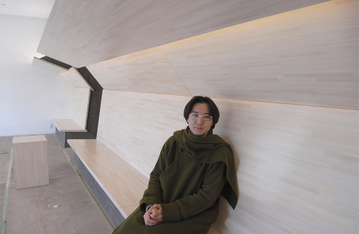
Yasuyuki KAWANISHI
An architect, the president of âÂÂnextstationsâÂÂand the lecture of Chiba University, member of Energy Labo and Architectural Institute of Japan. Previously, he was member of SNCF-AREP ville (French National Railway research and design institute), Paris, FRANCE and DRFTWD office, Amsterdam, the NETHERLANDS. He was the guest student of the Royal Danish Academy of Art: school of Architecture Copenhagen, DENMARK. Graduated from the Master of design and architecture, the University of Chiba, JAPAN. Received Good Design Award 2010: the special prize from the minister of The Small and Medium Enterprise Agency, and others.
(Text by Joji Oshiro Photos and designed by Yasuyuki KAWANISHI)