%20--%3e%3cpolygon%20points='24.7%201%200%201%200%207.6%208.5%207.6%208.5%2039.4%2016.1%2039.4%2016.1%207.6%2024.7%207.6%2024.7%201'/%3e%3cpath%20d='M34.1,32.4l-4.9-22.7h-7.9l9.1,33.1c-.4,1.7-1.1,2.9-3.7,2.9h-2.6l1.9,6.6h1.5c4,0,8-1.2,10.3-9.2,1.8-6.4,8.9-33.3,8.9-33.3h-8l-4.6,22.7Z'/%3e%3cpath%20d='M91.7,8.7c-8.7,0-12.7,6.5-12.7,16.1s3.6,15.3,13.8,15.3,7.2-.9,9-1.6l-1.2-6c-2.4.8-4.9,1.2-7,1.2-4.3,0-7-2-7.2-7.3h16v-4.8c0-7.5-2.9-13-10.7-13ZM86.5,21c0-3.3,1.7-6.4,4.7-6.4s4.1,2.7,4.1,6.4h-8.8Z'/%3e%3cpath%20d='M218,8.7c-8.7,0-12.7,6.5-12.7,16.1s3.6,15.3,13.8,15.3,7.2-.9,9-1.6l-1.2-6c-2.5.8-4.9,1.2-7,1.2-4.3,0-7-2-7.2-7.3h16v-4.8c0-7.5-2.9-13-10.7-13ZM212.9,21c0-3.3,1.7-6.4,4.7-6.4s4.1,2.7,4.1,6.4h-8.8Z'/%3e%3cpath%20d='M126,1h-10.7v38.4h7.6v-11.8h5c6,0,11.3-3.8,11.3-14.1s-5.5-12.5-13.1-12.5ZM125.9,20.9h-3.1V7.6h3c3.7,0,5.4,1.8,5.4,6.3s-1.5,7.1-5.3,7.1Z'/%3e%3cpath%20d='M150,12.9c-.2-1-.5-2.4-.8-3.2h-6.9c.5,1.9.7,4.6.7,7.9v21.8h7.4v-20.3c1.1-2.2,4.5-3,7.4-3v-6.8c-3.5,0-6.5,1.7-7.7,3.6Z'/%3e%3cpath%20d='M192.6,40.6c0,3.5-1.6,4-4.7,4h-1.5l1.9,6.6h2.3c6.3,0,9.3-3.2,9.3-9.8V9.7h-7.4v30.9Z'/%3e%3crect%20x='192.2'%20width='8.4'%20height='6.4'/%3e%3cpath%20d='M247.4,33.7c-4.8,0-6.6-2.8-6.6-9.6s1.9-8.9,6.2-8.9,3.4.4,4.9,1l1-6.4c-1.3-.5-3.7-.9-6.2-.9-10.6,0-13.4,6.7-13.4,15.9h0c0,10.7,4.6,15.3,12.4,15.3s5.9-.5,7.4-1l-.9-6.1c-2,.4-3.7.6-4.7.6Z'/%3e%3cpath%20d='M264.7,30.2v-14.2h5.4l1.4-5.8h-6.9V2.1l-7.3,1.9v26.8c0,5.3,2.4,9,8.2,9s4.9-.2,4.9-.2v-5.7h-2c-3,0-3.8-1.3-3.8-3.7Z'/%3e%3cpath%20d='M64.3,8.8c-3.3,0-5.8,1.6-7.3,3.4-.2-1.1-.5-2.1-.8-2.6h-6.6c.5,1.9.6,4.4.6,7.4v34.4h7.3v-13.8c1.5,1.5,3.8,2.4,6.2,2.4,8,0,11.2-6.6,11.2-16s-3.1-15.2-10.4-15.2ZM62.1,33.8c-1.6,0-3.1-.6-4.6-1.8-.3-1.6-.4-3.7-.4-6v-3.3c0-1.8.1-3.8.4-5.1,1.4-1.4,3-2.5,5-2.5,3.2,0,4.6,3.2,4.6,9s-.9,9.6-5,9.6Z'/%3e%3cpath%20d='M173.6,8.6c-9.5,0-13,6.7-13,15.7s3.5,16.1,13,16.1,13-6.8,13-16.2-3.3-15.7-13-15.7ZM173.6,34.2c-3.6,0-5.5-2.9-5.5-9.9s2.2-9.5,5.5-9.5,5.5,2.2,5.5,9.5-1.9,9.9-5.5,9.9Z'/%3e%3c/svg%3e)

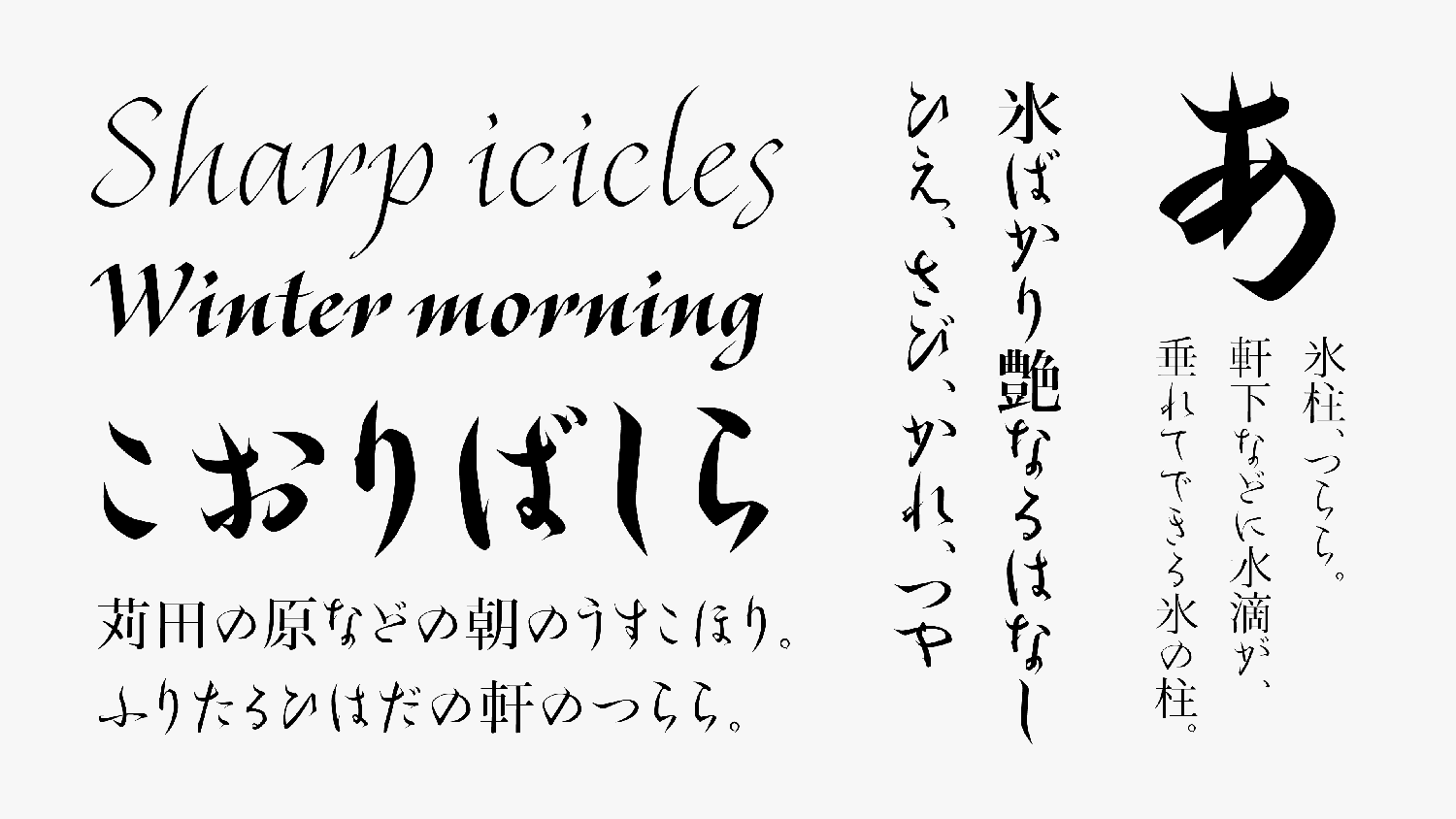
TP Tsurara, a font with the image of icicles, modeled around the handwriting of Fujiwara no Toshinari as the Kana character design. It is a typeface with high practicality even in modern applications, with its own strong personality.
Feature

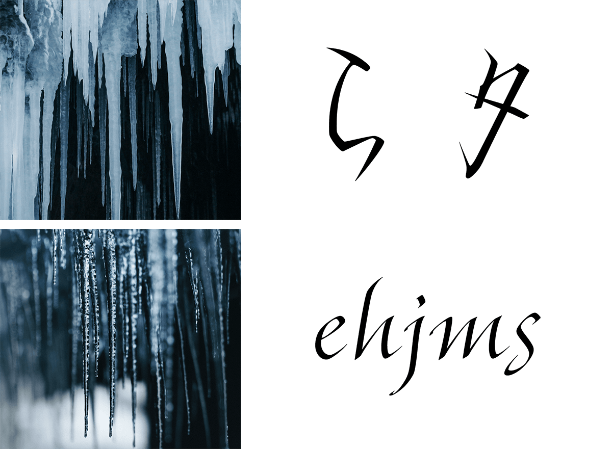
Image of icicles
With the image of icicles created by the cold winter air, TP Tsurara was designed to install the essence of beauty that remains in coldness, Sabi – quiet simplicity -, and maturity into typeface design. Although the main axis of TP Tsurara is hiragana vertical typesetting, katakana horizontal typesetting is fresh and practical as a modern application. Latin sticks to the taste peculiar to Latin, while attempting to harmonize with Japanese characters, and the typeface is finished with a feeling of tension in the air. The Latin has a stronger element of originality compared to the Kana; the shape of the blackletter stenography writing system, such as Bastard, is used as a reference for angular curves, etc. For Kanji, the Hama Mincho Headline that matches Kana in terms of beginning of a brushstroke in vertical strokes and the degree of the uroko’s sharp point are combined.

Modern and sharp atmosphere
Utilizing the handwriting of Fujiwara no Toshinari, TP Tsurara reflects the sharpness and coldness of icicles in the character shape, and it is designed with the image of the beauty and sparkle of ice. The Latin typeface is created based on writing with a pen to express the sharpness of icicles. Longer ascenders and descenders are designed with the intention to recall a long narrow icicle. The impression of icicles is strengthened by angulating the turnup part of the Latin character shape, equivalent to the turning parts in the Kana. Design processing to suggest the coldness of winter is adopted throughout. TP Tsurara is a typeface family with a modern and sharp atmosphere, though it is based on classic.
Modeled handwriting of Fujiwara no Toshinari
TP Tsurara, a font with the image of icicles, modeled around the handwriting of Fujiwara no Toshinari as the Kana character design. Toshinari was a master of tankas in the late Heian dynasty (A.D. 794 to 1185), and “*Korai Futeisho” written by him, influenced later Japanese culture significantly. Features of the characters of Toshinari are the sharp beginning and ending of brushstrokes, and turning parts; combined with the strong peculiarity of the character shape, the characters of Toshinari form his own calligraphic style.
*Korai Futeisho
This is a book on the study of waka poems formed in the early Kamakura period (A. D. 1185 to1333) It is believed that Fujiwara no Toshinari wrote this book upon request by Imperial Princess Shikishi. It is the only study of waka poems by Toshinari as a collection. Examples of poems were selected from various collection of poems, and short comments were added.
- WHITE MODE
- BLACK MODE
- A
Family・Specification
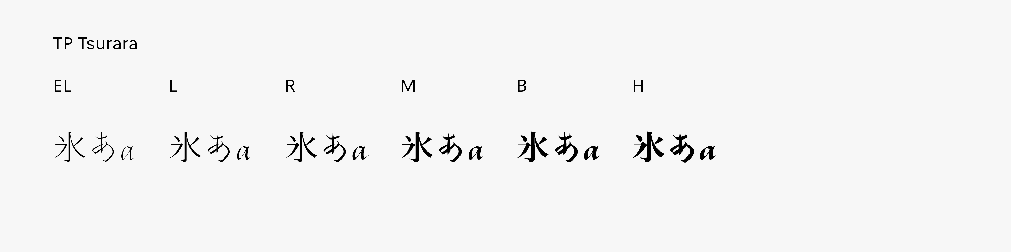
Font set
Standard(StdN)
9,534 characters (Adobe-Japan1-3, with custom glyphs added)
Buy
TP Connect
Subscription service that enables
the use of all of Type Project fonts.
TP Connect is only available in Japanese.