A-D
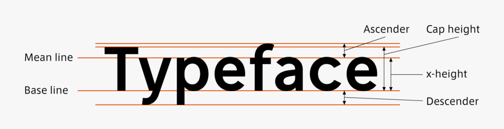
- Descender
-
The part of a character that comes below the baseline. Lowercase letters “g,” “j,” “p,” “q,” and “y” have descenders.

- Base Line
-
The base line of Latin characters. The line that passes the bottom of the uppercase letters, such as “A, B, and C,” etc.
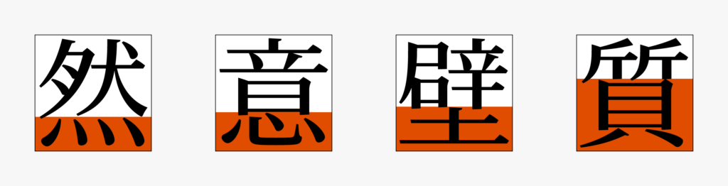
- Ashi (feet)
-
A generic term used for radicals located at the bottom of a kanji.
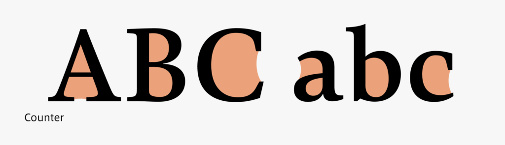
- Counter
-
The inside space surrounded by strokes.
It is mainly used in the context of Latin typography, but it is also a concept in common with “Futokoro” in kanji and kana.
- Corporate Font
-
Font established to regulate a corporate brand image.
- Beginning of a brushstroke (pen stroke)
-
Beginning part of writing of a line that constitutes the character.
- Ending of a brushstroke (pen stroke)
-
Ending part of writing of a line that constitutes the character.
- Character shape
-
Shape of a written character.
- Character width
-
Right and left width of a character.
- CJK font
-
Font that corresponds to the three languages of Chinese, Japanese, and Korean.
- Block style
-
One kind of typeface.
Each stroke of a character is written clearly and not in the cursive style.
The standard writing method taught at school in Japan currently. - Adobe-Japan1 (Character set)
-
The character set standard specified for Japanese fonts by Adobe KK.
As of June 2021, it is defined from Abode Japan 1-0 to 1-7.
E-H
- Gothic typeface (in Japanese typeface classification)
-
One kind of typeface. Strokes have almost constant thickness, which may include smaller ornaments.
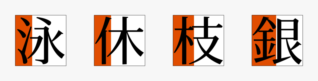
- Hen
-
A generic term used for radicals on the left side.
- Inside space between strokes (Futokoro)
-
Space between strokes that constitute a character.
- Hiragana
-
Phonogram specific to Japan that constitutes writing kanji in the cursive style.
“あいう,” etc. - Horizontal typesetting
-
Typesetting to arrange characters in a horizontal direction.
In Japanese, characters proceed from left to right, and lines proceed from top to bottom. - Glyph
-
Characters included in a font or its shape.
The same character may have multiple glyphs, such as the full width character “ア” and half width character “ア.” - Family
-
Font group created with a consistent design on the same concept.
Often, there are variations with different weight, character width, inclination, contrast, etc. within the group.
I-L
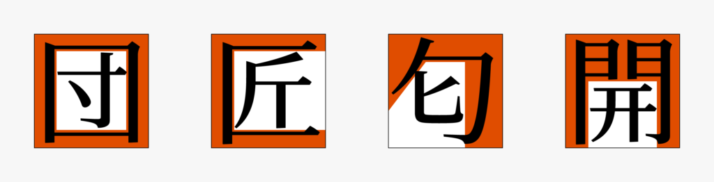
- Kamae
-
A generic term for radicals used to cover the inside of a kanji.
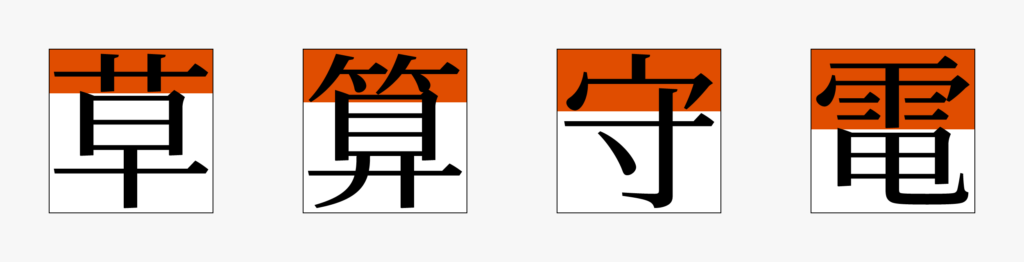
- Kanmuri (crown)
-
A generic term used for radicals located on the top of a kanji.
- Inside space between strokes (Futokoro)
-
Space between strokes that constitute a character.
- Kanji
-
Ideogram originating in China, also used in languages in the surrounding area.
“永東愛,” etc. - Katakana
-
Phonogram specific to Japan that is made up by taking a part of kanji.
“アイウ,” etc. - Kana
-
Characters used in Japanese notation, created based on kanji.
Kana mainly means hiragana and katakana today. - Latin alphabet
-
Phonogram used centered in European languages including English.
- Japanese
-
Japanese sentences. Or characters used in that notation.
- Leaving space between words
-
“Leaving space between words” is a notation method to separate words and phrases with word spaces (blanks).
- Kerning information
-
Information on adjusting space between characters for each glyph or combination of glyphs.
- Kana in small script
-
Indicates a palatalized doubled consonant, etc.
Kana indicated in small characters, such as “ゃ” for “や.” - Imaginary body
-
Square frame used to design each glyph.
M-P
- Proportional
-
An inverse concept of “fixed width,” in which the character width differs depending on the glyph
- ProN (Character Set)
-
This is the Japanese character set Adobe-Japan 1-4 with the addition of glyphs to correspond to professional and commercial printing, with the adoption of JIS 2004 character shape.
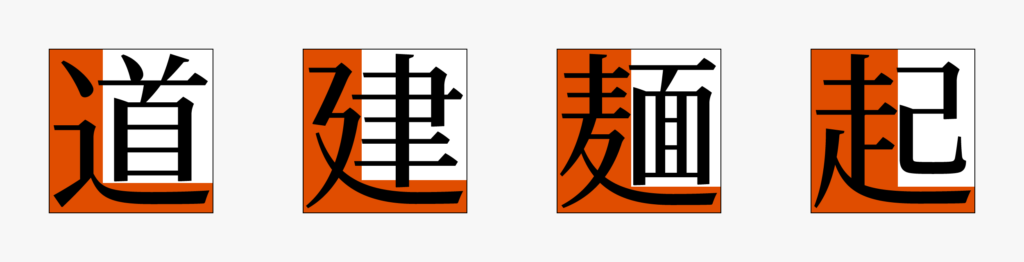
- Nyou
-
A generic term for radicals located from the left to the bottom right of a kanji.
- OpenType
-
The font format is developed by Microsoft and Adobe. The retail fonts supplied by Type Project are all OpenType.
- Punchcutter
-
A craftsman who cuts letter punches. A letter punch is an original mold used in making the concave shape mold that is to become a metal type used in letterpress printing. The letter part has a convex shape. Before mechanical engraving became popular, all letter punches were cut in full-scale and right and left reversed by hand.
- Parenthesis
-
Punctuation mainly used in pair to enclose characters and sentences to distinguish them.
“「」『』(),” etc. - Punctuation mark
-
文中や文末で使用し、文章の区切りを示す約物。
「、。」など。 - Mincho typeface
-
One kind of typeface.
Features include thick vertical stroke, thin horizontal stroke, triangle ornament of the “uroko.”
Q-T
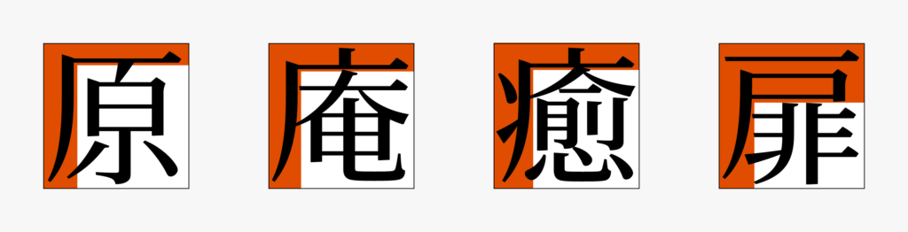
- Tare
-
A generic term for radicals located from the top to the bottom left of a kanji.
- Self-Hosting
-
In regard to web font, a website creator arranges and utilizes font data on a server.
- Radical
-
One part of kanji.
Categorization can be made by meaning (水 (water), 糸 (string), 木 (wood)), position (偏 (side), 旁 (right-hand radical), 冠 (crown)), etc. - Typesetting
-
Work to constitute paper space by combining type and illustration, or a type page.
- Solid typesetting
-
Typesetting to arrange characters without narrowing or widening the space between imaginary bodies.
- Type face
-
A frame one size smaller than an imaginary body.
Used as an indication to arrange character size. - Roman typeface
-
One kind of typeface.
Features include an ornamental “serif” attached at the end of a stroke. - Sans-serif typeface
-
One kind of typeface.
Unornamented stroke is a feature. - StdN (Character set)
-
It is the standard Japanese character set Adobe-Japan 1-3 with the adoption of the JIS 2004 character shape.
U-Z
- Yakumono
-
A generic term for symbols (punctuation marks, parentheses, etc.) apart from words and numbers used in typesetting.
- x-height
-
Literally, a term originating from the height of the lower case letter “x.” This forms the standard height for the lower case letters “a, c, e, x, z,” etc. in typeface design.

- Web Font
-
Technology that enables displaying text on a web page in a specific font by reading font data from the internet.
- Written in kanji and kana
-
Notation method in which kanji, hiragana, and katakana are mixed.
“この文章も漢字仮名交じり。” – This text is also written in kanji and kana. - Word space
-
Blank inserted between words and phrases to separate them.
- Vertical typesetting
-
Typesetting to arrange characters in a vertical direction.
In Japanese, characters proceed from top to bottom, and lines proceed from right to left. - Weight
-
Thickness and thinness of a font.
At Type Project, “L, R, M, B, Blk,” etc. are attached in the font name for indication.