2017.02/07
Surface Layers, Structures and Type
“People call those who only perfect the surface ‘hypocrites’. Be it a hypocrite or whatever you might call them, perfecting the surface is one way to improve the architecture beneath the surface.” With these words of the great Soseki Natsume prominently displayed on its website, Surface & Architecture aims to bring about new experiences through cutting-edge technology, and from the wonder and inspiration thus aroused, to offer people “a new map of the world”.
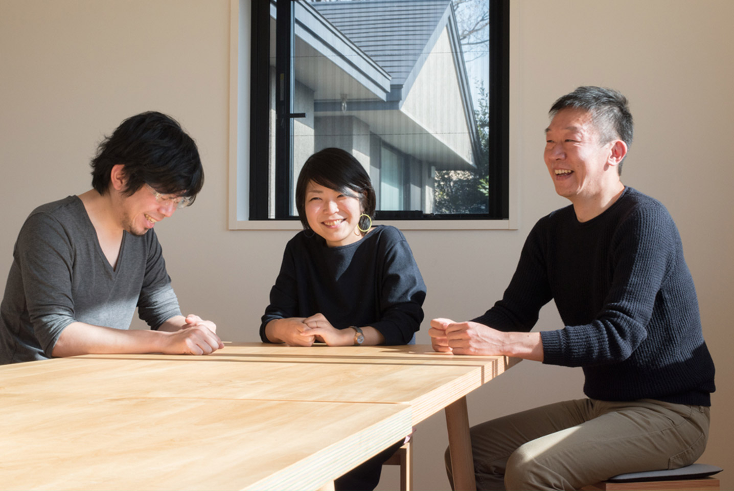
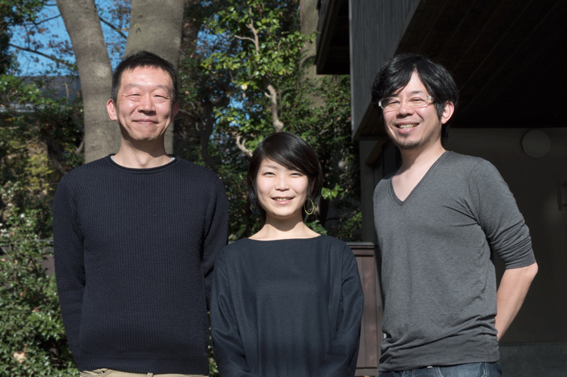
“Our company name refers to surface layer and structure. The surface layer and the structure are not so separate from each other. We feel that making the surface actually changes what is inside – so we handle both aspects. And in our name, there is also the idea that it’s okay to start off with the way something looks, and to then go about our work with the intention of filling out the interior,” says founder and chief executive officer Yusuke Okamura.
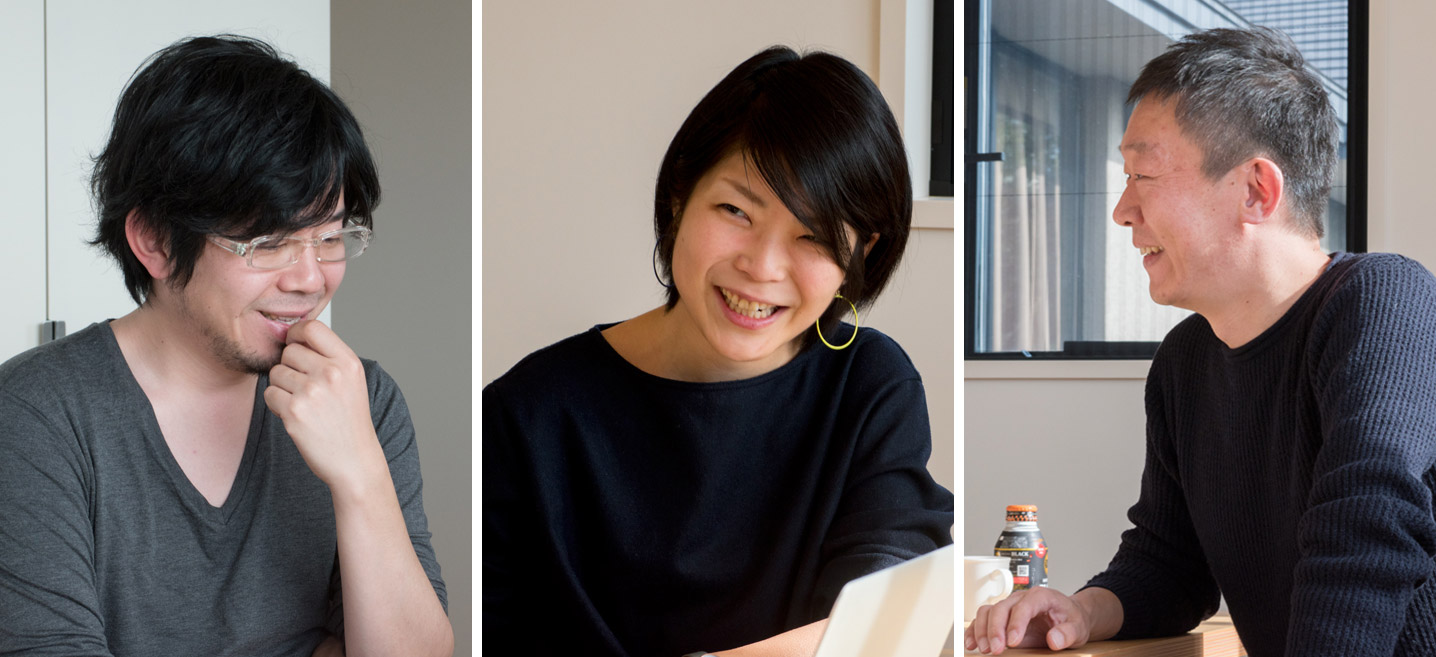
Okamura (right): We use AXIS Font as a corporate font. All our presentation materials are in AXIS Font. TP Mincho looks new, even though it’s a Mincho typeface. I’d really like to try it out.
Nagayama (center): When I was a student in the U.K., I came across an issue of AXIS Magazine, which was the only Japanese periodical in the university library, and that was the first time I had an awareness of bilingual work. It was very refreshing to see that it was possible, without using combined-font functions, to have different kinds of characters mixed together in a single typeface.
Dota (left): We were able to use AXIS Font, which I’d heard good things about from a senior colleague at my former workplace.
While the bulk of Surface & Architecture’s work involves the creation of websites and web applications, they have also been branching out into print media, and into video and its various forms of expression. The firm’s greatest strength is in offering everything from service visions and concept proposals to demonstrations of actual user interactions, and in this way they ensure that the services of the client corporation bring about positive experiences for the user. For example, Surface & Architecture worked with NTT DoCoMo to draw up the concept for the redesign of their i-concier service, and carried out UI/UX design and prototype development. Other major projects include the design of O’Reilly Japan’s event website, and redoing the website of the Japan Institute of Design Promotion.
Having handled everything from concept proposal to design on numerous projects for corporate clients, when it came to the design of its own website, Surface & Architecture decided on AXIS Font Condensed. According to Nozomi Nagayama, who was responsible for the design, “On the occasion of our website renewal, I was hoping to find a typeface that would go with our logo. Because with standard device fonts, there was always the feeling that the text was out of balance with the logo, and there was too much of a gap of contrast in the blacks. Furthermore, I wanted to be able to display information in an efficient manner within the limited world of the screens on smartphones and similar devices. One of the reasons that I wanted AXIS Font Condensed is that it goes so well with the logo. But the fact that it can be used as a web font too, as is, without needing to adjust the feeling of the ‘blocks of information’, was another major reason behind that choice.”
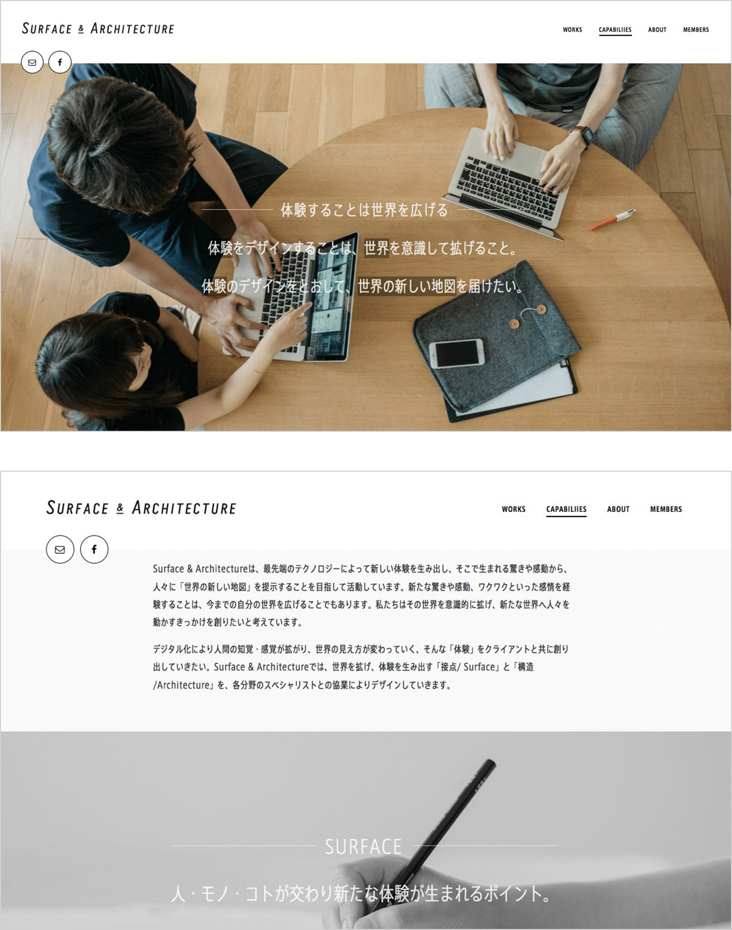
Furthermore, Nagayama explains, while Surface & Architecture treats its own website as a portfolio of past projects and has therefore given it a neutral image overall, by modifying weights for a given page or item of content, there are various feminine and masculine aspects that have been brought out as well. “The work we create comes first, so I wanted to make a design that would put the greatest emphasis on the work. I am taking care to bring out our own look without letting it get in the way of the work itself, which has all kinds of appearances and colors. I maintain that quality while putting in the necessary information, and I carry out adjustments to make it hold together well even when there are Japanese characters mixed together with English. Although I did consider using a Latin font, AXIS Font really felt the best in the end. The website’s design makes use of small white characters on black tags placed on each of the projects, and it was nice to discover that even at that small size, the type doesn’t fall apart and is still easy to read.” (Nagayama)
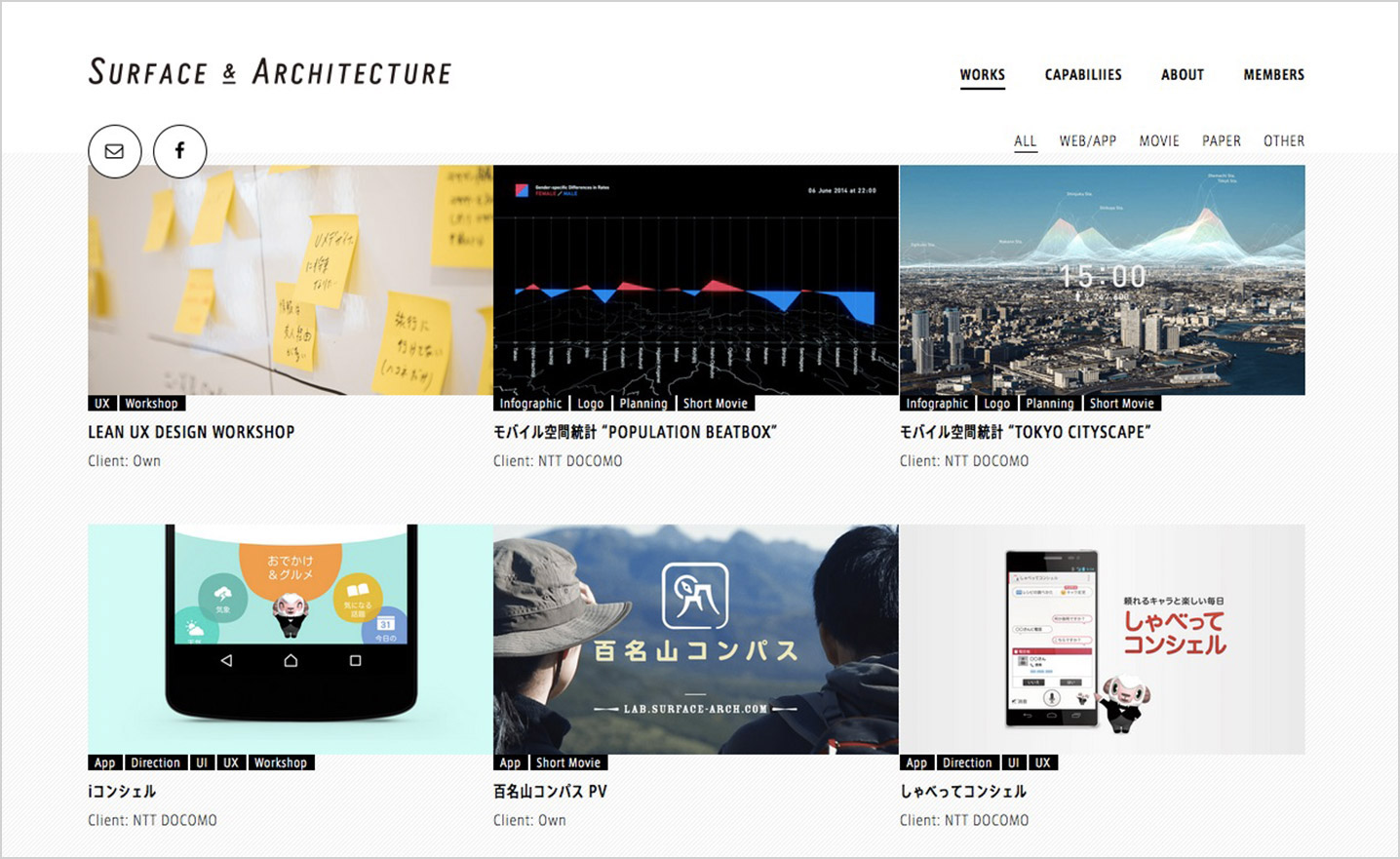
The company information page features a playful effect that is triggered by placing the mouse over the photographs: the black-and-white becomes full color, and a marker highlights parts of the text. According to the engineer who executed the design, Tetsuya Dota, “The designer Nagayama and I worked together, checking everything on actual browsers, and carrying out detailed adjustments so as to arrive at the best display. For this website renewal, we were able to use AXIS Font, which I’d heard good things about from a senior colleague at my former workplace.”
At Surface & Architecture, AXIS Font is used as a corporate font for documents and presentation materials. “Ever since our website renewal, I’ve been hearing from various people, not only designers, that it looks much nicer now. I’m glad they’ve noticed the difference. I don’t want it to have an overly decorative feel, so it’s good that we could use type to bring out our own look. AXIS Font Basic gives off a smart, refined impression, but Condensed has a little more robustness and personality, and creates a product-like expressiveness. That’s an aspect that I think is highly appropriate for a company’s brand image.” (Okamura)