%20--%3e%3cpolygon%20points='24.7%201%200%201%200%207.6%208.5%207.6%208.5%2039.4%2016.1%2039.4%2016.1%207.6%2024.7%207.6%2024.7%201'/%3e%3cpath%20d='M34.1,32.4l-4.9-22.7h-7.9l9.1,33.1c-.4,1.7-1.1,2.9-3.7,2.9h-2.6l1.9,6.6h1.5c4,0,8-1.2,10.3-9.2,1.8-6.4,8.9-33.3,8.9-33.3h-8l-4.6,22.7Z'/%3e%3cpath%20d='M91.7,8.7c-8.7,0-12.7,6.5-12.7,16.1s3.6,15.3,13.8,15.3,7.2-.9,9-1.6l-1.2-6c-2.4.8-4.9,1.2-7,1.2-4.3,0-7-2-7.2-7.3h16v-4.8c0-7.5-2.9-13-10.7-13ZM86.5,21c0-3.3,1.7-6.4,4.7-6.4s4.1,2.7,4.1,6.4h-8.8Z'/%3e%3cpath%20d='M218,8.7c-8.7,0-12.7,6.5-12.7,16.1s3.6,15.3,13.8,15.3,7.2-.9,9-1.6l-1.2-6c-2.5.8-4.9,1.2-7,1.2-4.3,0-7-2-7.2-7.3h16v-4.8c0-7.5-2.9-13-10.7-13ZM212.9,21c0-3.3,1.7-6.4,4.7-6.4s4.1,2.7,4.1,6.4h-8.8Z'/%3e%3cpath%20d='M126,1h-10.7v38.4h7.6v-11.8h5c6,0,11.3-3.8,11.3-14.1s-5.5-12.5-13.1-12.5ZM125.9,20.9h-3.1V7.6h3c3.7,0,5.4,1.8,5.4,6.3s-1.5,7.1-5.3,7.1Z'/%3e%3cpath%20d='M150,12.9c-.2-1-.5-2.4-.8-3.2h-6.9c.5,1.9.7,4.6.7,7.9v21.8h7.4v-20.3c1.1-2.2,4.5-3,7.4-3v-6.8c-3.5,0-6.5,1.7-7.7,3.6Z'/%3e%3cpath%20d='M192.6,40.6c0,3.5-1.6,4-4.7,4h-1.5l1.9,6.6h2.3c6.3,0,9.3-3.2,9.3-9.8V9.7h-7.4v30.9Z'/%3e%3crect%20x='192.2'%20width='8.4'%20height='6.4'/%3e%3cpath%20d='M247.4,33.7c-4.8,0-6.6-2.8-6.6-9.6s1.9-8.9,6.2-8.9,3.4.4,4.9,1l1-6.4c-1.3-.5-3.7-.9-6.2-.9-10.6,0-13.4,6.7-13.4,15.9h0c0,10.7,4.6,15.3,12.4,15.3s5.9-.5,7.4-1l-.9-6.1c-2,.4-3.7.6-4.7.6Z'/%3e%3cpath%20d='M264.7,30.2v-14.2h5.4l1.4-5.8h-6.9V2.1l-7.3,1.9v26.8c0,5.3,2.4,9,8.2,9s4.9-.2,4.9-.2v-5.7h-2c-3,0-3.8-1.3-3.8-3.7Z'/%3e%3cpath%20d='M64.3,8.8c-3.3,0-5.8,1.6-7.3,3.4-.2-1.1-.5-2.1-.8-2.6h-6.6c.5,1.9.6,4.4.6,7.4v34.4h7.3v-13.8c1.5,1.5,3.8,2.4,6.2,2.4,8,0,11.2-6.6,11.2-16s-3.1-15.2-10.4-15.2ZM62.1,33.8c-1.6,0-3.1-.6-4.6-1.8-.3-1.6-.4-3.7-.4-6v-3.3c0-1.8.1-3.8.4-5.1,1.4-1.4,3-2.5,5-2.5,3.2,0,4.6,3.2,4.6,9s-.9,9.6-5,9.6Z'/%3e%3cpath%20d='M173.6,8.6c-9.5,0-13,6.7-13,15.7s3.5,16.1,13,16.1,13-6.8,13-16.2-3.3-15.7-13-15.7ZM173.6,34.2c-3.6,0-5.5-2.9-5.5-9.9s2.2-9.5,5.5-9.5,5.5,2.2,5.5,9.5-1.9,9.9-5.5,9.9Z'/%3e%3c/svg%3e)
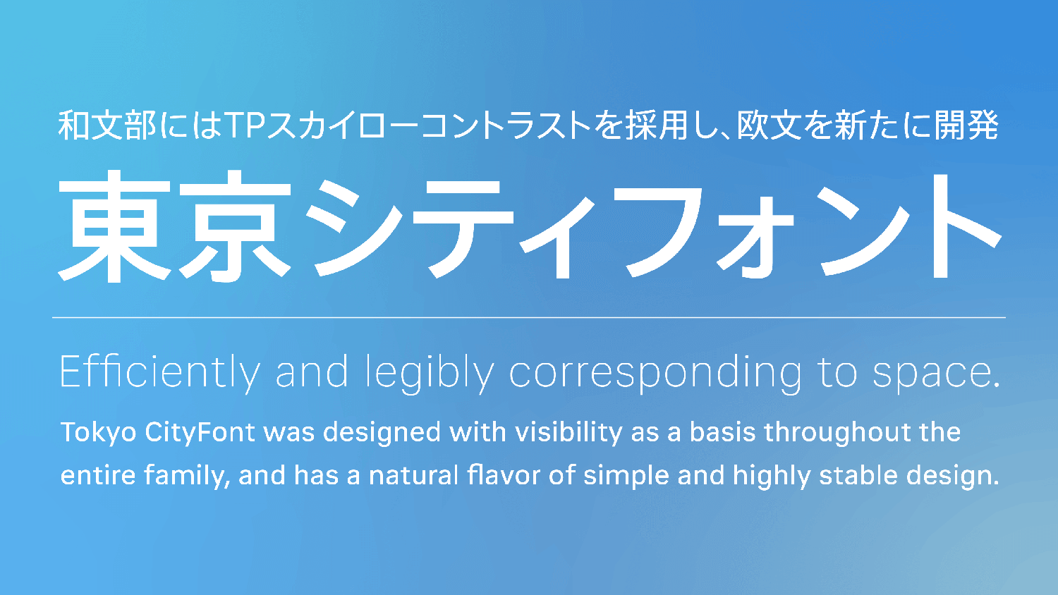
Reducing the emphasis on strong personality and instead emphasizing functionality, Tokyo CityFont was designed with visibility as a basis. The Latin has features of architectural shapes, combining embodiment with solidity. It is appropriate for digital signage in urban spaces, information displays for public transportation, etc., and developed as a part of the CityFont Project.
Features
Fonts as a communication tool
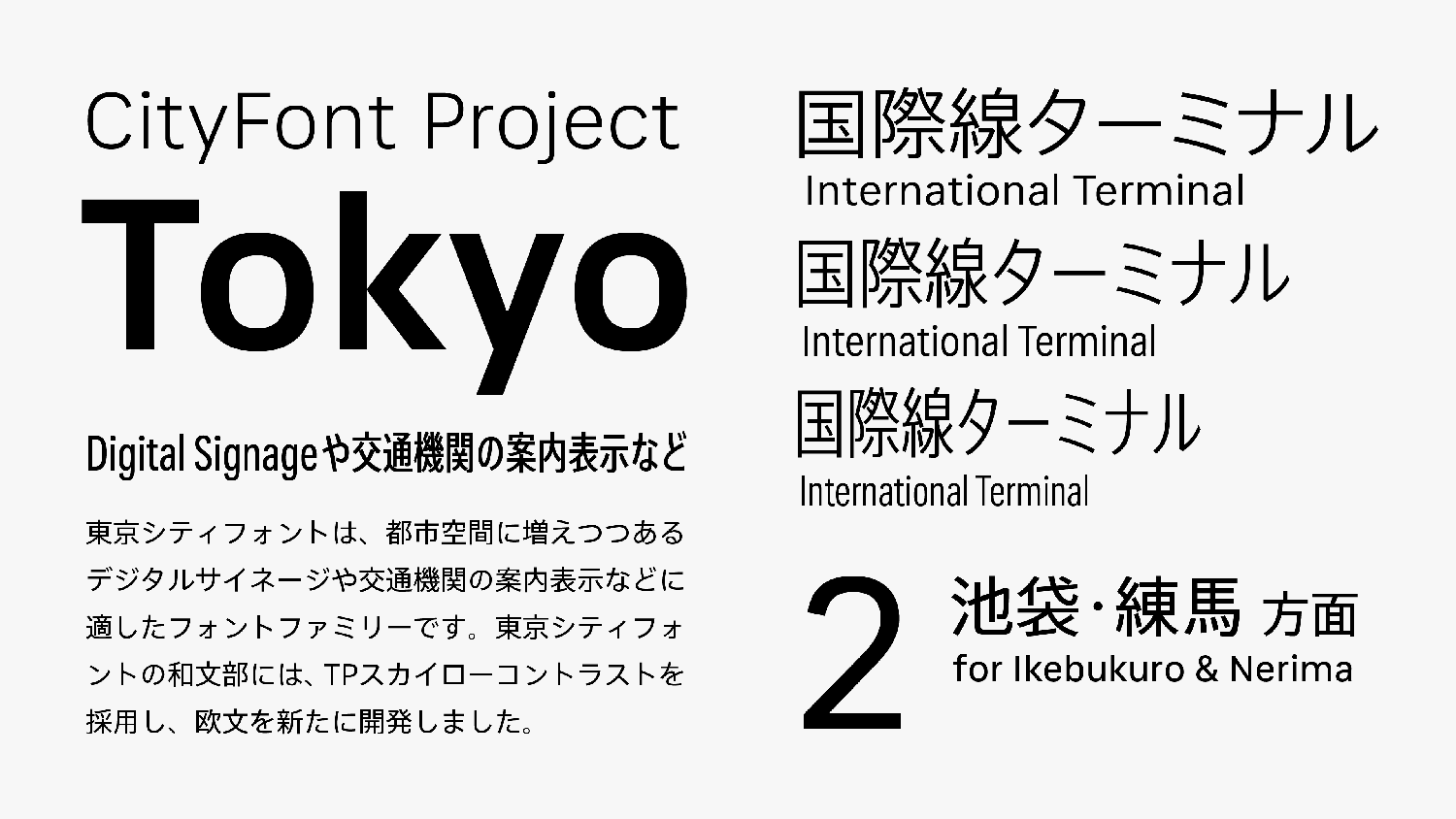
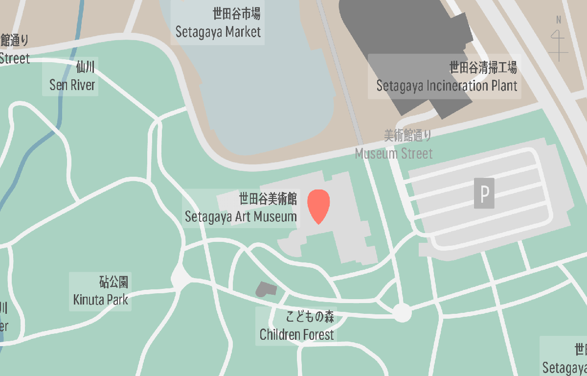
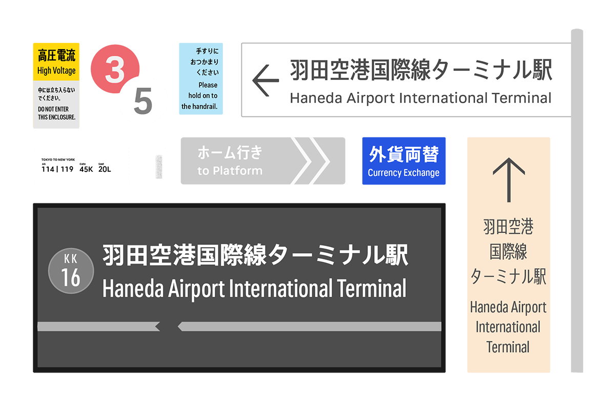
Tokyo CityFont is one of the City Font Project launched by Type Project. The City Font Project are experiments in strengthening city identity by implementing city-dedicated fonts as a communication tool. By utilizing Tokyo CityFont in various mediums including architecture, spaces, signage, and catalogs, the image is given consistency, and impression on visitors is strengthened, contributing to the long-term value improvement. Basic as a main axis, Tokyo CityFont is ideal for signage systems, etc. Also, Condensed and Compressed variations play a significant role on narrow screens. Compressed in particular enables great deal of information to be displayed, effective on smartphones, maps, etc.

Soft external shape and solid internal shape
Tokyo CityFont was designed with visibility as a basis throughout the entire family, and has a natural flavor of simple and highly stable design. Making an attempt to harmonize its soft external shape and solid internal shape, Latin has characteristics of architectural shapes, combining embodiment with solidity. Reducing a strong personality and emphasizing on functionality, Tokyo CityFont is a font family with specifically high practicality among City Fonts series.
Focus on the modern urban space
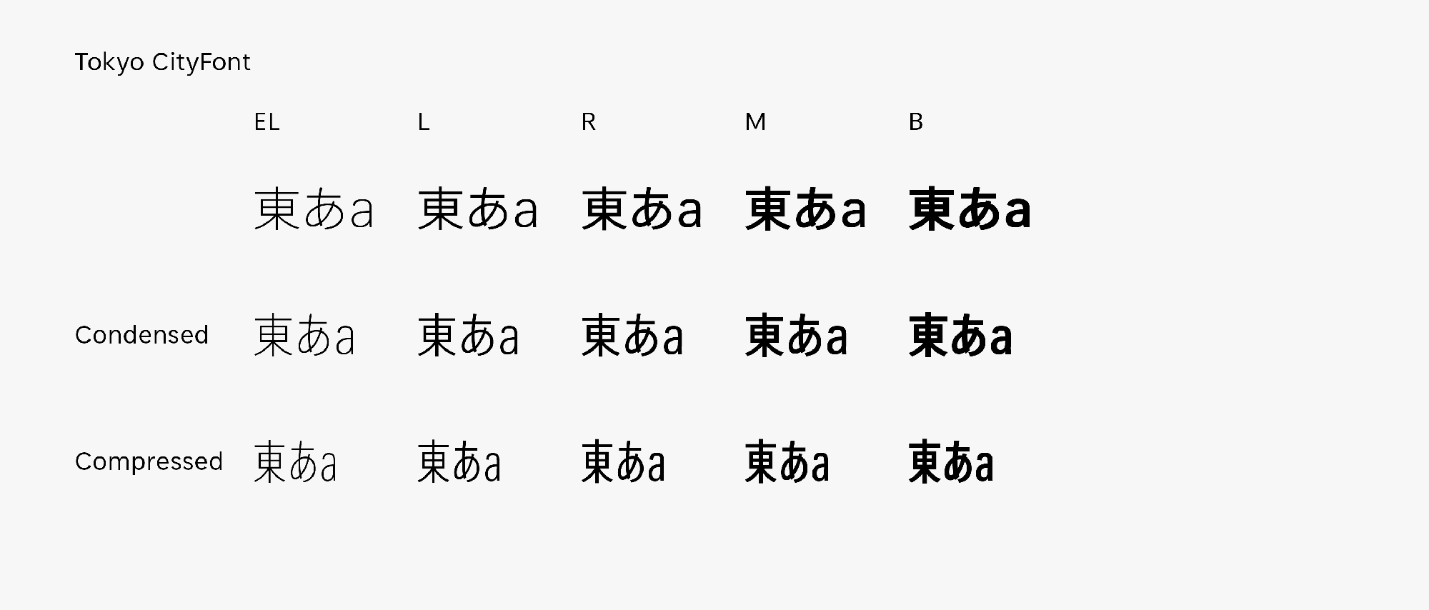
The concept of Tokyo CityFont is a typeface design appropriate for information display with a focus on the modern urban space. The central issues were differentiation from a long distance, and stability of display quality. With a family configuration of 15 fonts, it is possible to display the required information efficiently and legibly corresponding to space. When displaying the required information in a limited space, Condensed and Compressed variations are highly effective.
- WHITE MODE
- BLACK MODE
- ABasic
- ACondensed
- ACompressed
Family・Specification
Font set
Standard(StdN)
9,499characters (Adobe-Japan1-3, with custom glyphs added)
Buy
TP Connect
Subscription service that enables
the use of all of Type Project fonts.
TP Connect is only available in Japanese.