


2009.04/01
Characters Remain Forever
Font revolution in cell phones
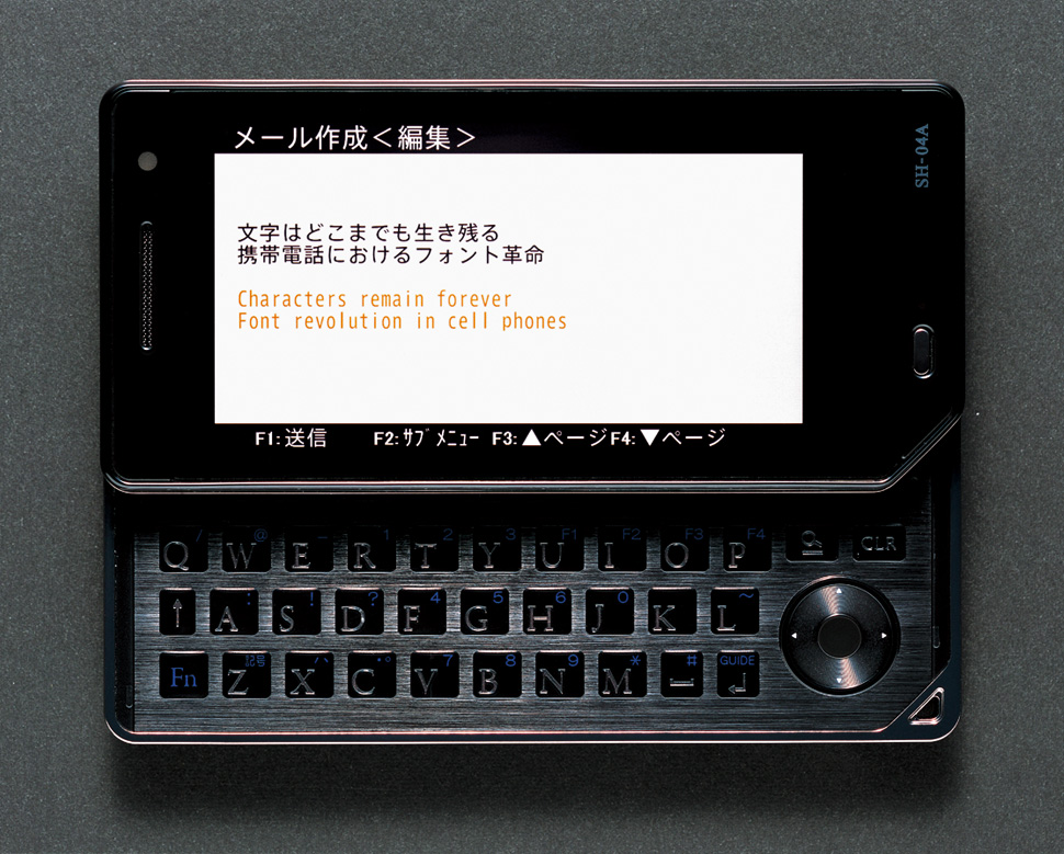
NTT DoCoMo will adopt completely new fonts in its cell phones. The first model to get this makeover is SHARP’s SH-01A, released in November 2008. The newly added font, which is set as its default font, is the AXIS Font. We talked to Kinya Tagawa of Takram who was involved in its development and its type designer Isao Suzuki.
80% of the display is text
It was several years ago when Kinya Tagawa set out on the development of a new user interface in response to NTT DoCoMo’s desire to create a platform on which multiple applications could be operated on a single cell-phone display. As a pro- totype screen display font, Tagawa casually chose his favorite font, the AXIS Font. He was, however, shocked to discover that the design quality was lost significantly when the font was converted to an existing bit-map font upon commercialization.
This prompted Tagawa to think hard. 80% of the design components on the cell-phone screen is text. The shortest way to improve the quality of the cell-phone product may be to make the characters on screen more beautiful.
He decided to adopt characters that are suited to the new interface. He relayed his thoughts passionately to the project members on the NTT DoCoMo side with his design project members including Mamoru Kano from WOW.
Tagawa, Kano and others, after debating what makes DoCoMo distinct, started selecting fonts that matched its image as “an authentic pioneer in technology.” At this stage, there was still a choice to develop its own new fonts, but through discussions they concluded that the AXIS Font was the one from the reason it was created by a single font creator with the “high aspiration” to design an exclusive font for a magazine, and that it stimulates the motivation of the creators and engineers. By discerning what will and won’t change while considering advancements in cutting-edge technology, Tagawa drew up pictures of the future as concretely as possible.
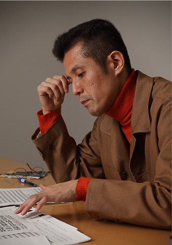
Kinya Tagawa stresses that characters are universal assets. He creates innovative de- sign from both engineering and artistic perspectives.
The unchanging condition that remains for- ever with the future of the cell phone is palm size. Due to this restriction, the width of the cell phone will not get much larger than it is today. This means that advancements in the LCD screen will not be represented by size but rather by higher resolution.”
In fact, the pixel count of the cell-phone has improved approximately four fold in years. If the resolution of the screen is raised further, it will be- come possible to display smaller characters more clearly. Tagawa is envisioning an interface that al- lows changing the font size freely by zooming. He explains, “They’re planning to use the AXIS Font in many cell-phone models to be released from NTT DoCoMo from 2009. I believe, for children today, the amount of text information input from the cell phone is considerably great even compared to the amount of printed text. I think it is also the responsibility of those involved in making things to provide an environment that lets the users feel the value of our language.”
“The unchanging condition that remains for- ever with the future of the cell phone is palm size. Due to this restriction, the width of the cell phone will not get much larger than it is today. This means that advancements in the LCD screen will not be represented by size but rather by higher resolution.”
In fact, the pixel count of the cell-phone has improved approximately four fold in years. If the resolution of the screen is raised further, it will be- come possible to display smaller characters more clearly. Tagawa is envisioning an interface that al- lows changing the font size freely by zooming. He explains, “They’re planning to use the AXIS Font in many cell-phone models to be released from NTT DoCoMo from 2009. I believe, for children today, the amount of text information input from the cell phone is considerably great even compared to the amount of printed text. I think it is also the responsibility of those involved in making things to provide an environment that lets the users feel the value of our language.”
Unprecedented gentleness
The fonts installed in SHARP’s SH-01A and SH- 04A (to be released in February 2009) this time are a monospaced outline version and bit-map version of the AXIS Font. Initially, AXIS Font Condensed that is an elongated version was also used in part of the prototype screen. It was eventually dropped because it was difficult to develop a rasterizer that properly controls the intervals between characters. It is evident that the future task is to optimize the font widths and layout intervals.
SH-01A is SHARP’s first model installed with the AXIS Font. The font is used not only for the mail text but also in the entire menu screen, and its ease and clarity in legibility contributes to establishing the image of the product.
Type designer Isao Suzuki who created the AXIS Font adjusted it to suit the cell-phone environment for this project. He created anew the outline data for all characters, their bit-map data in a total of seven sizes, and 282 glyph pictogram symbols for this project. To avoid overlapping on a small screen with minimal space between lines, he has already made fine design adjustments so that such letters as “p” and “y” would not stick out too far below.
“I think the gentle and lean feel unique to the AXIS Font is expressed well. The development time was three months, but if we had more time, I would have liked to step farther into the ‘cell- phone-like’ and ‘DoCoMo-like’ styles of the font. The next step, if there is one, would be to work mainly on customizing AXIS Font Condensed.”
Isao Suzuki is taking notice of cell-phone fonts in South Korea. He says several mil- lion users there not content with the standard fonts are enjoying downloading their favorite fonts.
There is another step after the elongated font is adopted. It is to get the efficacy of the Proportional Font recognized on compact LCD devices. The advantage of the proportional font is to once liberate characters from their fixed width and then give an appropriate width to each character so that text in which kanji, kana, alphabets and numbers are mixed can be read naturally. This also agrees with the direction of the cell phone that re- quires “legibility within a conserved space.”
Not limited to the AXIS Font, Suzuki’s idea is that the cell-phone font can be more diverse. Ac- cording to him, there are two approaches to developing fonts. One is standard fonts for the majority. The other is exclusive fonts to suit various needs. We may not be so far from the time users can freely download and use the fonts they like.
As the font on the cell-phone screen changes, the users’ eye for font aesthetics will be refined. Creators who recognize the importance of fonts will also increase. There are still many high-tech devices in which the font is unchanged and neglected. Potential demand for beautiful fonts in such devices as the digital terrestrial TV and car navigator is immense.
Kinya Tagawa
Co-Founder, takram design engineering
1999, Graduated with BS in Mechanical Engineering from the University of Tokyo, Faculty of Engineering, Department of Mechano-Informatics. 2001, received MA in Industrial Design Engineering from the Royal College of Art in UK. Returned to Japan and joined the LEADING EDGE DESIGN corp. Featuring a multilateral development approach that capitalizes on both design and engineering perspectives, he is active in wide range of products from interactive art works to software and hardware. His work was selected into the permanent collection in MoMA New York.
(AXIS Magazine, April 2009. Text by Tazlu Endo Photos by Makoto Fujii)