%20--%3e%3cpolygon%20points='24.7%201%200%201%200%207.6%208.5%207.6%208.5%2039.4%2016.1%2039.4%2016.1%207.6%2024.7%207.6%2024.7%201'/%3e%3cpath%20d='M34.1,32.4l-4.9-22.7h-7.9l9.1,33.1c-.4,1.7-1.1,2.9-3.7,2.9h-2.6l1.9,6.6h1.5c4,0,8-1.2,10.3-9.2,1.8-6.4,8.9-33.3,8.9-33.3h-8l-4.6,22.7Z'/%3e%3cpath%20d='M91.7,8.7c-8.7,0-12.7,6.5-12.7,16.1s3.6,15.3,13.8,15.3,7.2-.9,9-1.6l-1.2-6c-2.4.8-4.9,1.2-7,1.2-4.3,0-7-2-7.2-7.3h16v-4.8c0-7.5-2.9-13-10.7-13ZM86.5,21c0-3.3,1.7-6.4,4.7-6.4s4.1,2.7,4.1,6.4h-8.8Z'/%3e%3cpath%20d='M218,8.7c-8.7,0-12.7,6.5-12.7,16.1s3.6,15.3,13.8,15.3,7.2-.9,9-1.6l-1.2-6c-2.5.8-4.9,1.2-7,1.2-4.3,0-7-2-7.2-7.3h16v-4.8c0-7.5-2.9-13-10.7-13ZM212.9,21c0-3.3,1.7-6.4,4.7-6.4s4.1,2.7,4.1,6.4h-8.8Z'/%3e%3cpath%20d='M126,1h-10.7v38.4h7.6v-11.8h5c6,0,11.3-3.8,11.3-14.1s-5.5-12.5-13.1-12.5ZM125.9,20.9h-3.1V7.6h3c3.7,0,5.4,1.8,5.4,6.3s-1.5,7.1-5.3,7.1Z'/%3e%3cpath%20d='M150,12.9c-.2-1-.5-2.4-.8-3.2h-6.9c.5,1.9.7,4.6.7,7.9v21.8h7.4v-20.3c1.1-2.2,4.5-3,7.4-3v-6.8c-3.5,0-6.5,1.7-7.7,3.6Z'/%3e%3cpath%20d='M192.6,40.6c0,3.5-1.6,4-4.7,4h-1.5l1.9,6.6h2.3c6.3,0,9.3-3.2,9.3-9.8V9.7h-7.4v30.9Z'/%3e%3crect%20x='192.2'%20width='8.4'%20height='6.4'/%3e%3cpath%20d='M247.4,33.7c-4.8,0-6.6-2.8-6.6-9.6s1.9-8.9,6.2-8.9,3.4.4,4.9,1l1-6.4c-1.3-.5-3.7-.9-6.2-.9-10.6,0-13.4,6.7-13.4,15.9h0c0,10.7,4.6,15.3,12.4,15.3s5.9-.5,7.4-1l-.9-6.1c-2,.4-3.7.6-4.7.6Z'/%3e%3cpath%20d='M264.7,30.2v-14.2h5.4l1.4-5.8h-6.9V2.1l-7.3,1.9v26.8c0,5.3,2.4,9,8.2,9s4.9-.2,4.9-.2v-5.7h-2c-3,0-3.8-1.3-3.8-3.7Z'/%3e%3cpath%20d='M64.3,8.8c-3.3,0-5.8,1.6-7.3,3.4-.2-1.1-.5-2.1-.8-2.6h-6.6c.5,1.9.6,4.4.6,7.4v34.4h7.3v-13.8c1.5,1.5,3.8,2.4,6.2,2.4,8,0,11.2-6.6,11.2-16s-3.1-15.2-10.4-15.2ZM62.1,33.8c-1.6,0-3.1-.6-4.6-1.8-.3-1.6-.4-3.7-.4-6v-3.3c0-1.8.1-3.8.4-5.1,1.4-1.4,3-2.5,5-2.5,3.2,0,4.6,3.2,4.6,9s-.9,9.6-5,9.6Z'/%3e%3cpath%20d='M173.6,8.6c-9.5,0-13,6.7-13,15.7s3.5,16.1,13,16.1,13-6.8,13-16.2-3.3-15.7-13-15.7ZM173.6,34.2c-3.6,0-5.5-2.9-5.5-9.9s2.2-9.5,5.5-9.5,5.5,2.2,5.5,9.5-1.9,9.9-5.5,9.9Z'/%3e%3c/svg%3e)
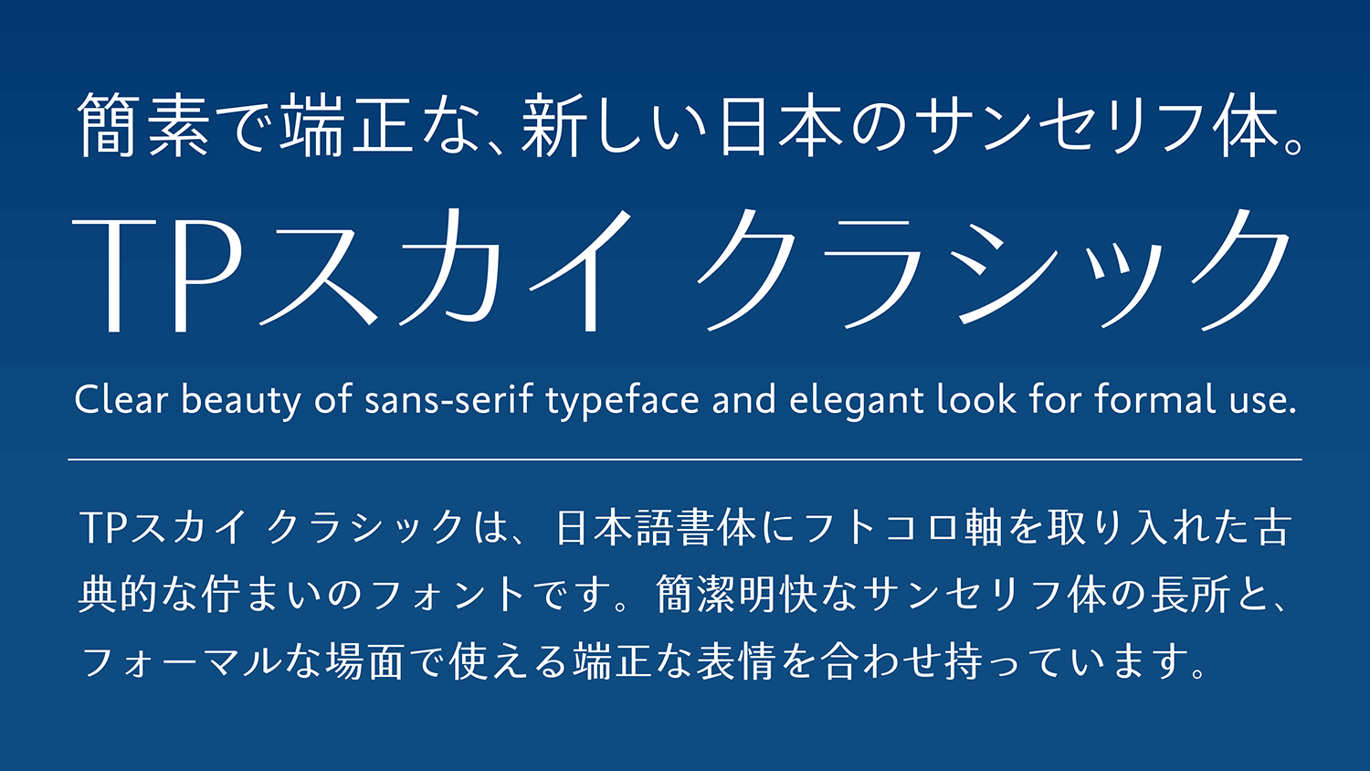
TP Sky Classic, in which the essence of the proper block style is incorporated in sans-serif typeface - the newest typeface format - is a font that combines a classical image mixed with a sense of modernity. As the font has concise expression and an expressive face, an adult calmness along with the force of strokes, it works well in formal applications.
Features

Classical and tightened structure.
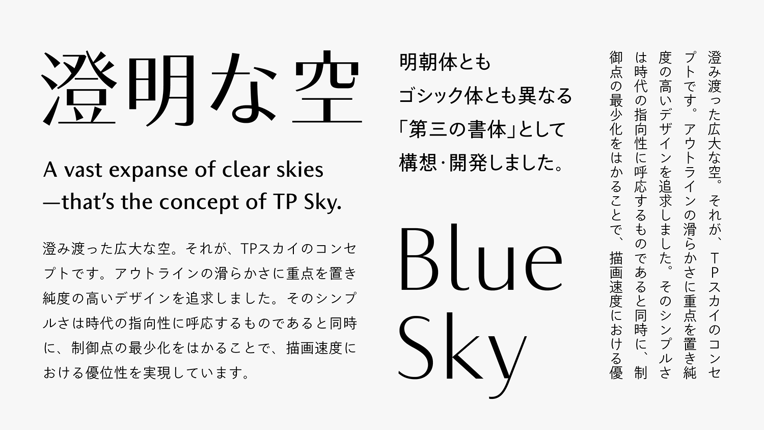
Based on the concept of “a vast expanse of clear skies above us” that covers the entire family, TP Sky Classic aims at the expansion of applications in formal scenes, and incorporates a well-balanced block style proportion. It also manages both a classical and tightened structure of inside space between strokes and a simple outline drawing. In addition to the conventional TP Sky family, it can be used depending on the scene by changing the attributes of the inside space between strokes. Furthermore, the font file size is restrained to the utmost limits by the displayability common to the TP Sky family, with concise and smooth outlines drawn thoroughly.

Natural flavor elongation and classical.
Kanji with tightened inside space between strokes, with peaks in the *block style of the first period of the Tang dynasty are positioned as the standard for Classic. TP Sky Classic has a natural flavor of the tightened inside space between strokes, and contrast between elongation and strokes. Using well-balanced classical typeface for kanji, kana, and Latin as a model, its essence is incorporated in sans-serif typeface.
*Block style of the first period of the Tang dynasty
The first period of the history of literature, of the four periods of the Tang dynasty of China. The period is 100 years, from the year 618 of the first period of Tang dynasty to 712 (the year before the enthronement of Xuanzong).

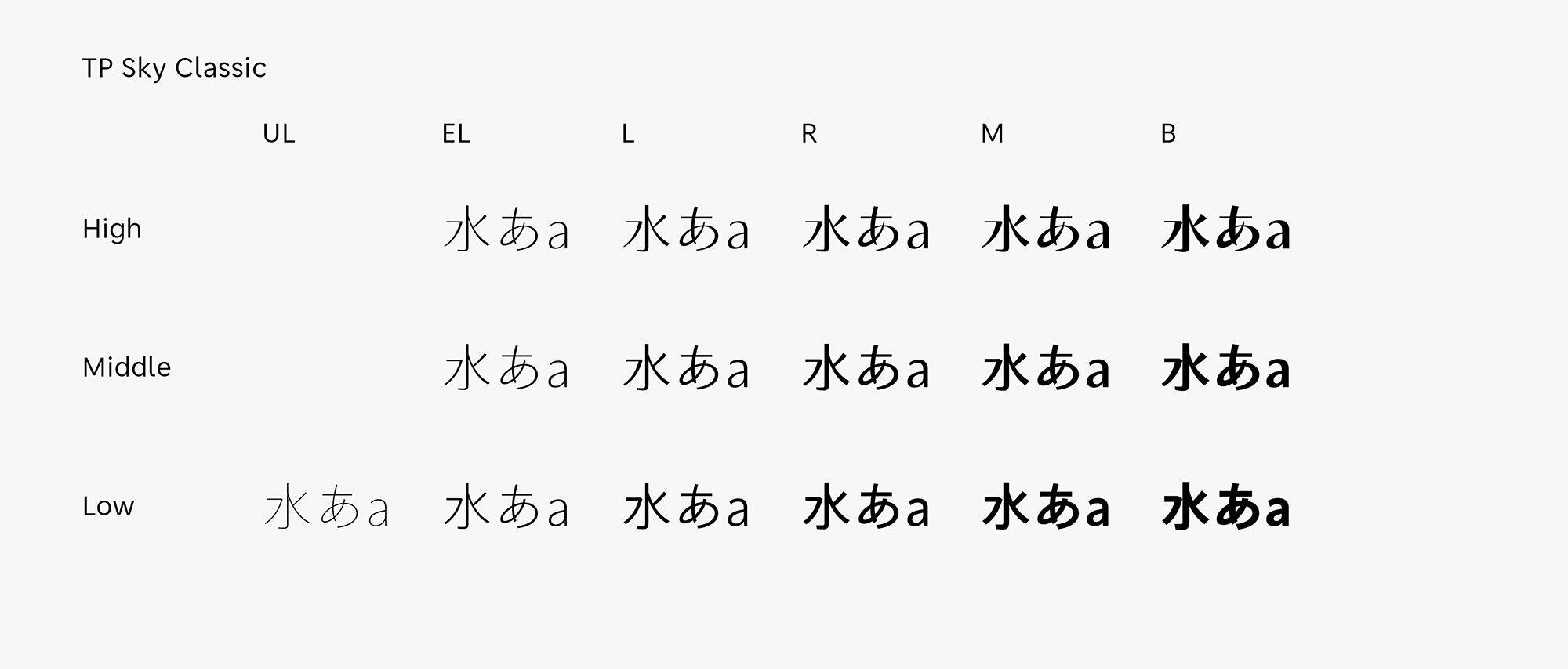
3 contrasts, modeled of classic block style
In Middle Contrast and High Contrast, in which the brush modulation is incorporated in “sweeping,” “point brush,” etc., the classical expression is stronger that in Low Contrast. High Contrast with a sharp impression is effective in titles, catch phrases, etc. It is also ideal for product logos with a desire to show high quality. Middle Contrast with an expressive calmness has versatility appropriate for the digital environment. With a thin weight in Middle Contrast in particular that combines both ease of reading and beauty. Although Low Contrast looks as though there is no stroke intensity, there is a nuance of the natural modulation of handwriting when used in large sizes, such as headings, etc.
- WHITE MODE
- BLACK MODE
- ALow
Contrast - AMiddle
Contrast - AHigh
Contrast
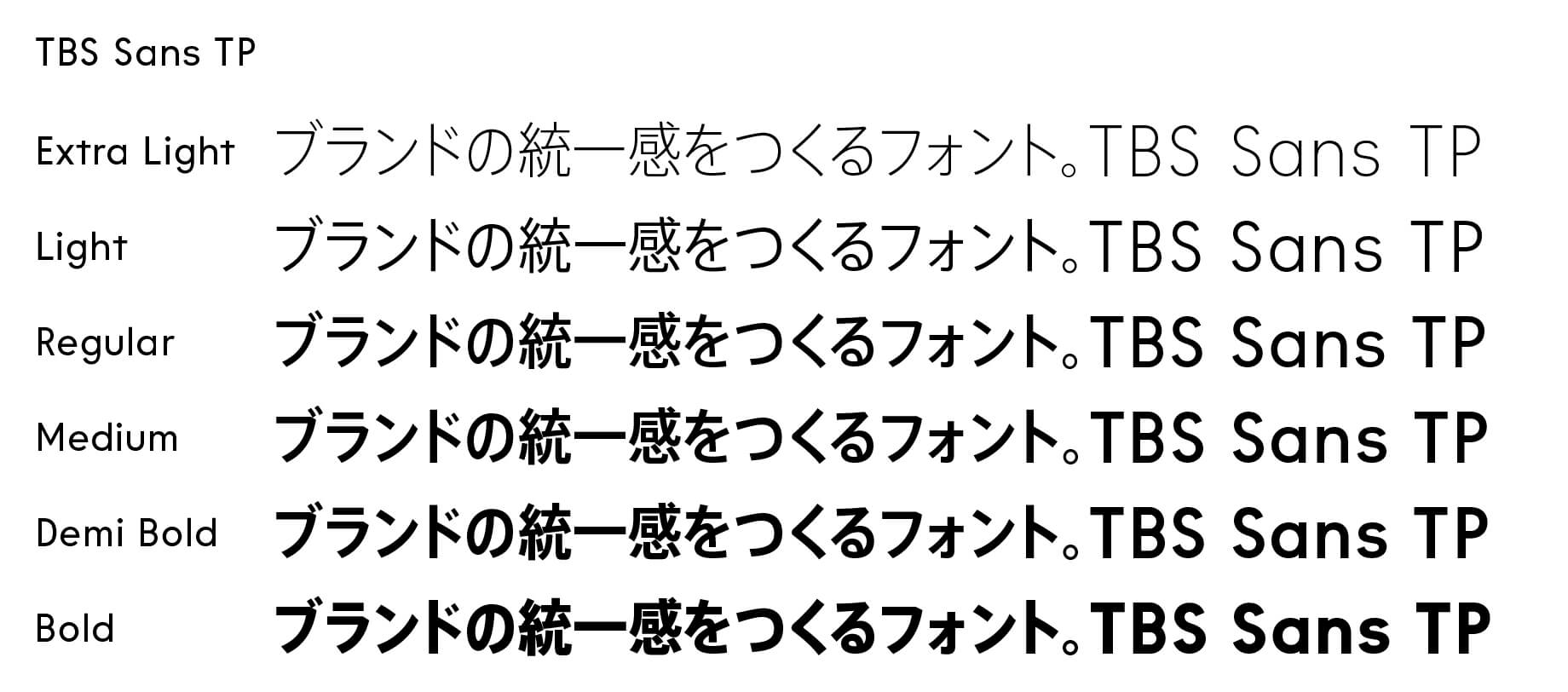
Family・Specification
Font set
Standard(StdN)
9,499 characters (Adobe-Japan1-3)
Buy
TP Connect
Subscription service that enables
the use of all of Type Project fonts.
TP Connect is only available in Japanese.