


2015.09/28
Letter as a voice that speaks
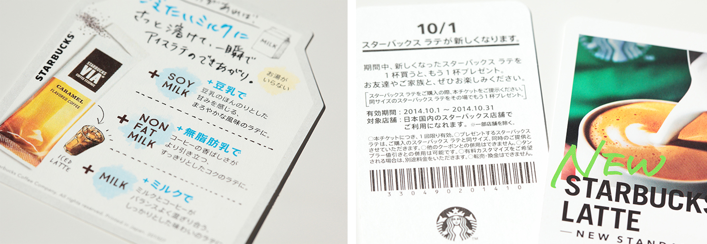
Starbucks has established over 20,000 shops across 66 countries, with its mission, “To inspire and nurture the human spirit – one person, one cup, and one neighborhood at a time.” The Japanese branch, Starbucks Coffee Japan, Ltd., adopted AXIS Font as its corporate font for Japanese signs, using it for wide variety of media such as in-store posters, menus, pamphlets, and its website.
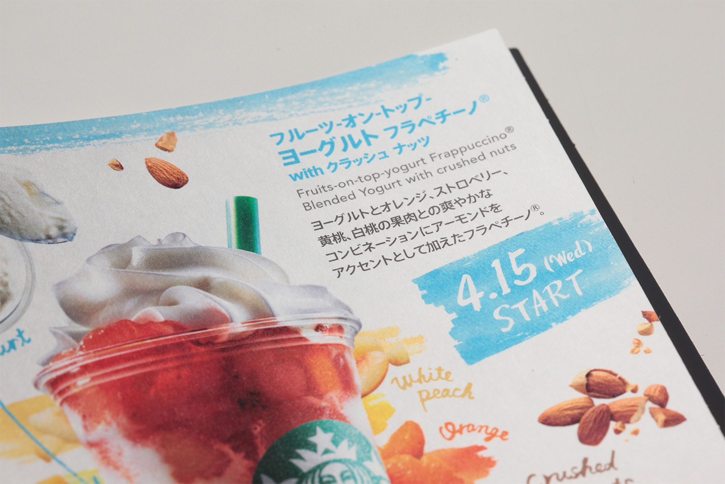
Visual communication for Starbucks is mainly done in English, with photographs, or illustrations. In this context, the Japanese font needed to blend in well with the visuals without a loud personality, and balance out well with English words. The company’s Creative Specialist, Satoshi Kawakami, states as below.

“When expressing through creative media, there is a world wide guideline that determines the use of 3 kinds of Latin fonts to be mainly used, such as Avenir. In addition, you may have seen inside Starbucks shops that the use of handwriting, although not a font, is also part of the guideline. For each creative project, a fitting font is chosen from all of these in order to fit the message being conveyed. We needed a Japanese font that matched any of these Latin fonts, and that was why we adopted AXIS Font.”
Visual communication for Starbucks is mainly done in English, with photographs, or illustrations. In this context, the Japanese font needed to blend in well with the visuals without a loud personality, and balance out well with English words. The company’s Creative Specialist, Satoshi Kawakami, states as below.
When comparing and testing other fonts to choose the Japanese font, the AXIS Font’s advantage was that it did not clash with English messages, and the completed set of fonts displayed full compatibility. Also, a system of using different Japanese fonts depending on which Latin font was used was considered, but because that would emphasize the design of the Japanese fonts, and we wanted to conveyed the substance of the message directly, so we decided on using just AXIS Font.
“It’s a company rule, that everything written for Starbucks in Japanese is unified by AXIS Font.”
“We are always thinking about not only providing coffee, but what we can do in order to inspire people, when communicating with our customers. That’s why we don’t try to invent an advertising slogan. We don’t want to express ourselves in a way that exaggerates or stirs people up. Even in our posters and pamphlets, we aim for human-like communication to take place, just like our baristas who speak to our customers with respect and affection at the shops. As the voice that delivers our message to our customers, I feel that AXIS Font is the perfect choice.”

(Photos by Kou Chifusa)