%20--%3e%3cpolygon%20points='24.7%201%200%201%200%207.6%208.5%207.6%208.5%2039.4%2016.1%2039.4%2016.1%207.6%2024.7%207.6%2024.7%201'/%3e%3cpath%20d='M34.1,32.4l-4.9-22.7h-7.9l9.1,33.1c-.4,1.7-1.1,2.9-3.7,2.9h-2.6l1.9,6.6h1.5c4,0,8-1.2,10.3-9.2,1.8-6.4,8.9-33.3,8.9-33.3h-8l-4.6,22.7Z'/%3e%3cpath%20d='M91.7,8.7c-8.7,0-12.7,6.5-12.7,16.1s3.6,15.3,13.8,15.3,7.2-.9,9-1.6l-1.2-6c-2.4.8-4.9,1.2-7,1.2-4.3,0-7-2-7.2-7.3h16v-4.8c0-7.5-2.9-13-10.7-13ZM86.5,21c0-3.3,1.7-6.4,4.7-6.4s4.1,2.7,4.1,6.4h-8.8Z'/%3e%3cpath%20d='M218,8.7c-8.7,0-12.7,6.5-12.7,16.1s3.6,15.3,13.8,15.3,7.2-.9,9-1.6l-1.2-6c-2.5.8-4.9,1.2-7,1.2-4.3,0-7-2-7.2-7.3h16v-4.8c0-7.5-2.9-13-10.7-13ZM212.9,21c0-3.3,1.7-6.4,4.7-6.4s4.1,2.7,4.1,6.4h-8.8Z'/%3e%3cpath%20d='M126,1h-10.7v38.4h7.6v-11.8h5c6,0,11.3-3.8,11.3-14.1s-5.5-12.5-13.1-12.5ZM125.9,20.9h-3.1V7.6h3c3.7,0,5.4,1.8,5.4,6.3s-1.5,7.1-5.3,7.1Z'/%3e%3cpath%20d='M150,12.9c-.2-1-.5-2.4-.8-3.2h-6.9c.5,1.9.7,4.6.7,7.9v21.8h7.4v-20.3c1.1-2.2,4.5-3,7.4-3v-6.8c-3.5,0-6.5,1.7-7.7,3.6Z'/%3e%3cpath%20d='M192.6,40.6c0,3.5-1.6,4-4.7,4h-1.5l1.9,6.6h2.3c6.3,0,9.3-3.2,9.3-9.8V9.7h-7.4v30.9Z'/%3e%3crect%20x='192.2'%20width='8.4'%20height='6.4'/%3e%3cpath%20d='M247.4,33.7c-4.8,0-6.6-2.8-6.6-9.6s1.9-8.9,6.2-8.9,3.4.4,4.9,1l1-6.4c-1.3-.5-3.7-.9-6.2-.9-10.6,0-13.4,6.7-13.4,15.9h0c0,10.7,4.6,15.3,12.4,15.3s5.9-.5,7.4-1l-.9-6.1c-2,.4-3.7.6-4.7.6Z'/%3e%3cpath%20d='M264.7,30.2v-14.2h5.4l1.4-5.8h-6.9V2.1l-7.3,1.9v26.8c0,5.3,2.4,9,8.2,9s4.9-.2,4.9-.2v-5.7h-2c-3,0-3.8-1.3-3.8-3.7Z'/%3e%3cpath%20d='M64.3,8.8c-3.3,0-5.8,1.6-7.3,3.4-.2-1.1-.5-2.1-.8-2.6h-6.6c.5,1.9.6,4.4.6,7.4v34.4h7.3v-13.8c1.5,1.5,3.8,2.4,6.2,2.4,8,0,11.2-6.6,11.2-16s-3.1-15.2-10.4-15.2ZM62.1,33.8c-1.6,0-3.1-.6-4.6-1.8-.3-1.6-.4-3.7-.4-6v-3.3c0-1.8.1-3.8.4-5.1,1.4-1.4,3-2.5,5-2.5,3.2,0,4.6,3.2,4.6,9s-.9,9.6-5,9.6Z'/%3e%3cpath%20d='M173.6,8.6c-9.5,0-13,6.7-13,15.7s3.5,16.1,13,16.1,13-6.8,13-16.2-3.3-15.7-13-15.7ZM173.6,34.2c-3.6,0-5.5-2.9-5.5-9.9s2.2-9.5,5.5-9.5,5.5,2.2,5.5,9.5-1.9,9.9-5.5,9.9Z'/%3e%3c/svg%3e)
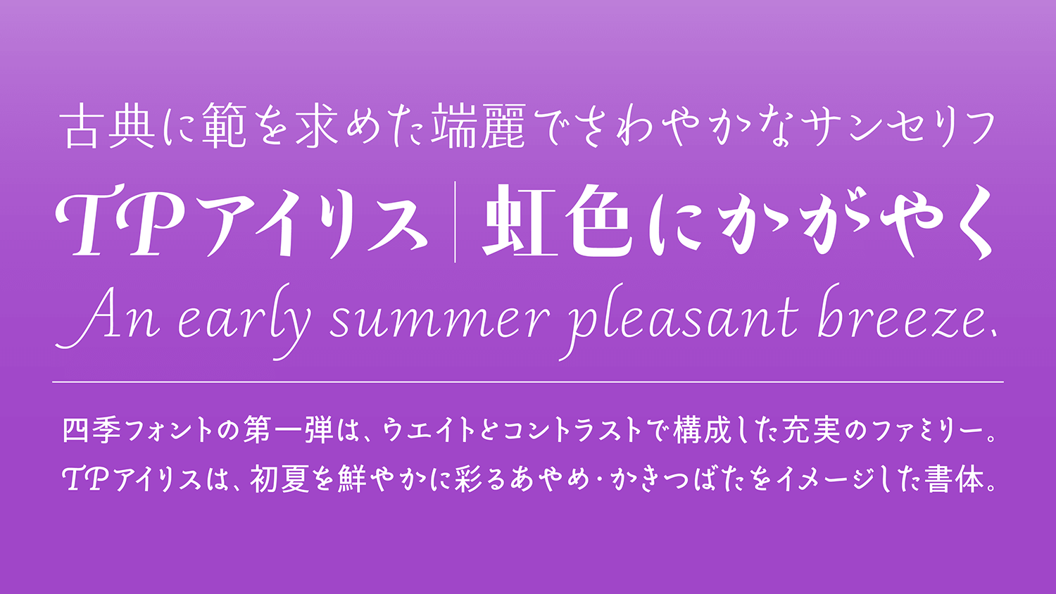
TP Iris, a fine-looking typeface with in the image of the flowers “iris”, representing early summer. While modeling a transitional typeface, it is an easy-to-use sans-serif typeface that conforms to modern applications. The uniqueness of TP Iris appears characteristically in the beginning of a Kana brushstroke. In Latin, the shape and angle of the beginning and ending of a brushstroke is changed according to the features of each contrast.
Feature

Representing early summer
The first release of the Seasonal Font Project is TP Iris, a fine-looking typeface with the image of the flowers “iris” and “Japanese iris,” representing early summer. While modeling a transitional typeface, it is an easy-to-use sans-serif typeface that conforms to modern applications. Its Kana is based on refined Kana in the Heian dynasty (A.D. 794 to 1185); an elegant cursive script developed in Latin around the 16th century as a model. TP Sky Classic, in which the block style structure is modernized, is adopted for Kanji. High contrast has boldly innovated detail with classics as a core. Middle contrast can be used with confidence in a wide variety of applications. Low contrast is fresh with a modern expression. Using high quality culture as food for creation, TP Iris is a font family that represents something new in the combination of Japanese and Latin while valuing the original Japanese.
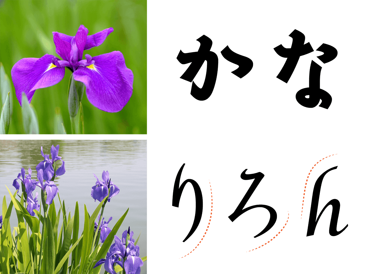
Impression of glamorous purple petals
TP Iris is a font that is reminiscent of sharp sword grass with its high contrast stroke shape, a thick weight that gives an impression of glamorous purple petals, and its thin weight conveys an early summer pleasant breeze. Iris is a generic term for irises, including iris, Japanese iris, and iris ensata. German iris, Dutch iris, and other irises can also be widely seen in Europe. The origin of iris is the rainbow goddess Iris who appears in Greek mythology. Iris ensata in particular has many varieties and colors, the flower most suitable for the metaphor of rainbow. Taking in seasonal features to typeface, and adding color to the category of sans-serif typeface – this is one of the objectives in the background of TP Iris.
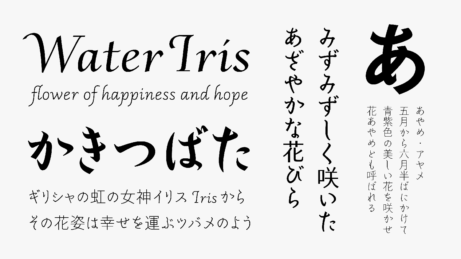
Atmosphere of Japanese style
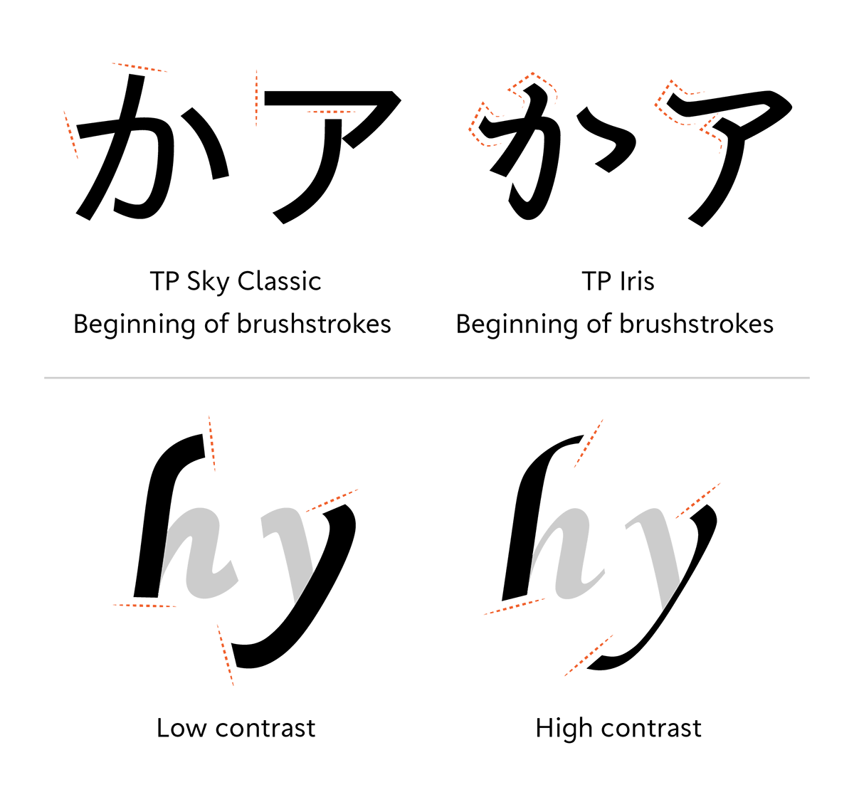
The uniqueness of TP Iris appears characteristically in the beginning of a Kana brushstroke. In the common Japanese sans-serif, the shape of the beginning of a brushstroke is cut down. TP Iris, however, handles the beginning of a brushstroke as an important element to indicate the atmosphere of Japanese style. It enters from the upper right and comes out on the lower left. The connecting strokes express the before and after of the character and the flow of a brush in vertical writing. In Latin, the shape and angle of the beginning and ending of a brushstroke is changed according to the features of each contrast. In low contrast, the sense of unity with Kana is improved. To give an elegant atmosphere, the tips are slightly at an acute angle. In high contrast, the angle and shape with the features of flat pen writing material are kept and adopted.
- WHITE MODE
- BLACK MODE
- ALow
Contrast - AMiddle
Contrast - AHigh
Contrast
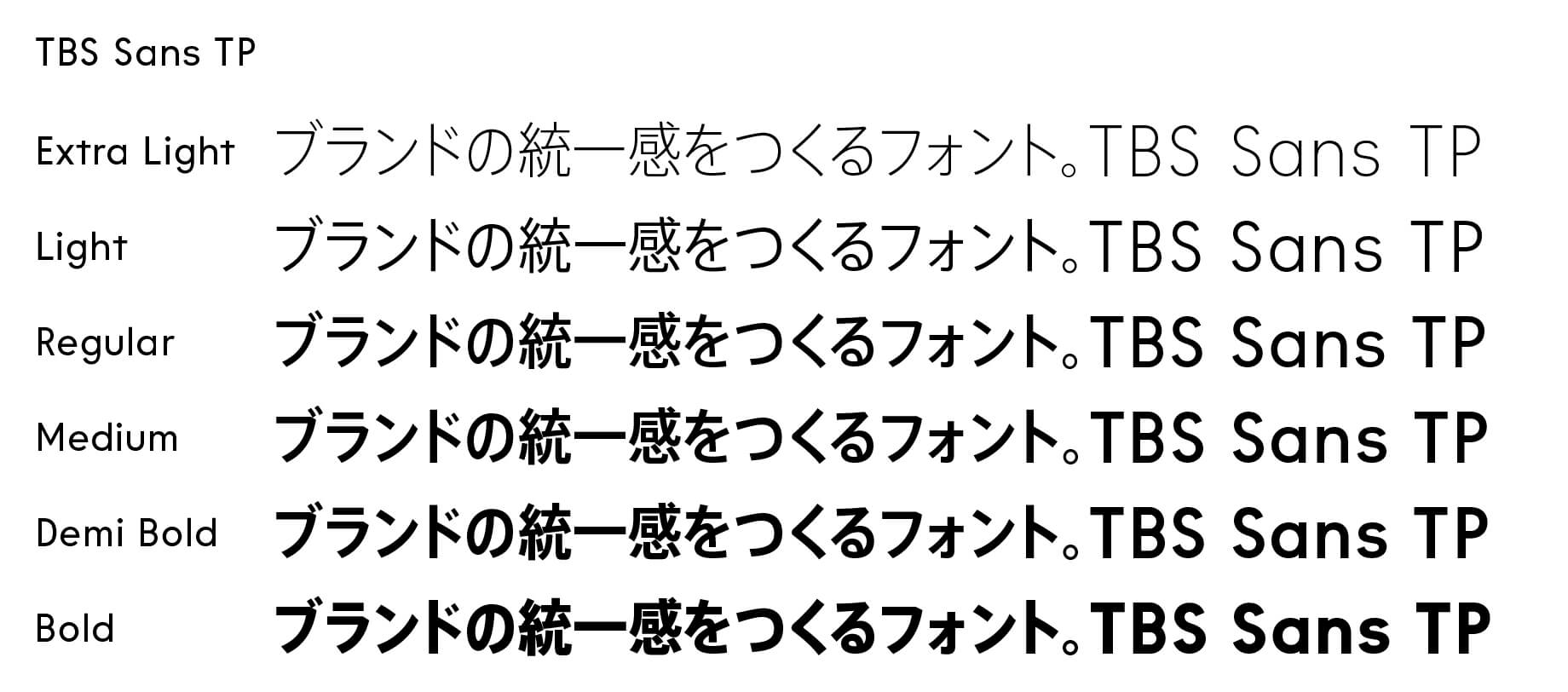
Family・Specification
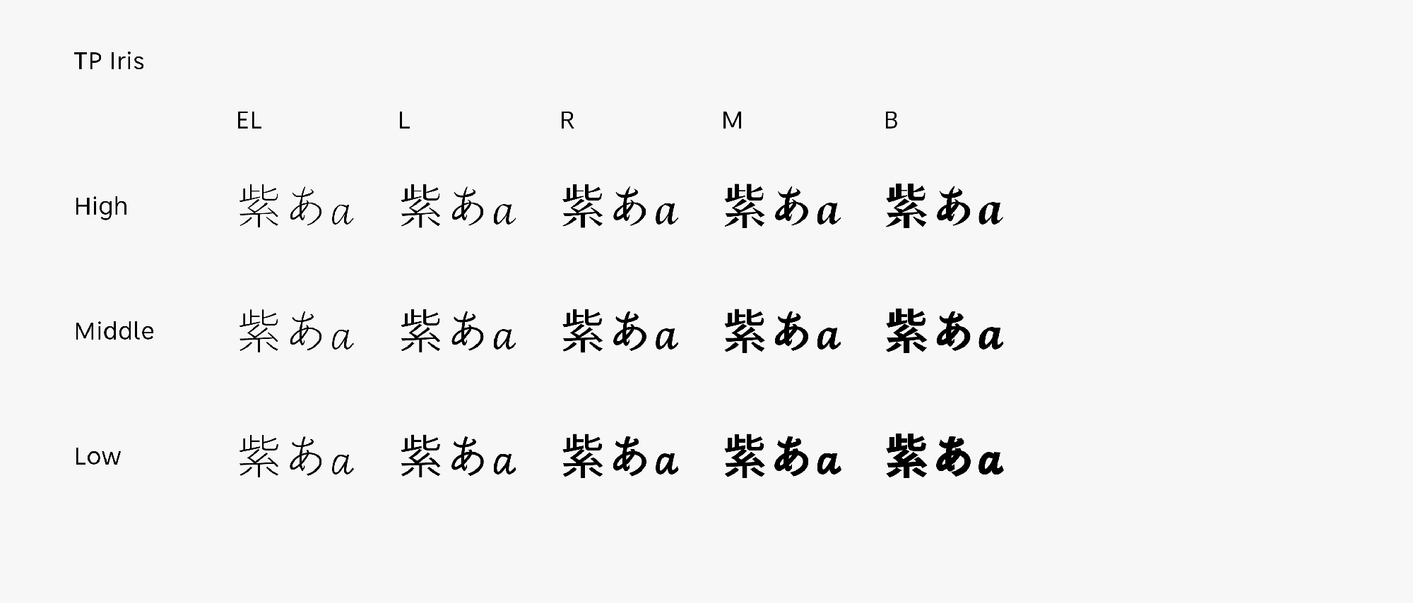
Font set
Standard(StdN)
9,530 characters (Adobe-Japan1-3, with custom glyphs added)
Buy
TP Connect
Subscription service that enables
the use of all of Type Project fonts.
TP Connect is only available in Japanese.