2012.06/01
A Font that Supports Visual Identity and Conveys a Sense of Commonality
POLA declared 2002 as its year of re-establishment, and initiated the restructuring of its brand. The corporate philosophy of ‘Pola Value’ was summarized with three key phrases indicating the company’s provision of value to the customer: Respect for the individual, Superlative hospitality, and the Pursuit of premium quality. This sales locale-integrating value sensibility is now bearing fruit with the development of a new business style, exemplified by the motto ‘Pola the Beauty’.
Concurrently, a reexamination of the company’s visual identity (VI) was carried out as well. The tone and style of the photography of Pola’s product line, the handling of illustrations, layout rules and the like were all standardized with specific design rules.
According to Satoshi Arita who was the branding project leader at the time, “Typefaces are an important factor in VI. If the product planning, advertising and marketing divisions are all using typefaces that give off different impressions, the brand will lose its distinctiveness, and the message we want to convey will not reach the customer. But above and beyond that, we had a sense of unease that it would not even be possible to arrive at a single typeface that could be used both for our marketing tools and to create advertisements that would express the our brand’s worldview. We needed a highly versatile typeface that could be applied in all forms of media.”
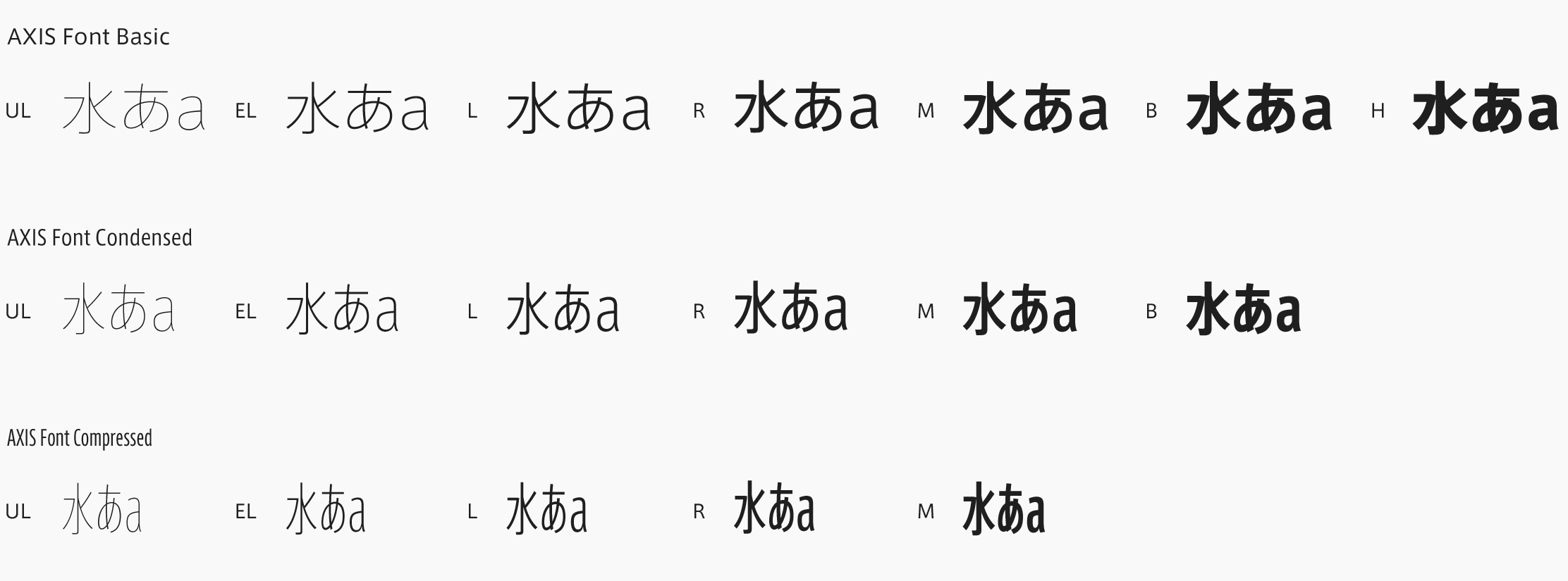
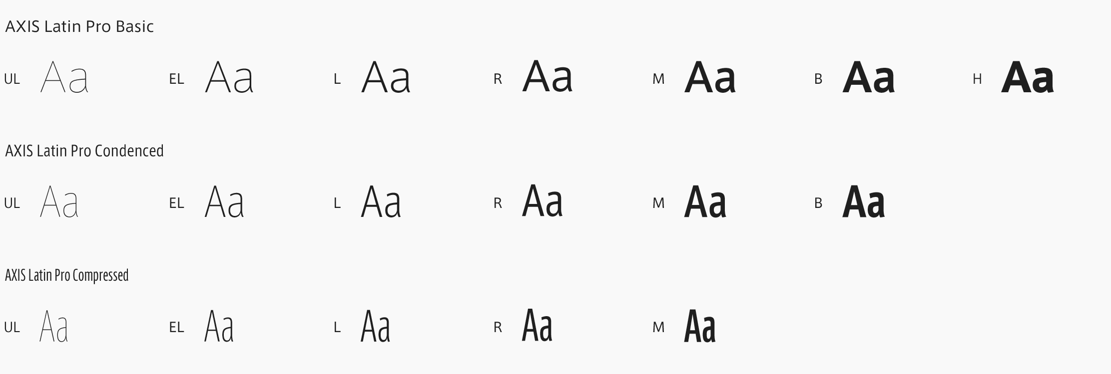
In 2005, POLA began using AXIS Font for the transmission of customer-targeted information across the board, employing a uniform typeface for diverse forms of information presented via all types of media, from printed materials to the internet.

“We adopted AXIS Font because of its superior readability and versatility, as well as the low cost of implementation. With regard to readability in particular, since it was originally developed for magazine use, the choice was clear. It’s a typeface that your eyes get used to right away, so it’s not tiring to look at. We think of it as a one-of-a-kind font endowed with a look that is both contemporary and erudite, while still being approachable and not cold or aloof. Another aspect we’re grateful for is the full range of appearances and weights available for both the Latin characters and the Japanese characters. Carrying out space adjustments between characters and between lines of text allows for various styles of presentation, and all kinds of possibilities can develop from that. It’s a typeface that can accommodate high-prestige brands and mid-priced brands alike.”
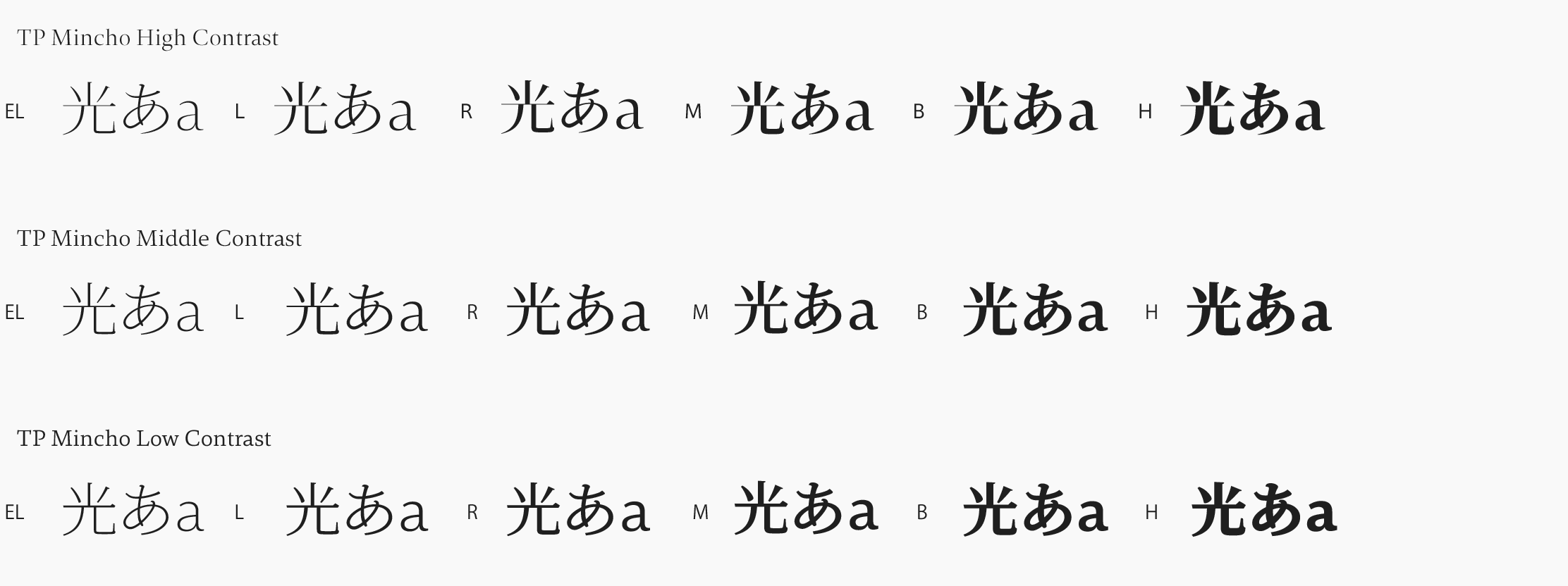
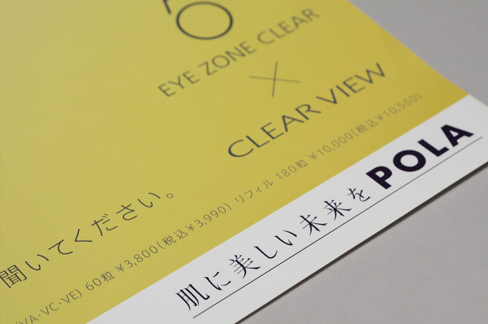
In addition, Type Project created the typeface for POLA’s corporate slogan from 2005 to 2011, ‘Hada ni utsukushii mirai o’ (‘For a beautiful future for the skin’). What we proposed, in line with POLA’s request for characters that would have a high affinity with AXIS Font, was a typeface based on the form of type known as Socho.
Socho (Song typeface) has a history from ancient China that dates back even further than Mincho. Our challenge was to reconstruct a modern-day version that could convey the strength of a tradition that is deeply rooted in the cultural sphere of the Chinese writing system. So we undertook this project with a sense of being oriented toward the future, while maintaining the heritage of history as our base.
The crisp ambiance of that typeface made our message â that we want women to be beautiful â into something even more powerful. A typeface that was neither in vogue nor old-fashioned, and that actually seemed highly improbable, became the embodiment of the orientation POLA was aspiring to, of tradition and innovation.”
(Text by Joji Oshiro)

