


2001.10/01
How I See the AXIS Font
We asked type director Masahiko Kozuka for his impression of the AXIS font.
The Shingo font I did at Morisawa was based on the concept of a modern sans serif. I wanted to make a Japanese font akin to the Helvetica concept. While the AXIS font also falls under the category of modern sans serif, compared to Shingo it places its focus on reading.
My theory is that conveying the writer’s ideas to the reader is at the root of typography. The main-text font in particular is meant to devote itself to the medium for that purpose; the font really doesn’t have to say anything itself. I think that the AXIS font is the embodiment of that way of thinking.
This is different from whether the font has individuality or not. I think that the font used in the main text is like water. Even though water is water, Japanese water and French water taste different. Even water from different parts of Japan tastes different. That difference in individuality should be there, and is probably due to the individuality of the designer.
If Shingo’s kana can be said to be close to the Helvetica concept, then the AXIS font’s kana is closer to handwriting with a pen. In other words, I think the font is an honest stylization of the flow of a pen. Although the letters are used on computer, it honestly expresses written characters.
I say that typefaces are words that you can see. If they are words you perceive with your eyes, the font will continue as long as good words are written for it. Put simply, the fonts that will survive are those that are easy to read, easy to get used to, and are never tiresome. The reader is not conscious of the font itself and the meaning of the text comes through. Long-surviving fonts are easy-to-read and are visual, that is, they have to be beautiful. The AXIS font too, was created with that understanding.
(AXIS Magazine, October 2001))
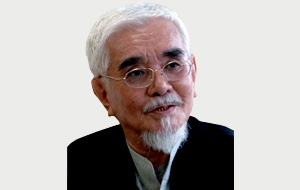
Masahiko KOZUKA
Masahiko Kozuka began making type in 1952. At that time, he had started working at the Mainichi newspaper, one of the leading nationwide daily newspapers in Japan, where he made hot metal text and headline typefaces. In the 1970s, in the transition from hot metal to digital type, he redesigned many fonts of Mainichi’s newspaper faces. From 1984, as type design director for Morisawa & Company, he supervised many type development projects such as the popular ShinGo typeface family. From 1992 to 2001, he supervised the Adobe Originals Japanese typeface development, and designed the Kozuka Mincho and Kozuka Gothic typeface families, in which he could adopt some new methods of Japanese type design by using Adobe’s up-to-date font development technologies.