


2017.01/10
Transform values, arrange environments, support culture, and be rooted in everyday life.
The shape of Type Project’s aspirations.
From the creation of a magazine-dedicated font for the design publication AXIS Magazine, to the production of FitFont with freely combinable weight and contrast options, to its offerings for the City Font Project and of a range of font experimentation tools, Type Project aims to continue with its original approach to development.
Type that raises the value of objects and of people (2)
Why AXIS Font works as a corporate font, too
When AXIS Font came out in 2001, in part due to the fact that it was a media-exclusive font, it had a unique presence that could not be found in other fonts. One couldn’t say for sure whether or not it even resembled other existing typefaces, and it resisted categorization with any other lineage of typefaces. Isao Suzuki’s way of thinking about type design shows why this was the case. “I’ve always felt this way, but I think that one should just start in a natural way, and that it’s good to bring out in a typeface the things one is living and seeing now, the air one breathes, and one’s sense of the spirit of the era one is living in. So, with AXIS Font, it was always important to me that it felt right, and that to my eye it worked in a comfortable way, without any sense of something being out of place. If I can express the ‘contemporary’, and that can be something that connects to environments and visual atmospheres five years from now, or even ten years from now… I have such hopes whenever I am creating a new typeface.”
In AXIS Font, Suzuki gave expression to his sense of the spirit of the times. It is interesting to note that AXIS Font is frequently adopted as a corporate font. One might think that since this font was designed for the specific medium of AXIS Magazine, everything one does with it will end up looking like that magazine, regardless of the medium one is working in. But when looking at actual examples of AXIS Font in use, one is struck by how easily and naturally it seems to fit into each situation. Suzuki’s typeface design philosophy, of having a sense of transparency and neutralness and looking ahead five or ten years in the future, would seem to be consistent with the corporate font way of thinking, which is to choose for long-term use. Suzuki offers the following analysis as to why this is so: “Overwhelmingly, in addition to adopting neutralness as a typeface characteristic, companies were using sans-serif fonts as their corporate fonts. And AXIS Font had seven weights, which was a lot for that time. Moreover, with Condensed and Compressed, we had three character widths available, which is probably what led to AXIS Font being a popular choice for situations with Japanese text used in combination with Latin characters.”
AXIS Font as a corporate font
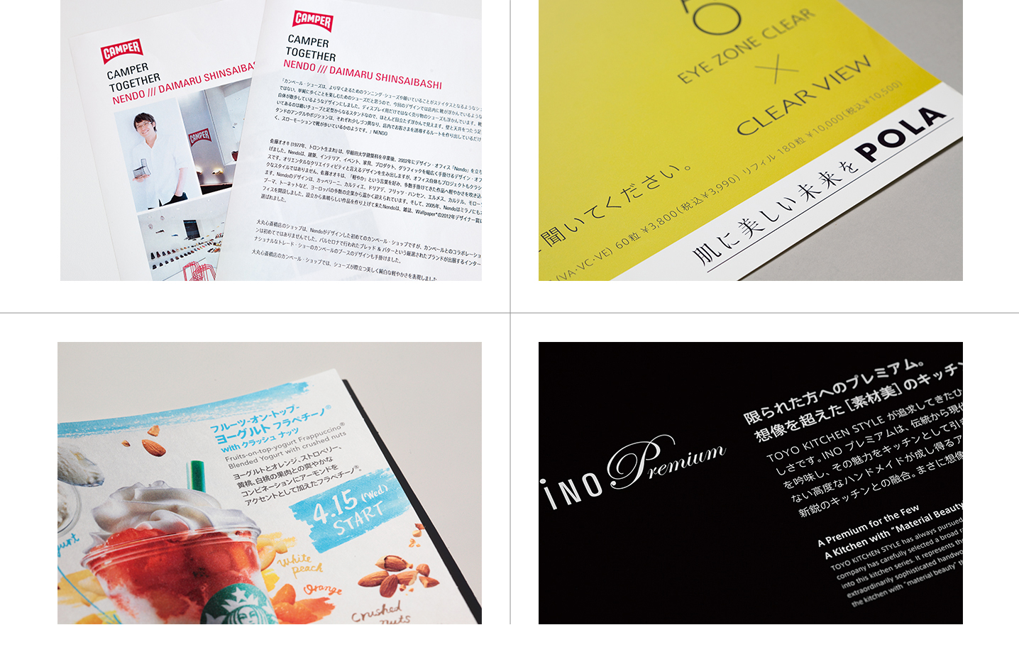
AXIS Font (and any custom fonts that use it as a base) has been adopted by many companies as a corporate font. There are many reasons for this popularity – the neutral design, its well-balanced handling of Japanese and Latin font combinations, and ease of design due to the availability of Condensed and Compressed, to name just a few. But as can be seen from these examples, while AXIS Font is endowed with advanced design qualities, it is a unique creation that also possesses a certain anonymity.
Upper left: Camper
Lower left:Starbucks Coffee
Upper right:POLA
Lower right:TOYO KITCHEN STYLE
FitFont, born from AXIS Font
It has presence, and it doesn’t. Such unusual reasons often come into play when adopting AXIS Font, Suzuki explains, and there are many cases of corporate font use in which requests are made for customization. “With corporate fonts, we used to get a lot of requests from clients who said, ‘AXIS Font is fine, but we want to change it a bit so that it’s different from what other companies have,’ and initially we were handling each request one at a time. Since it seemed likely that the demand for this would continue to grow, we came up with FitFont to provide it as a service.”
Type Project’s FitFont is a service that offers 1,071 variations each for both AXIS Font and TP Mincho (see page 21) by making adjustments of weight and contrast. Provided in combination with Latin fonts from Monotype and Commercial Type, all manner of corporate font needs can be satisfied. This is a service that could only be created by Type Project, a company that allows type designers and type engineers to work closely together. “We always have a lot of discussions between designers and engineers. Because the designers have to understand things, and the engineers have to understand the designers’ requests, too.”
Complete control over width and weight – AXIS Font’s FitFont
While with AXIS Font, one may select weight and width settings to yield a total lineup of eighteen variations, there are times when more refined levels of thickness and width are desired for corporate fonts. To respond to such needs, Suzuki worked with engineers to develop “FitFont”, which allows for modification of up to 51 levels of thickness and 21 levels of width.
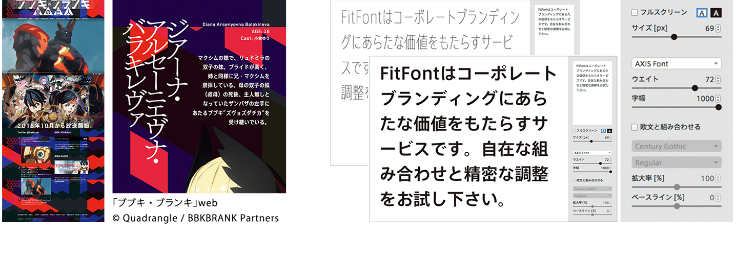
Left: The font set created for BUBUKI/BURANKI incorporated a geometrical Latin font into AXIS FitFont. This combination had a huge impact on Suzuki and made him aware of new possibilities.
Right: On Type Project’s online shop, one can select the “FitFont” item to carry out simulations of altering weight and width (AXIS Font) or contrast (TP Mincho), and one can also purchase fonts with one’s specified settings. Sample text can be changed as desired.
The font possibilities opened up by FitFont
Though Suzuki started FitFont in order to respond to the need for corporate fonts, his work sparked a surprising level of interest from other quarters, as well. For example, there was the request that came from Nippon Design Center’s Tomoyuki Arima, to use FitFont for the anime television series BUBUKI/BURANKI, which went on air in January 2016.
“I received an order from Arima, in which he said he wanted to use an AXIS FitFont, because it would fit perfectly with the Latin font he had chosen, which had characters with a slightly narrow, mechanical feel. In contrast to the rather geometrical Latin font, the Japanese font set in AXIS Font is neutral and human-feeling. Normally, one would have expected it to be a strange combination, but once the weight and width are adjusted, it looks very nice. I’ve been doing this work for a long time, and I’ve always tried to keep an open mind and not treat such things as taboo, but there I was with blinders on. Of course, it’s always a good idea to combine typefaces that have qualities that go together – but this project made me realize that sometimes they can be different, and if the weight and width are just right, it’s actually even better to have a bit of a feeling of something being out of place. BUBUKI/BURANKI was a fantastic learning experience for me. So, I’m very grateful to Arima for that.”
FitFont takes an unconventional approach, and makes it possible at any time to prepare a Japanese font that will fit any Latin font, regardless of its structure or thickness. AXIS Font’s neutral quality enables any differences between fonts to be absorbed, and opens up all manner of possibilities for combination.
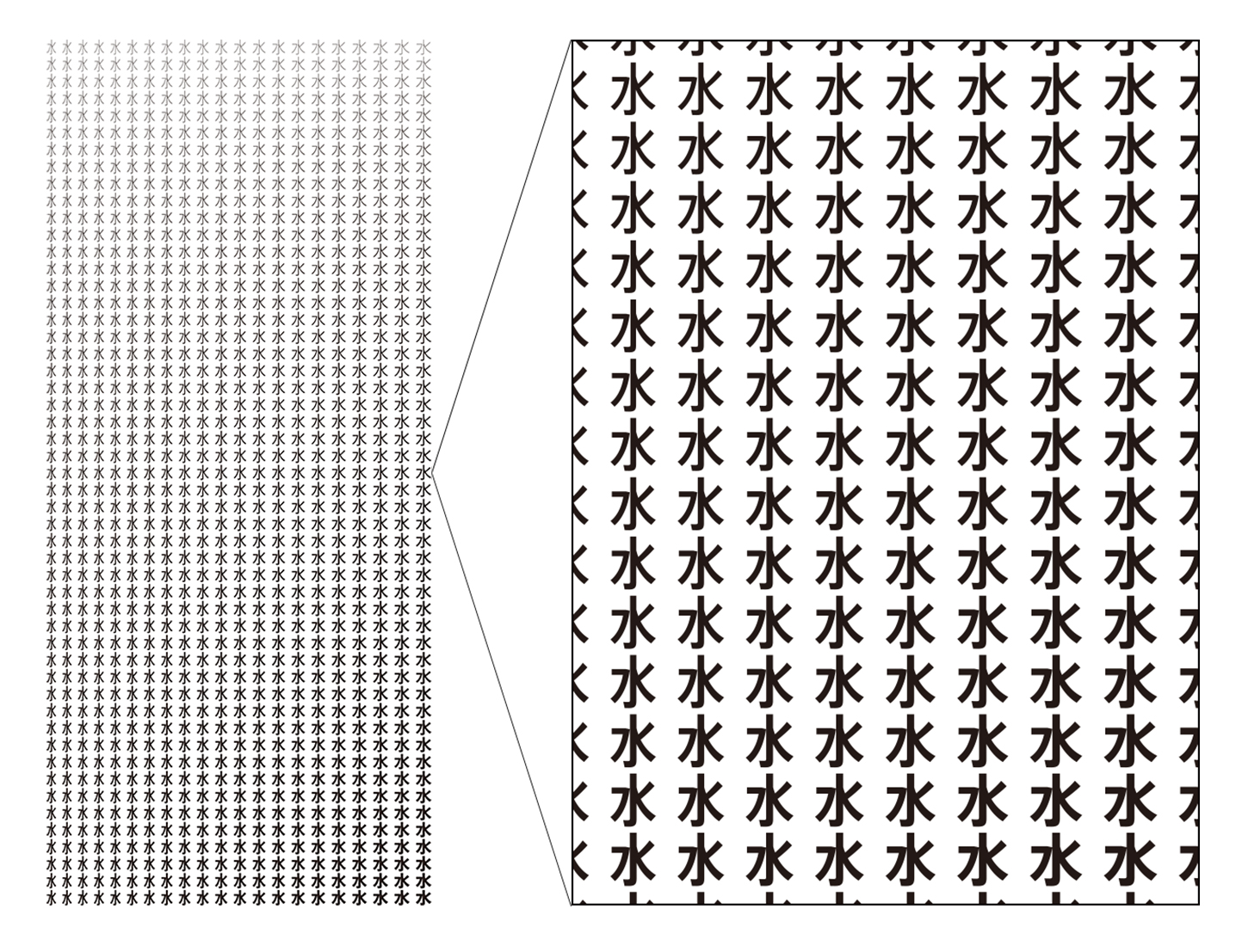
FitFont’s variations have AXIS Font at their core
The diagram depicts all of AXIS FitFont’s variations arranged in a matrix. The vertical axis indicates weight (51 levels), while the horizontal axis indicates width (21 levels). This technology, which allows the user to alter a typeface while retaining the design, is one of Type Project’s strengths.
The fruit borne from the “trunk” that is AXIS Font
“BUBUKI/BURANKI is really an excellent example of this. Without me even noticing it, the typeface came to accommodate a range far beyond what I had originally intended. I think this is one of the things that’s great about working with this technology. I realized that by bringing the classical forms of the letters together with the technology, it was still possible to achieve such things when attempting to create a really new look.” In this way, FitFont continues to broaden the “main trunk” of Type Project that is AXIS Font, and to grow many branches from that “trunk” and bear all manner of fruit.
Photo by Mitsuru Hirota