


Transform values, arrange environments, support culture, and be rooted in everyday life.
The shape of Type Project’s aspirations.
From the creation of a magazine-dedicated font for the design publication AXIS Magazine, to the production of FitFont with freely combinable weight and contrast options, to its offerings for the City Font Project and of a range of font experimentation tools, Type Project aims to continue with its original approach to development.
Type that adapts to and supports everyday lifestyles and environments
Giving shape to urbanness – City Fonts
Type Project is engaged in an initiative to create “City Fonts” that are closely connected to everyday life and culture. In contrast to both AXIS Font and TP Mincho, which embody Type Project’s characteristic neutralness and visual approachability, the City Font undertaking is a development that may be thought of as antithetical to such neutralness. Accordingly, as both Nagoya’s “Kinshachi Font” and Yokohama’s “Hama Mincho” appear to be antitheses of that neutralness, we asked Suzuki if there is anything these very different projects have in common.
“I think of them as being two pillars. One is text-use fonts, meaning fonts that have high functionality for use in main body text situations, while the other is display-use fonts, which possess qualities of being entertaining and idiosyncratic that make them desirable for headlines and the like. They’re pillars that have very different orientations – you can’t make a text font if your focus is on displays, and you can’t create a display font if you are focusing on main body text. But legibility isn’t always the only thing that is important. If you look at Edo-moji character styles, for example, the variety is really astonishing. They aren’t made just for the variety, though. Sumo wrestling has rankings lists, and that’s why we have sumo-moji; and yose comedy acts use mekuri signboards, so we have yose-moji. The existence of kabuki plays created the need for kabuki-moji.* Similarly, I think that in the background of every display font, there were probably specific conditions that gave rise to it.” The look of type characters that are as they should be, suited to that place, to that city. Through type, the City Font project is giving shape to the atmosphere of the city.
On the task of popularizing City Fonts
Suzuki says that one of his ultimate objectives with City Fonts is that each of them be a typeface that becomes part of its locality and everyday life. “With City Fonts, the hope is that they get incorporated into their localities as much as possible. I have high expectations that the City Fonts will have the effect of communicating my fascination with the characters. So, for example, when people come to Nagoya and see Kinshachi Font, I hope they’ll think, Ahh, I’m really in Nagoya.”
Although various requests have been made for locally-oriented fonts, it seems they rarely get past the request stage. “We’ve received a variety of requests, including some from local companies. As it’s highly unlikely that members of the general public will be buying fonts anytime soon, the hope is that City Fonts will be used by city government institutions. But with their budgetary considerations and municipal assembly decisions and the like, it’s even harder time with them than with big corporations. And another thing that makes realizing City Fonts difficult is the fact that city administrations change every few years. It takes several years to make an original typeface, so even if the current leader says it’s good and they set aside the budget for it that year, if the next leader comes in and pulls the plug, it’s all over.”
However, Suzuki points out that the City Font for Yokohama, “Hama Mincho”, showed that it is possible to realize this idea and help people become more aware of fonts in everyday life through crowdfunding – gaining the participation of members of the general public in the form of financial support – and through their becoming attached to the font and nurturing it together. “I think that expressing urbanness in a type is a wonderful thing, and I really feel that this is something that raises the value of the city itself, just like what Johnston did in London.” Raising the value of a town and changing its environment – with type. Little by little, this project is taking shape.
Nagoya: “Kinshachi Font”
A City Font created to evoke the city of Nagoya, and as an attempt at nurturing a local font in the local community and broadcasting it to the world. In its design, the font refers in the starting point of a stroke, to the arc of the kinshachi – the motif of the mythical golden tiger-headed carp that famously adorns the roof of Nagoya Castle – and in the stroke’s end part, to the curvature of the castle’s gables and roofs. Done in a lively calligraphic style with a brush technique, this font incorporates the Maru-Hachi mark, the long-cherished official symbol of the city of Nagoya.
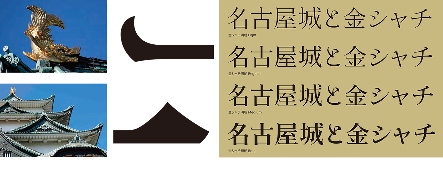
Left: By incorporating Nagoya’s beloved kinshachi and the gables of Nagoya Castle into the design of stroke start- and end-points, a playful-feeling font was created that is more ornamental than customary Mincho typefaces.
Right: The somewhat forceful expressiveness brings out a regionality that echoes the strongly flavored, local culinary specialties of Nagoya meshi.
Yokohama: “Hama Mincho”
A font designed on the basis of impressions of Yokohama gained through fieldwork and a sampling of key phrases from over 2000 comments, which were collected in a branding program held with participation from Yokohama citizens on the occasion of the 150th anniversary of the opening of the city’s port. The horizontal strokes evoke the Hikawa Maru, Yokohama’s celebrated ocean liner, while the vertical strokes represent the city’s tall buildings seen from the ocean. On carrying out crowdfunding so as to bring the font to completion, ¥3,955,000 in contributions were received in response to the stated goal of ¥3,000,000.
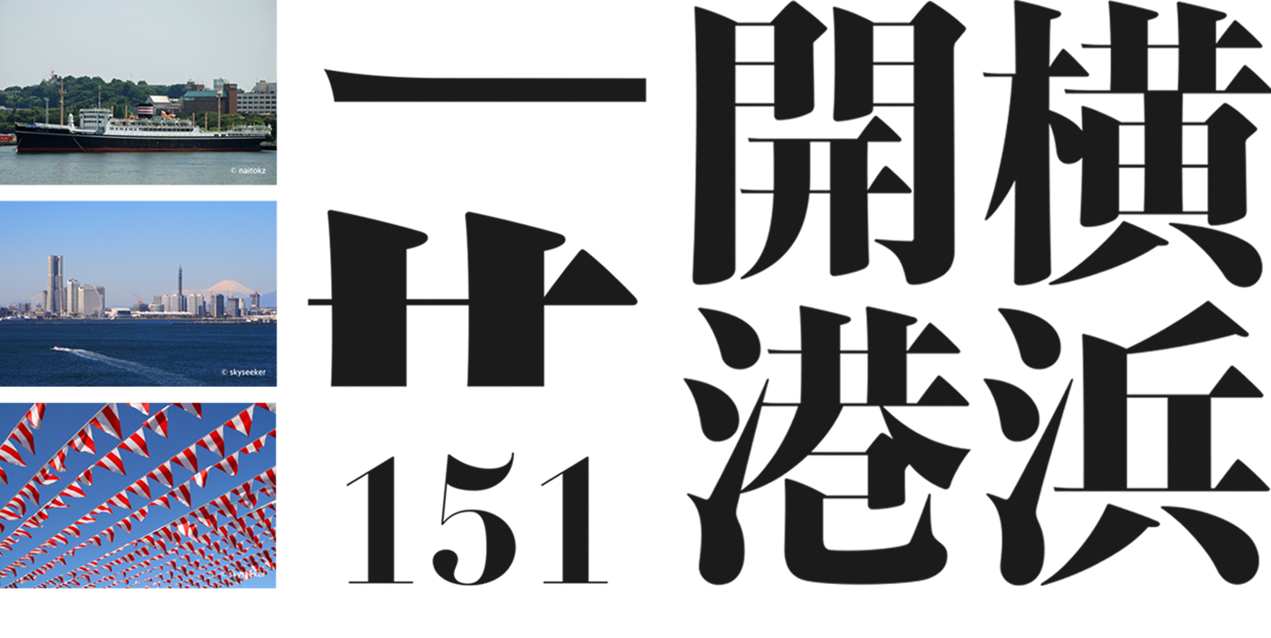
Narrow horizontal strokes that evoke the ferries that travel to and fro across the harbor (top), and a composition based on wide vertical strokes representing the city’s tall buildings (middle). The Latin font emphasizes horizontal-to-vertical contrast, and in its details incorporates imagery of wind-flapped flags and anchors (bottom).
)
Tokyo: “Tokyo CityFont”
A trial-production font that was created and submitted in response to a request from the graphic designer Yoshiaki Irobe. Based on digital sign system fonts that were already in development at the time, this font was treated as an exclusive communication tool for the city, one that would strengthen Tokyo’s identity with the concept of a “refinement/stylishness” inking today’s Tokyo to old Edo.
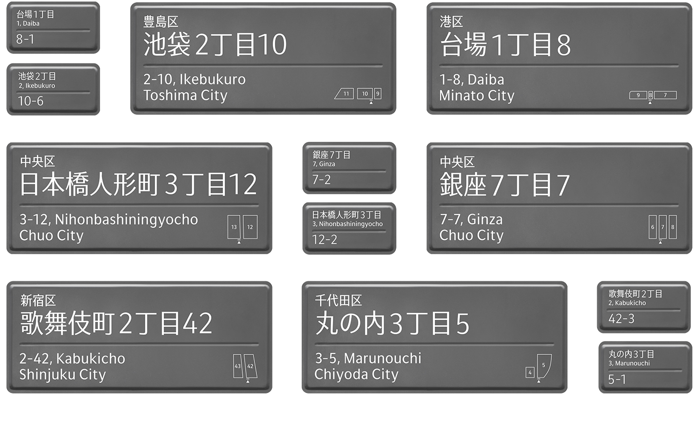
By referring to the city’s unique history and culture and adding the function of accessibility, to bring to mind the traditions of old Edo in today’s Tokyo.
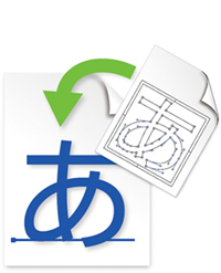
“Drop&Type” – a font trial production tool
In 2016, Type Project released for sale to the general public a tool called “Drop&Type”, which it had been using internally for the trial production of fonts. This tool generates a font from the outline data of characters that have been traced using Adobe Illustrator, allowing for up to 280 characters to be converted into the font at a time. “It would be nice if we could get more people to use this kind of tool, first of all to try out making fonts, and then to gain the knowledge that type can be a tool for demonstrating identity.” Drop&Type is a means, and even an environment, through which people can get a sense of fonts as more familiar aspects of their lives. And this is a path that connects with the dream to realize City Fonts.
Originally made by Type Project for internal use to create trial-production fonts, this tool arranges Illustrator path data on a dedicated drop sheet, and can generate font files with a simple drop. Perfect for making fonts with ease, even without technical font-production knowledge.
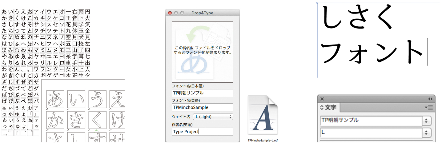
Left: With Drop&Type, a template called a “drop sheet” is prepared. Using Adobe Illustrator’s Live Trace, the outlines of characters sampled from scanned images are arranged onto it.
Center: Start up Drop&Type, and input the font name and designer name. Once you have selected the appropriate weight, drop the previously made drop sheet. Conversion will begin, and a font file will be output.
Right: Once the created font has been installed, it can be used right away. You’ll want to try it out with handwritten characters first.
Type Project’s goal
Though many people tend to shy away when it comes to the subject of fonts, everyone is constantly writing and reading characters, and they’re an essential part of everyday life. That is why they have the potential to change many values and environments – which would be the case even if there were only one way of thinking about characters, and one way of making them. Type Project’s approach to type characters and fonts is making closer connections between type and people, and helping to realize comfortable spaces. And within this approach, there lies the unwavering conviction and earnest wish to endeavor to make society a better place through type.
Photo by Mitsuru Hirota