%20--%3e%3cpolygon%20points='24.7%201%200%201%200%207.6%208.5%207.6%208.5%2039.4%2016.1%2039.4%2016.1%207.6%2024.7%207.6%2024.7%201'/%3e%3cpath%20d='M34.1,32.4l-4.9-22.7h-7.9l9.1,33.1c-.4,1.7-1.1,2.9-3.7,2.9h-2.6l1.9,6.6h1.5c4,0,8-1.2,10.3-9.2,1.8-6.4,8.9-33.3,8.9-33.3h-8l-4.6,22.7Z'/%3e%3cpath%20d='M91.7,8.7c-8.7,0-12.7,6.5-12.7,16.1s3.6,15.3,13.8,15.3,7.2-.9,9-1.6l-1.2-6c-2.4.8-4.9,1.2-7,1.2-4.3,0-7-2-7.2-7.3h16v-4.8c0-7.5-2.9-13-10.7-13ZM86.5,21c0-3.3,1.7-6.4,4.7-6.4s4.1,2.7,4.1,6.4h-8.8Z'/%3e%3cpath%20d='M218,8.7c-8.7,0-12.7,6.5-12.7,16.1s3.6,15.3,13.8,15.3,7.2-.9,9-1.6l-1.2-6c-2.5.8-4.9,1.2-7,1.2-4.3,0-7-2-7.2-7.3h16v-4.8c0-7.5-2.9-13-10.7-13ZM212.9,21c0-3.3,1.7-6.4,4.7-6.4s4.1,2.7,4.1,6.4h-8.8Z'/%3e%3cpath%20d='M126,1h-10.7v38.4h7.6v-11.8h5c6,0,11.3-3.8,11.3-14.1s-5.5-12.5-13.1-12.5ZM125.9,20.9h-3.1V7.6h3c3.7,0,5.4,1.8,5.4,6.3s-1.5,7.1-5.3,7.1Z'/%3e%3cpath%20d='M150,12.9c-.2-1-.5-2.4-.8-3.2h-6.9c.5,1.9.7,4.6.7,7.9v21.8h7.4v-20.3c1.1-2.2,4.5-3,7.4-3v-6.8c-3.5,0-6.5,1.7-7.7,3.6Z'/%3e%3cpath%20d='M192.6,40.6c0,3.5-1.6,4-4.7,4h-1.5l1.9,6.6h2.3c6.3,0,9.3-3.2,9.3-9.8V9.7h-7.4v30.9Z'/%3e%3crect%20x='192.2'%20width='8.4'%20height='6.4'/%3e%3cpath%20d='M247.4,33.7c-4.8,0-6.6-2.8-6.6-9.6s1.9-8.9,6.2-8.9,3.4.4,4.9,1l1-6.4c-1.3-.5-3.7-.9-6.2-.9-10.6,0-13.4,6.7-13.4,15.9h0c0,10.7,4.6,15.3,12.4,15.3s5.9-.5,7.4-1l-.9-6.1c-2,.4-3.7.6-4.7.6Z'/%3e%3cpath%20d='M264.7,30.2v-14.2h5.4l1.4-5.8h-6.9V2.1l-7.3,1.9v26.8c0,5.3,2.4,9,8.2,9s4.9-.2,4.9-.2v-5.7h-2c-3,0-3.8-1.3-3.8-3.7Z'/%3e%3cpath%20d='M64.3,8.8c-3.3,0-5.8,1.6-7.3,3.4-.2-1.1-.5-2.1-.8-2.6h-6.6c.5,1.9.6,4.4.6,7.4v34.4h7.3v-13.8c1.5,1.5,3.8,2.4,6.2,2.4,8,0,11.2-6.6,11.2-16s-3.1-15.2-10.4-15.2ZM62.1,33.8c-1.6,0-3.1-.6-4.6-1.8-.3-1.6-.4-3.7-.4-6v-3.3c0-1.8.1-3.8.4-5.1,1.4-1.4,3-2.5,5-2.5,3.2,0,4.6,3.2,4.6,9s-.9,9.6-5,9.6Z'/%3e%3cpath%20d='M173.6,8.6c-9.5,0-13,6.7-13,15.7s3.5,16.1,13,16.1,13-6.8,13-16.2-3.3-15.7-13-15.7ZM173.6,34.2c-3.6,0-5.5-2.9-5.5-9.9s2.2-9.5,5.5-9.5,5.5,2.2,5.5,9.5-1.9,9.9-5.5,9.9Z'/%3e%3c/svg%3e)
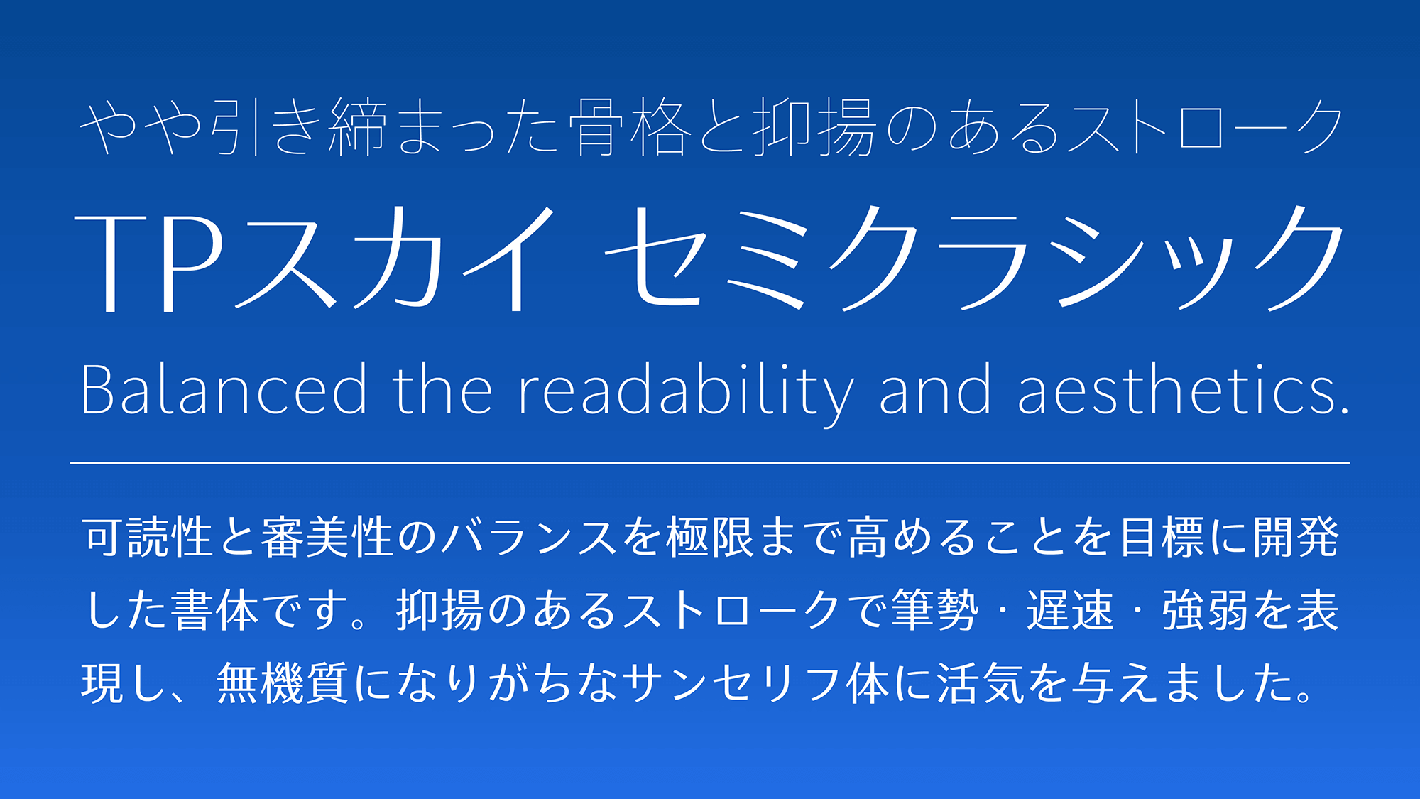
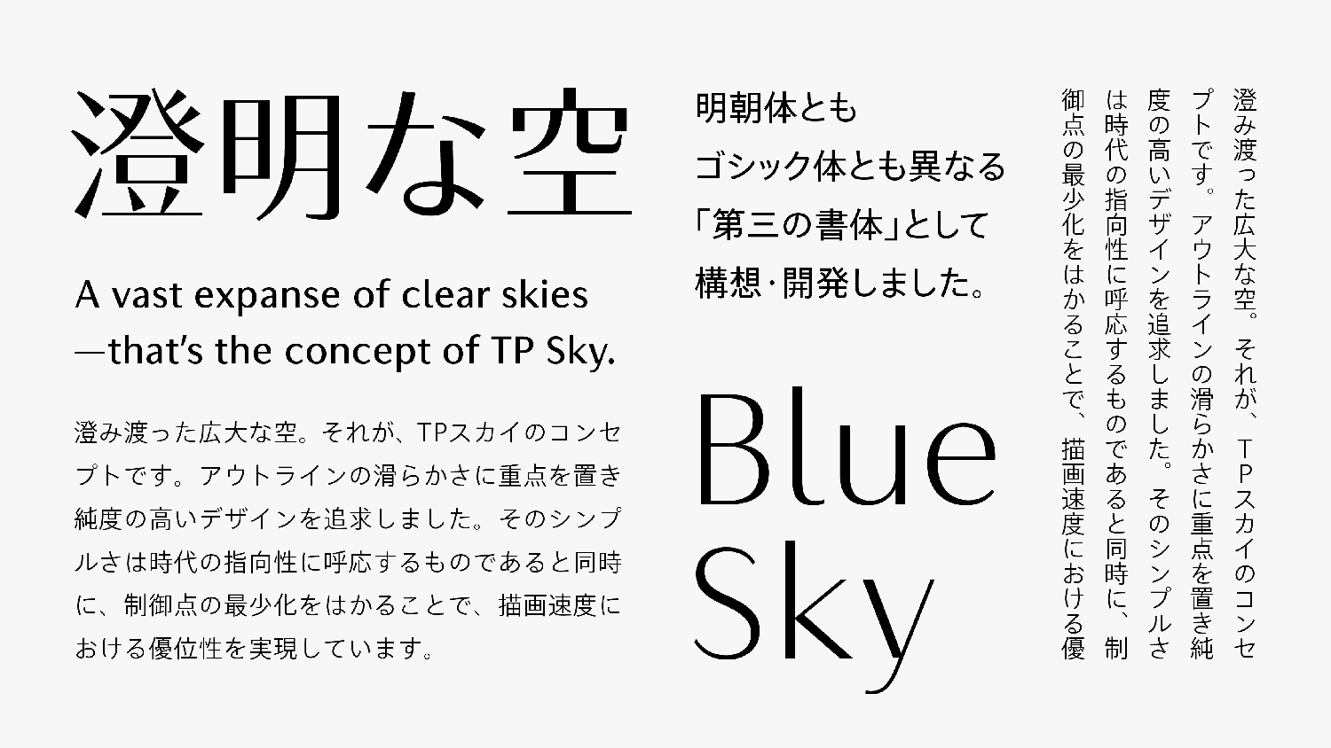
TP Sky SemiClassic is a series usable as a font for texts.It is a font family with high multiplicity that combines a relaxed atmosphere and familiarity while pursuing ease of reading. The brush strokes, speed, and intensity are expressed with the modulated strokes, providing liveliness in a sans-serif typeface that tends to appear inorganic.
Features

Lightening the amount of font data.
Based on the clear, bright design and concise outlines appropriate for screen display, the adjustment of the attributes of inside space between strokes is emphasized, with its influence on readability. The simple and smooth outline drawing of TP Sky brings a clear and bright air, and contributes significantly to lightening the amount of font data. Though it is based on the proper appearance of the block style from the first period of the Tang dynasty, the width of inside space between strokes is set as appropriate to screen display to achieve an even higher degree of multiplicity.
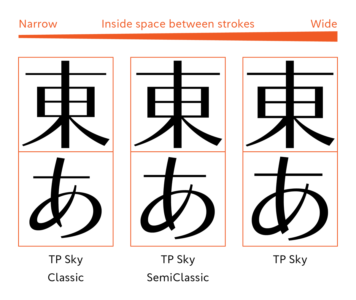
Tightened structure and modulated stroke.
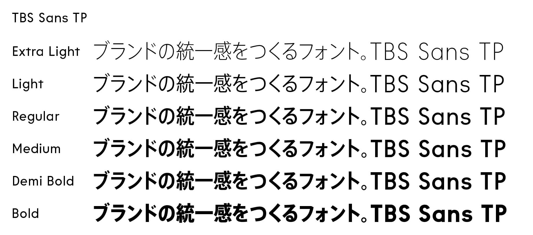
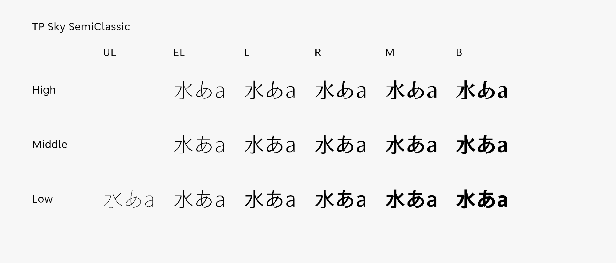
The excellent compatibility of the slightly tightened structure and modulated strokes are features of TP Sky SemiClassic. The width of inside space between strokes is set as appropriate to screen display to achieve an even higher degree of multiplicity. The brush modulation is marked by contrast attributes (high, middle, and low), and the characters are richly expressed. Keeping a classical image in its freshness, TP Sky SemiClassic is a series with the most balanced aesthetics and readability in the TP Sky family. Six weights with the addition of an extremely thin weight UL (Ultra Light) are provided for Low Contrast. The appropriate font for each purpose can be selected for use.
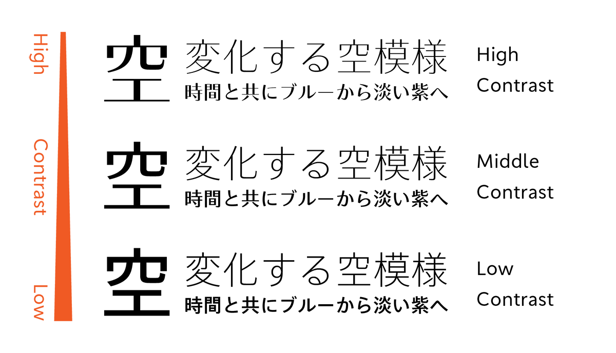
Variation and effect by three contrasts.
High Contrast with a sharp impression is effective in usages in which messages are desired to be given a stronger impression, such as titles, catch phrases, etc. With a nuance similar to a Mincho typeface, it has a compact clarity that is unique. When handling the large characters in usage, EL (Extra Light) and L (Light) in particular give a vivid impression.Middle Contrast is highly effective in titles and logotypes, in addition to use in text. Low Contrast, which can perform well in a variety of uses, has the highest displayability of texts. It also has high readability at the time of use in small sizes, such as in captions.
- WHITE MODE
- BLACK MODE
- ALow
- AMiddle
- AHigh
Family・Specification
Font set
Standard(StdN)
9,499 characters (Adobe-Japan1-3)
Buy
TP Connect
Subscription service that enables
the use of all of Type Project fonts.
TP Connect is only available in Japanese.