2016.12/24
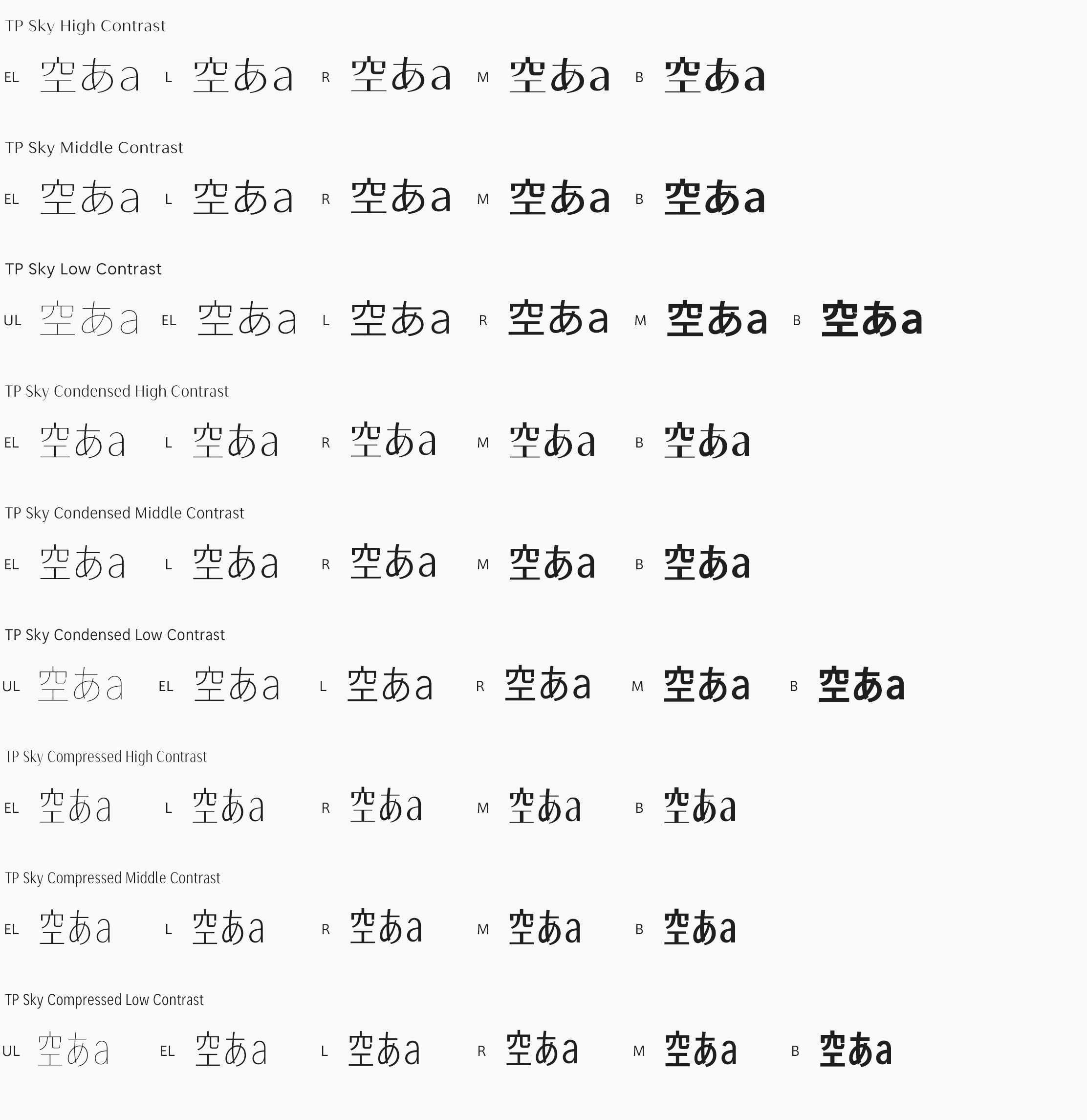
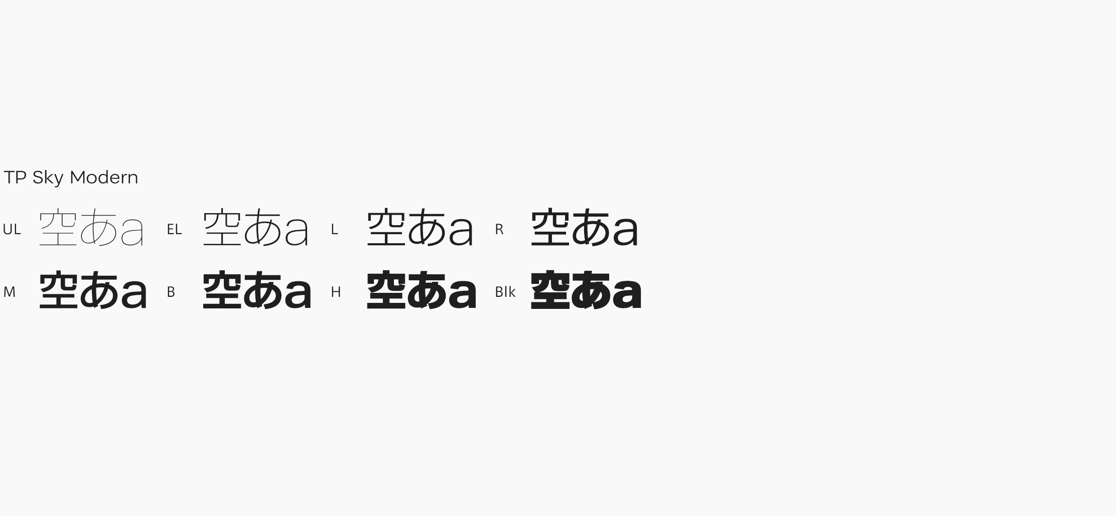
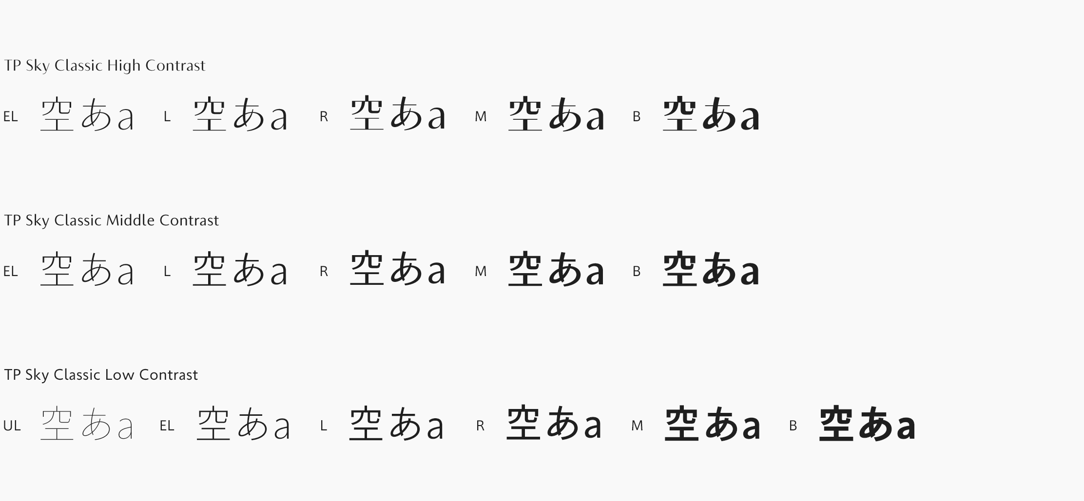
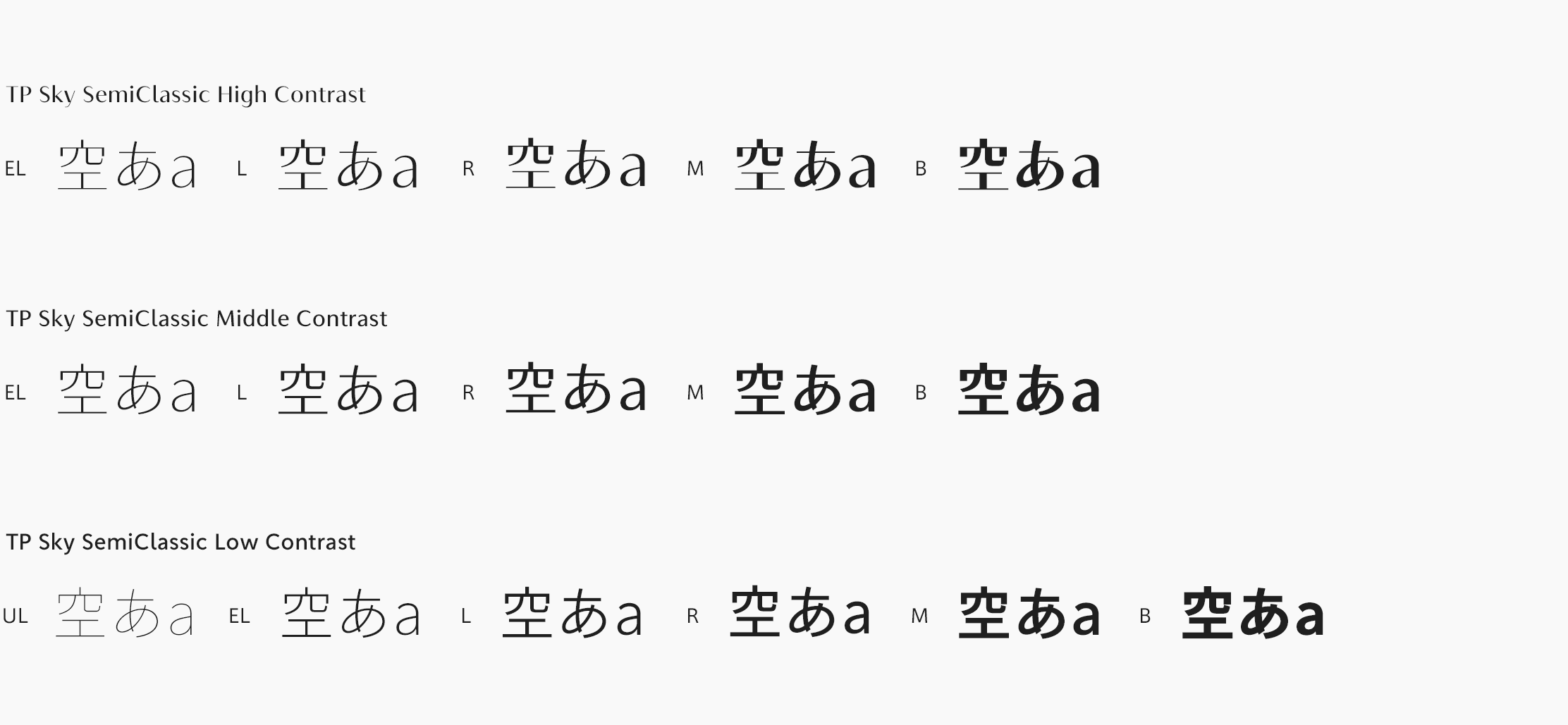
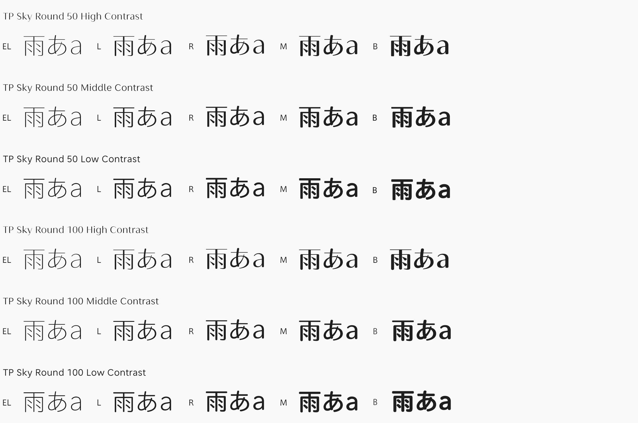
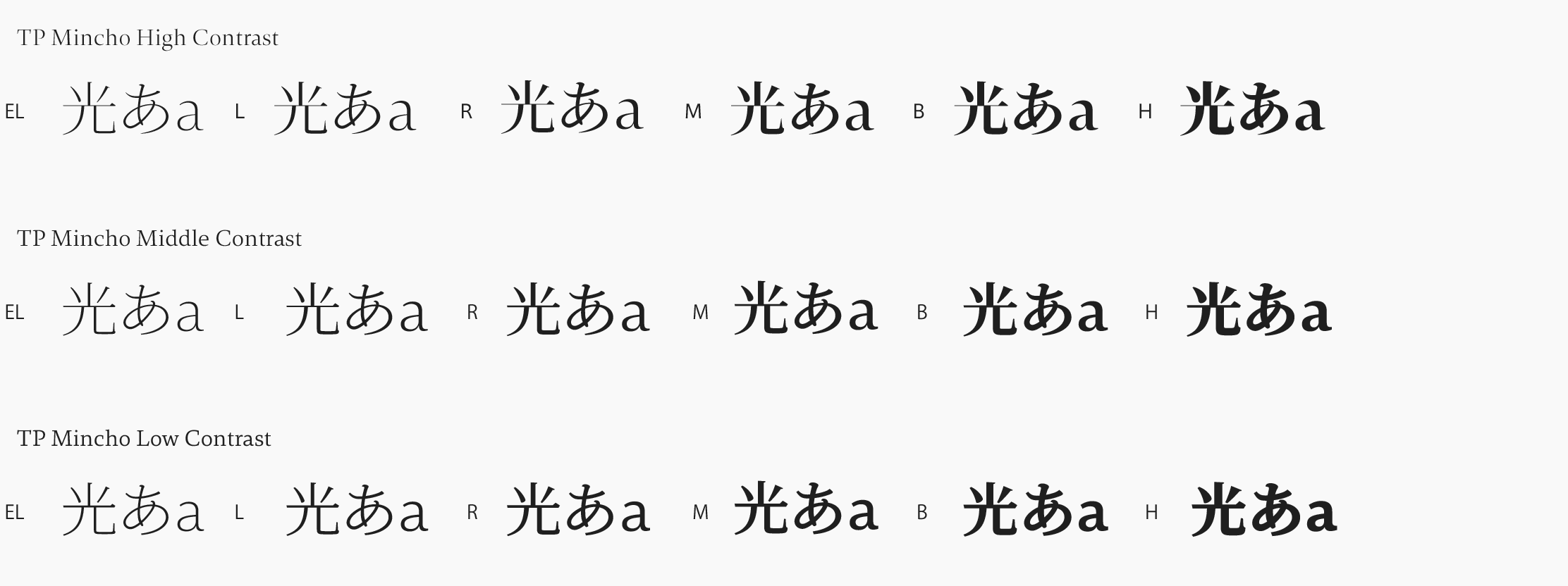
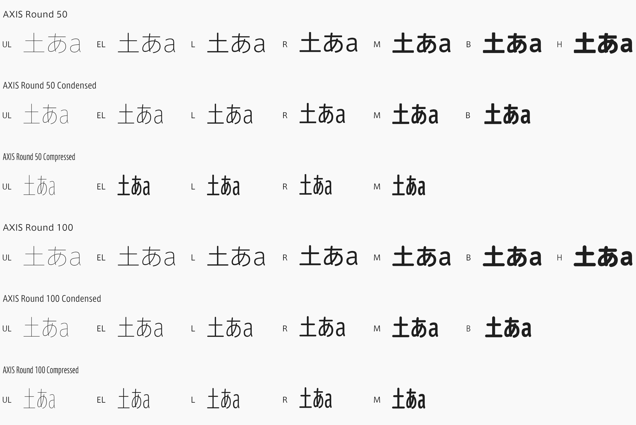
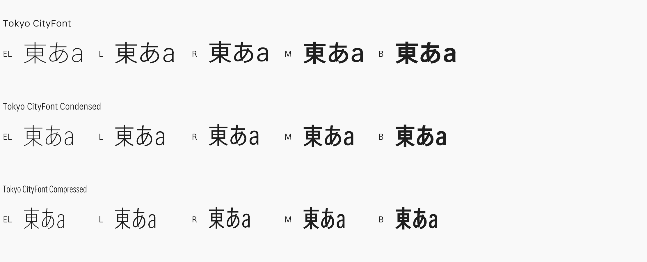
From the creation of a magazine-dedicated font for the design publication AXIS Magazine, to the production of FitFont with freely combinable weight and contrast options, to its offerings for the City Font Project and of a range of font experimentation tools, Type Project aims to continue with its original approach to development.
Type that raises the value of objects and of people (1)
Type Project continues to transcend the conventional framework of the font maker
Starting with the typeface “AXIS Font”, which was created exclusively for the design publication AXIS Magazine, and then developing other one-of-a-kind productions, such as the local, everyday-life-rooted “City Font Project”, with its expressions of cultural background and dialect, and the “FitFont” service, which has made it possible to accommodate diverse needs with customized weights and contrasts, Type Project has continued to take on ever more challenging endeavors. While not as prolific in terms of font production as other makers, Type Project has been creating type characters that are steadily and surely spreading to the world. For the first installment of this series, we asked director Isao Suzuki to look back on his career, and to share with us Type Project’s way of thinking about fonts and their place in society, and the direction he envisions as font maker.
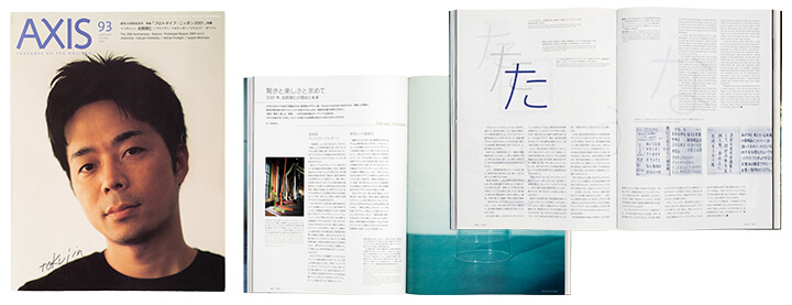
The October 2001 issue of AXIS, in which AXIS Font first appeared. An article on the circumstances of AXIS Font’s development was featured as well.
Before Type Project
Type Project continues to engage in unique projects that distinguish it from other font makers. What were the circumstances that led to Type Project’s founding? “I wasn’t particularly interested in typefaces when I was a child, actually. There were all sorts of influences from different fields that fed my growth during the ’70s and ’80s, including manga, animation and tokusatsu sci-fi dramas. I always wanted to be a manga artist.”
Suzuki attended Aichi Prefectural University of Fine Arts and Music, and became aware of the attraction of kanji characters as a medium, and as design. “Though I certainly didn’t make my choice of university with the idea of making typefaces in mind, in my junior year I met exchange students from China, and became aware of kanji as being a medium – I started seeing them as design. I became completely obsessed with various fascinating aspects of kanji, such as their origins, their basic structural principles, and the system of radicals. But I realized that that wasn’t going to be of any use to me when it came to getting a job, and it was just when I was starting to worry about what I would do with myself after graduating that I met Masahiko Kozuka, pioneering Japanese type designer, who had come to the university as a part-time lecturer. After that, I joined Adobe Systems, and that’s how I got my start in the typeface-designing profession.”
After working as a type designer at Adobe Systems for seven years, what was it that led you to found Type Project? “I had several reasons for doing it, but one of the main things that inspired me was at the Association Typographique Internationale event held in England in 1997, when I heard the type designer Jean François Porchez talk about making a new, exclusive font for Le Monde newspapers. I wondered then if there was anything in Japan that echoed the work done by Porchez, and I looked into the matter. I found that there were examples of large newspaper companies and publishing houses that had their own fonts in metal type, but almost none of them had digital fonts. When I learned that, I just knew I had to make exclusive fonts for specific media. And then I founded Type Project.”
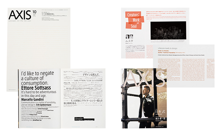
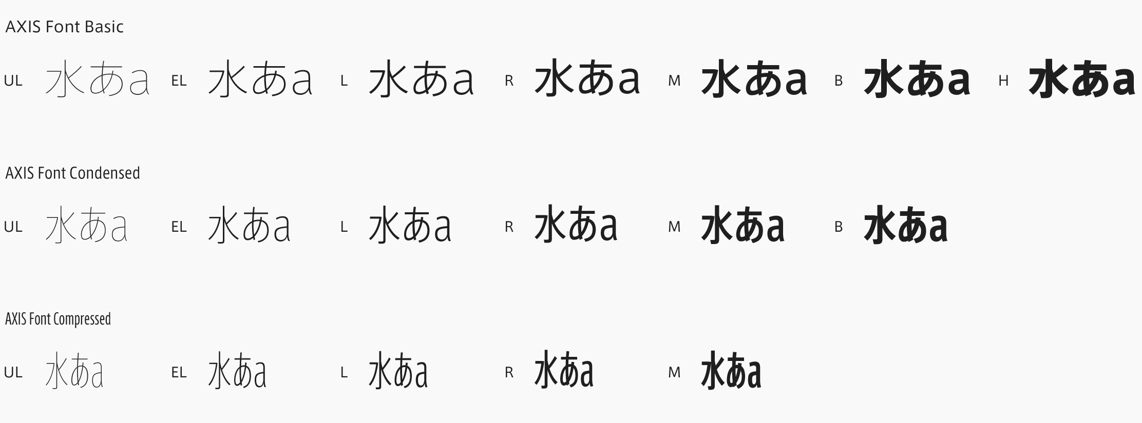
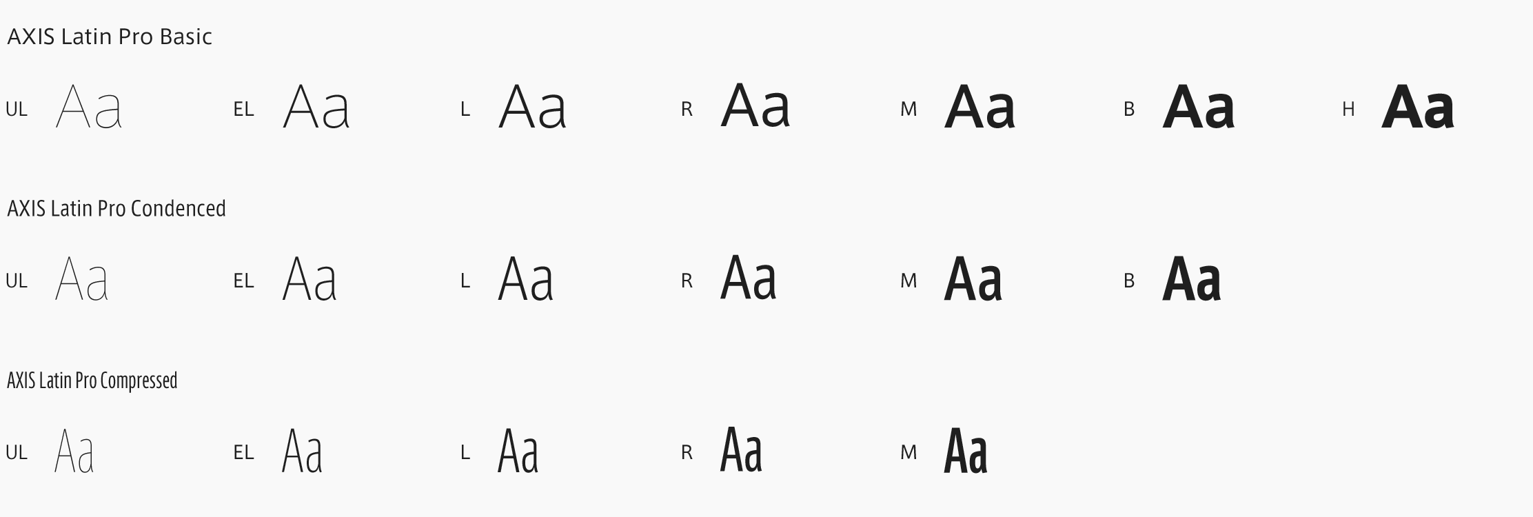
Left: AXIS Font Condensed and AXIS Font Compressed were adopted from AXIS’s October 2006 issue onward, exactly five years after the first appearance of AXIS Font.
Right: From the August 2016 issue of AXIS. Even today, fifteen years after its release, AXIS Font Basic continues to be used for the magazine’s main text, while both Condensed and Compressed make frequent appearances in cover and article titles. Suzuki says that AXIS Latin Pro has made it easier to work with italics and the like in English text.
The birth and development of AXIS Font
After the event in 1997, Suzuki focused his energies on the creation of a media-exclusive font, which he then brought to the design publication AXIS Magazine. “The first prototype I made was different from today’s AXIS Font. It was already a sans-serif with an exclusively horizontal layout, but it was something that felt a bit forced for a Japanese font and seemed to take over the baseline system. But the very idea of exclusive fonts alone generated a lot of excitement. And then, when I brought in my second prototype, which wasn’t really that different from today’s AXIS Font, the response was quite good, so I pushed forward with creation to complete it in time for AXIS Magazine’s twentieth anniversary.”
Suzuki explains his choice of AXIS for his proposal of a new font: “When I looked into what media-exclusive fonts were in use in Japan, I found that it was something that only large newspaper companies and publishing houses tended to spend money on. There were almost no reports of their being adopted by magazines or the like. There were many magazines to choose from, but the only one I felt would be interested in an exclusive font was AXIS. Having made a thorough study of AXIS Magazine, from the latest edition all the way back to its early issues, Suzuki considered ‘neutral font’ and ‘airy font’ as keywords for this project.
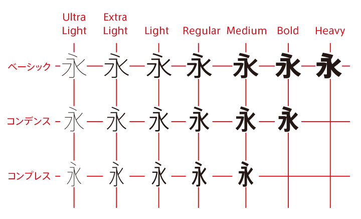
Where it all began –AXIS Font – and the evolution to Condensed and Compressed.
Type Project’s starting point, and what may also be termed its “main trunk”, is the Japanese sans-serif typeface “AXIS Font”. According to Suzuki, while Basic was released in 2001, followed by Condensed in 2007 and Compressed in 2009, the plan from the early stages was to create a weight-plus-width typeface, and to later expand that even further with FitFont.
Moreover, he explains, at that time, he already had a plan in mind for AXIS Font that would connect to its current lineup. “In addition to developing different weights, from the time of the first prototype, I had the plan to make the character width variations of Basic, Condensed and Compressed. With the meaning of the word ‘axis’ in mind, I had the idea of making a Japanese font that had more than one axis.”

