2020.07/01
Realizing Regional-ness in Typefaces
Cities have their foundation in the native cultures and histories they possess. In much the same way, nurtured by their native cultures, written characters have carved out unique histories since time immemorial. Today, in cities throughout the world, diverse measures are being undertaken to address the issue of branding. In Rome and Seoul, for instance, new production projects are underway to develop typefaces for use in urban guidance signage, websites, tourism posters and other promotional materials. By employing designs that both possess formal beauty and functionality and reflect the local character, city branding programs are becoming increasingly effective.
Type Project is envisioning the City Font Project as an attempt to incorporate the distinctiveness and charm possessed by Japan’s cities into the design of typefaces, each of which will embody the ‘urbanness’ of its city. To reflect the uniqueness of a city in the shape of its lettering, and make that into a typeface – This is the first stage of the City Font Project plan. So that written characters born in a city will be used and nurtured by that city, eventually becoming part of the local landscape. This is the vision the City Font Project seeks to realize.
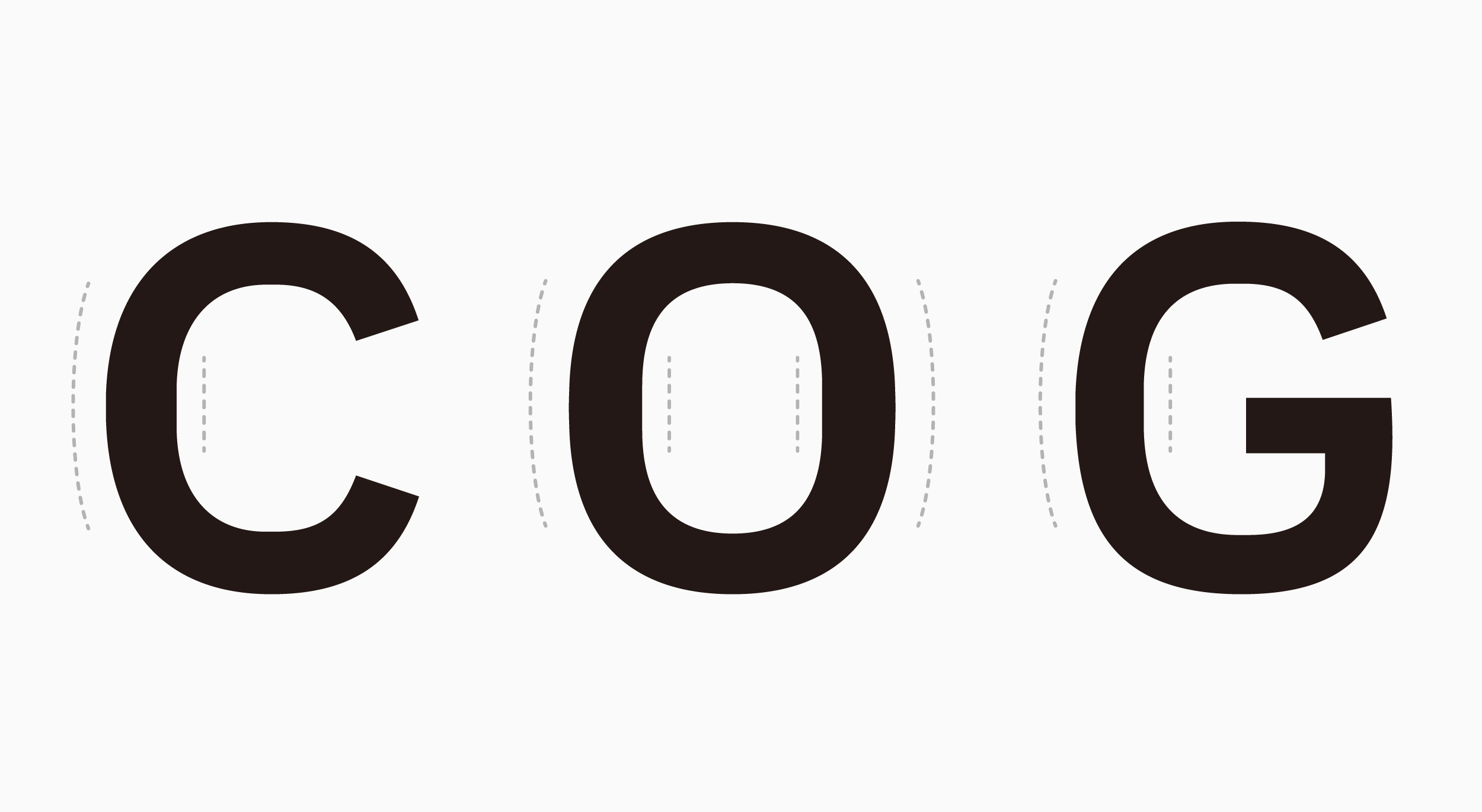
At Type Project, we engage in typeface design based on the following three central concepts: the ‘regionality’ that brings out the distinctive traits of a city, the ‘consistency’ that gives form to the identity of a city, and the ‘publicness’ that increases a city’s value. By actively infusing aspects that are unique to a given locality, such as dialect, scenery and customs, we create typefaces that give voice to that place, and for which people can develop a sense of affection. Local residents and the region they inhabit can be brought closer together in this way, thereby promoting their coalescing as a city; and the sense of easygoing publicness that arises then in turn increases the value of the city itself. City fonts not only contribute to the integrity of urban development campaigns and cityscapes, they also act as tools for fostering a sense of identity and unity among the citizenry.
The development of a city font and the application of it in urban architecture and spaces, and signage, catalogs, business cards and all manner of other media give consistency to the overall image of the city. Not only does this increase convenience for local residents, it contributes to making deeper impressions on visitors and to improving the long-term value of the city.
Type Project’s City Font
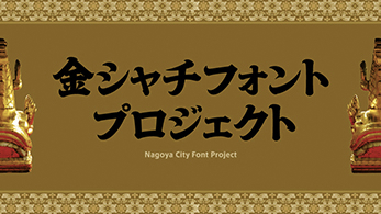 Kinshachi Font
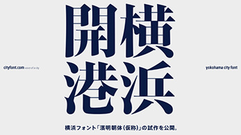 Hama Mincho
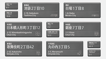 Tokyo CityFont
Kinshachi Font
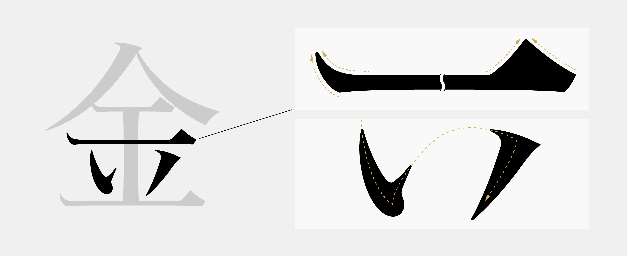
Kinshachi Font is a Mincho typeface in which symbols of Nagoya culture are incorporated, such as the curved form of the shachihoko tiger-headed carp in the starting point of a stroke, reflecting the shape of the curved gables of the castle in the uroko (fish scale: the triangular shape at the end part of a horizontal stroke) of the kanji character. While in most typical Mincho typeface elements such as the triangles of the “uroko” are composed out of straight lines, the end of a horizontal stroke in Kinshachi Font features the shape of the curved gables and roofs of Nagoya Castle. In this manner, by curving the “uroko” at both the start and end of a horizontal stroke, a unique rhythm and expression are given to this typeface. The prototype of Kinshachi Font was introduced in 2010, the year marking 400 years since the founding of the city of Nagoya as a seat of government, and released the Kinshachi Font Hime in March 2020. Currently, we are working on Kinshachi Font Tono.
Unique expression methods include making a combination of the ending of words with “myaa and ryaa” that are characteristics of Nagoya dialect, in unbroken ligatures. Applying everyday usage of unbroken line text (renmentai) from the Heian period up to the Edo period (mid-1800s) in the dialect is a role special to City Font.
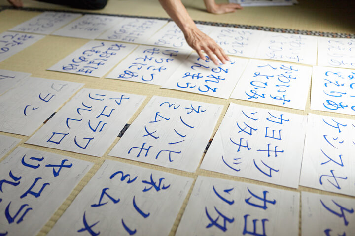
We have drawn the words of “Nagoya dialect karuta” as a live event at Kinshachi Font Project exhibition held in Nagoya in 2010.
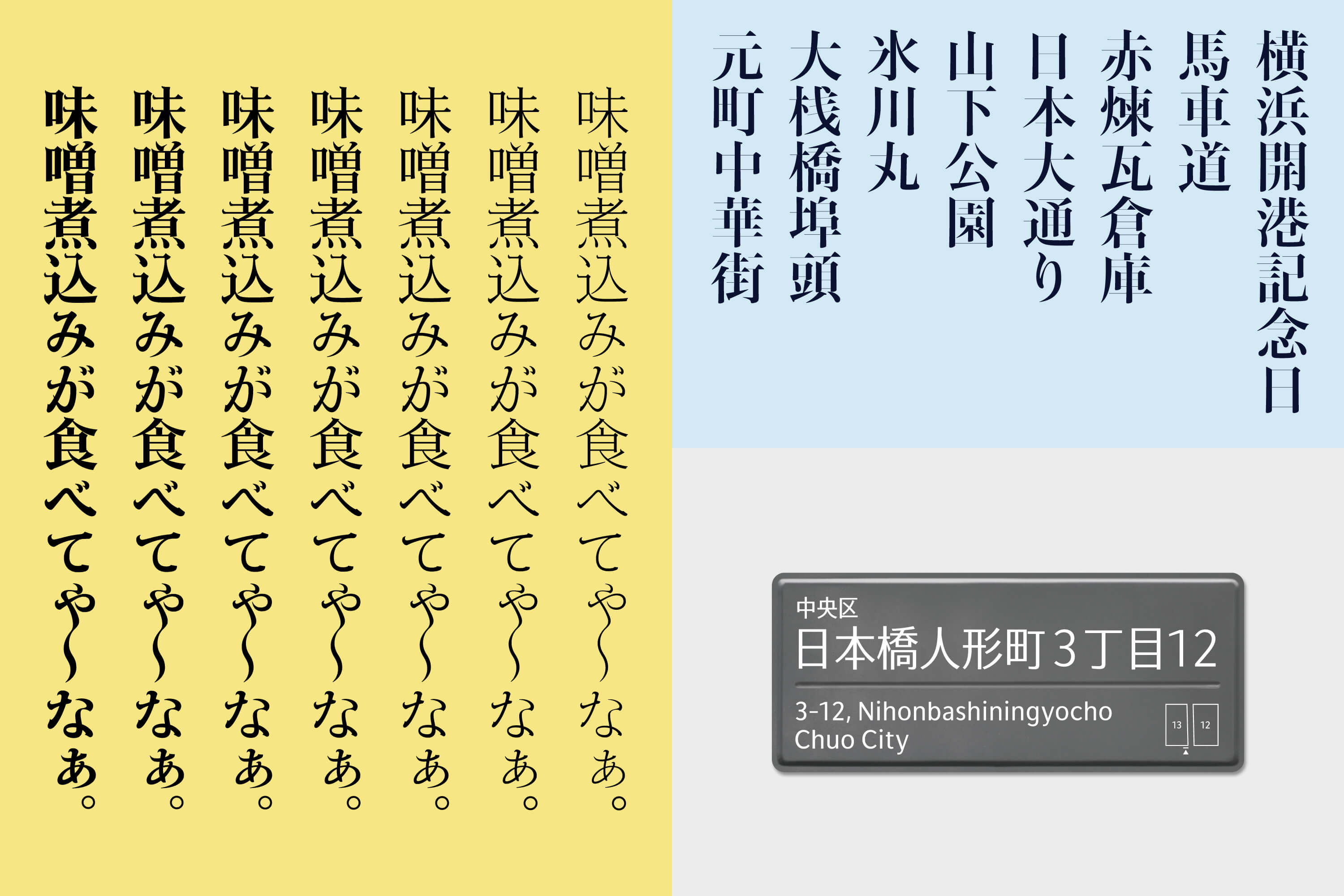
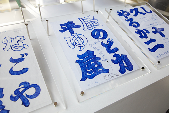
Hama Mincho
Hama Mincho’s (Hama refers to Yokohama and means ‘beach’) design incorporates the scale and distinctive character of the city of Yokohama, and for styles that accentuate vertical/horizontal stroke contrasts. This evokes in its horizontals the ferries that traverse the harbor and in its verticals the city’s tall buildings seen from the ocean. Hama Mincho is created with the aim of expressing the city of Yokohama’s broadmindedness and openness to adopting new things. Thickness variations have been included while maintaining design consistency, so as to enable use for titles and headings, and to accommodate main text and footnote situations as well. It released in July 2017 as a family series, with the four categories of Caption, Text, Headline and Display, each of which is available in six weights.
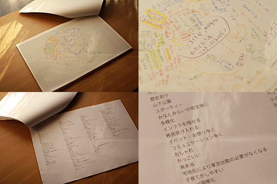
When the project was launched in 2009, we have chosen the following key phrases: ‘A stylish town’, ‘A port alongside history’, and ‘Coexistence of tradition and new things’, on the basis of impressions of Yokohama that were gained through fieldwork, and more than 2000 phrases that were collected from local residents in a branding program held on the occasion of the 150th anniversary of the opening of the city’s port. In 2016, we achieved 131% of our target at the crowdfunding event at FAAVO Yokohama. Thanks to the support of many people, including designers based in Yokohama, artists from Yokohama, and local manufacturers and stores.
The designer talked about the Hama Mincho, which inspired by Yokohama at the time of the 150th anniversary of Yokohama port, at Hammer-head Studio Exhibition in 2014.
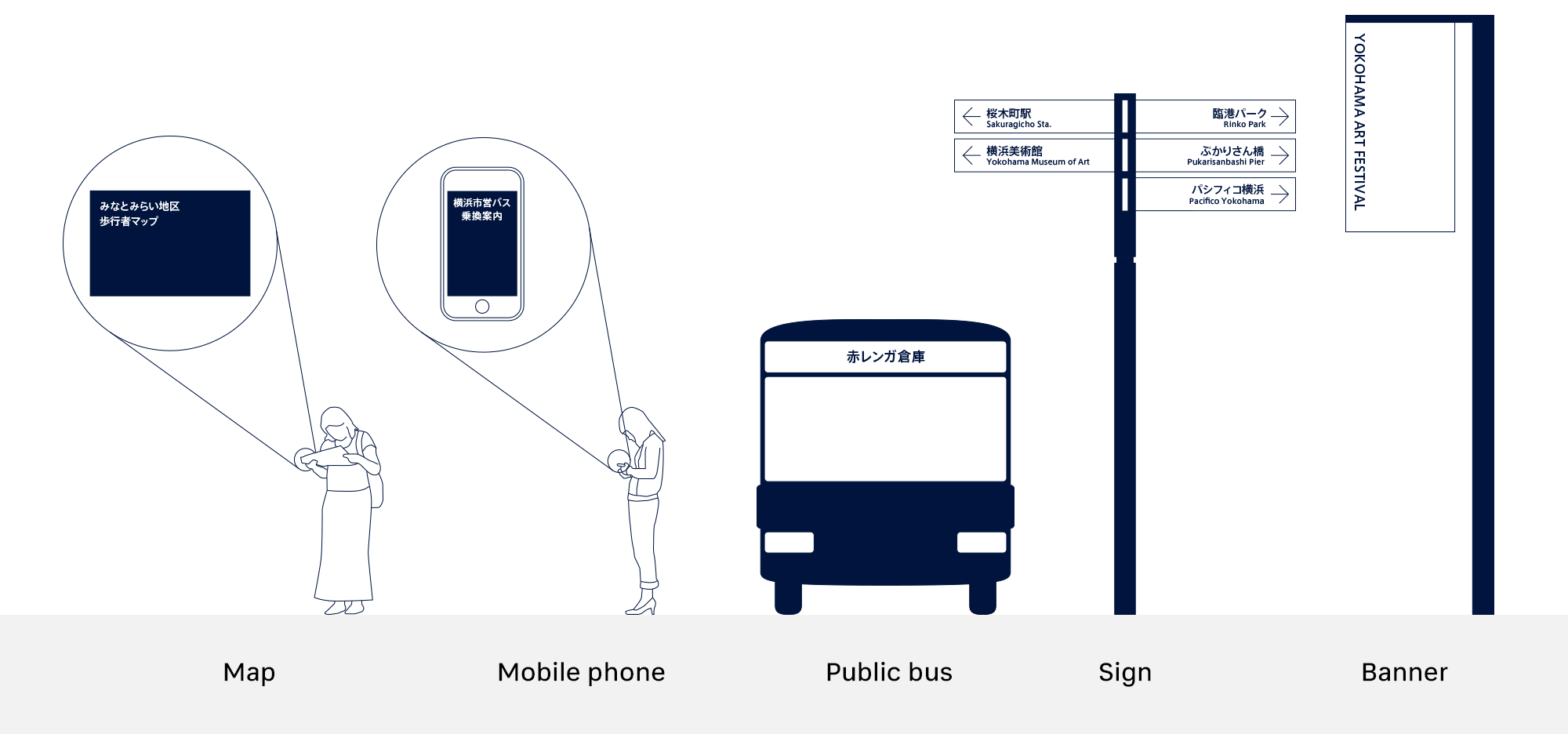
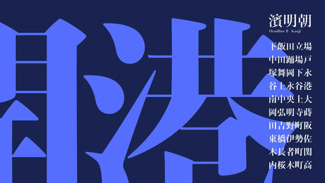
Tokyo CityFont
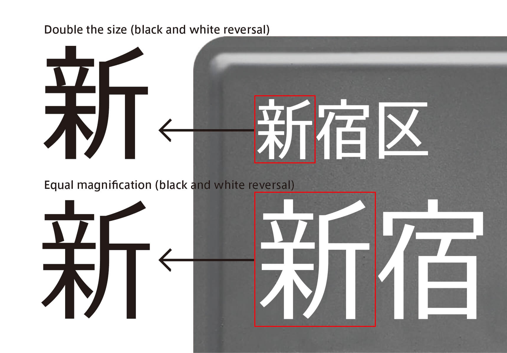
Tokyo CityFont is a font family appropriate for digital signage, information display for public transport, etc., increasing in city spaces. The central issues were differentiation from a long distance, and stability of display quality. TP Sky Low Contrast is adopted for the Japanese part of Tokyo CityFont, and Latin is newly developed. The newly developed Latin has linear style for inside and rounded style for outside; it is designed in consideration of compatibility with buildings in Tokyo. We have released the Tokyo CityFont in May 2020.
Prior to the release, in 2015, TP Sky, which we had been developing ahead of Tokyo City Font, was customized for the demonstration design of town block indicator plates proposed by the Japan Design Center, and announced as two prototypes of Tokyo City Font, Small (top) and Large (bottom). The prototype was designed started with an elegant, slender, and modulated style a narrow typeface of 90%. For small characters, which have weak-looking stroke lines, the specification of the Tokyo CityFont to be used for ward names has been set approximately 15% wider.
After that, Latin was developed with simple and solid design, emphasizing visibility. Furthermore, variations of Basic, Condensed, and Compressed were added to expand the family. Tokyo CityFont was designed with visibility as a basis throughout the entire family, and has a natural flavor of simple and highly stable design. Making an attempt to harmonize its soft external shape and solid internal shape, Latin has characteristics of architectural shapes, combining embodiment with solidity.
City Font in the world
 Bristol
 Rome
Rome Berlin
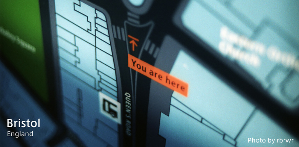
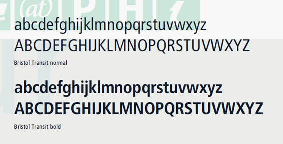
Bristol, England
Placed at the distance of 170km west from London, Bristol had started up the project called “Bristol Legible City” to re-design the illegible city into legible totally. As one of the project, in 2000 the sign system for Bristol was completed to establish, and the original typeface was developed for “Bristol Legible City”. The typeface was named “Bristol Transit” and now used not only for the sign system but also for the map panels on the road and guide maps. The typeface contributes to the city identity of Bristol to be legible. “Bristol Transit” is designed basing on the “Transit”, dedicated to the Berlin metro. Basing narrow typeface, it prevents unreasonable transformation of letters with a function of graphic software in a situation such as the sign system to fit many letters in limited space.
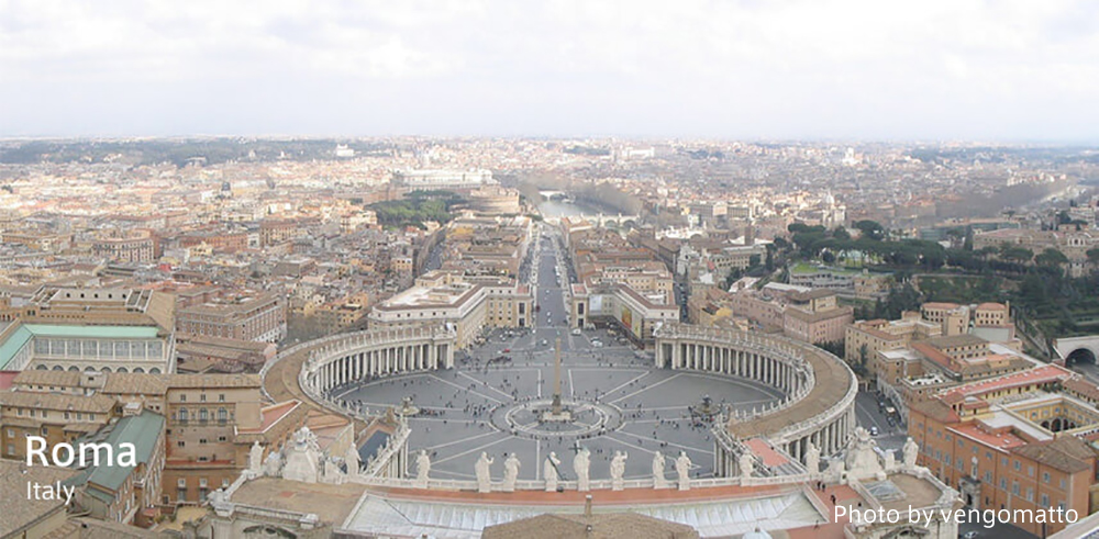
Rome, Italy
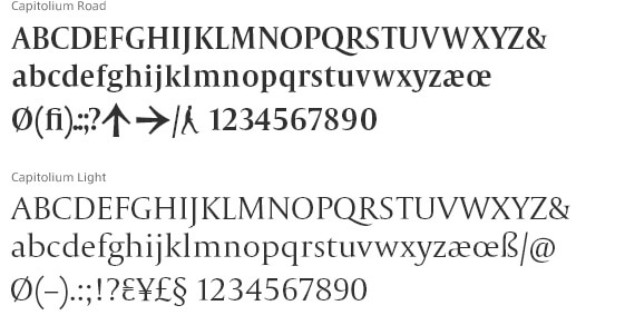
Rome was planned to make the sign system for the Christians worshippers in saint Millenium, 2000. The typeface for Rome was named “Capitolium”, based on the manuscript of Giovanni Francesco Cressi, a secretary of Cathoric Christian Church in 16 century. At first the typeface was planned to be used as a face for signs, but the use in other media was considered later. Finally he made the faces for body text: Capitolium Light, Regular, Italic, Bold, and the face for sign: Capitolium Road. Capitolium Bold has the feature of a narrower width and a higher X-height.
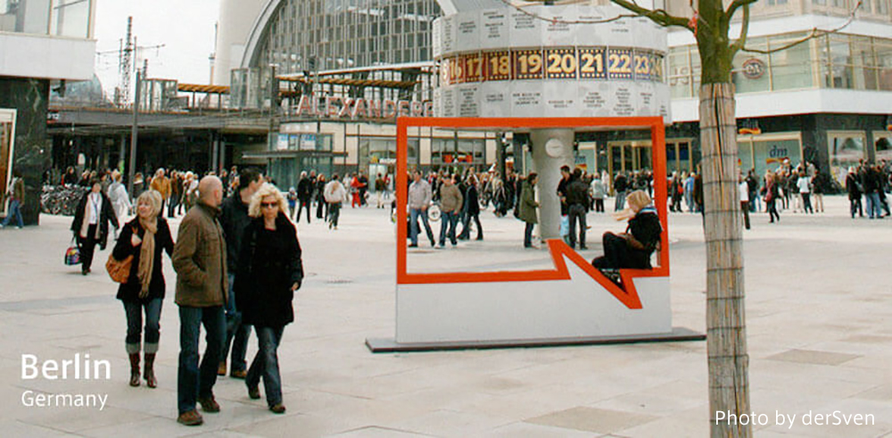
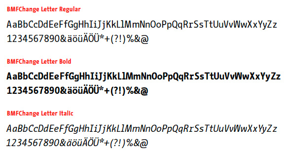
Berlin, Germany
In 2008 in Germany, started for the campaign to the world of Berlin city, “be Berlin”. The new typeface BMFChange was designed for headlines. BMFChange as a tool for campaigns, but later it came to be thought of as a city identity. As a city communication tool, the BMFChange Letter’s characteristic details, typewriter-like structure, ad relatively wide-character width was not suitable. So that the BMFChange Sans was created with a somewhat modest and slightly condensed character width, and the effect of balloon icons was added to reflect the voice of the city and citizens.