2012.08/31
Serene Written Characters, in Close Accompaniment with a Space
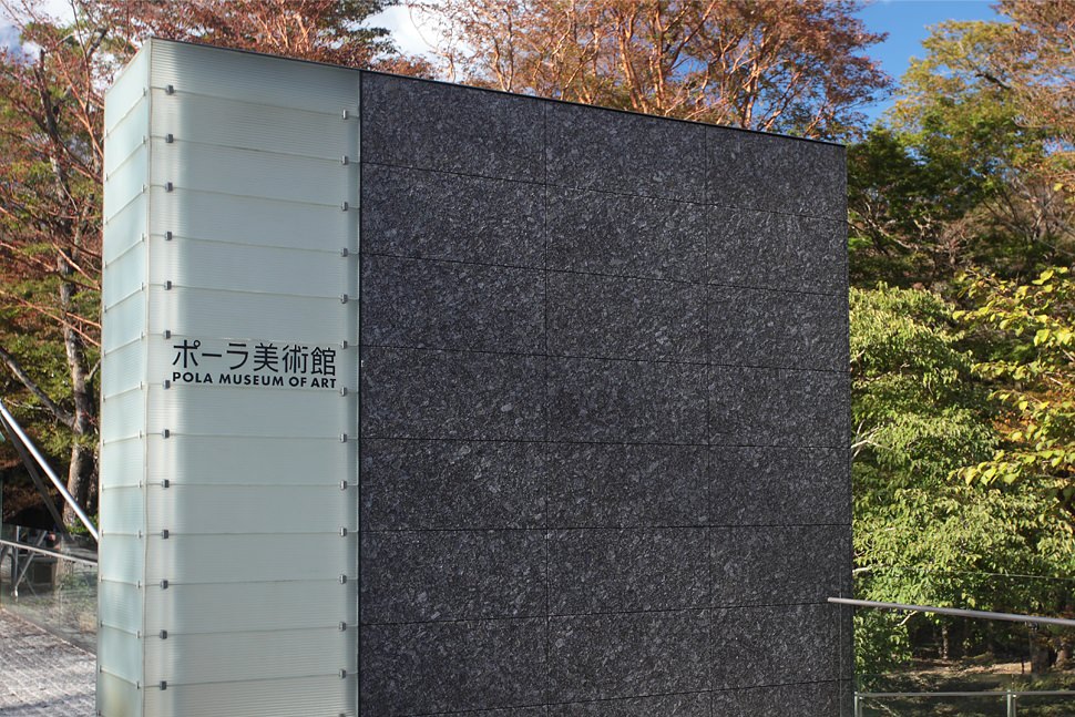
Established in 2002, Pola Museum of Art is located in the Sengokuhara area of Hakone, in Kanagawa Prefecture. The museum is renowned for its collection of over 9,500 works, featuring numerous paintings by proponents of 19th century French Impressionism and the ÃÂcole de Paris, fine examples of yoga and nihonga (Western-style and traditional Japanese-style paintings, respectively) by Japanese artists, as well as Oriental ceramics, glass craftworks and cosmetic utensils. Conceived architecturally as a “symbiosis between the natural beauty of Hakone and the fine arts”, the museum is situated within Fuji-Hakone-Izu National Park, in an area of approximately twelve hectares of lush greenery blessed with massive beech trees over three hundred years old, tall hime-shara stewartia with its beautifully smooth bark, and an abundance of other plants. In order to protect the surrounding environment, most of the museum building was built set into the ground; in its design, as much consideration as possible was given to the preservation of the precious natural scenery of the site. Furthermore, various groundbreaking technologies were adopted: for instance, the fiber-optic lighting used to display the world-famous artworks encountered in the galleries and the phantasmal wall of light that greets visitors in the main lobby, not to mention the building’s complete seismic base-isolated structure, the first of its kind in Asia. The recipient of the Architectural Institute of Japan Prize and the Togo Murano Award, Pola Museum of Art has been acclaimed in particular for its wonderful transparency, which impresses the visitor with the beauty of the natural light.
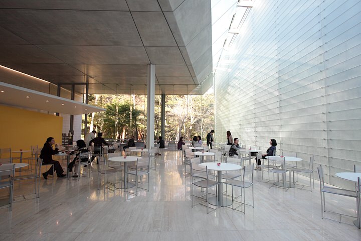

While the museum was preparing to first open its doors, a project to produce the building’s signage was underway at Pola Chemical Industries’ Design Laboratories, led by Takeshi Usui (current deputy director of the museum). In Usui’s words, “The first thing we were working on was the logotype for the name of the museum, ‘Pola Museum of Art’. I wanted it to have a sense of refinement and serenity, to exude a real art museum ambiance. And in view of the fact that the collection contains many paintings by Impressionists, and that the architecture was designed with an awareness of the natural light, I felt the logotype should be imbued with a feeling of light.”
Type Project created the Pola Museum of Art logotype with both positive and negative display uses in mind. We verified that the impression made by the logotype was preserved even when inverted, and carried out fine character- and line-spacing balance adjustments for both vertically and horizontally set characters and lines of text.
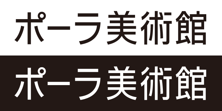
The logo was created by the request from Pola Design Laboratories to brush up their original design. Its base design was 90% narrow mechanically to Shin Gothic. We modified the curvilinear distortion, and ratiosãÂÂof ãÂÂlengthwise and crosswise caused by mechanically narrowed. The white logo on colored background looked slightly fat. It turned 5 to 6 % thin down than a positive version, so that same thickness shows it in sight. The thickness of the letter in a negative and positive are different.
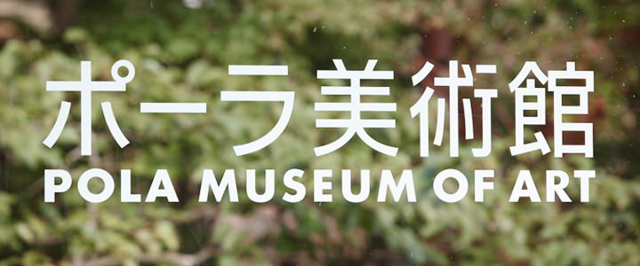
The four seasons of Hakone Sengokuhara are seen through the transparent indication board.
“Written characters are like water or air. And that’s exactly why there is a need to be particular that they have a universal quality. We’ve been particular about the museum space, so there would be no point in not being particular about the written characters displayed in that space. Following this line of thinking, we decided that what we were creating was not just a logotype, but a Pola Museum of Art-dedicated signage typeface.”
To fulfill Pola’s request for crisp, refined characters that would be suitable for that particularly-designed building, Type Project produced the 84 characters that were needed for Pola Museum of Art’s guidance signs. A 95% narrow typeface design was used, in order to optimize compatibility with the previously executed oblong signboards and slim-bodied pictograms, while still reflecting in the typeface the free and open structure of the space. It is a bright, discreet signage typeface, made with relatively thin lines so as to allow the characters to blend into the museum space, with its abundance of natural light.
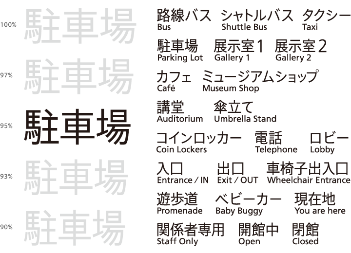
Parking lot (left)
The idea of narrow typeface design for signage was smoothly led by optimizes compatibility with the previously executed oblong signboards and 90% narrow logo. We proposed choices of 100% and some narrows (97%, 95%, 93% and 90% ), and 95% narrow typeface design was chose. The thickness of the typeface weight set relatively”thin”and “brightness” for close accompaniment into the museum space with its abundance of natural light.
Accomplished signage typeface for the Pola Museum of Art (right)
Type Project produced the 48 kanji and 4 hiragana and 32 katakana, total 84 characters that were needed for guidance signs. Use Frutiger for Latin part. Addition to that we created the letters of “å®Âå¡/capacity, ç©Âè¼Â/loading, éÂÂéÂÂ/open and shut, ç¨éÂÂ/use, ä¹Âç¨/passenger use, andè·ç©ç¨/ baggage use) with 100% version for elevators. These letters use in small size and easy to be destroyed, so that weight is slightly thin than signage typeface.
「ロゴタイプやサイン計画における文字間や行間というものは、建築における空間表現と同じだと気がつきました。美術館そのものが光にあふれた空間を目指していましたから、建築の考え方と文字の考え方が見事に呼応している。これは、私自身にとっても、大きな刺激になりました。ポーラ美術館専用サイン書体は華奢だけど凜として、みごとに調和しています。まさしく美術館のためにあるバランスを持つ、ミュージアム フォントの誕生です。」
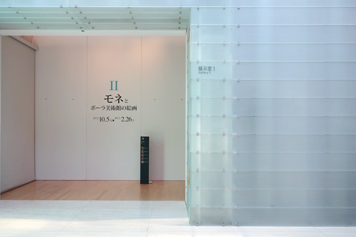
The neutral signage typeface matches various material including acrylic, stone and metal, and concord with the space that opened out full of the light.
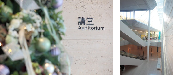
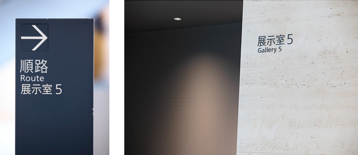
(Text by Joji Oshiro Photos by Kou Chifusa)

