


2017.11/15
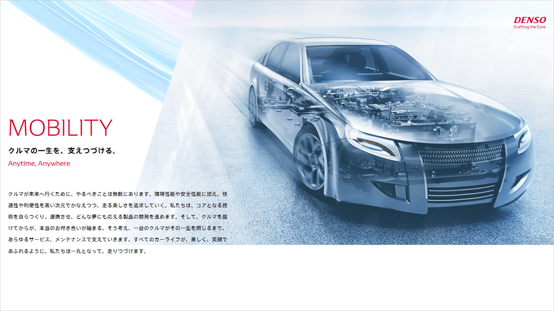
The future is not something you talk about, it’s something you make. Denso has always provided innovative technologies for groundbreaking products and devices. In order to build a new, globally-oriented future amid the “once-in-a-century” shift occurring in today’s automobile industry, Denso established “Crafting the Core” as a corporate slogan that communicates its aim “To continue to create and refine things that are of value to people.” The first task to be undertaken was the evolution of the DENSO logo – which conveys the company’s enthusiastic commitment to maintaining tradition and quality – and the development of a corporate font designed with that logo at its base.
I had no idea that such a service existed that allowed you to get a typeface semi-custom built, so it was like a ray of sunshine.
“With the growing need for media that can be developed in-house, to be spread on social media and the like, the role of fonts is becoming more readily apparent. At companies in Europe and America, it is common to find corporate fonts being used to create and transmit a consistent image in advertising campaigns and product lines and such. There is an increased awareness that fonts are necessary, both for carrying out communication with a broader scope, and as a valuable tool for making strong impressions. The first attempt we made for a globally-oriented expansion in this venture was the development of an original Latin character typeface. And we chose Kontrapunkt as our partner. They have a proven track record of course, and are based in Europe, and their approach to design resonated with ours, so I knew they would be an ideal partner.” Masami Muramatsu (Chief of Advertising Creation Section, Brand Promotion Office, Denso Corporation Public Relations Division)
The Copenhagen-based branding agency Kontrapunkt is the leading force in the field of strategic design and branding in Scandinavia. The terms set by Denso for the development of a corporate font were that it be an evolution from and refinement of the DENSO logo, which has been in use for twenty years (since 1996), without altering the logo itself but still reflecting the sensibility with which it was originally created. Muramatsu says that the first tasks of this project were to rearrange the anchor points and the balance of the characters in the DENSO logo, and to discuss color settings and related aspects. As the development of a Latin corporate font would essentially reflect the aims of the DENSO logo in a typeface, they adopted a process of examining it within a prescribed range. Previously, the existing sans-serif typeface Helvetica had been used as the company’s established font, but in order to improve affinity with the DENSO logo, they developed a seriffed typeface, and later prepared a sans-serif typeface as well. As this development was initiated with global expansion in mind, viewpoints representing a diversity of cultural backgrounds in Europe, America and Asia were sought. Furthermore, viewpoints regarding usage feel and the like were gathered from Denso’s internal designers and conveyed to Kontrapunkt, and special attention was given to improving the precision of the font.
“When the Latin character typeface was nearing completion, the question of what to do about the Japanese came up. I knew that the development of a Japanese typeface would take time and money, so I hadn’t thought we would get involved in developing an original one. And then we happened to run across FitFont. I had no idea that such a service existed that allowed you to get a typeface semi-custom built, so it was like a ray of sunshine. Though we already had Shin Go as the company’s established font, AXIS Font had been in use in the design department for some time in a variety of communication situations, so we were totally open to bringing in an AXIS Font-based FitFont.”
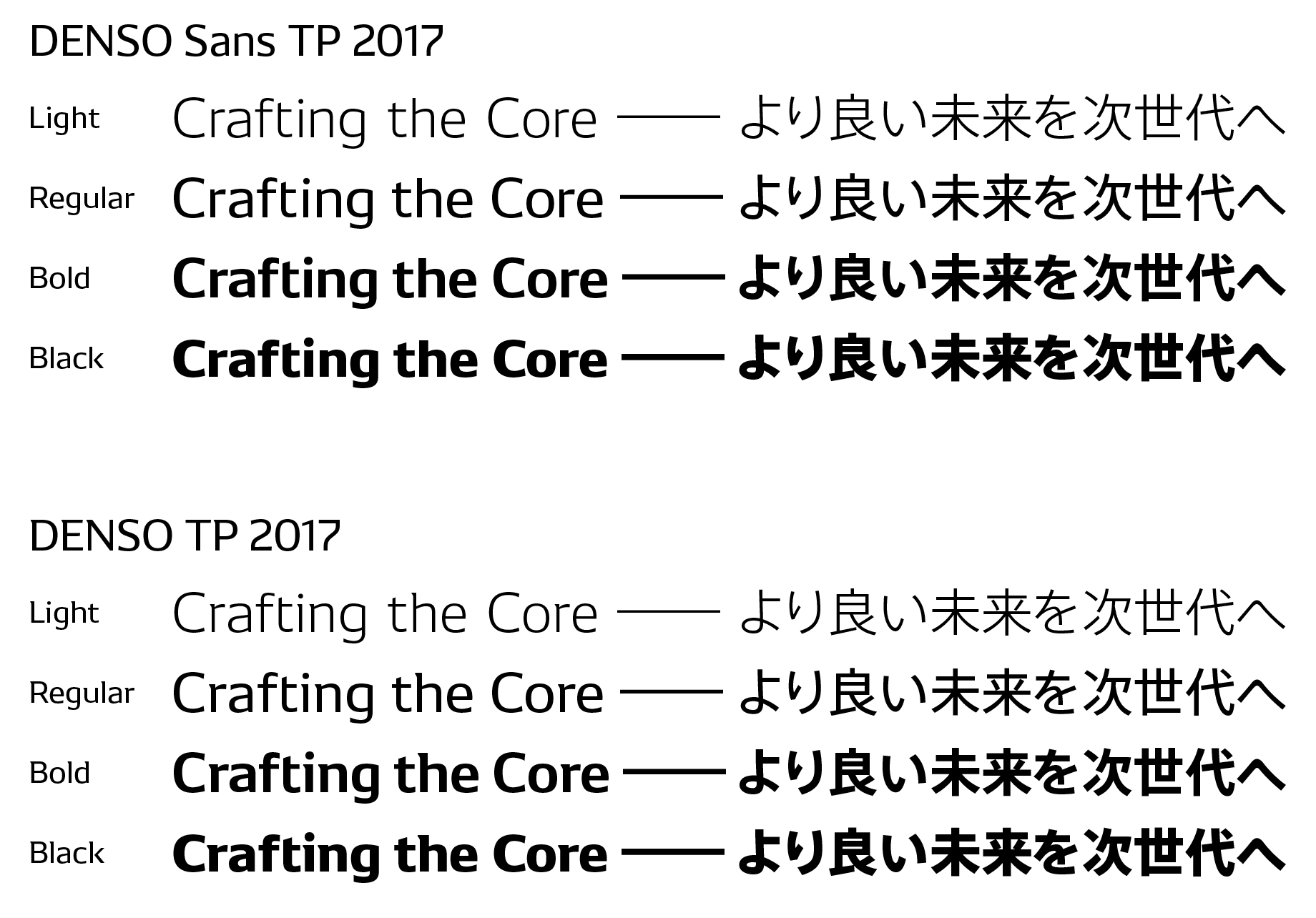
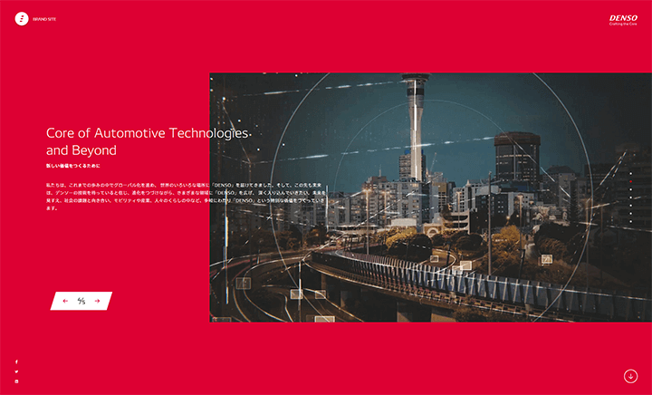
Type Project applied its FitFont technology to adjust AXIS Font’s weight to fit the Latin font developed by Kontrapunkt, and provided Denso with the fonts “DENSO TP 2017” and “DENSO Sans TP 2017”. For its first corporate font, in January 2017 Denso began deploying “DENSO TP 2017” on the company website, and for television commercials and public transit and newspaper advertising; at present, all company literature, employee business cards, letterhead and the like are being issued with this font as well. Muramatsu says that with the corporate font now complete, he has high expectations for the realization of smooth project launches.
“When starting a new creation, there is value in having a corporate font that is imbued with Denso’s identity. I think that there is something that is accumulated by being able to deliver the same design message at every touchpoint with the customer. Though Denso doesn’t have many touchpoints, since it’s a B-to-B company, I think it is best when the media is efficiently integrated and spread throughout the customer’s image.”
In Europe and America, there is a deepening awareness of typefaces as cultural. As the awareness of typefaces grows in Japan too in the coming years, Denso will continue to transmit its commitment to craftsmanship through its corporate font.
I think that there is something that is accumulated by being able to deliver the same design message at every touchpoint with the customer.