2017.10/02
In an effort to strengthen its brand on the occasion of the twentieth anniversary of its founding, Sakura Internet spent a year studying rebranding, and arrived at the motto “Change want-to-do into can-do” as an expression of its brand concept. To realize this concept, Nippon Design Center drew up a visual identity (VI) plan with a new logo and developed an original Latin character font. Type Project provided a Japanese font that was customized from TP Sky, together with a corporate font, “Haru TP”, which was created by combining that typeface with Nippon Design Center’s Latin character font.
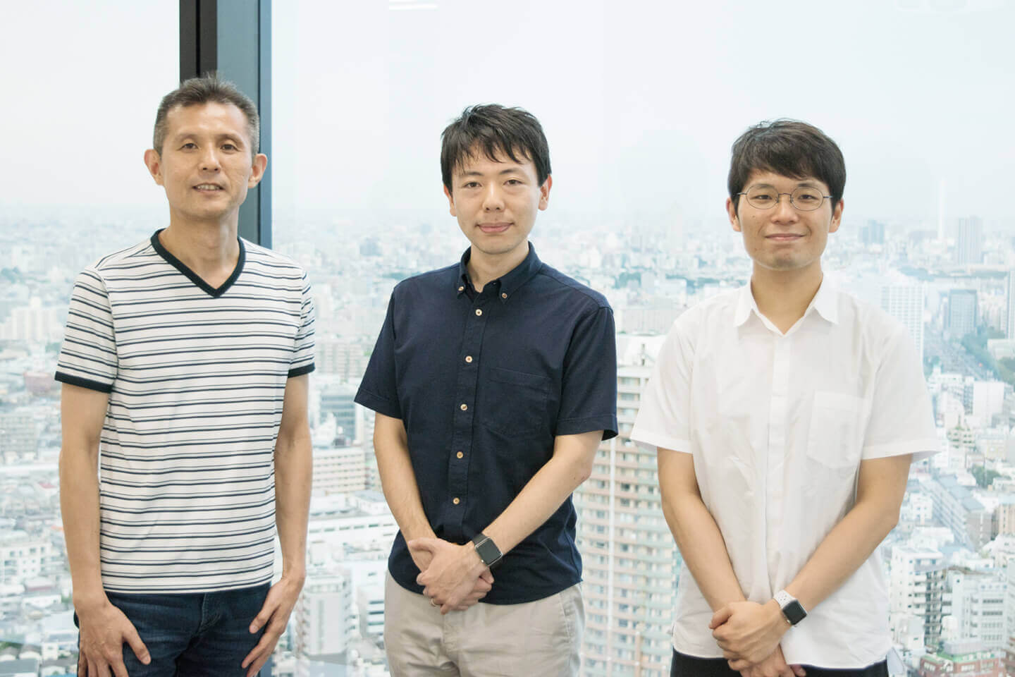
Satoru Kawahara (manager of Technical Division UX Design Group at Sakura Internet), Tomoyuki Arima (art director of Nippon Design Center’s On-screen Design Division) and Isao Suzuki (Type Project) look back on the Haru TP project.
Kawahara: The first time I saw Haru TP on a computer screen, I was struck by its crispness and clarity.
Kawahara:First off, we decided not to engage in centralized rebranding. It would have been easier being centralized because all we’d have needed to do was to implement the director’s decision, but that didn’t feel like a Sakura Internet way of doing things. I’m sure it takes time to cover all the aspects, from the new logo to everything else, but with our approach it all came together and was completed before we knew it. And just when I was wondering who we should turn to for our VI, I happened to attend a talk given by Arima. When he referred to a way of “Making use of logos in a non-fixed manner, in accordance with the situation,” I was really impressed by that flexibility and started up a conversation with him right then and there.
Arima: For a company in the IT industry, Sakura Internet struck me as being rather unusual. I had the image of them as decent, good people, which seems to be something of a rarity these days. I wanted to give shape to that in some way. I think it’s not just the quality of Sakura Internet’s infrastructure services that sets them apart, but the language with which they convey their intent in providing those services. And in order to bring out that uniqueness, whether it’s on the control panels of Sakura Internet’s servers, its event T-shirts, the signage at its data centers, or in all its printed materials, I felt that their in-house designers needed to have the right tools.
This was the starting point for the Sakura Internet rebranding project, which included the development of a Latin character font. When carrying out rebranding or VI, it’s generally the case that you have all the logos, signage, business cards, websites, catalogs and the like ready in time for the announcement date of the new brand. But Sakura Internet’s request was “Start with internal branding, and then let it gradually become visible outside, as if it’s emanating from us.” Instead of continuing to be selected for its functional value, to become the users’ choice because of its emotional value. That is what Sakura Internet was aiming for.
Arima: We proposed it by saying, “If we’re going to do a corporate font, it should be a FitFont.
Arima:I felt that a typeface would be the right solution, as a tool for making things that would exude Sakura Internet’s uniqueness from various vantage points. The order we received from Sakura Internet was that, if we were going to create a typeface, regardless of what kind of typeface we chose, they wanted one in which the さ (the hiragana character for the “sa” in Sakura) had three strokes. And the reason for that request was that さ has three strokes when written by hand, not two. When I heard that, it occurred to me that I should make a Latin character font. Because expressing the feel of human handwriting in a font is something that Latin characters and some kana characters can do. I knew for sure that they could convey the originality of the company.
Kawahara:I hadn’t imagined having an original font made for us, and it sounded unexciting. Actually, I’d been thinking that just getting a logo seemed rather trivial as a new tool. We have a lot of situations where we use text, in pamphlets and such, so I thought it would be wonderful if we could incorporate Sakura Internet’s uniqueness into the type itself. I had the feeling that the typeface could act as a key that links our home pages, advertising fliers, control panels and data centers. “A typeface is a voice” – on hearing that statement by Suzuki, that feeling I’d had grew stronger, and I decided to get a custom-made typeface. Sakura Internet places emphasis on diversity and freedom. While there is the approach of determining the exact logo and color, and then going about applying it in a standardized way, I felt that such an approach would run counter to our idea of diversity. It seemed to me that standardizing the typeface would allow us greater freedom in our use of color and other aspects.
Arima:A brand gains a great deal of depth with the presence of the three key points of logo, color and typeface. We gave it a color palette with priorities 1 and 2. In the world of Web design, there is a framework called Bootstrap that contains various easy-to-use components, such as forms and buttons. There was an atmosphere in this project of building that sort of toolkit. So we proposed it by saying, “If we’re going to do a corporate font, it should be a FitFont.” Because they had previous examples, and there isn’t anyone else who offers similar services.
Suzuki:I think of the font’s role as being like that of shoes or chairs – it has that kind of functionality as a product. What’s interesting about a font is that while we don’t think about making it as the final goal, we can see how it’s used and how it takes on a suitable form and voice, and that gives meaning to the work. It truly is a tool. With Haru TP, though we didn’t customize that much of the Japanese typeface, it felt like an effective, new approach.
Arima: Our way of doing things is always to make proposals that are complete opposites of each other, and then to work through them together and arrive at a decision. For this project, we proposed four patterns – in Gothic, Mincho, Slab serif and Tapered sans-serif – and the final decision was the Tapered sans-serif, because of its handwritten feel. Making an actual visit to a data center reaffirmed for me that while this was a brand at the forefront of the digital realm, rather than giving off a sense of coldness, it had a human warmth. So, I wanted to make a typeface that would convey that, and wondering if there were any suitable, up-to-date tapered Japanese typefaces, I reached out to Suzuki.
Slab serif: a robust serif with uniform lines
Tapered sans-serif: a sans-serif with narrow stroke ends
Suzuki: If Sakura Internet hadn’t chosen the “challenge”, this project never would have seen the light of day.
Suzuki:I felt that Arima’s trial version of the Latin character font and the impression I had of his kind-heartedness in interacting with Sakura Internet were both highly compatible with the personality of TP Sky, and even though the typeface was still under development, I went ahead and showed him the designs for TP Sky. As we were still about a year away from its completion, I hesitated for quite some time as to whether or not I should show it. But I knew this typeface would be the better choice, so I couldn’t keep it under wraps. (Laughs)
Kawahara:At first, I was thinking of choosing either AXIS FitFont or TP Mincho FitFont. But I looked at them together with Arima’s Latin character font, and I had the sense of something being a bit out of place. And then I had a look at his design for TP Sky, and thought, “This is it.” I could relate to the idea of it being Gothic but with a handwritten feel, and I remember being amazed by the lucky timing.
Arima:There were two things I wanted to achieve with the Latin character font. One was a data center countermeasure, to prepare alternate character forms for the lowercase “I” and the numeral “0” (so as to make them easily distinguishable from the numeral “1” and the letter “O”). The other was to increase the x-height (to raise the center of gravity of the lowercase letters). As Sakura Internet is expanding into the IoT realm, instances of low resolution printing are to be expected. The typefaces we will be producing from now on will be used in all manner of places. They might even be used in satellites up in space! (Laughs.) So I wanted to make something with clearly distinguishable lowercase letters. I actually altered the Latin character font (mainly the contrast parts) after seeing the design of TP Sky.
Suzuki:Arima’s design of the Latin character font had the x-height set quite high, and I had the sense that it had been made with an awareness of difficult applications – for example, to allow for good readability with business cards and other situations where small characters are used, such as the detailed information on cut-out stickers and the like. While Latin character x-height may correspond to Japanese character “counter level”, when it comes to Japanese fonts, setting the counter too large will make the character space narrower, which results in a somewhat cramped feeling. That’s why the counter for TP Sky isn’t very large. The thing that was difficult when developing TP Sky was the possibility that Japanese characters created using this font category – the tapered sans-serif – would feel old the moment one saw them. So, to make it up-to-date. And to make it settable for text. These are the two things I was really focused on with TP Sky. It’s one of the most challenging typefaces I’ve ever created.
Arima:The first time I saw TP Sky, I was amazed. It doesn’t get old. I think of it being like James Bond movies, which are a kind of battle with oldness. There’s the sense that the model is preventing it from evolving. Even so, the latest 007 is really good. TP Sky seems to me quite similar. It’s gotten past the dilemmas of an area that everyone seems to have been avoiding. I have some confidence that it’ll be put to good use in the future.
Suzuki:I guess it’s a worldwide trend with Latin character fonts, but over the past three or four years or so, a lot of high contrast fonts have been coming out. It seems to me that with so much sans-serif around, there’s the sense that everything starts to lack depth.
Arima:Yes, I feel that too. With all the new possibilities available to us, we can play around with things as much as we want, but it does feel that in the realm of Latin character design, the same trends have already come around again once or twice. They’re just barely managing to avoid the parts that feel old. Maybe it’s the current of the times. But if you stop thinking, you end up making compromises, and I wanted to go beyond that. So, in that kind of deep way, I was really glad to be able to get on the same wavelength with Type Project.
Suzuki:In typeface development, we think up new things, like hybrids for example; but when we make them, they tend to be kind of difficult to use, or maybe cool-looking but hard to relate to. So the important thing is to find places where the typeface fits perfectly. This is especially clear with corporate fonts. Each company has its own history and character, and the voices and faces that embody that will be expressed through the typeface. I think of the き (“ki”) and さ (“sa”) and other hiragana in this typeface as conveying a human warmth. In many movable type fonts, the first and second strokes of さ (“sa”) are connected, and I was aware that there are people who that feels strange to. There’s a similarity between the act of writing by hand and one’s voice, and through this project I became aware once again that a font’s character emerges together with what makes it unique to its product.
Kawahara:When I saw Haru TP, I thought, at last we’ve got something that fits the ideal of being modern but specialized. One of our preconditions was that it had to be clean and attractive on the Web, and when I saw it on a digital monitor, I was really impressed by its beauty and crisp clarity because it was exactly the image I’d had in mind. Working with a pretty font gives motivation to our in-house designers.
Suzuki:Screen attractiveness was one point that we emphasized in the development of TP Sky. When I’m working on typeface production, I tend to superimpose typefaces I’ve made in the past and gauge my feeling of distance between it and other typefaces I like. Will someone who doesn’t have that kind of filter tell me that it’s beautiful? That’s the part I was concerned about most of all. It makes me really glad whenever someone can appreciate this aspect, and I hope that all Sakura Internet users will feel this way. Another concern I had in mind when creating this typeface was that it should be something one will never grow tired of. I felt very strongly that one should be able to look at it every day, and still be impressed by how nice it is.
Arima:The full-fledged usage of Haru TP is still to come. It’ll start on the Web. The design of the business cards and signage is just about final. The signs are easy to read even from far away. I think it’s a really tough usage environment for a typeface – on the Internet, in printed publicity materials, and data centers, too. So it was a relief to see TP Sky being put to use there.
Suzuki:Typeface design has two opposing functions with regard to distance: retaining each character’s internal integrity at small sizes, and being readable even from far away. I’m calling TP Sky a modulated sans-serif, and I thought that what really needed that category of font was the signage. I think of modulated sans-serifs as giving form to the liveliness of handwriting, to the natural fluctuations in forcefulness of the human hand. I felt this way again when I was shown the actual-size signage design. And what I had made with the intention of having characters that would be appealing at large sizes without losing their personality, I was surprised to find was also fine for use in small sizes, for business cards and the like.
Arima:To draw out the local optimum of the site, without being too rigid about the rules. I suppose this is very Japanese approach to branding. Once your way of doing things is in order, you can get approval from those around you. That’s what the tools are for. I think that when you’re engaging in branding work, the best situation is when you can use things just as they are. Each person’s attractiveness can come out just as it is, without any adornment. There’s not much point in putting on nice clothes only when you’re going out on a date – it’s that kind of thing. This is consistent with the work we do for any business. The task of design, in this world of constant over-interpretation and loud declaration, is to be able to present a person or company, and convey in an entirely normal way how interesting they are. We are always looking for things that are unchained from the medium, that go beyond it. And our greatest resource is our typefaces.
Kawahara:Another part of our brand concept is “Keep taking challenges.” We spoke about making proactive and challenge-taking choices as we go about deciding our VI. One of these was the choice of a typeface that was neither Mincho nor Gothic. This typeface came about as a result of accepting that challenge, and I think it was a good choice.
Suzuki:Even if it had been made somewhere else and with different expectations, as it something that was connected at a basic conceptual level, with just a few adjustments it would still behave as a single typeface. The finished product looks totally natural, but this certainly was a project that had experimental values.
Arima:It was a good challenge for all three of our companies.
Kawahara:Making this choice taught me that technology is a necessity for typeface development. Sakura Internet is a company that lays emphasis on technology, so that’s another reason this was a good fit. More than ever, I am glad that we treated the typeface as key.