


2017.05/23
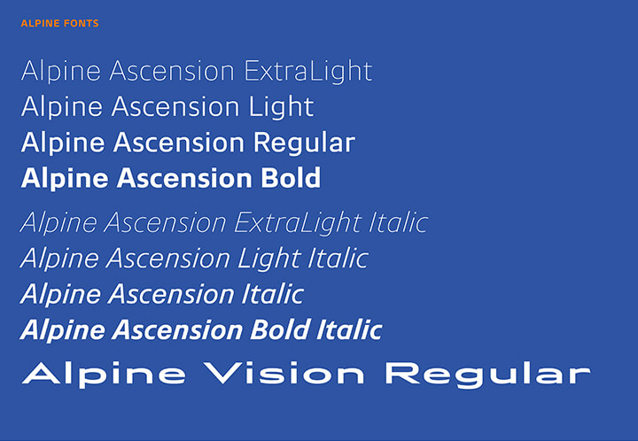
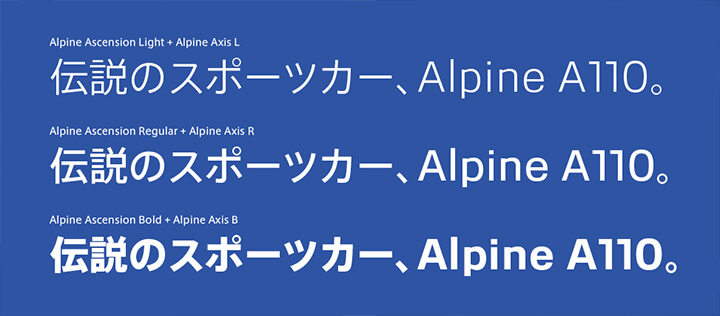
Production Type builds a comprehensive type program for Alpine, France’s storied brand of fast and fun automobiles. Type Project collaborated with Production Type to expand the Alpine Ascension family of Japanese typefaces, the Alpine AXIS. To develop Alpine AXIS, Type Project has adjusted the weight of the AXIS Font using its own technology FitFont. It has also delivered the renamed font with the Alpine brand. FitFont developed adjustable functions that make it possible to retain a balanced state with proper character proportions such as the weight, contrast or character width.
Type Project interviewed Jean-Baptiste Levée of Production Type.
Type Project interviewed Jean-Baptiste Levée of Production Type.
Based in Paris, Production Type is a digital type design agency. Our activities span from the exclusive online distribution of our retail type for design professionals, to the creation of custom typefaces for the industrial, luxury, fashion and media sectors.
Jean-Baptiste Levée, founder of Production Type, works methodically in a process where history and technology are approached altogether within the nuances of artistry. He manufactures functional, yet versatile digital platforms for designers to build upon. Levée has designed over a hundred typefaces for industry, moving pictures, fashion and publishing. His work has won multiple awards and has been shown internationally in group and solo shows.
It is featured in the permanent collections of the French national library (BnF) and the National Center of arts (Cnap); of the Newberry Library in Chicago, and several printing museums in Europe.
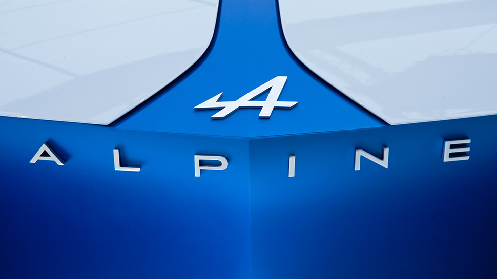
2. How Alpine project started?
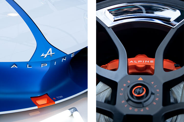
We were commissioned by Alpine to accompany them on the rebirth of the brand. They wanted a new, exclusive type that would carry the brand’s values. At the starting line was a redrawing of Alpine’s existing logo. Production Type improved the ‘A’ by reducing the length and prominence of its piercing arrow, and harmonizing its angles. After reviewing several new proposals for the wordmark, Alpine settled on a subtle refinement of the existing lettershapes. The wide sans serif, with its mix of pointed apexes and angled terminals, is now more balanced and cohesive. A new typeface, Alpine Vision, extends the wordmark style to a complete font with an extensive character set.
3. Tell us about Alpine Ascension
Alpine is famous for several things: speed, agility, lightweight… We needed to transcribe this into fonts. Also, the legacy of gentleman drivers was a key topic. At first, we explored around French 50s and 60s typefaces, but soon we created a truly 21st century typeface.
Developing a typographic identity for a brand with a global reach requires working in writing systems other than Latin. For Alpine, the most immediate cross-border requirement was Japanese support. Production Type worked with the experts at Type Project, adapting and reshaping the Tokyo firm’s Axis Font to ride smoothly alongside the alphabetic characters in Alpine Ascension. Alpine’s proprietary font family is now fully equipped to carry messages throughout Europe and Japan.
4. How did you know Type Project?
We met on several international conferences. The Type Project approach seems very compatible with ours: progressive, evolutive, and very demanding in terms of design quality.
5. What do you think about Type Project and Alpine AXIS font?
Several factors were balanced: availability, ease of communication, pricing clarity and flexibility. Type Project scored best in all these fields. We selected AXIS Font for its capacity to be easily matched with our own design.
6. What do you think about FitFont service?
That was a key factor in establishing brand consistency. FitFont enabled us to offer a perfect solution for our client, with the best of both the retail and the custom world, at a reasonable price. In the end, we were able to extend the brand voice in Japan while maintaining our quality standards.
7. Please tell us about trends of corporate fonts/branding fonts in your country and worldwide.
Mostly, Sans-serifs are king in the branding market, but script fonts and expressive fonts are legion. The custom fonts market is between two trends. We offer innovative and durable typefaces for a selected portfolio of clients. But we also see a frequency in easy, short-sighted, cheap design tricks that are sold to unsuspecting corporate clients.
8. Can you tell us about what you are working on right now and what you will like to work on in the future?
We are expanding our retail catalog towards a broader offer for magazines and brands. That means we’ll have some more families released later this year. We are also working on custom fonts, as usual, which we’ll reveal at some point… or not.
Photo by Julien Lelièvre