


2008.12/25
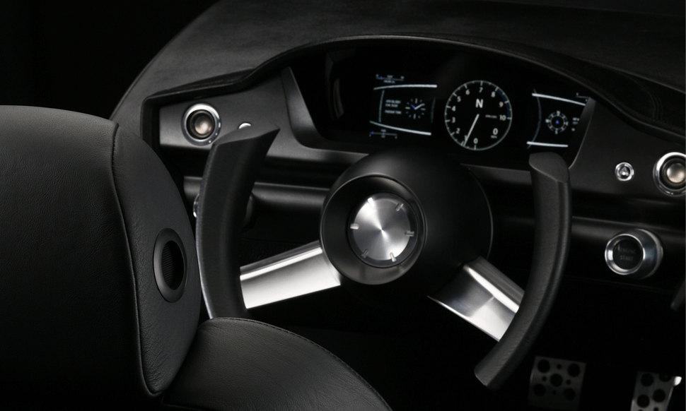
Yukihiro Kajita of the Design Division at DENSO Corporation, a major supplier of a wide range of components for the automotive industry, felt that the maps displayed on car navigation systems needed be redesigned so as to make them easier to look at. The display screen on such systems changes constantly whenever the vehicle is in motion; no sooner does one item of information appear than another replaces it. Recognizing that these text characters and icons were in a fluid state, Kajita began searching for ‘something different’ from conventional fonts.
A New Typeface for Drivers – the Ultimate ‘At-a-Glance’ Font
Kajita approached Type Project with a proposal to try to create a dedicated motor vehicle-use typeface that is grounded in the cognitive state and body sensations of the driver, and we began working collaboratively on basic research. Safety is always given top priority when driving; but as being in motion is clearly not conducive to the thorough reading of characters displayed on a screen, the driver generally ‘scans’ or takes in text content ‘at a glance’. What sort of written characters would be appropriate for such conditions? For three years, we engaged in continual iterations of hypothesis, trial production and testing. For our first-generation version, we released two alphanumeric-based typefaces that adapt according to driving conditions. The design concept focuses on compact outlines and restrained finishing touches. While taking care to maintain outlines that convey the integrity of the characters, we have accented the dynamics of the shaping details as well, so that clear text impressions are left even when read ‘at a glance’.
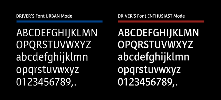
Urban Mode that is the basic mode during general driving. Right Enthusiast Mode for high-speed driving.
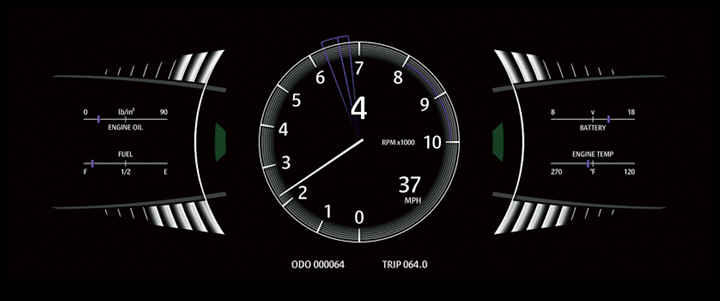
An actual example of using the Driver’s Font Enthusiast Mode in an instrument.
In Kajita’s view, Driver’s Font is not simply a typeface, but a vital component of the interfaces of the future. “There is a crisp tension to the interior space of a car that increases one’s motivation to go for a drive. From now on, it will be the role of the developer to ascertain that character display is of superior quality even while moving. I hope to perfect this by testing out hypotheses, correcting them and creating new ones, and also by listening to opinions from various people.”
Furthermore, as Director of Design Division Yoshito Ito states, in explaining the importance of this area of development, “Right now, in terms of the functions of audio and car navigation systems and the like, we are in a state of saturation. If we can create an interface that will handle all these functions together, I am sure the raison d’etre of Driver’s Font will be greatly enhanced. I am hoping to bring to the world a Driver’s Font-using interface that we can be proud of.”
The Driver’s Font is being research jointly by Type Project (concept and font design) and Denso (concept and direction).
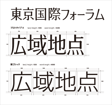
The advantage of having a small frame was clearly demonstrated in a comparison to the Shin Gothic font (bottom). The Driver’s Font (top) that adopts the optimal width for each character is easily legible as it makes use of the characteristics of the character, its inner lines are clear and bright, and it can also contribute to economizing the overall space.
Written Characters that Speed along Our Interfaces
n creating Driver’s Font, it was also necessary to consider the terms of optimization for car navigation systems and similar devices. In other words, we realized that the characters would have to be endowed with a sense of ‘comfortable differentness’ that would make the text clearly visible whenever one wants to see it, but would let it blend easily into the background at all other times. The characters also needed to be easily readable and naturally coherent, and to appear vivid at small sizes without losing their internal integrity, even when kanji, kana and alphanumeric characters are all displayed together. With these considerations in mind, we have made sure that the character and line widths maintain uniformity even when font weights are changed.
As motor vehicle controls are now computerized for the most part, compatibility with digital fonts is generally high. Accordingly, if the universal availability of high-resolution LCD technology continues to grow, there is likely to be an increased need for character precision as well. Cars are inevitably going to evolve as moving spaces that are fully equipped with diverse information functions. Driver’s Font just might be the next ‘new product’ that the great car-producing country Japan will offer to the world.
And Driver’s Font has the potential to evolve even further, beyond the limits of motor vehicle applications, to become a font for the ‘human being as a mobile body’. Written characters will speed along our interfaces. And so continues the development of Driver’s Font, Japan’s first onboard display font designed exclusively for motor vehicle use.
(Re-edited reprint of original article published in AXIS Magazine in December 2008.)