


2015.07/17
Mamoru Kano
Born in 1972 in Miyagi Prefecture. Graduated from Tohoku University of Art and Design. As an art director and the director of WOW, created radical user interfaces and a wide variety of video work for media art, advertisements, and other media. He is an associate professor in the Creative Design department of the Tohoku University of Technology.
http://www.w0w.co.jp
What will happen to typography in the digital world?
Type Project’s Isao Suzuki reunited with art director Mamoru Kano of WOW, who had worked together on a customer project previously, for an interview in Pen magazine (featured in the May 1, 2015 issue). There, they discussed UIs and typography, both of the “very near future” and “more distant future.” Below is part of their conversation that was not published in the article.
Typographic design that changes the user interface
Kano:The first time I worked with you was about eight years ago—for a mobile phone project, right? I wanted to use AXIS Font by myself, and I wanted many other people to use it as well. At the time, every mobile phone company used different fonts, so we proposed that information be provided not just through layout and graphics, but through using a beautiful, uniform typeface. Typeface makes a huge impact on the visuals and can completely change the impression given by the interface. I feel that it’s necessary for designers to keep in mind the idea that “characters have to be used properly within a screen.”
Suzuki:While dark black characters on paper have a strong presence, characters in a user interface are subtractive characters; rather, they have an impact that’s preferred for casual messages.
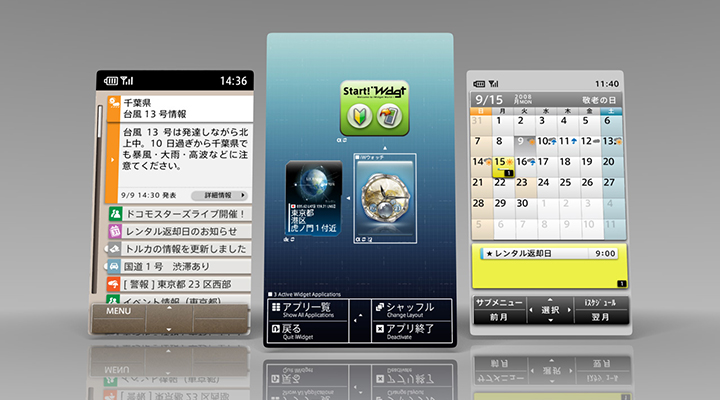
iWidgets visual design by WOW
(design direction: takram design
engineering ) using AXIS Font.
Kano:I believe that AXIS Font is appealing as an on-screen font, not just in user interfaces. When asking staff why they use AXIS Font, you hear things like “it doesn’t have any thorny bits or hangups; the information just comes straight through.” The empty space—like a window, in terms of a building—is very pleasant.
Suzuki:I’m thinking about how typography will need to be to suit user interfaces five years from now. I’m not thinking in the digital sense—I’m thinking in our everyday lives now, and beyond, and how I can incorporate into our typefaces elements that provide a sense of pleasure. In particular, the idea that “Japanese isn’t cool, so we’ll just use the Latin alphabet” is extremely prevalent in user interfaces, isn’t it. I hope to do away with this sort of thinking. I want to have the Japanese language present in places where there should be Japanese, so what we can do to make Japanese cool is a very big theme for us.
Kano:I think contrast and horizontal text will be standards that must be considered in the future of the Mincho fonts. Right now, we’re in an age where typeface is elevating screen design. TP Mincho has this impact where it seems refreshing & stylish—there’s this newness to it that translates to beauty on a digital screen. When you’re designing content that communicates Japanese culture, the best things about Japan, the flavor of the Mincho fonts fits perfectly. It can send a chill down your spine. If we could use TP Mincho in UIs and image content where we’ve previously been compelled to use Gothic fonts, I’d be thrilled.
The very near future & the far distant future
Kano:For user interfaces encountered in everyday life, such as those of home electronics, more interfaces will likely be created with Japanese aesthetics. Novel typefaces like TP Mincho may be the impetus for the birth of new designs.
Suzuki:In your work, I can get a sense of your strong feelings toward Japan that are present in your universal portrayal of nature. With higher resolutions for digital devices, we are now able to provide a rich showcase of Japan’s customs, seasons, and sensations. If we present a message that extols the benefits of the Japanese language but use a typeface that doesn’t support that message, we can’t bring our words to life. So I think we’ve assumed a heavy responsibility in creating a typeface that can be used as this tool.
Kano:Up to this point, video has been a way to record and play back creations. Looking at it now, the technology for creating video is changing. With computer graphics, too, we’re entering this revolutionary age where you can create video in real time. We’re placing text in environments where various elements such as the background and size are changing, and designers have to design their layouts with that in mind. At the same time, being able to choose fonts from Gothic to Mincho, and being able to select contrast and character width—from a certain perspective, the vast selection of fonts available is an extreme advantage—it will become indispensable in visual design in the future, I think. The definition of media art as “a form of expression using technology” is connected with previous art history, and it’s become a platform for creating some truly beautiful pieces and works that touch the human heartstrings—that’s obvious. At a time like this, how the state of typography will change in the future is very important, and artistic expression itself is probably also in transition. Could it not be said, then, that what we fundamentally want from text is also changing?
Suzuki:The point about “touching the heartstrings” is important to me as well; for example, communicating more through whispers rather than shouts, right? I have a feeling that in the near future, there will probably be a demand for those sorts of typefaces in the digital space as well.
Kano:I also use AXIS Font as a typeface in my work, as well as a typeface for materials and presentations, and as a team default. It increases the motivation of staff creating the materials, and it’s important to share aesthetics by constantly using things that are beautiful. Also, it’s a “winning font,” and it gets our messages across cleanly and smoothly, so it helps boost the number of orders we get. (laughs)
Suzuki:Thank you. I’m glad to be able to contribute behind the scenes. (laughs)
Kano:In the future, I think the technological threshold for computers and UIs will steadily become lower, and they’ll eventually become something like stationery. When that happens, I think we might enter a phase where customers buy a device because they like the screen, or because they like the typeface. Then, I think all the various efforts and initiatives that have been made over the years in the digital world will bear fruit, and may become this kind of infrastructure that supports our daily lives. I think that’ll happen in the fairly near future, or further ahead.
Suzuki:Right now, I’m a bit wary of this idea that technology has to be extremely new and bare-bones. When a technology matures, I think, well, now I can really use it well to demonstrate the strengths of Japan—which encompasses a wide variety of cultures. I mean, you want to be able to take full advantage of a technology, right? Typography is a product of culture and history, and it’s evolved in response to the surrounding environment and the state of technology. I want to cherish that idea as I move forward—with the attitude that I’ve been passed a baton.
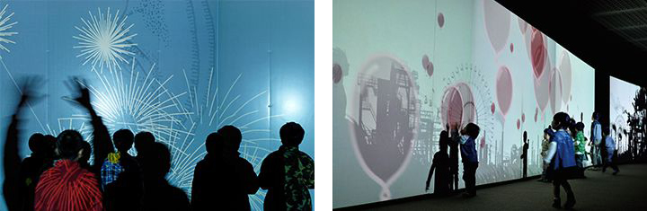
Pieces representative of WOW.
Left: “Light Rain”; right: “Factory and Amusement Park”
Pen magazine dialogue between Isao Suzuki and Mamoru Kano
What is the goal of “typeface” in a world of video?
“Digital device interfaces have become a constant presence throughout our daily lives. The text on those screens shouldn’t make a strong impact or draw attention to itself; it should be attuned to its environment and slip naturally into our everyday lives.” (Kano)