


2015.07/23
What lies beyond trimming away character detail
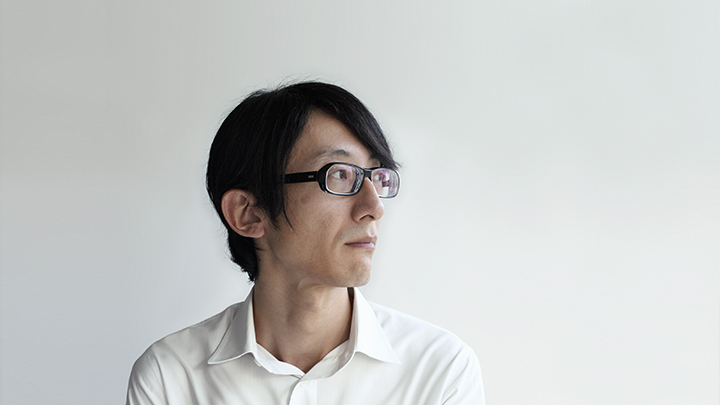
This is a dialog between Isao Suzuki and DELTRO representative Masanori Sakamoto, who is active in on-screen media art direction. Though a diverse array of subjects were addressed, what’s been put together are the portions discussing role and design in fonts that weren’t recorded in the article appearing in the May 15, 2015 edition of Pen magazine.
Sans-serif – function and beauty in form
Sakamoto:My work involves a lot of on-screen promotion for businesses, so I make logos and Latin fonts as well. When creating a logo, I make sure it has visual appeal, but what I must consider at those times above all else are the standards. Because I’ve fostered my faculties for image creation, the duration I spend on logo design is shortened, and I put aside time during the process as a whole for the production of Latin fonts.
Suzuki:It’s important to segregate fonts into display fonts, which assert their presence, and communication-oriented text fonts, which do not. When I say that the Latin fonts you design do not assert themselves, I say this as praise. I can really appreciate how you’ve aimed to transform the UI experience into an unconscious one.
Sakamoto:The Latin fonts I design are engraved with notches to allow ink to pool. When I see these used in characters for on-screen graphics, I think, “This is hardly necessary.” In Japanese Gothic typefaces, you will often see triangular serifs. With AXIS Font, however, those serifs have been removed, and there’s a balance struck with the Western sans-serif typefaces for it.
Suzuki:Around when AXIS Font was released, there were a lot of heads tilted, as the Japanese language in sans-serif was rare. It may have been that the definition of “Gothic typeface” was ambiguous. The accents at stroke points seen at that time were remnants of metal type, though they did have a power of expression and bonded fabulously to paper. I chose to make AXIS Font free of adornments, believing that the digital realm has a need for fonts with a clarity made possible through plain character composition.
Sakamoto:When I first saw AXIS Font, I thought it was the very embodiment of aesthetic sense. Nowadays, when I have information that must be communicated with care and precision, I use AXIS Font. The form the font takes is well-balanced, and there’s an ease and gentleness to it, as well. This is a bit different from saying that there’s an innate Suzuki-ness present in it. After all, I didn’t even know you at that time! (laughs)
Suzuki:As a designer, it’s not a matter of trying to put yourself into a work but instead one of how much you hold that influence back. That being said, it’s inevitable that some of the designer will appear in the character of the typeface. Especially with the degree of freedom granted by the cursive nature of Hiragana. I’m afraid quite a lot of myself shows up in my design. My thinking is that it’d be nice if the typeface took on some of the spirit of the era owing to that.
Sakamoto:For me, there’s a beauty in the curves of the typefaces that you’ve designed, both when they’re seen as single characters and as a cohesive whole. The AXIS Font has a personality and a voice. It’s a global typeface, one that’s functional in public spaces. The sensation of balance in terms of its geometry is accentuated to the extent its details are trimmed away.
Suzuki:Simplifying the figure of the typeface, I thought that since smaller font data sizes lead to faster display, this was an important element when considering digital device applications. Both AXIS Font and TP Mincho are near to having the smallest file sizes in their categories. When data volume balloons owing to a fixation on design details, display speeds drop. Ultimately, that kind of accumulation ends up affecting traffic conditions on the Internet. We try to give users a thing of beauty, but instead we simply leave them with a negative impression owing to delays in display. It’s a tough issue.
Sakamoto:That’s also owing to the sluggish spread of web fonts in Japan, isn’t it? Compared to Western typefaces, the data for each given Japanese character is increasing. Display definition may be on the rise, but we face a problem in that the infrastructure hasn’t kept up. Perhaps a few years from now, things will have changed and connections speeds will have increased. Minding, a few years ago, the future I imagined for today was much further evolved. (laughs)
Mincho fonts – glimpses of typography’s future
Suzuki:If we say that the character of sans-serif is to blend into the background, then Mincho fonts brings with it a sense of presence, an emotional atmosphere. Its job is to act as a voice. Sans-serif and Mincho fonts have a good relationship, one that’s mutually complementary. Of course, this was the case historically as well, but it still holds true even in the digital age.
Sakamoto:I think it’s important to continue to create typefaces without breaking with the rules and history we have in Japan. At Type Project, even as you hold to those traditions, I feel like the designs implemented cast light on the obverse side, asking, “Have you really considered this aspect?” For example, TP Mincho gives a new answer to the question of what is needed in a Mincho typeface, responding synthetically with the design concept. It’s the glimpse of the future it commands that makes people to want to use TP Mincho.
Suzuki:From now more than ever, digital fonts will be playing an important role in urban life. As not only small-screen text but large text, like that seen in digital signage, spread throughout the urban environment, I believe there will be an increase in situations and locations where sans-serif alone is not enough. How will typography respond flexibly to the needs of a new era? That is the very question digital fonts are suited to answer. What I want us to do is meet the novel demands of a new era even as we stay sensitive to the balance of functionality and feeling.
Pen magazine dialogue between Isao Suzuki and Masanori Sakamoto
The possibilities borne from “typeface” customization
“Trying out the FontFit in actuality, I was able to select a typeface based in the features intrinsic to the Latin characters while assessing their affinity with the Japanese text, something I’d never experienced before. It was all too natural, having a layout using this typeface.” (Sakamoto)