2015.09/15
First and foremost a custom type design studio
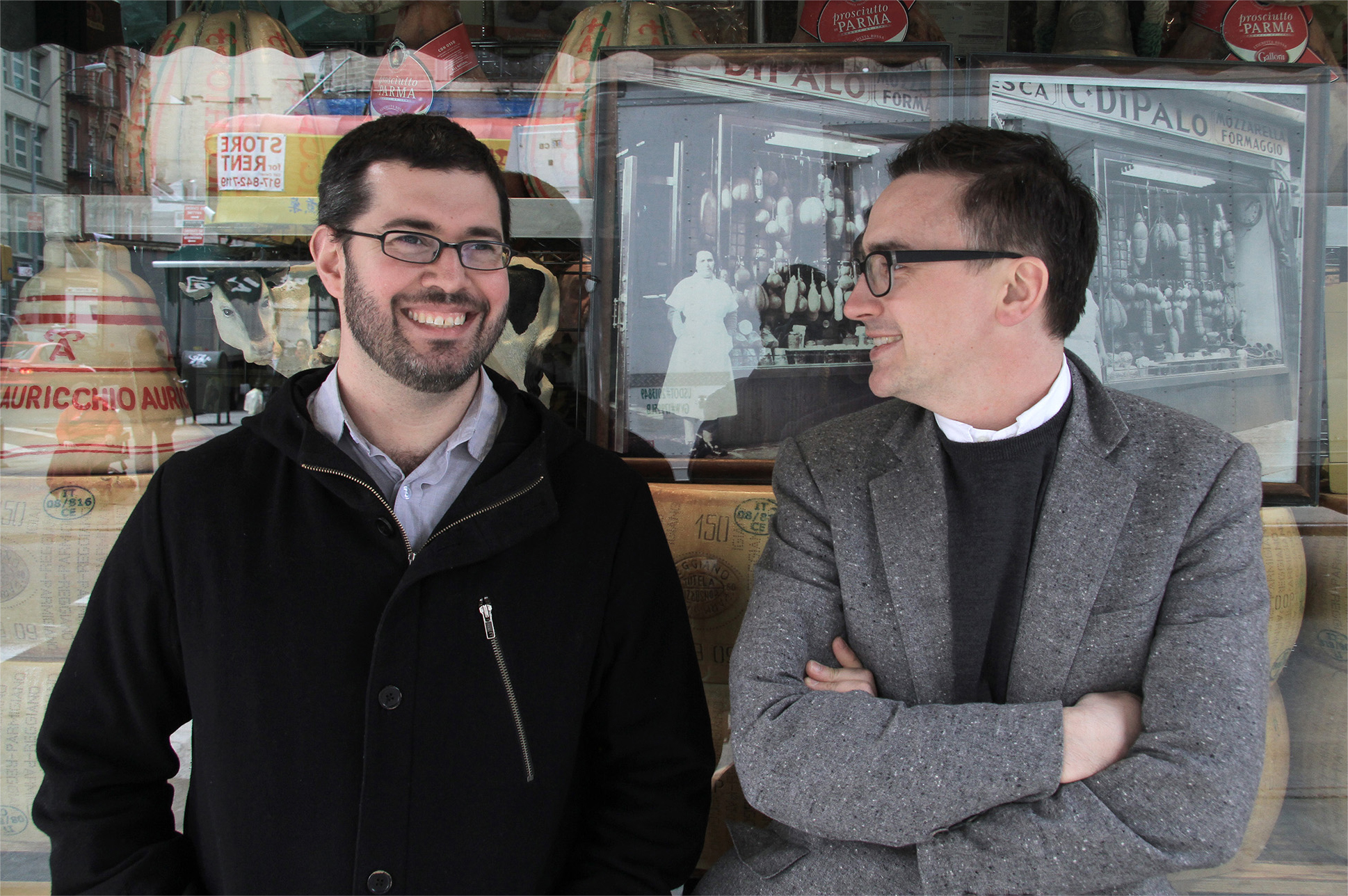
Type Project interview with Christian Schwartz (Left)
1. Tell us about your company.
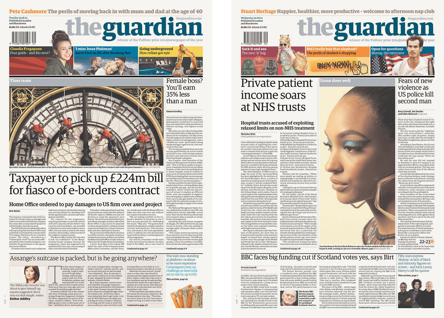
Commercial Type is a joint venture between me and London-based designer Paul Barnes. We have collaborated since 2004, since teaming up to design type for The Guardian, a daily newspaper in London. Our foundry publishes retail fonts developed by Paul and me, our staff designers Miguel Reyes and Greg Gazdowicz, and outside collaborators such as Susana Carvalho and Kai Bernau of Atelier Carvalho Bernau in the Netherlands and our former staff designer Berton Hasebe. There are six of us in total, also including our technical specialist Mark Record and our director of licensing Monica Shane Sanchez. In addition to running the foundry, we create custom typefaces for clients all over the world, primarily but not exclusively publications. We launched our website at the beginning of 2009, and we have worked to build a small but growing library with a balance between highly versatile “vanilla” typefaces that can do whatever a designer needs, and expressive typefaces that allow a designer to sit back and let the typeface do the hard work of making a piece of design interesting and memorable.
2. What are the main/leading fonts of your company?
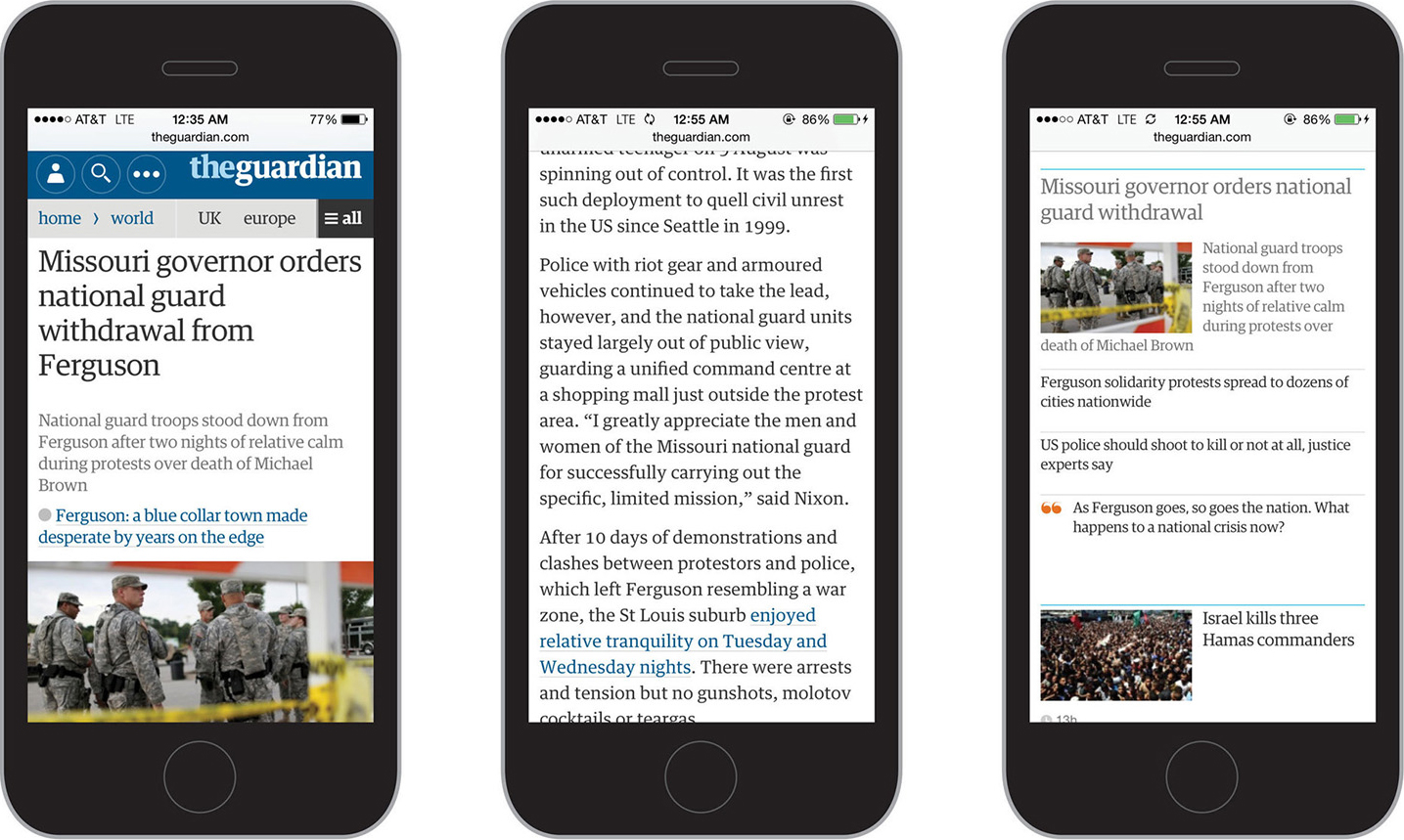
Several years before Paul and I founded Commercial Type, we worked together on the Guardian collection, the end product of a two year process to create a type system for The Guardian. Creative director Mark Porter, who headed the redesign project and commissioned the typeface, has said that this was the first time he has seen a newspaper use just one tailor-made typeface family for every bit of text it put on its pages, from headlines to photo credits, giving the newspaper a unique voice that has helped it bridge the transition from print to digital media. This collection was the cornerstone of our library when we launched Commercial Type almost five years later, and continues to be our most popular typeface. Our library contains a wide variety of styles, from workhorse sans serifs like Graphik and Atlas to specialized display typefaces like Stag, Druk, and Marian. The workhorses are more popular, particularly for use on the web, but the more expressive display faces give our library personality and a specific point of view.
3. Is there any newly released typeface from your company?
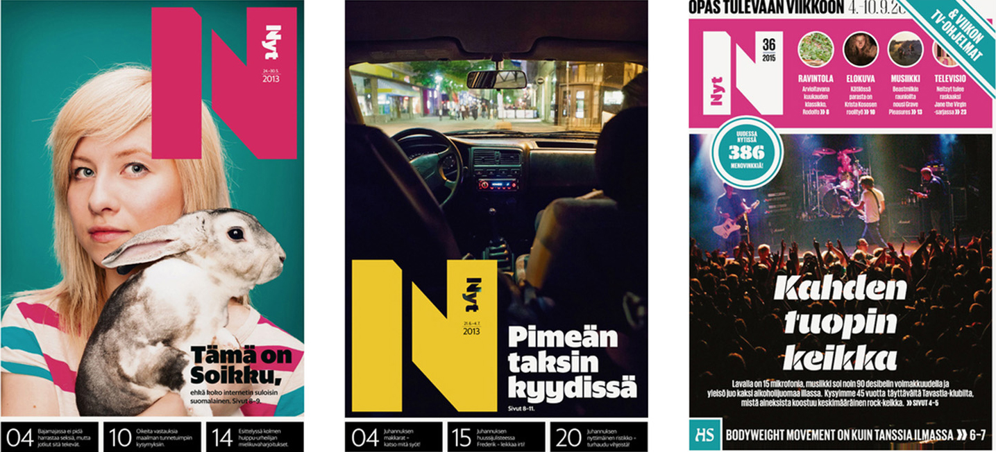
Our latest release is Sanomat Sans, originally created for the Helsingin Sanomat, a daily newspaper in Helsinki, Finland. It was designed to maintain an air of elegance when the newspaper changed from the large broadsheet format to the smaller tabloid format. This family includes an extensive set of alternates, giving the typeface a chameleon-like ability to change tone and personality, which was necessary to satisfy the varying needs of different sections and their designers.
Recent custom projects have included a titling face for New York Magazine’s fall fashion issue, a couple of custom display types for Bon Appétit magazine, and a typeface drawn specially for Esquire’s 1000th issue.
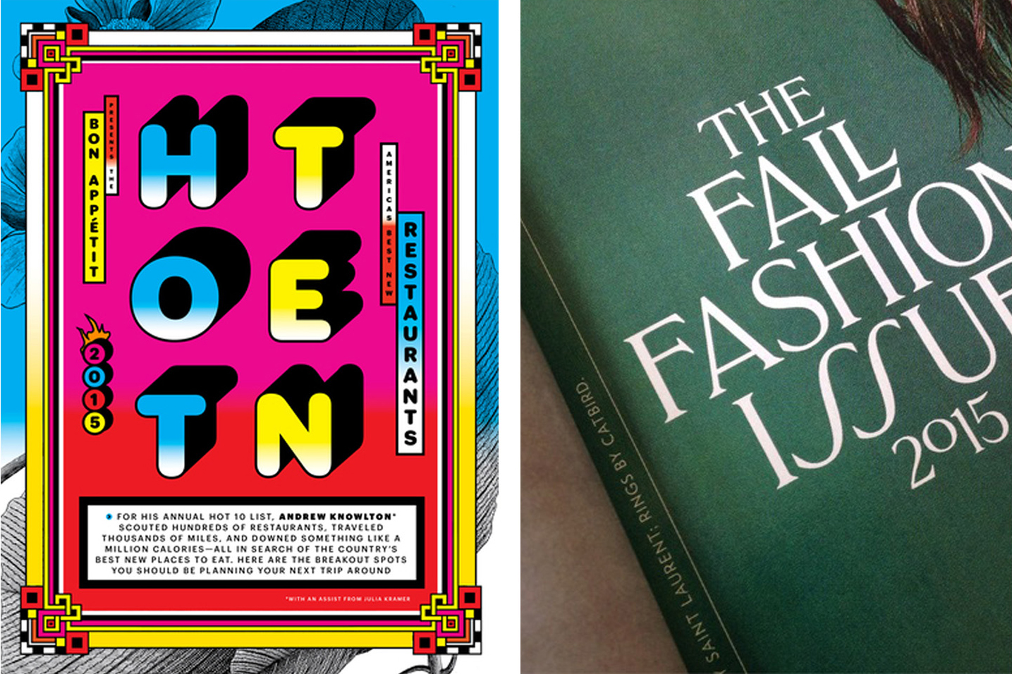
(Left) Christian Schwartz drew Graphik Round Black for Bon Appétit’s 2015 Hot Ten, their annual roundup of the ten best new restaurants in the US. (Right) Greg Gazdowicz drew an all-caps titling typeface for New York magazine’s 2015 fall fashion issue.
4. What is the ratio of your work for original design fonts and custom order fonts?
The majority of our work is commissioned, and this is intentional. We really enjoy the process of collaborating with a client, and welcome the challenges of working outside the ideas we would come up with on our own. Aside from the custom work, our staff designers are required to spend one day per week on their own personal typeface projects, and Miguel and Greg will each be releasing a family in the next year.
5. Can you tell us about your customers? How do they use the font?
The customers who license fonts from our library rather than commissioning new type use our typefaces in a wide variety of ways, from corporate design, to publication design, to book design, to design for the screen. We were a bit later than some other foundries to make our library available for use on the web, because we wanted to make sure we got the quality right. We hope our customers felt it was worth the wait.
6. What kind of devices your customer have embedded the fonts with?
Our fonts have been used in everything from iPhone and Android apps, to cable TV interfaces, to ATMs. It has been interesting to learn that many of the same optical compensations that make typefaces readable on newsprint also apply to the screen.
7. In which country will an end user be able to purchase your fonts?
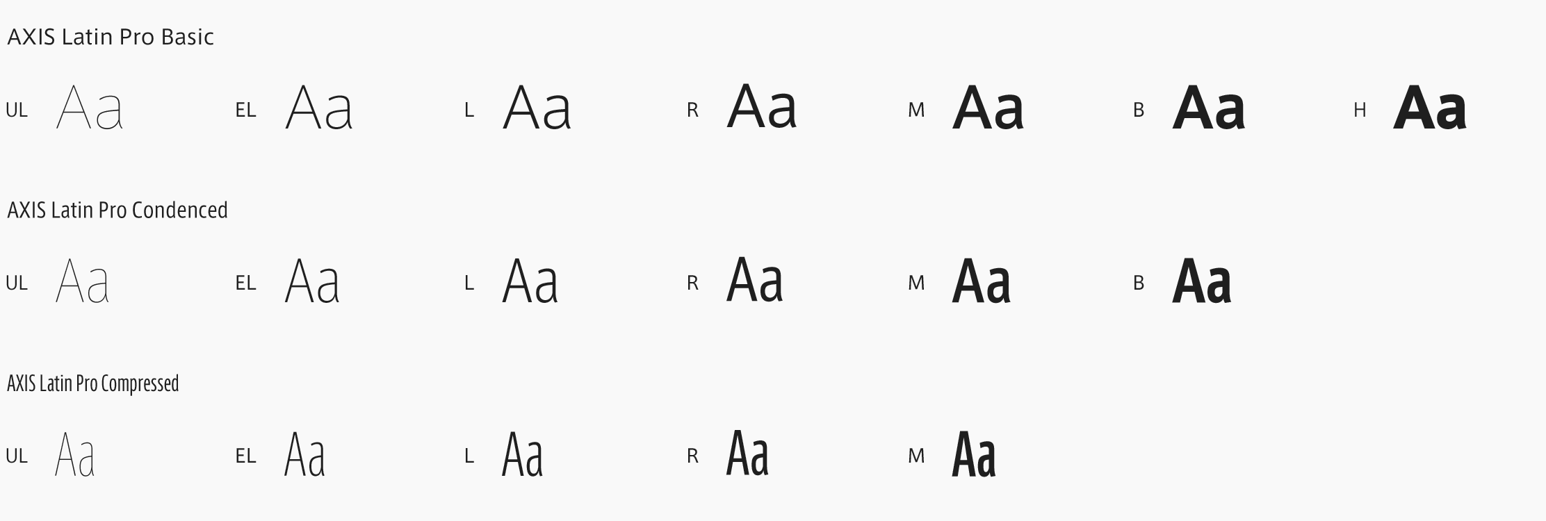
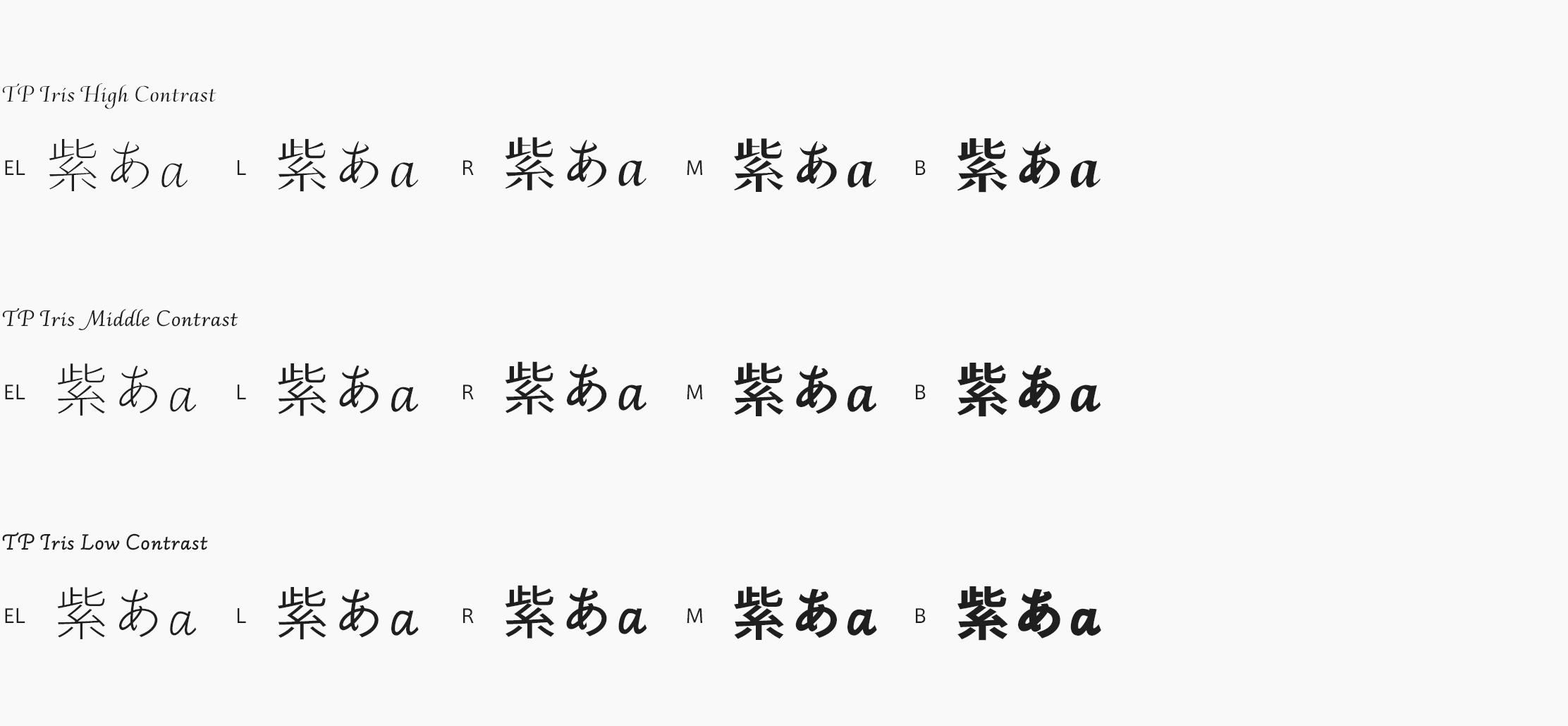
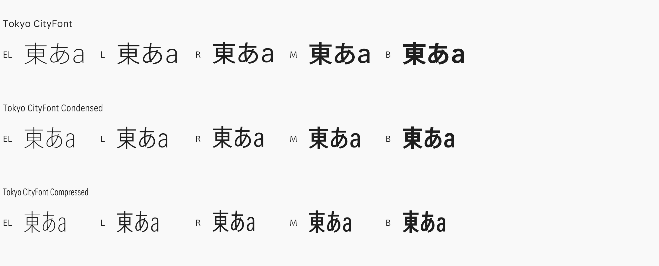
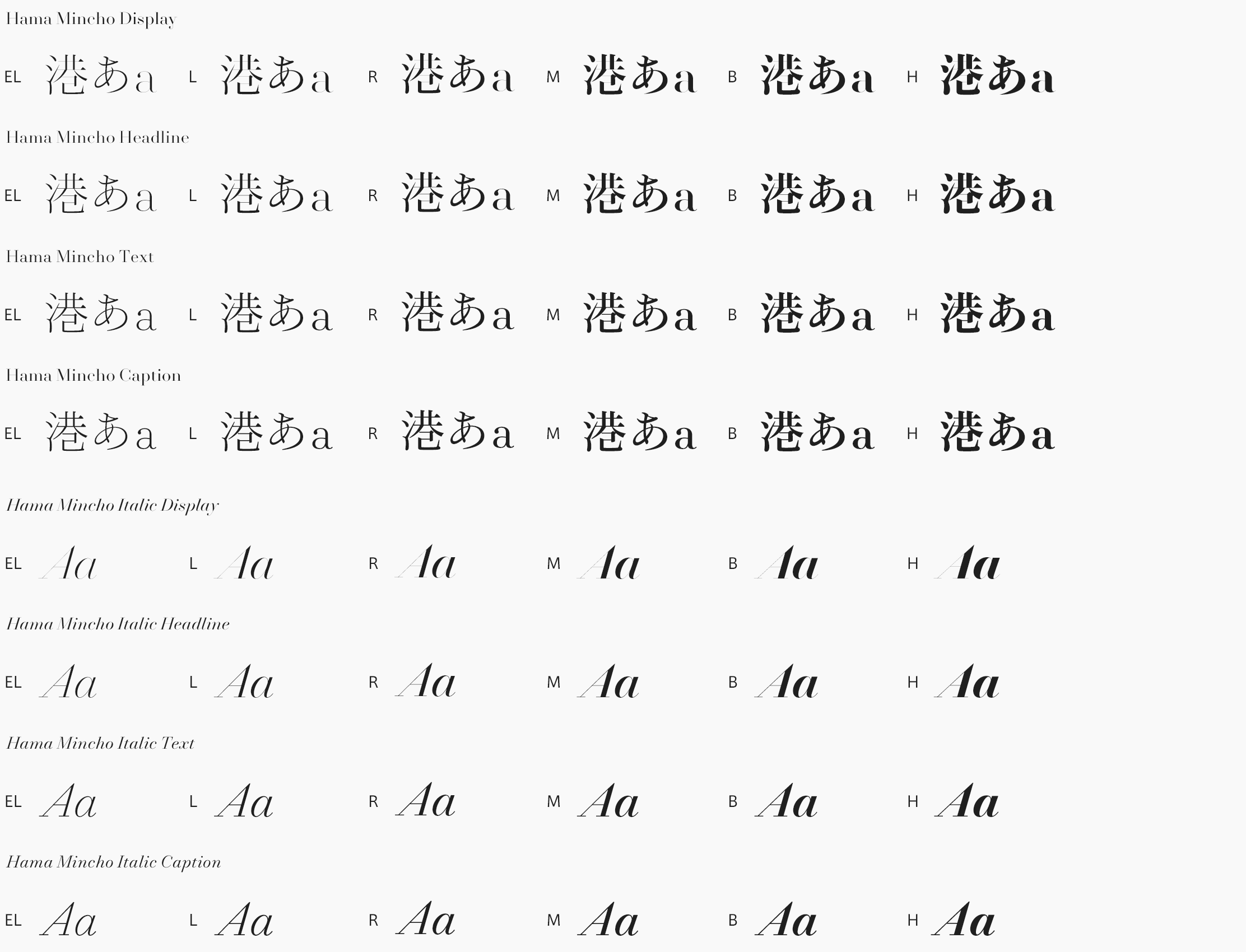
Our fonts are available worldwide, via our website, though our fonts are of limited use in places that don’t use the Latin alphabet. We have expanded a few of our families to support Cyrillic (for Russia, Bulgaria, Ukraine, and other neighboring countries) and Greek, and intend to continue to build our library in this direction. Japan has not been a strong market for us, even though a number of our typefaces match very well with Japanese, so we look forward to finally seeing our work in use in Japan thanks to our new partnership with Type Project.
8. Can you tell us about what you are working on right now and what you will like to work on in the future?
We are in the early stages of a couple of interesting custom typeface commissions, but unfortunately our clients don’t want us to talk about them until they’re finished. By the time this interview is published, our new website should be up and running. It was designed by our friends at Project Projects here in New York, and has been over a year in the making. Once our new website has launched, our next goal is to release the typeface Paul and I drew for the American magazine Vanity Fair, and continue working through our backlog of unreleased typefaces.
9. What do you think about your company positioning, for its raison d’etre in the font design/development industry?
We are first and foremost a custom type design studio, and this is where most of our energy goes, even if it isn’t our primary revenue source. Paul and I both have a background in publication design, which I think gives us a good understanding of what publication designers need, and makes it easy for us to talk to them. Most of the typefaces in our library were originally commissioned, many of them by magazines and newspapers, and I think we have reputation as editorial type designers.
10. What is you opinion about open source fonts and free fonts?
Type is a wide landscape, and open source and free fonts are an important part of it. Without Microsoft commissioning Georgia and Verdana from Matthew Carter, it could have been a long time before the web became comfortable to read at all! Free fonts serve audiences that otherwise would not have type created for them, and I really admire Google’s dedication to underserved languages with their Noto project.
11. What do you think about FitFont service?
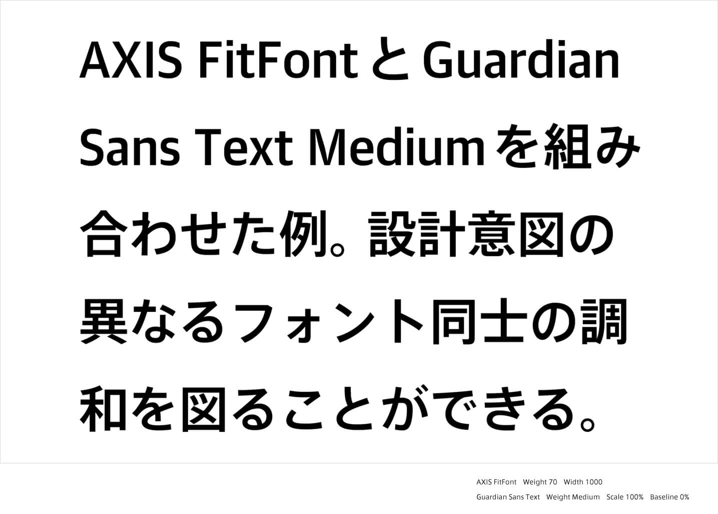
We think FitFont is a very impressive system, and we expect that it will make it much easier for both Japanese designers and Western brands doing business in Japan to find the right multilingual typographic voice. We are delighted to be part of this cross-cultural collaboration, with Japanese and Latin-based type designers each concentrating on what they do best. It is surprising to see how different Latin companions can change the atmosphere of a piece of text set primarily Japanese Mincho. Though the change is subtle, the overall impression is strikingly different. FitFont is uniquely positioned to take advantage of this possibility.
12. What do you think about Type Project and do you have any expectation for us?
We have admired the ingenuity and craftsmanship of Type Project since first seeing the AXIS Font family over a decade ago. We feel a real kinship with Type Project’s balance between comprehensive type systems like Axis, and their City Font projects, which give such a specific sense of place.

