2019.02/12
Introduced pioneering concepts in web fonts
Type Project interview with Peter Bilak.
1. Tell us about your company.
Typotheque is a type foundry based in The Hague, the Netherlands, established in 1999. Typotheque work has been recognised internationally, receiving numerous awards from TDC New York, Granshan, European Design Award, etc. Their work has been featured in dozens of books and magazines.
The founder of Typotheque, Peter Bilak, is the professor of typography at the postgraduate course Type & Media, at the Royal Academy of Arts in The Hague. For his contribution to the non-Latin typography, he was named in 2012 one of the 12 Game Changers by the Metropolis magazine. In 2009 we introduced pioneering concepts in web fonts, being the first commercial type foundry to licence its entire type library for use on the web. Typotheque has three partners: Peter & Johanna Bilak, and Nikola Djurek.Typotheque also has a sister company TPTQ Arabic, which specialises in development of Arabic fonts.
2. What is (are) the main/leading font(s) of your company?
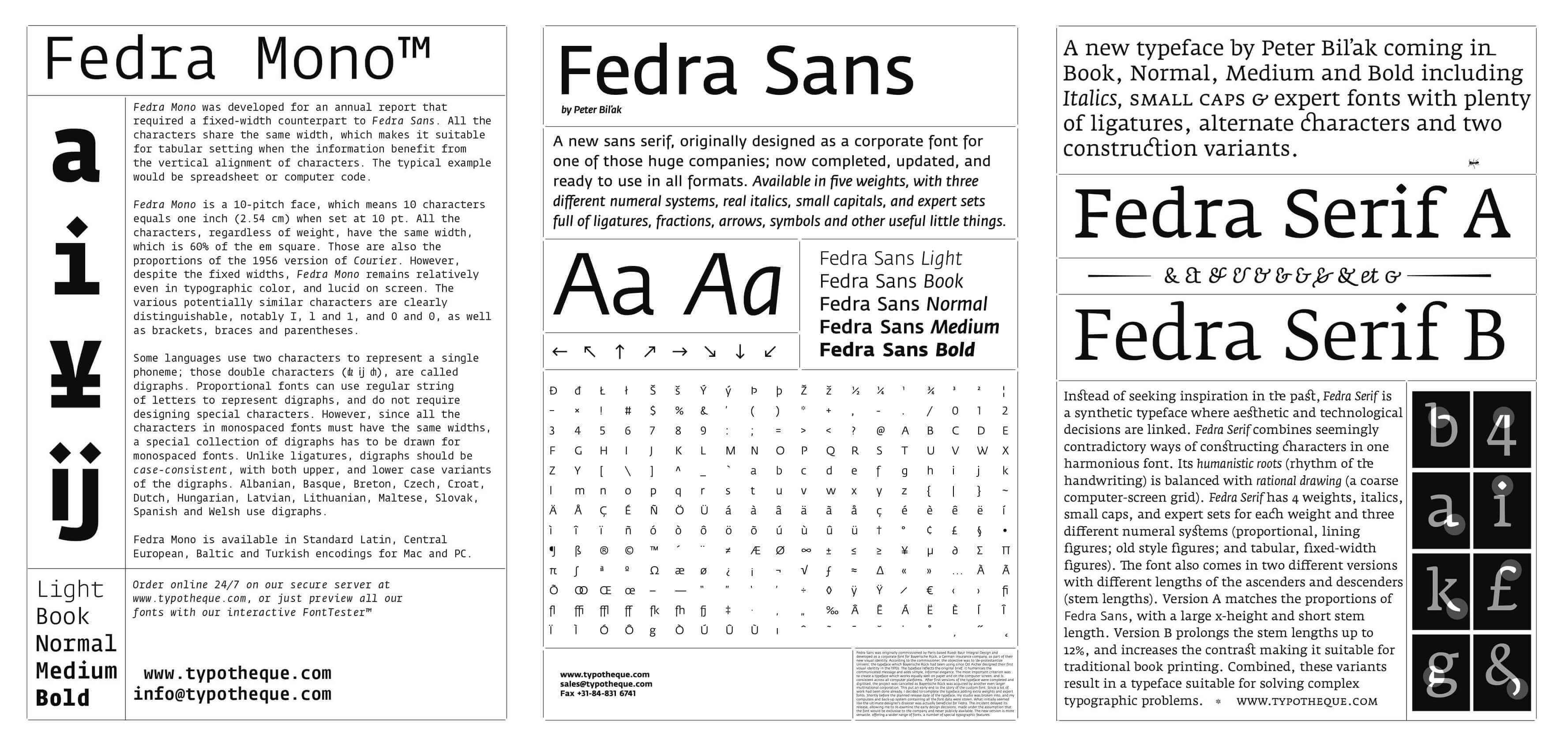
Our flag ship font suite is Fedra, a typeface that works well in both print & screens, available in Sans, Sans Condensed, Serif, Monospaced, Display, covering hundreds of languages, from Latin based to Cyrillic, Greek, Armenian, Arabic, Hebrew, Devanagari, Tamil, Bengali, Malayalam.
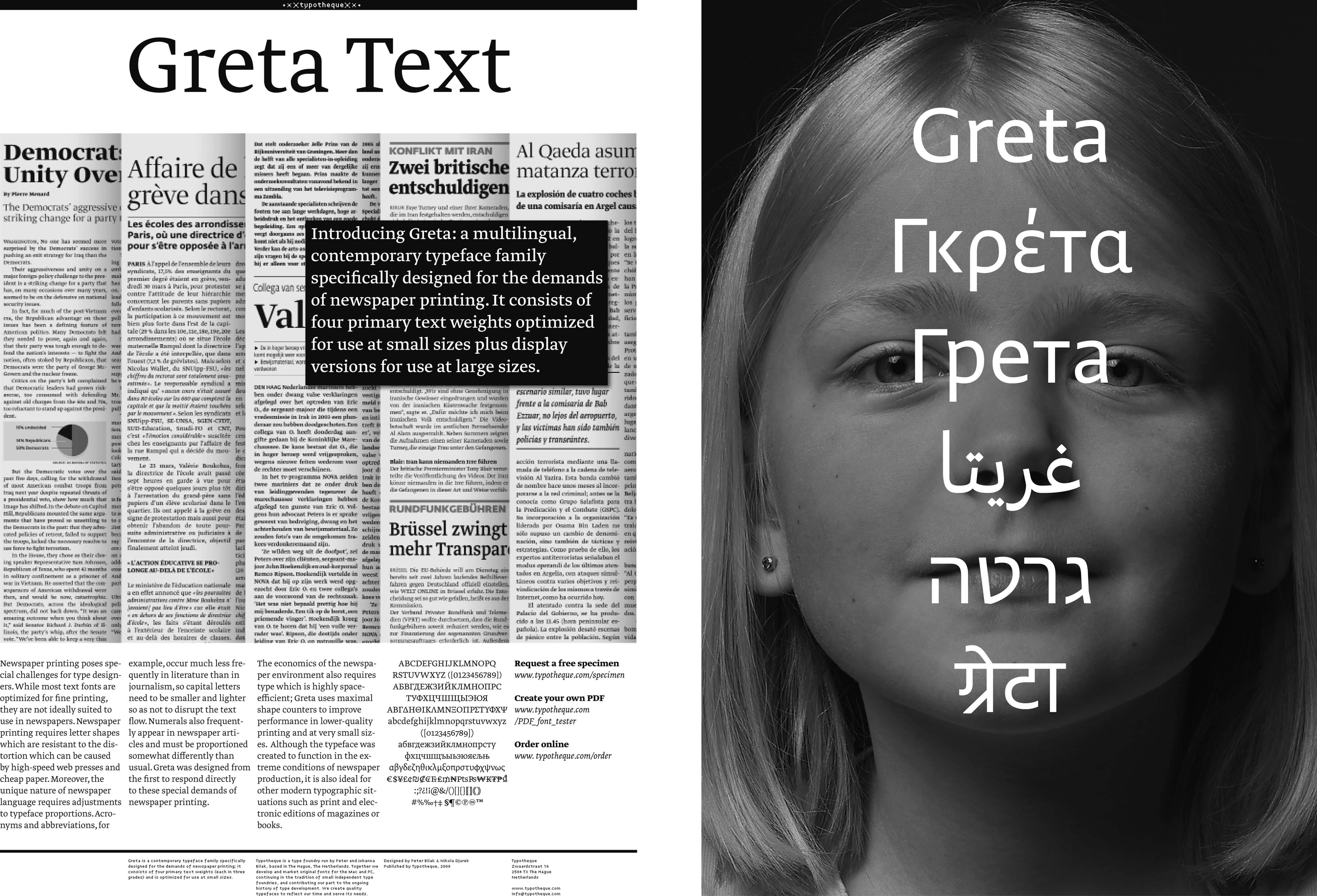
Another important super family is Greta, also in Serif and Sans and Mono available in multiple widths. Greta Sans comes in 80 styles (10 weights and 4 weights, with true italics.) It supports also Arabic, Hebrew, Cyrillic, Greek and Devanagari, each of those covered scripts is unprecedented, and currently largest typeface family available for these languages.
Typotheque retail library includes over 200 complex typeface families, consisting of over 2000 fonts.Typotheque retail library includes over 200 complex typeface families, consisting of over 2000 fonts.
3. Is there any newly released typeface from your company?
We publish new typefaces four times a year, so there are new designs regularly published. Recent ones are variable font explorations playing with optical illusions called Wind, or an unusual editorial typeface system called Brenner.
4. What is the ratio of your work for original design fonts and custom order fonts?
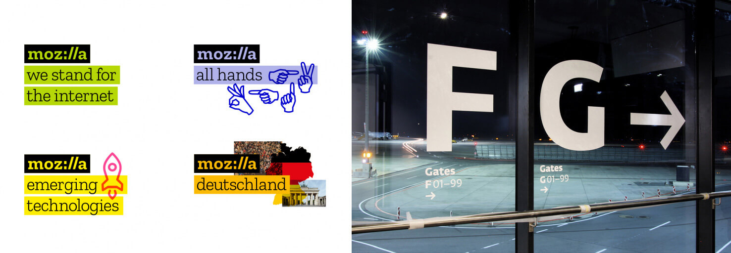
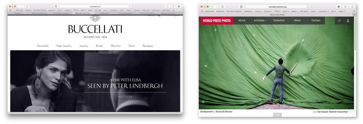
Typotheque has designed a number of corporate fonts, namely for the Paris Metro, Mozilla, World Press Photo, Vienna Airport, but still our retail type collection is the most important part of the work, taking 80% of our time.
5. Can you tell us about your customer(s)? How do they use the font?
We work directly with our customers, advising them on how to get most out of our fonts. They are mainly design and branding agencies around the world. They used our fonts when they want to express specific voice, or define a brand.
6. What kind of device(s) your customer has (have) embedded the font(s) with?
Our fonts have been used in variety of ways, built in in mobile applications, or electronic airport signage, used in software or hardware, but also in conventional print or websites. We are particularly proud that our fonts can be found on many websites, as we helped to defined the webfont standards, and we were the first foundry to introduce webfont licensing.
7. In which country will an end user be able to purchase your font(s)?
Since we operate mainly online, and we support over 200 languages, you can buy our fonts in all countries of the world.
8. Can you tell us about what you are working on right now and what you will like to work on in the future?
We always work on a number of projects at the same time. At the moment, we work on a collection of Devanagari and Tamil fonts for our bestselling font collection. We also work on very playful display fonts for Latin, that will be published in 2019. Many of the projects that we work on will be published in 2-3 years, sometimes it takes even longer, to create the work that we are satisfied with, and that can bring value to our customers for many decades. For example, Fedra Sans was designed in 2001, but right now is our bestselling font, and we continue improving it and extending the language support. So when our client buy our fonts, they can expect to use them for a very long time.
9. What is your opinion about open source font(s) and free font(s)?
Design and creativity doesn’t work great when they are too many people involved, so that’s why open source typefaces don’t bring creative value. Open Source methods is great for community collaboration, and is better suited for more technical work, which is not so much design driven.
There is no such thing as free fonts. It costs money and resources to make fonts, and someone has to invest both to make it happen. Usually it is big companies which pay for it, but that doesn’t make the fonts really free. One has to realise that big companies have their own intentions why they do it, and we have to decide if we want to be dependent on this work.
10. What do you think about Type Project and do you have any expectation for us?
We design fonts for many languages, but we also have limits, and are unable to make Japanese fonts. That’s why it is very valuable to work with local experts who can delivery high quality for other high quality typefaces. We hope that our fonts can become even more valuable, and usable by new communities which they can benefit from our work.
11. What do you think about FitFont service?
We find FitFont an important service that can extend the possibilities of other fonts and allow local audiences to use global fonts. We are very excited to work with FitFont.