2015.12/11
Mincho typeface co-exists with world heritage
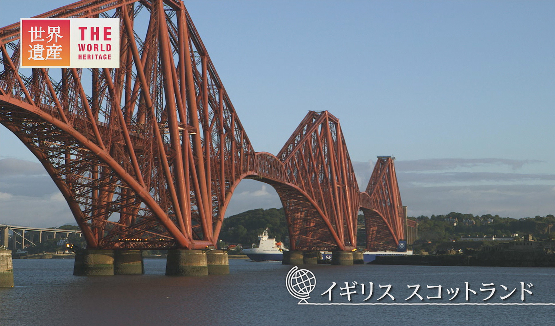
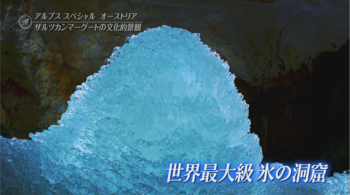
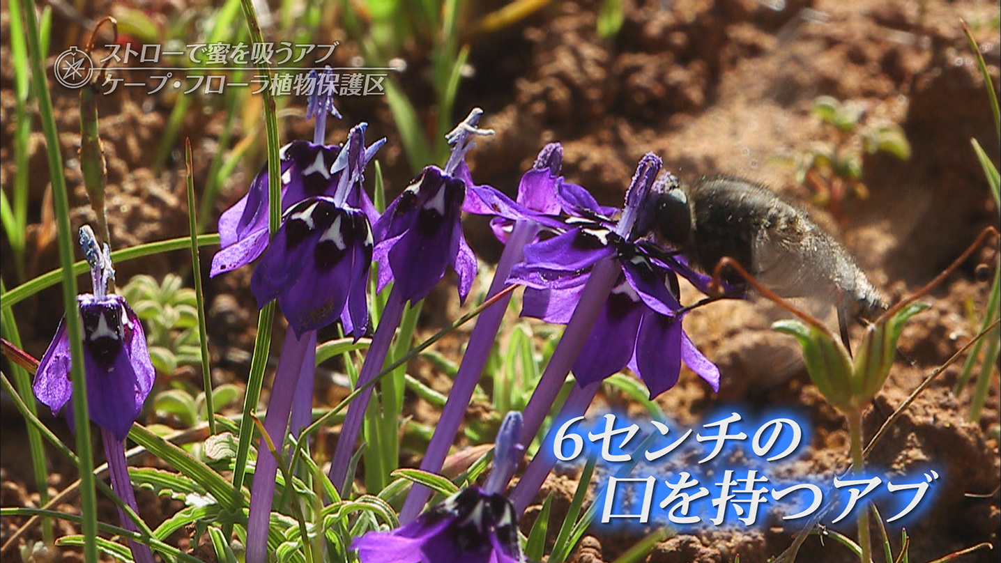
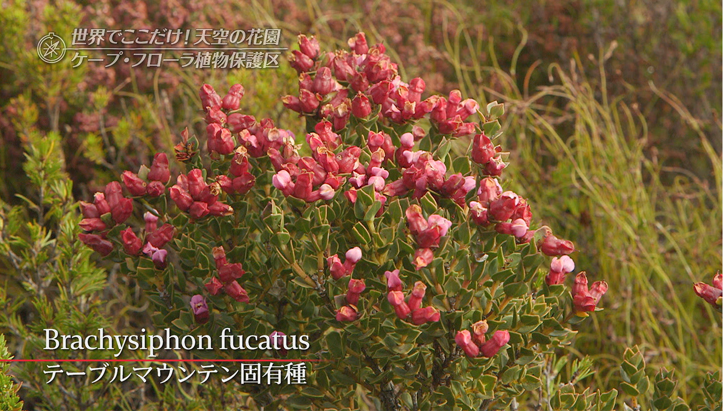
“World Heritage” screens on TBS TV every Sunday from 6pm. The program has walked down the paths of world heritage, with the goal of “passing down the history of the earth and humans from the past and connecting it to the future”. It celebrated its 20th broadcast anniversary in April 2015 with a revamping, and has freshly adopted TP Mincho as its telop typeface.
I think that the Mincho font is an attractive typeface, but sometimes it’s difficult to see horizontally on a screen, so it can be limited in its usage. When I first heard that we could choose its horizontal thickness via TP Mincho, I was very happy.
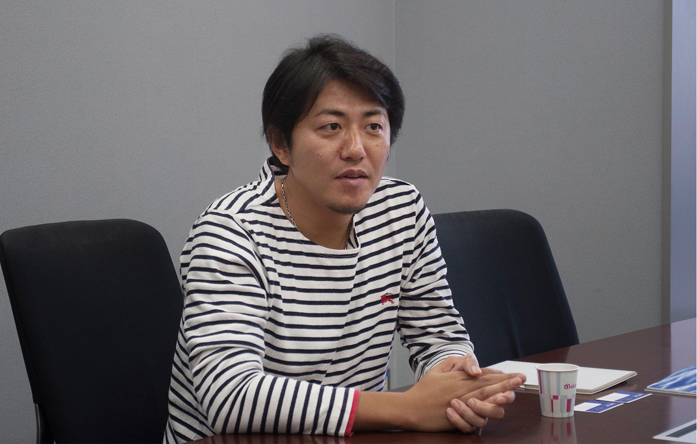
TBS Vision Inc.’s Director, Shingo Ohya, manages production for “World Heritage”. He has the following to say about the circumstances in which TP Mincho was chosen: “I felt that the letters that express world heritage, in other words those things which speak of the various cultural and natural assets of the world, can be expressed well in Mincho typeface, as it connects to universality. Additionally, we are a program whose protagonists, as it were, are images; as such, we want a font that appears in a subtle fashion, and doesn’t seem excessively self-assertive. More than anything, it was important to us that the letters can be read easily when they are on top of an image. For the revamping of our program, when we were saying things like ‘a font with this kind of image would be great, wouldn’t it?’, the CG designer suggested TP Mincho. My first impression was ‘yes, this is very attractive!’”
TP Mincho is a Mincho font with a typeface design that is optimized to horizontal typesetting, and which is ideal for ease of reading in a digital environment. By introducing an axis of both weight and contrast (the ratio of horizontal and vertical thickness), it can be selected for a wide variety of scenarios and suited to the specific environment of its use. Additionally, TP Mincho’s modern stroke representation and design framework is ideal for usage with character variations such as italics.
“When using a telop for a program, often the font is selected at the stage of VTR editing, but at World Heritage, we felt that uniformity within the program was important, so we have made a thorough policy of using one font as main. As such, the selection of font for our revamping was treated seriously. Finally, we narrowed it down to 4 or 5 candidates, and we tried using the letters on images that we had broadcast in the past, and compared the selections in order to make our decision.”
At World Heritage, the telop letters are not very large, and it was important that they would be easy to read without the horizontal strokes fading out of view and that there was a good balance between the Japanese and English text, as well as that the font could be used in an attractive fashion without requiring fine adjustments. With this in mind, Ohya chose the middle contrast of TP Mincho. “When we suggested this option to the producer, who had been aware of the font previously, he replied ‘that would be perfect for our needs’, so the decision to introduce it went smoothly. In terms of the vision that World Heritage has, it was something that the staff had in common.
The concept of our program is to act as an archive of beautiful imagery that preserves world heritage for future generations. There have now been over 900 episodes of World Heritage. We will be using TP Mincho as our telop typeface, with simple processing.
“World heritage is very interesting, and we want to convey that to the world in as close to its original state as possible. That’s why we want to minimize the processing of letters, so that they don’t get in the way. For example, no matter what the typeface is, if you process it by using something like edging of potentially many layers, then it does often become easier to read, but we want the font design to appear attractive, too, and TP Mincho is perfect for that. In our program of 30 minutes length, which is watched by an audience ranging from little children to the elderly, we want our viewers to experience the charms of world heritage, and it would make us very happy if they think to themselves, ‘I’d love to visit there one day!’”