


2014.08/01
A Typeface to Create a “New Standard”
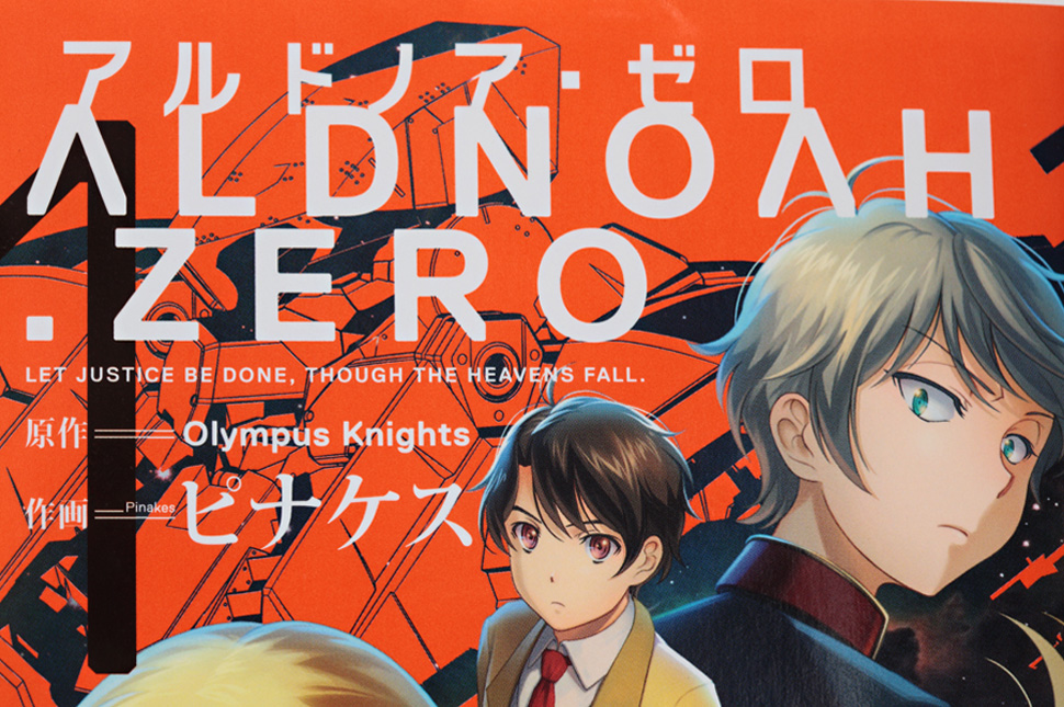
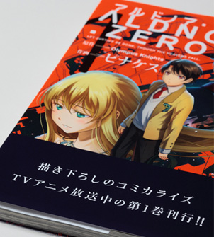
In July 2014, the original TV animation series Aldnoah.Zero went on air. The artwork is supervised by Tomoyuki Arima of Nippon Design Center. Arima had worked in manga and animation on a personal level in the past. For this project, when the producer from the planning and production company first approached him, not even the title of the series had been decided. It was the producer’s statement on that occasion, “We want to create a new standard in mecha anime,” that became the starting point for Arima’s development of a bold and ambitious design.
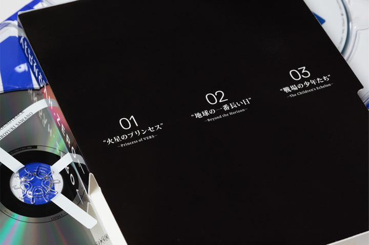
Arima was of the opinion that “The creative aspects of aiming for a new standard should be evaluated from a number of viewpoints,” and with this in mind, he sought the cooperation of Takuya Sejima, a deeply knowledgeable specialist in the field of animation. The team that came into being around Arima and Sejima is responsible for designs realized in diverse media, from the title logo, website, advertising and pamphlets for Aldnoah.Zero, to the logos of organizations that are part of the show’s story, the display screen graphics, packaging for related products, and more.
Arima was of the opinion that “The creative aspects of aiming for a new standard should be evaluated from a number of viewpoints,” and with this in mind, he sought the cooperation of Takuya Sejima, a deeply knowledgeable specialist in the field of animation. The team that came into being around Arima and Sejima is responsible for designs realized in diverse media, from the title logo, website, advertising and pamphlets for Aldnoah.Zero, to the logos of organizations that are part of the show’s story, the display screen graphics, packaging for related products, and more.
Arima was of the opinion that “The creative aspects of aiming for a new standard should be evaluated from a number of viewpoints,” and with this in mind, he sought the cooperation of Takuya Sejima, a deeply knowledgeable specialist in the field of animation. The team that came into being around Arima and Sejima is responsible for designs realized in diverse media, from the title logo, website, advertising and pamphlets for Aldnoah.Zero, to the logos of organizations that are part of the show’s story, the display screen graphics, packaging for related products, and more.
Arima was of the opinion that “The creative aspects of aiming for a new standard should be evaluated from a number of viewpoints,” and with this in mind, he sought the cooperation of Takuya Sejima, a deeply knowledgeable specialist in the field of animation. The team that came into being around Arima and Sejima is responsible for designs realized in diverse media, from the title logo, website, advertising and pamphlets for Aldnoah.Zero, to the logos of organizations that are part of the show’s story, the display screen graphics, packaging for related products, and more.
TP Mincho, which was developed with the aim of becoming a new standard for use in digital media, has an axis for contrast (the proportion of thickness of horizontal and vertical strokes), and is designed to allow the user to select whatever works best with the special characteristics of the media. “TP Mincho’s High Contrast is very sharp and has narrow horizontal strokes. So if this typeface had existed two years ago and we’d tried to use it on TV, probably the network would’ve stopped us. Now, however, it’s become accepted to have high resolution not just on TV, but for webcasts too, and new kinds of expression have become possible. It’s a happy thing when you find a typeface that can really harmonize with the era you want to convey,” says Arima.
©Olympus Knights/Aniplex・Project AZ
For Aldnoah.Zero’s title sequences, Arima and his team rearranged and combined various title and logo elements to create a rich assortment of designs. In addition, they produced a design manual for people involved in diverse kinds of created work, containing detailed definitions of rules for color balance, typography and other characteristics. This manual stipulates the use of TP Mincho and AXIS Font as Mincho and Gothic typefaces. “In the creative aspects of Aldnoah.Zero, we do not treat the logo as a logo. By applying several rules to redistribute those roles that have always been assigned to the logo, I am hoping to design newer forms of communication. The thing that has been vital to ensure design quality and identity within this kind of system is fresh typography. Also, at production sites that involve many people, if the rules are not easily applicable the quality of the creativity deteriorates. TP Mincho and AXIS Font both have clear and beautiful appearances even without being set in a special way, so the choice was an obvious one.” (Tomoyuki Arima)
“I think that the thing about setting a new standard is that people are going to come along who will continue it. In that sense, having our designs imitated will be a welcome thing, and I am hoping that a lot of people will follow in our footsteps.” (Takuya Sejima)
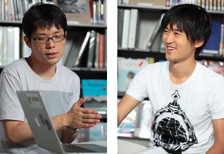
(Photos by Kou Chifusa)