


2015.09/11
New possibilities for web design spread by TP Mincho
Tsuyoshi Otsu is the president of THROUGH, a design studio that takes an integrated approach to logo creation, business cards, and pamphlets through the unified vector of design. In spring of 2015, he was selected as representative of Gifu Prefecture for the “NIPPON no 47 Nin (47 from Japan)”, a design exhibit held at Shibuya Hikarie. Otsu, a longtime fan of AXIS Font, took an immediate interest in TP Mincho for its explicit design for digital displays, and he now uses it to create graphics for a range of firms.
“In early 2014, I saw a tweet that said TP Mincho, a new Mincho typeface, has been released from Type Project. I knew how intuitive AXIS Font was to use, so I checked their site right away. The first thing that struck me as new and surprising was the idea of contrast. Both the High and Low Contrast typefaces suggest the intellectual aspect of a Mincho typeface, but the change in contrast provides a key aesthetic change. I could already picture myself alternating between the two for different contexts.
TP Mincho was designed to be the next generation of Mincho typeface. Users can select from High, Middle, and Low Contrast, it is designed to be the easiest-to-read in a horizontal layout and be beautiful in double-byte character typesetting.
Otsu says, “The idea of a Mincho font designed for digital displays really resonated with me. I realized there was no way I could do without this font in the field of web design.” He chose to purchase TP Mincho High Contrast and Low Contrast which each have six weights.
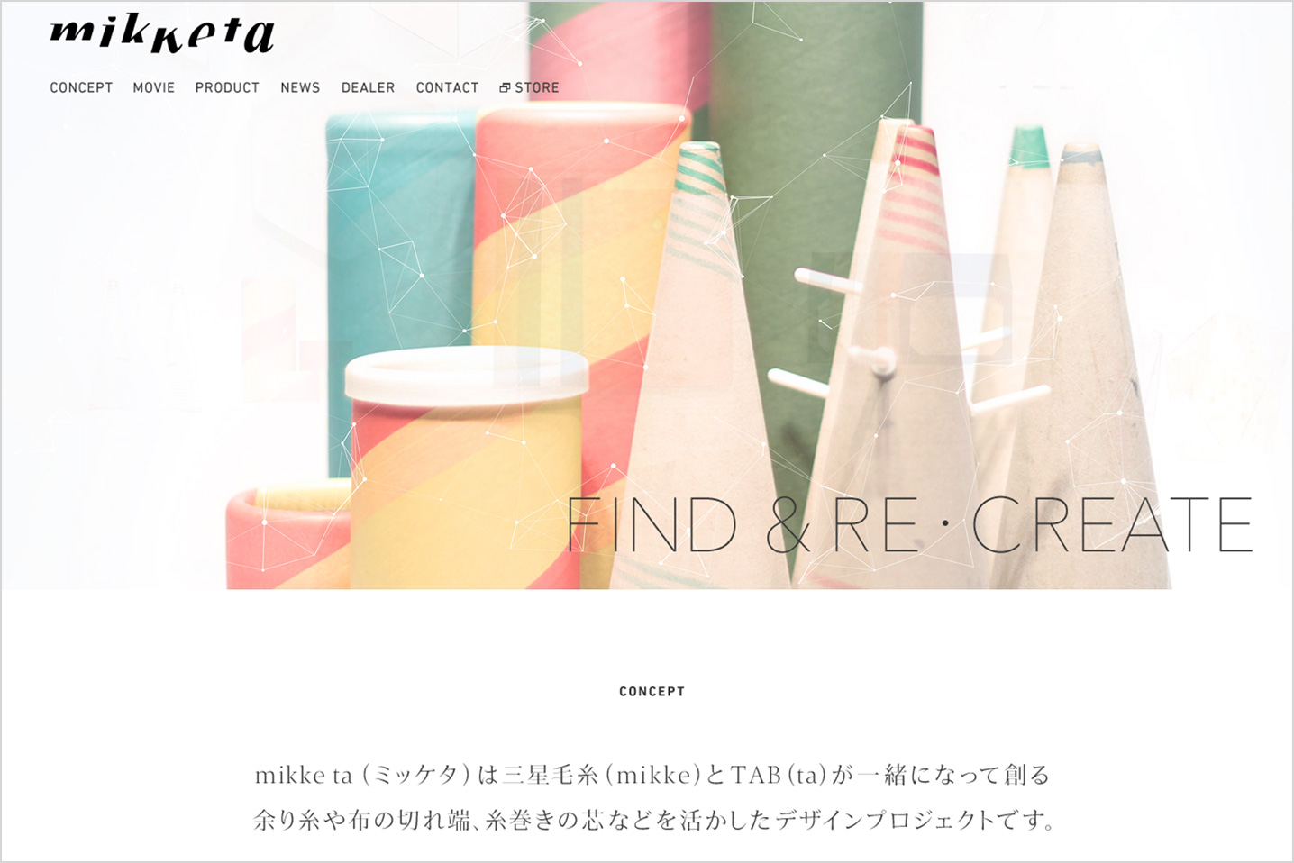
Among the sites Otsu has been responsible for is one for “mikketa,” where the High Contrast version of TP Mincho is used to great effect. In this implementation, TP Mincho uses a sharp High Contrast and thin weight that aptly corresponds to mikketa’s aims as a design project making use of scrap yarn. The typeface synchronizes with the product’s texture to give a sense of tension and interest to viewers. Otsu says, “Actually, TP Mincho is only used on one point on the site, yet this presence alone transforms the overall impact. TP Mincho is that powerful.”
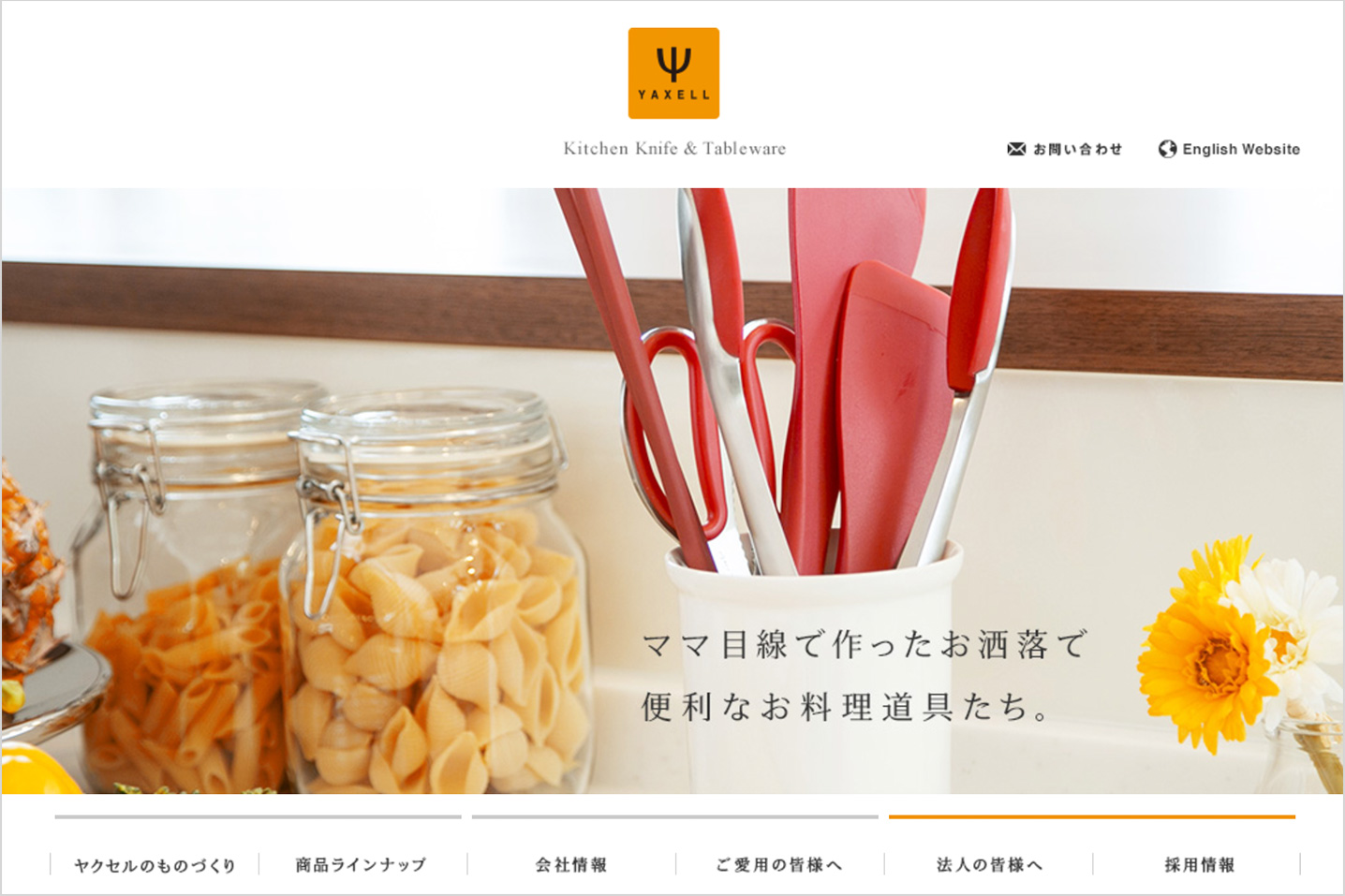
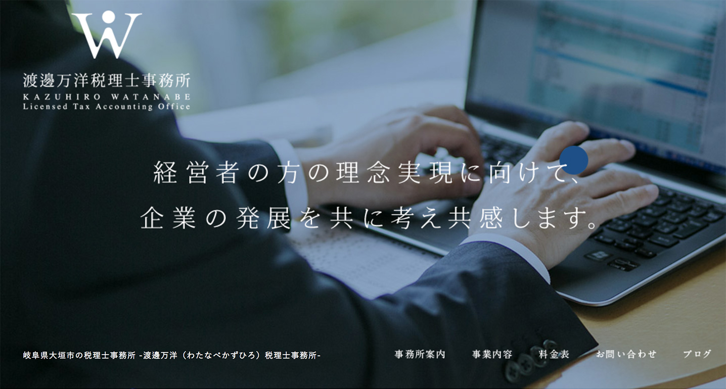
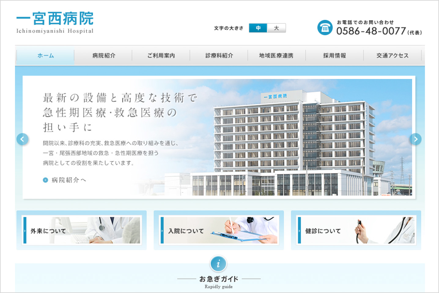
Whereas, for the design of sites like the Kazuhiro Watanabe Licensed Tax Accounting Office, the Ichinomiyashi Hospital Resident Site, and Yaxell Corporation’s corporate site, Otsu selected the Low Contrast typeface. Otsu says, “When using Mincho typefaces for web design, you often have to tweak the anti-aliasing. This takes time and effort, and sometimes the result is not as desired. TP Mincho, however, has the weights pre-dialed in and a range of contrast choices, so it doesn’t stray from our intended concept when we make modifications. There are many possibilities in particular for the low contrast versions, making it an excellent font for the web. It has a subdued effect and suggests cleanliness and reliability. This is perfect for businesses wanting to promote that image.”

“I enjoy using both AXIS Font and TP Mincho for different purposes. My stance may be a bit different from most designers, but I don’t purchase annual licenses for fonts – I buy the ones I like outright. In that sense, I’d love for Type Project to come out with more fonts I can add to my arsenal. I’m interested in other Latin fonts beyond what is offered by AXIS Font.”
“AXIS Font is not only simple and easy to use, but it can also be scaled to give balance to a design – scale up the thin typeface or scale down the thick typeface for headlines. I consider it to be a universal font.”