


2019.02/26
A Typeface Chosen for “Speed”
Harnessing its prowess in content production and news coverage, Asahi Shimbun’s Advertising Division creates special advertising sections and oversees tone and manner. Numbering more than sixty per month, these special advertising sections are created together with production companies such as Text House, which serve as idea-generating think tanks. On average, production takes 3-4 weeks from receipt of client requests to completion, with at least ten projects underway at any given time.
According to Advertising Division art director Manabu Suematsu, “Almost all aspects of newspaper advertising production require immediate decision-making. This is due to the large number of projects and the short turnaround time, and ‘immediate decision-making’ is essential to newspaper creation as a whole. The moment a reader looks at a newspaper, he or she is making a judgment: Is it interesting or not? And I think that for the producer, sharing that sensibility with the reader by making immediate assessments, rather than by opting for things that take a lot of time to create, will be the most appropriate approach going forward.”
As everything from font and layout changes, to color and tone corrections and the like is settled at the first-draft stage in newspaper advertising, procedures done on computer must be carried out over a period of several days.
“TP Mincho strikes me as needing less fine-tuning than other fonts. It feels right just as it is. Time doesn’t get taken up with instructions to enlarge kana characters that were built small, or to insert half-width spaces before and after an exclamation point, for example. When we go to press everything is last-minute, so it helps being able to cut down on production time and work efficiently.” (Suematsu)
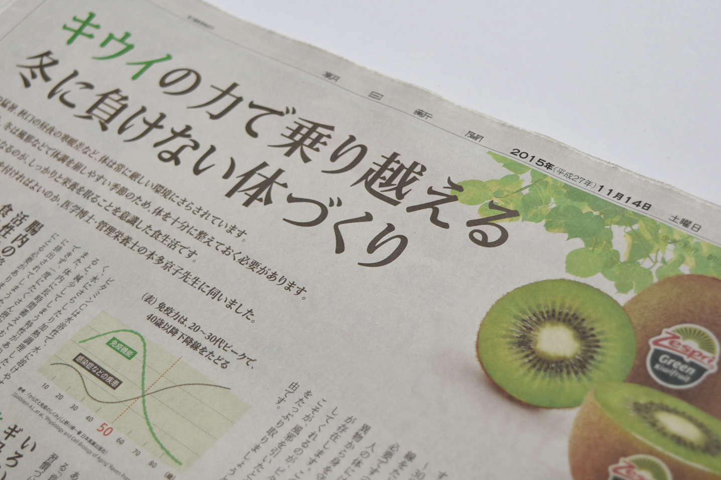
While Asahi Shimbun is set with an original typeface called Asahi Shimbun Mincho for the main newspaper text, a variety of fonts are used in the advertisements. For the creation of advertisements for Zespri, they were searching for a font that had a feeling of newness not found in conventional fonts, and that could convey the sense of warm familiarity and freshness of the company’s kiwi fruit, while also fitting well with the product and being easy to read.
TP Mincho is used for the entire Zespri seminar advertisement series.
Text House chief graphic designer Miyamoto explains, “I was searching for a modern-looking Mincho typeface that didn’t have distracting uroko (stroke-ending flourishes). I’d started to get the feeling that the typefaces I was using were outdated. I wanted a Mincho typeface that went with the AXIS Font I used most frequently, and my choice was TP Mincho.” Miyamoto speaks of TP Mincho as having a feminine quality. One of his reasons for adopting it was that Zespri’s seminars feature women lecturers, and women are the targeted audience of the advertisements.
“TP Mincho has a modern feel and a high level of completion. I think that the high level of completion of the font has the effect of showing the advertised product as having a higher level of completion.” (Miyamoto)
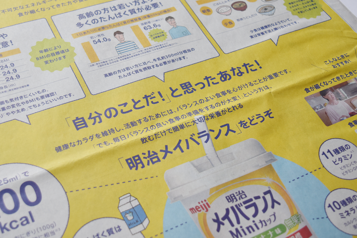
The special advertising sections produced by Asahi Shimbun Company’s Media Business Department frequently use AXIS Font as well. At one time, the department employed a technique of processing Gothic font outlines to obtain new expressions. AXIS Font was chosen as a font that could be used without such processing. For advertisements for Meiji Mei Balance, AXIS Font was selected as a font that would resonate with readers while also conveying more information of interest to purchasers, and the issue of how to obtain a better response than that from prior advertisements was resolved.
“AXIS Font has a modern feel, with a clean and natural counter level that makes it easy to use. It’s the font I’ve been using most for the past ten years or so. After all, the combination of AXIS Font and TP Mincho is perfect, so without even being aware of it, I find myself choosing this combination in many cases.” (Miyamoto)
Suematsu apparently noticed the scope of his design broaden as a result of adopting AXIS Font. “When making an advertisement, at times I find the assertion of a character disturbing. I have the image that it is encroaching on an adjacent character, and that they are attacking each other. With AXIS Font, I get the impression that this is being researched – for example, that the long parts found in characters like ひ (the hiragana “hi”) have been moderated, and the circumference of の (the hiragana “no”) is not too empty. And with its way of resolving characters’ narrow parts, which I always used to find disturbing, AXIS Font is a “cure-all for characters”.

Ippo Miyamoto, Chief Graphic Designer, Text House, Inc. (left):
The first time I saw TP Mincho, I had the impression that it could just slip into place in a way I’d never really seen before. Now I am completely used to working with it, and it just seems like it’s been around forever.
Manabu Suematsu, Art Director, Cross-Functional Sales and Marketing Department, Advertising Division, The Asahi Shimbun Company Tokyo Head Office (right):
With a Gothic it might be a bit light, while with a Mincho typeface it would be too serious-feeling, and neither would fit the product material. I was always searching for a font that was truly new and different, but was still easy to read. It’s great working with TP Mincho, as it needs almost no fine-tuning even with vertical writing.