2017.02/03
Changing the shape of courses on type design – Drop&Type
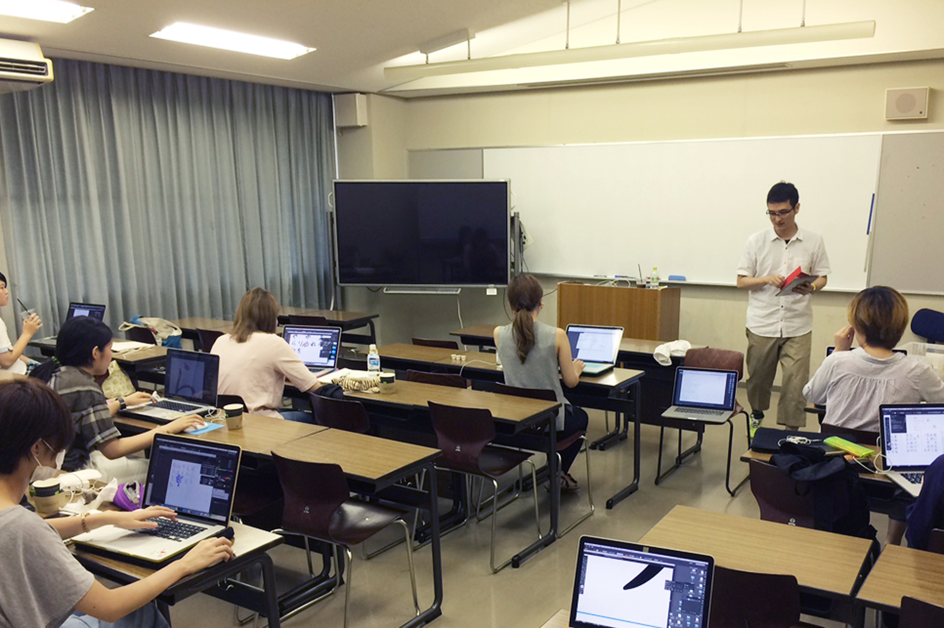
In 2016, at Kyoto Seika University’s Department of Visual Design, we introduced Drop&Type. As the font creation software used in the department at the time had many different functions, and therefore made it difficult for students to focus on making their own original fonts, we consulted with Hiroto Ueda of coban.lab regarding the need for a simpler software tool, and we asked him to give a lecture on the occasion of Drop&Type’s introduction.
As Ueda explains, “About four years ago, I gave a lecture on building fonts using other companies’ applications, which had numerous settings that had to be dealt with before any characters could be made, and were challenging for students to use. The students were completing most of their character designs with Adobe Illustrator, and they needed a software tool that they could work with intuitively to get the fonts they wanted. I had the objective of raising the efficiency of the work done in Illustrator, rather than the work of carrying out detailed software settings.”
Toru Takahashi
“In class, Japanese kana creation is the main focus, so envisioning solid-typeset Japanese is fine. There is no need for anything more than introductory-level functionality, so I hope that future versions of the software will still be easy to use.”
With the software in use at the time, there were various detailed instructions that had to be carried out in order to build a font, such as how to set metrics for and confirm the placement of vertical writing-use characters, or how to move between tools while making corrections. As Toru Takahashi, of the Department of Visual Design in Kyoto Seika University’s Faculty of Design, says of Drop&Type, “It’s simplicity itself. If you’re using software that you can create characters with that have outline Bézier curves, but you still have to take care of encoding and character face settings, not to mention the editing of side bearing, pair kerning and other metrics information, the specifications get pretty complicated. So, that’s an application that would be rejected as an introductory-level tool for students. But Drop&Type is easy to use, so it did not get rejected.”
Another factor was that the price of the software was too steep for students to buy, so they produced their work using trial versions. As a result, it was not possible for students to continue creating fonts outside of class. Drop&Type is affordable even to the individual user, so it has quickly become part of students’ workflows.

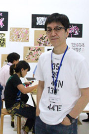
Hiroto Ueda
“It’s great to be able to set the goal that if you make 280 characters, you can make a font. Students have responded to the ease of use – that they can take whatever they’ve made in Illustrator, which is where they’re accustomed to working, and they can just copy and drop it.”
“It was remarkable how the students’ excited feeling of ‘I made my own font!’ would settle down right away, and then they’d go back to their designs and get absorbed in making corrections. Since they could bring their work to completion on their own using tools that they were accustomed to using, the desire to modify things in certain ways started emerging, and they’d redo things over and over again. That’s because their eyes had started picking up on those areas that one has to be aware of when doing type design. I realized then that in comparison to the software we’d been using, Drop&Type is a world of difference in terms of the font-building workload.” (Ueda)
Coban.lab engages in client logo creation, and in design, coding, content creation and consulting for websites. Out of a desire to further deepen people’s knowledge of fonts and make proposals to clients in the context of his interaction with them as a web designer, Ueda has started “Japanese and Latin Scripts” and held such events as the Kyoto Moji-juku (character school) Exhibition. Ueda’s awareness of letters was influenced by his on-site experiences of seeing them in use in countries throughout Asia, which he visited during his sojourn as editor of the Japan Typography Association journal Typographics ti (TEE).
“I realized while talking with designers there that Japanese are the only people who are adept at using five kinds of characters: kanji, hiragana, katakana, Arabic numerals and the Latin alphabet. Feeling that web designers need to be more aware of and involved in typeface selection, I created a space in which Japanese and Latin scripts could be studied simultaneously. I think it’s wonderful to be able to have the experience of using Drop&Type to make a font on one’s own, so that one can look at how that font came into being, and how it should be used.” (Ueda)