


2020.10/19
The Design Center has been in charge of various designs in regard to the present branding in the in-house creative division of TBS. The scope of designs handled by the Design Center includes many different items, from logos to designing programs, providing publicity and promotion, events, producing videos, in-house documents, and printed matters. At TBS, logos with different designs had been used for each group company and service, such as ground wave, BS broadcasting, radio broadcasting, etc. Taking the present re-branding as an opportunity, a unified logo was designed to show one TBS brand for all group companies and services. At the same time, there was request to change the design of in-house documents, program captions, etc., to look the same.
A graphical element is required for the font for the purpose of making logos. On the other hand, ease of reading must be emphasized in the font used for documents and long sentences. For these two purposes, implementation of a custom font for branding and corporate font was decided, and selection was made at TBS from a separate point of view, respectively.
Corporate Font

TBS TELEVISION, INC.
Shintarou Danno
Design Center Design Management Dept.
“For example, we were hoping for documents created by directors, etc. who are not designers, to look the same. We were also hoping to have a sense of unity in various mediums including documents, captions, website, and digital signage. Upon selecting the present corporate font, I thought the AXIS Font was ideal from the view of creating a gentle impression while being easier to see and more sophisticated in design. Following this, a Mincho typeface that matches the AXIS Font is also required,” says Shintaro Danno in the Design Center Design Management Dept.
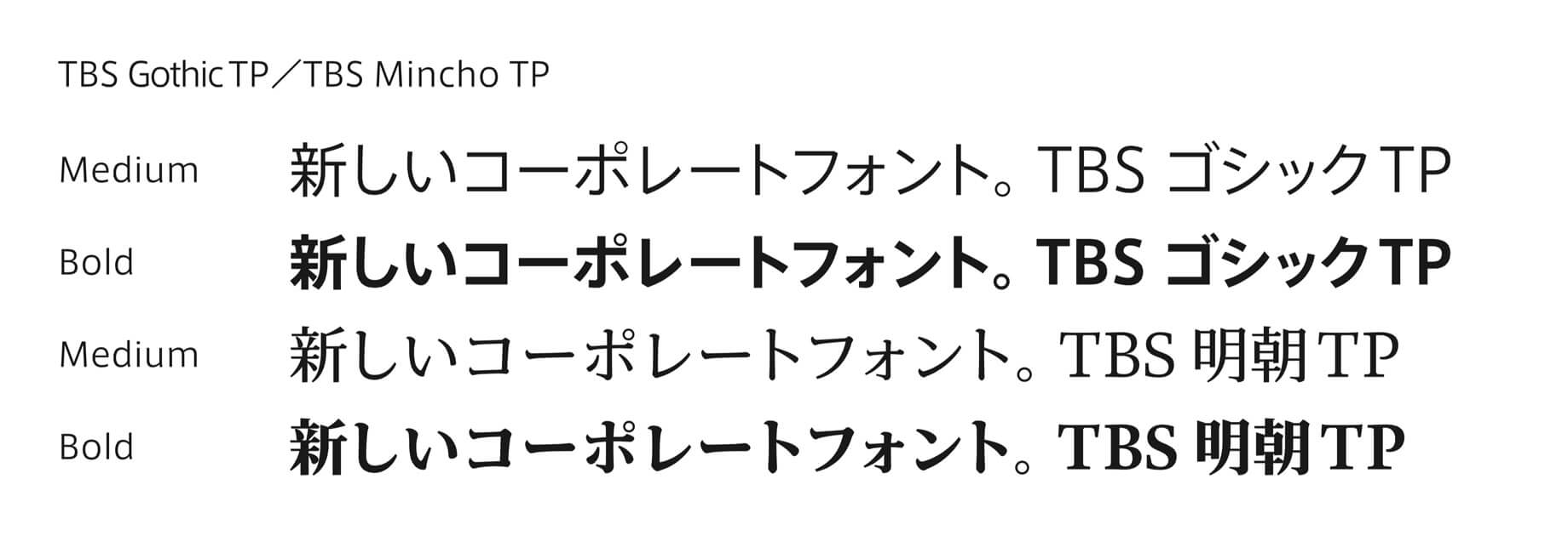
This is how the fonts with numerical values most appropriate for corporate font were selected from AXIS FitFont and TP Mincho FitFont. Currently, 2 weights of “TBS Gothic TP” and “TBS Mincho TP” are pre-installed in personal computers used by approximately 3,700 employees of the group companies as the TBS corporate font. In the templates for Microsoft PowerPoint and Word for employees provided by the Design Center, either “TBS Gothic TP” or “TBS Mincho TP” is set as the font used.

TBS HOLDINGS, INC.
Takaaki Matsubara / Manager
Corporate Branding and Promotion Center
Design Center Design Management Dept.
Takaaki Matsubara of the Design Center says: “The use of corporate font is recommended when making documents at TBS. I’m actually feeling that usage is increasing gradually. It is the first time for the company to implement a corporate font, but I feel that the meaning of using the corporate font, such as ‘the look of the company can be changed by unifying the fonts,’ ‘the external look is starting to be unified by having official fonts with the name of TBS,’ etc. in addition to matching the tone and manner, is starting to be understood.”
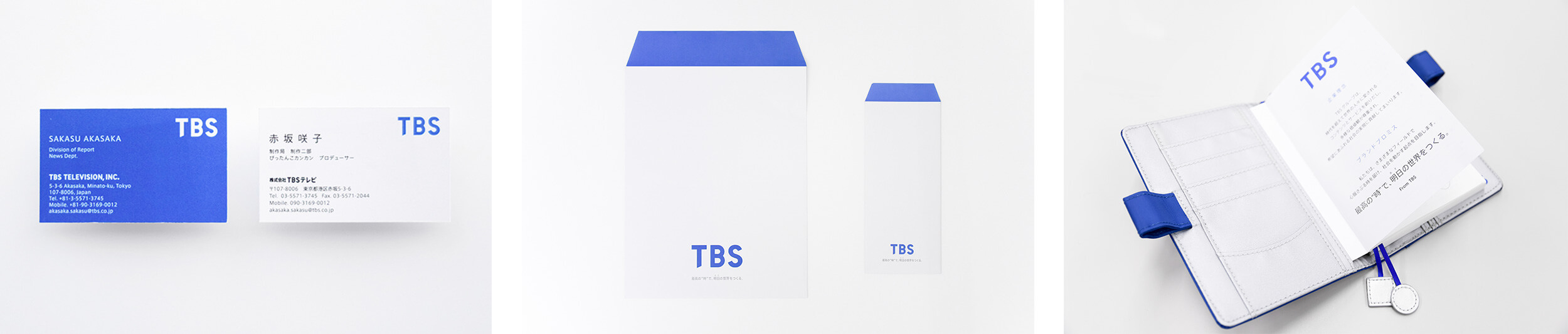
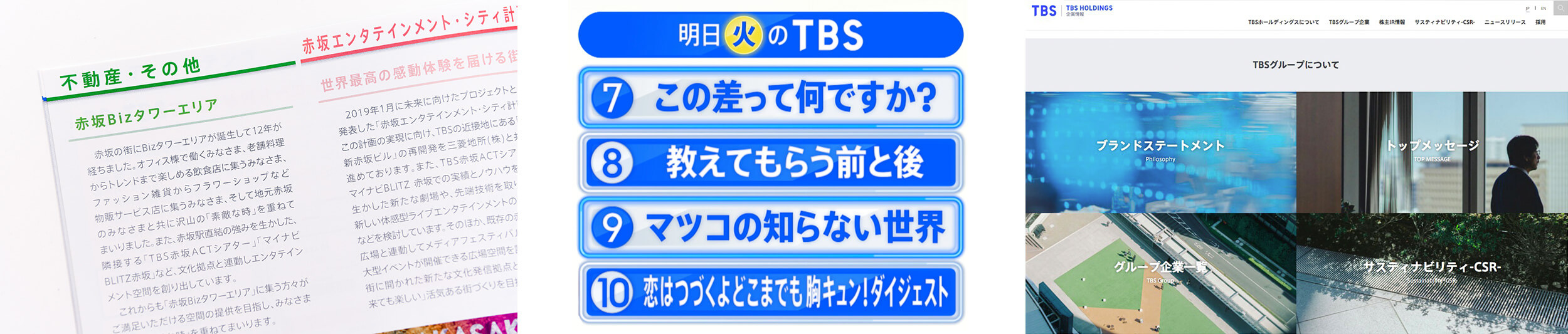
The corporate font has already been used for business cards, signboards inside the broadcasting station, sales documents, booklets for investors, etc. The corporate font is also used for the company information page of the website, in-house intranet site, news video distribution, and captions for news programs on ground wave. In the use of captions in particular, it is said that the corporate font is relied on in the newsroom in regard to cost in font selection in addition to having a sense of unity in design.
“Having more of a stabilized look and no longer being required to select a font every time led to cost reduction. As there are various news programs from morning to nighttime, design frequently differed depending on the font. Having the same look in both broadcasting and on the website has had more of an effect than I expected. As the blue color of TBS was stipulated in re-branding, many people started to think, ‘Here, TBS font is used with the TBS blue,’ and I feel that the awareness of design has risen. As I became aware that the corporate font is used in detailed places far more than I expected, and I admire that the font is used in such places… I’ve been hearing praise for the font from in-house as very easy to read.” (Shintaro Danno)
Branding Font
At the TBS Design Center, feeling the necessity to design the prototype of that alphabet as the fellow of new logotype, and further typesetting with the Japanese font to complete the font for branding, he says that he found the FitFont.
“As I wanted all logos used in the group companies and various services to have the same design, and the design should look the same no matter who they are created by, I thought about developing an original font for the purpose of making logos. At a lecture, I heard about Type Project, and I learned that the original Latin font can be created, and the Japanese part is perfectly matched with the FitFont.” (Shintaro Danno)
There were several terms for developing the branding font, such as not to harm the impression of the original design of the prototype, logo creation is possible by only inputting, readability function must be provided, etc. In regard to the Japanese part, having good compatibility with the original Latin font, and having enhanced symbols and weights were also important points.
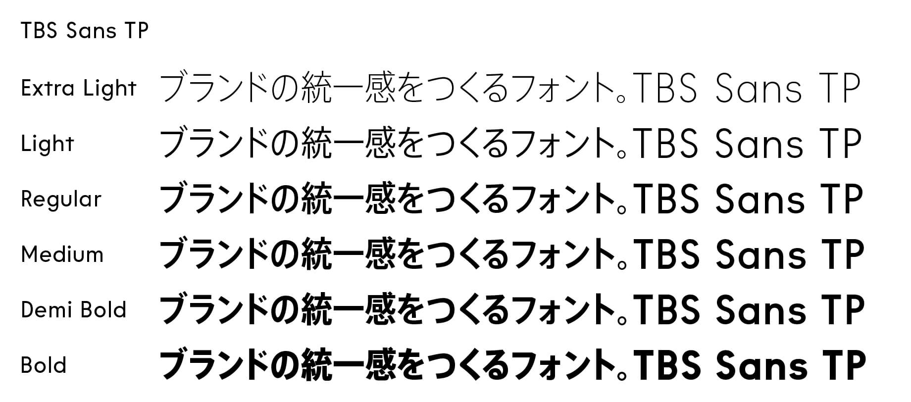
Type Project newly developed the Latin font, and provides 6 weights of the branding font called “TBS Sans TP” set with the appropriate numerical value with the AXIS FitFont for the Japanese part.
“I was a little surprised to see the original Latin font at first. When handing the design prototype, I thought it was complete to certain extent. However, I became aware that it was not complete as a font when I saw the detailed corrections. When I actually started using the font, I was impressed by its functionality, that it can immediately be used as a logo just through input. I felt confident that it could be used for anything.” (Shintaro Danno)
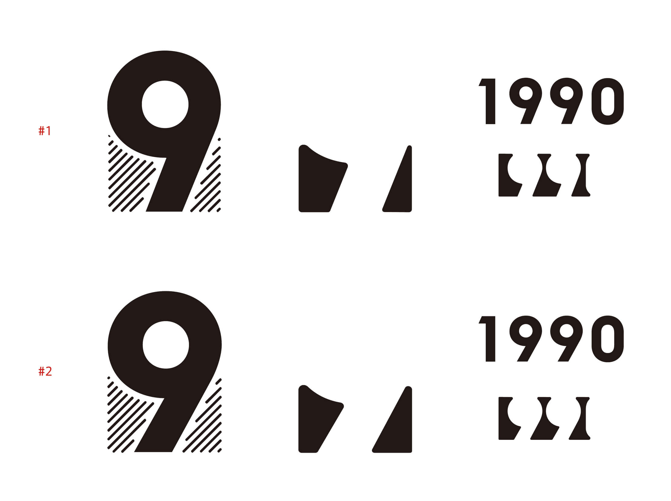
In the font design, the white space in addition to the black part of a character is looked at. In #1, the space on the left is wide, and the space on the right is a little narrow, so it slightly lacks stability. In # 2, the space on the left is slightly wider, but the area is approximately the same, so it looks more stable. Arranging the rhythm of the white space at the time of typesetting provides stability. The plan of # 2 was adopted to TBS Sans TP.
The branding font “TBS Sans TP” is used in every situation from visual design of the TBS’s new brand promise: “From each moment, a better tomorrow” to program publicity commercial messages, logos for the group companies and each service, etc. As the design team no longer needs to consider the font to be used, they are able to proceed with their work rationally. In addition, there is no matter who is in charge, the design is stable, so the sense in security for using TBS Sans TP is significant.

“I’m uncertain whether or not I can convey this well, but I feel that I can no longer live without the branding font (LOL). As the look is always the same whoever is in charge at anytime without a choice or feeling of the day of the person in charge, there is no need to take time to think about the design every time or search for the identity of TBS, so it is very effective. An executive officer who saw the general meeting document, etc. recognized the font as the ‘TBS font.’ As there are both a corporate font and branding font, I feel that a wide and thorough scope is covered.” (Shintaro Danno)
“Basically, separation is made between the branding font, which is used in places where the design element is required, such as titles, etc., and the corporate font, which is used for text, and those used in operation. I believe that enlightenment is still required in regard to the corporate font, it is a huge difference as a company to have the font pre-installed in the personal computers of all employees, including the group companies. For those who thought it is okay to use whichever font he/she likes up to now, the recognition of the importance of implementing and using the corporate font is gradually increasing.” (Takaaki Matsubara)