2019.12/04
Best known for its carbonated and alcoholic drinks, Suntory provides various products to a wide range of fields, including health supplements and cosmetics. The Design Department at Suntory Communications Ltd. is involved in extensive commercialization activities from the development of product concepts to package design and branding.
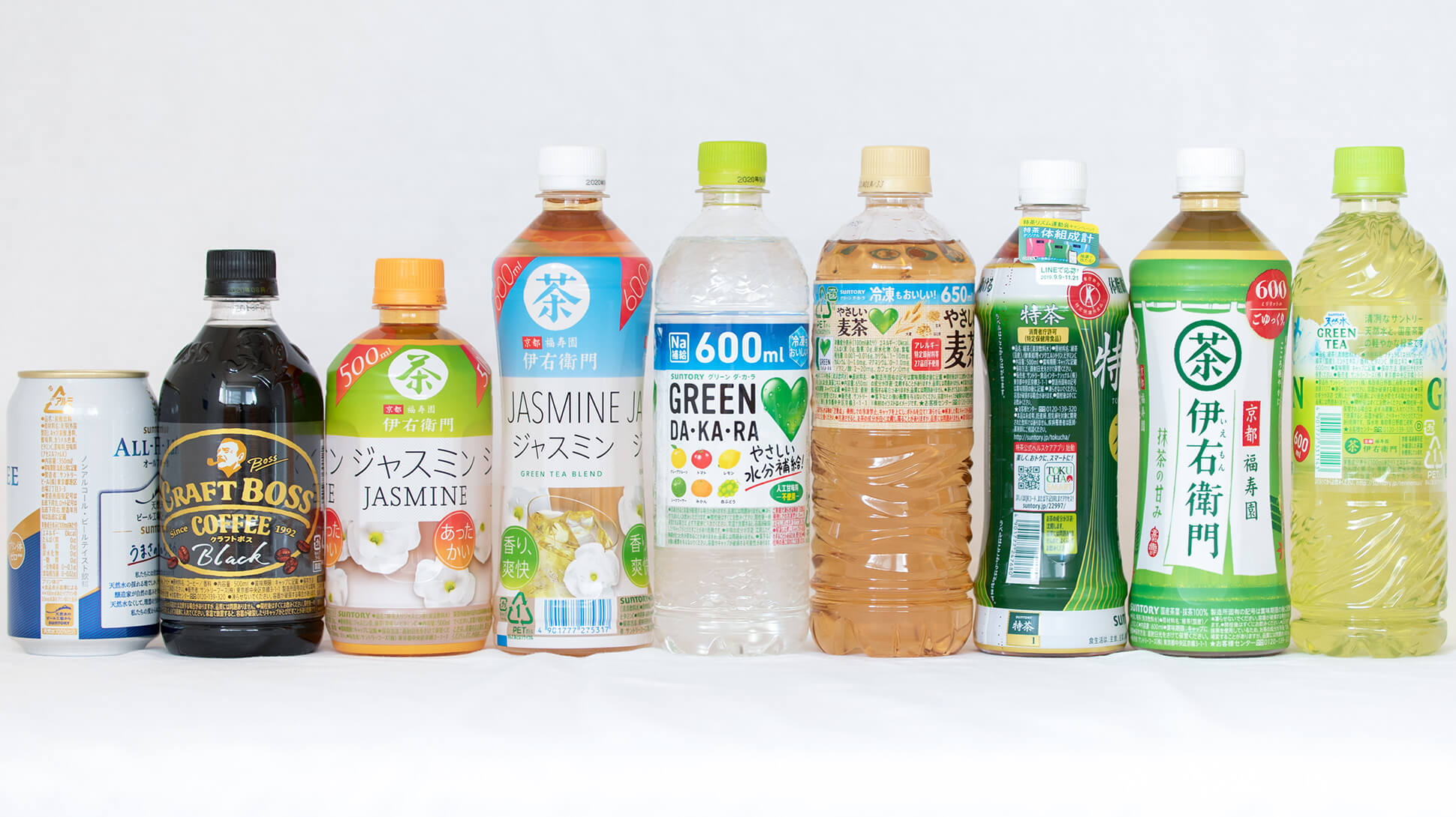
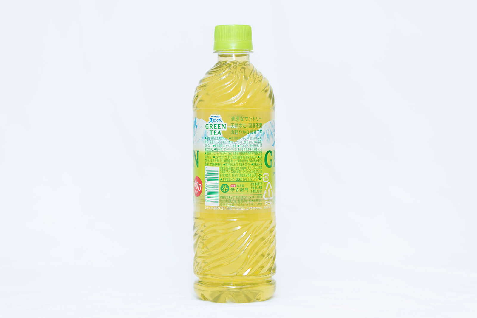
It is required to display nutritional composition and raw materials on the containers of carbonated and alcoholic drinks. There are a great number of cautionary descriptions in food for specified health use (designated health food), functional drinks, freezable drinks, etc. Due to legal changes and similar regulations, there is an increasing tendency toward displaying content. On the other hand, from the perspective of environmental consideration, there has been a trend towards changing full-shrink labels that cover the whole bottle to roll labels with a shorter width. In the present situation, the composition display space is getting smaller.
Type Project provided a customized font, AXIS SUNTORY TP, as a font for display typesetting for raw materials and cautionary descriptions. This font for display typesetting was designed to describe more information in a narrow space, as well as to maintain readability. AXIS SUNTORY TP satisfied practical requests, including “do not let perfect circles, stars, etc. that are used to end the sentence get buried in the text,” “highlight the caution display used in alcoholic drinks by making its general appearance different from the other parts,” and “adjust hyphenation to improve readability.” Currently, AXIS SUNTORY TP is used in many new products.
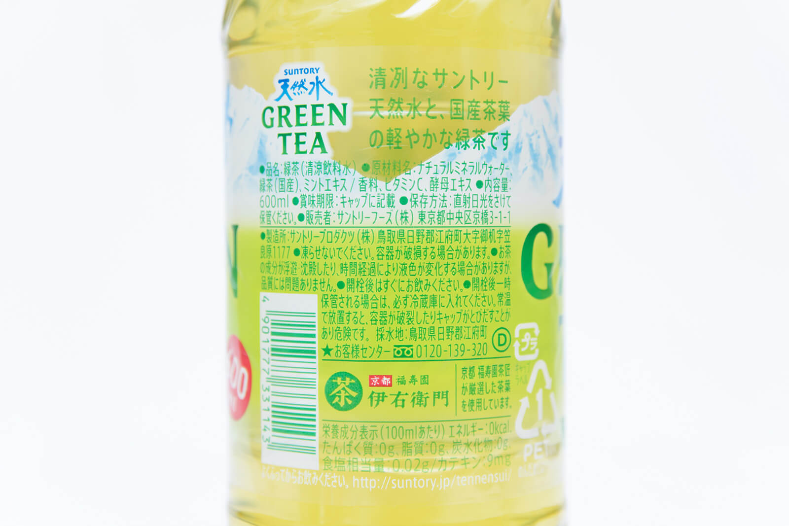
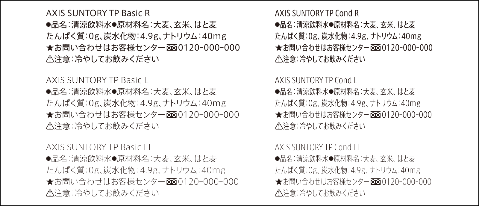
Perfect circles and stars are set at 100% regular, even with condensed font that is condensed and compressed. By rounding the corners of a caution mark, the atmosphere is changed from the other parts.
“There are conditions that must be cleared for the display part, such as composition, etc., due to laws and conventions in the industry. Making display typesetting compact and easy to read is considered to be directly connected to the strength of products in stores. By implementing AXIS SUNTORY TP, our work efficiency has sharply improved,” says Design Director Kei Nishikawa of the Design Department at Suntory Communications Ltd.
Prior to the implementation of AXIS SUNTORY TP, Suntory had been using another customized font for display typesetting for 10 years or so. However, several problems became clear using the font for such a long time. The font at the time was not used in its original form. Instead, it was designed on the premise that the font would be condensed by 60% or 80% before use for the vertical and horizontal ratio to be best seen.
“In display typesetting, the process begins by inputting characters as they are, making line breaks at appropriate locations without entering information on the number of characters on a line. In the previous font, extra effort was required to change the character width after inputting characters. Furthermore, processes to return the symbol parts, such as dots, to 100%, and make Latin characters easier to read, etc. were added. Clearly understanding some points of difficulty in use and points of adjustment, I proposed a customized font based on the AXIS Font that can solve various problems at once.”
It is laborious work to change display typesetting. The implementation of AXIS SUNTORY TP reduced the amount of that work. In addition to making the actual work approximately 30% faster, it also contributes to reducing mental burdens significantly.
Considering the characters used for display typesetting as similar to infrastructure, operation regarding the in-house use of AXIS SUNTORY TP conforms to the manual, instead of formulation of rules.
“The entire Design Department naturally made the shift to AXIS SUNTORY TP, meaning that the font can be used satisfactorily without stress. It is certain that designers are used to using the conventional font. However, the fact that many designers went ahead and made the shift to AXIS SUNTORY TP seems to indicate that they understand its long-term advantages above current work efficiency. After all, the effect of having fast and beautiful typesetting is significant. Work has become 30% faster. We can perform display typesetting at a level where completion time can be estimated just on the basis of inserting text.”
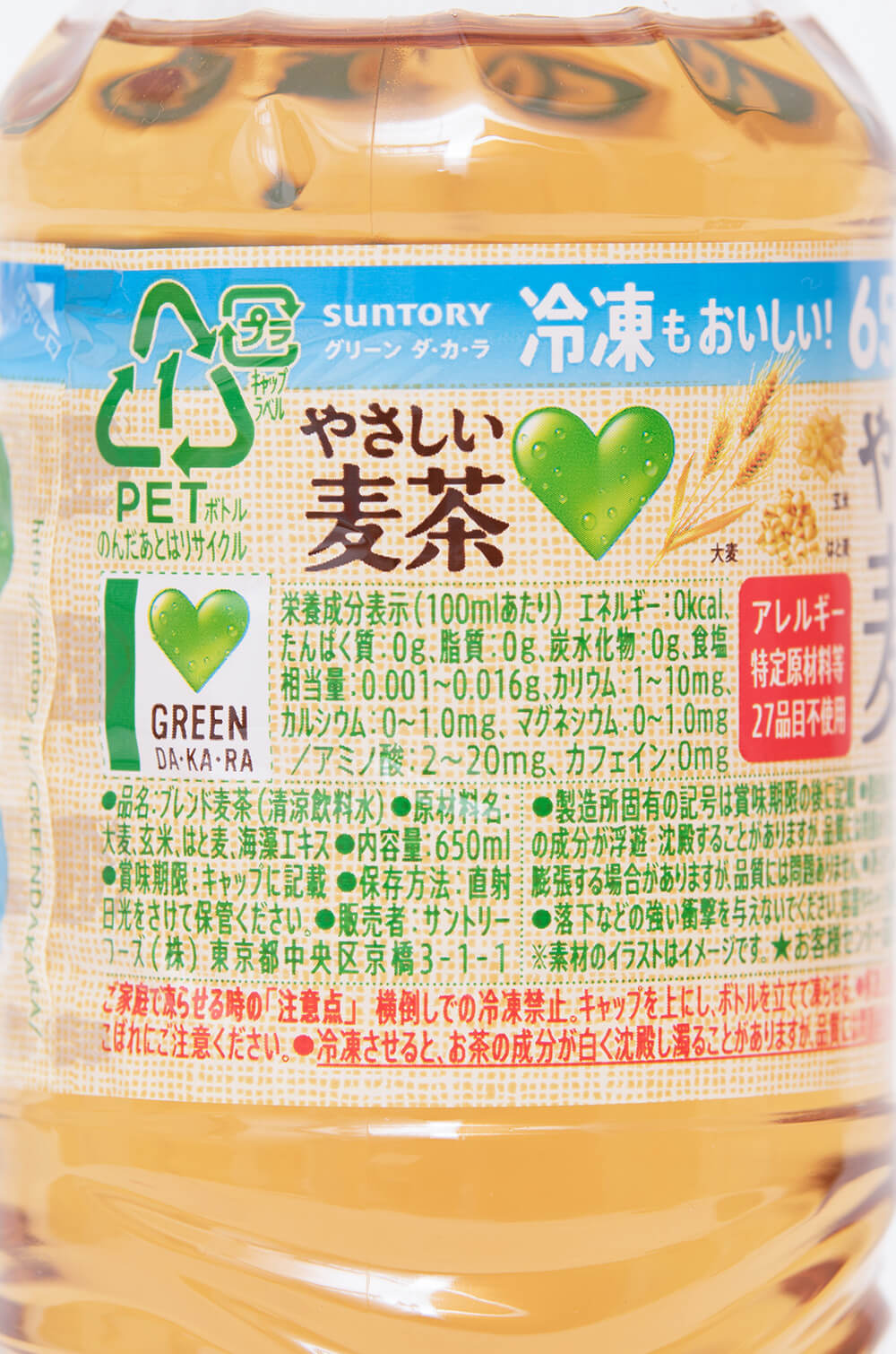
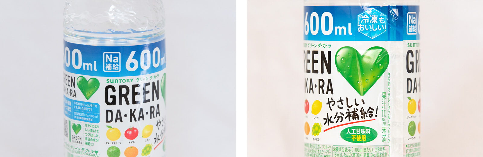
At Suntory, the AXIS Font is utilized in designing parts aside from the display area. Depending on the content of information transmitted, AXIS Round 50 and 100 are used where appropriate. For example, the expression of “kindness” that matches the theme of “making parents and children smile” is required in addition to an image of functionality and reliability in the functional drink GREEN DA・KA・RA.
“The fonts are used depending on the purpose of use, such as the AXIS Font for information to be transmitted clearly, AXIS Round 50 for information to be transmitted gently, and AXIS Round 100 for parts that are intended to be displayed with brightness. The atmosphere changes completely by simply rounding the corners. In GREEN DA・KA・RA, the AXIS Font is mainly used as the basic font. Even with the AXIS Font changed to AXIS Round 50 and Round 100 to adjust the atmosphere, the typesetting width does not change – it was a new sensation.”
Display typesetting is AXIS SUNTORY TP, “Na 補給/Na supplementation” is AXIS Round 100, the part for “人工甘味料/Artificial sweetener” and “冷凍も美味しい/Delicious, even frozen” is AXIS Round 50. Round and condensed type can be selected depending on information to be transmitted.
Also, the AXIS Font and TP Sky are used to distinguish iced from hot drinks in the “Jasmine” Iemon series.
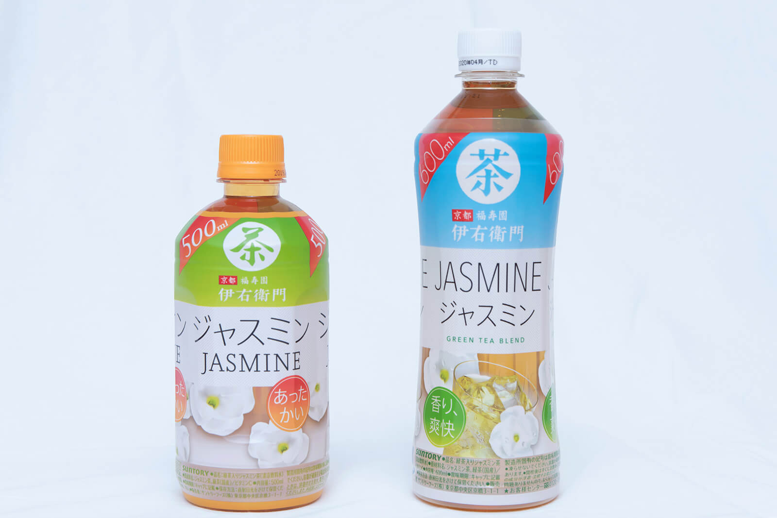
The AXIS Font is used for iced “Jasmine” (on the right), and TP Sky is used for hot “Jasmine” (on the left) from the Iemon series.
“Customers do not purchase the products to treasure the package design. As we want to enrich customers’ lives to as great a degree as possible through our products, we believe that it is important for the package design to adapt to their lives rather than to provide an impact. AXIS SUNTORY TP can adapt to the product design in an instant. The expression of ‘unsung hero’ is the best match for it. It is now an important tool that cannot let go.”