2021.06/21
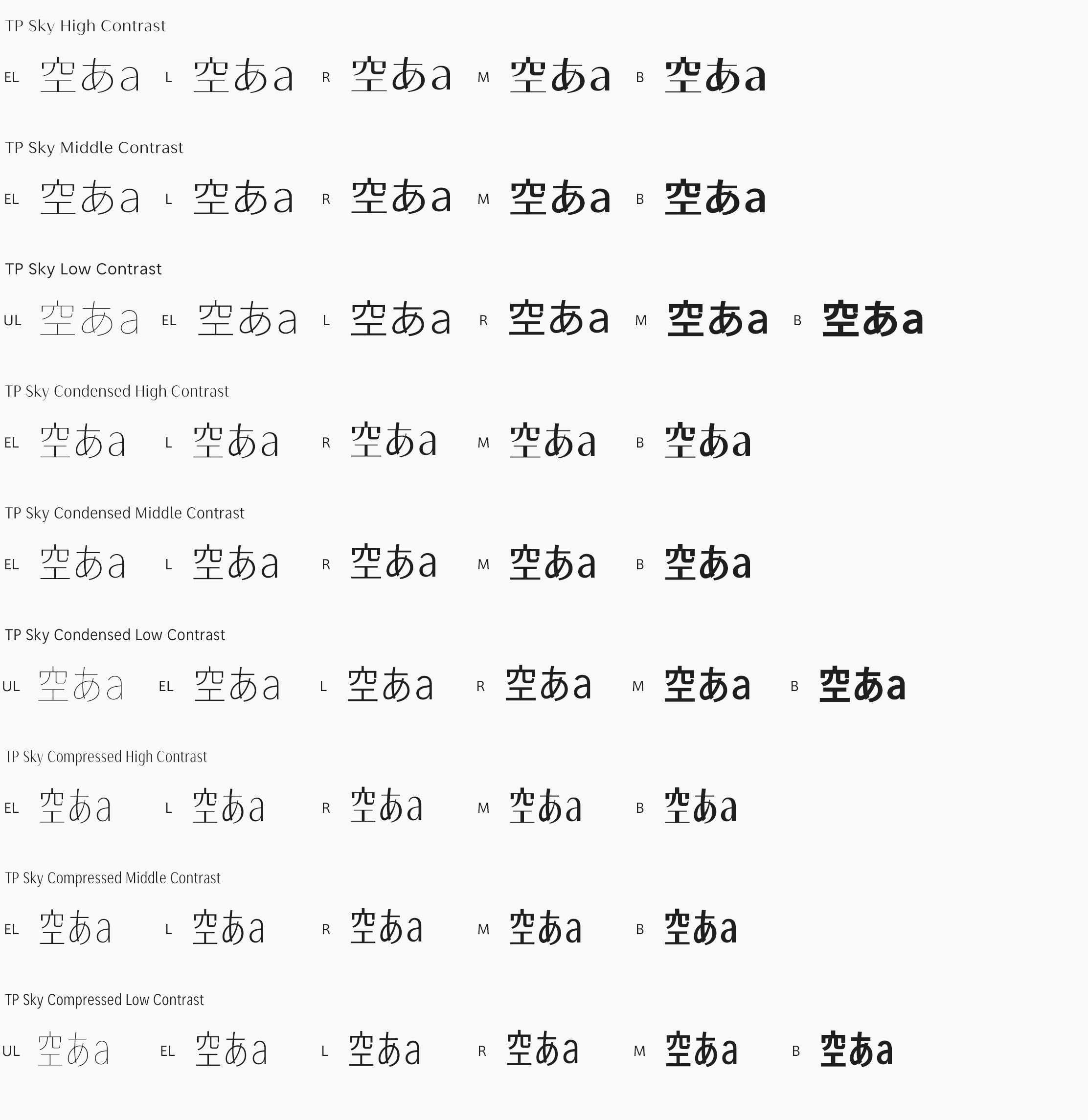
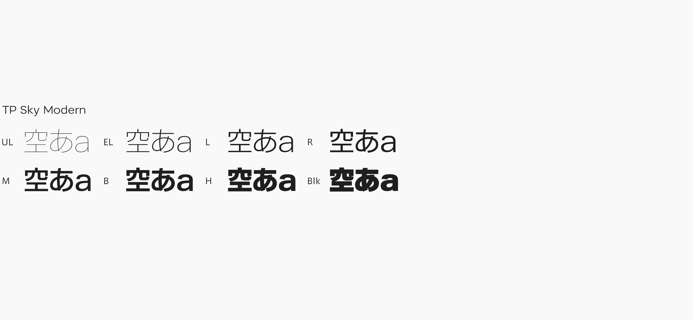
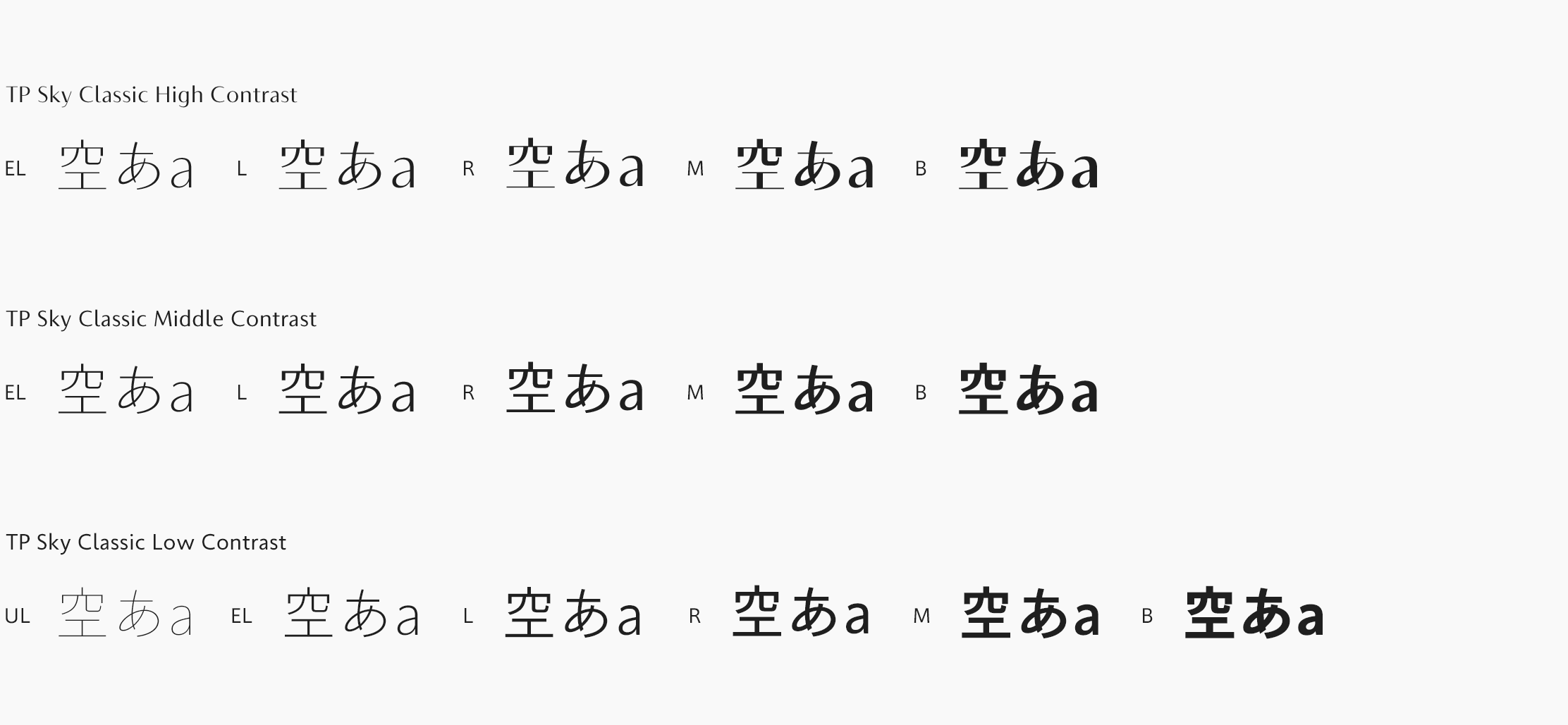
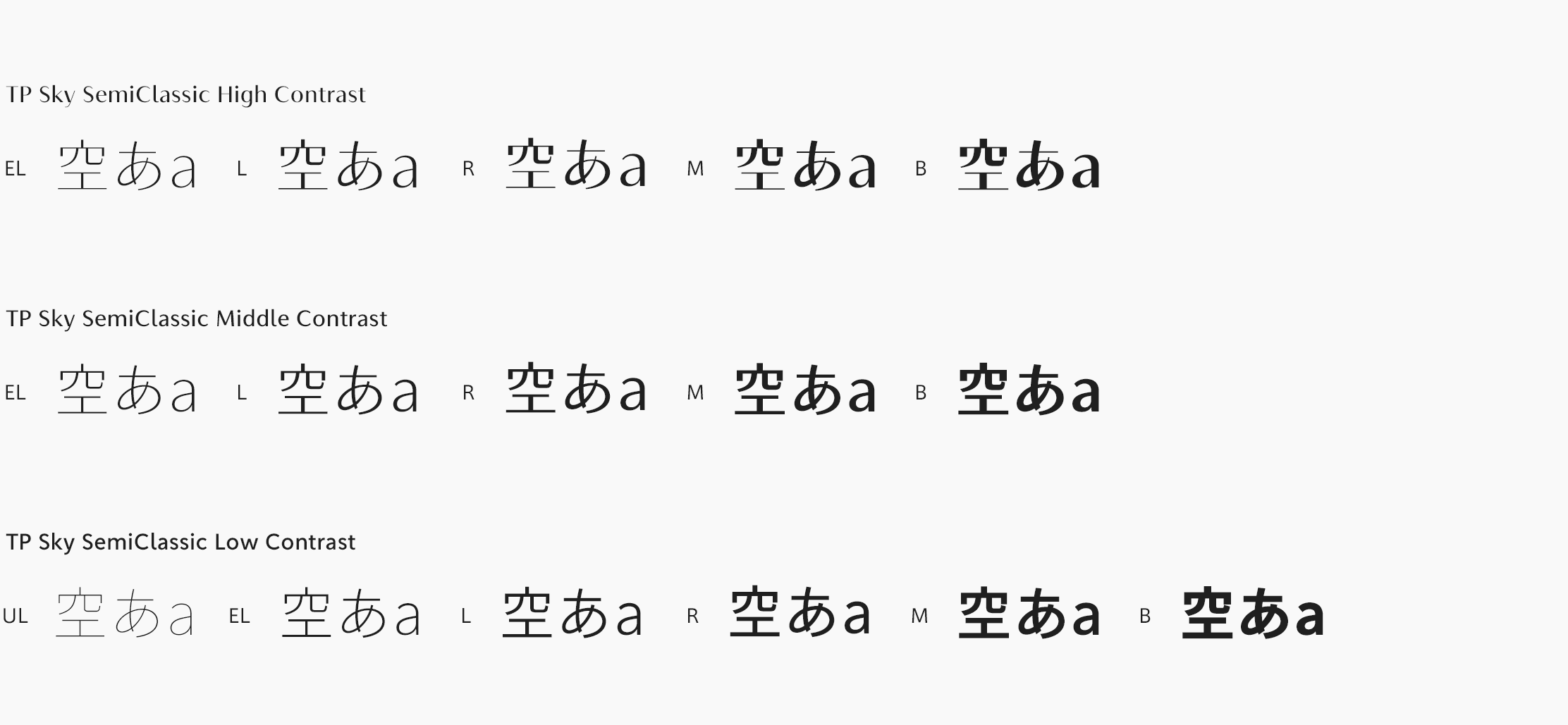
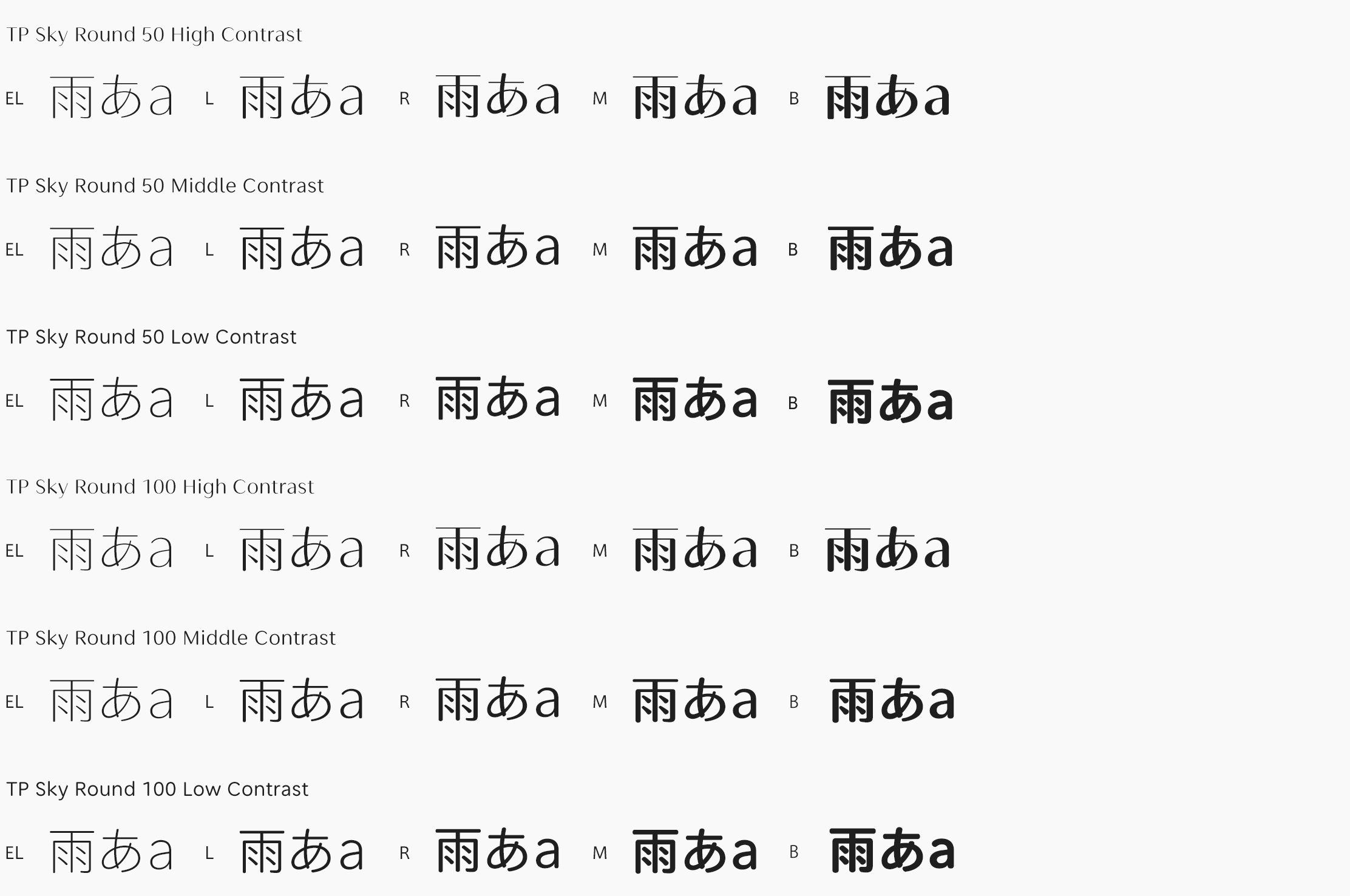
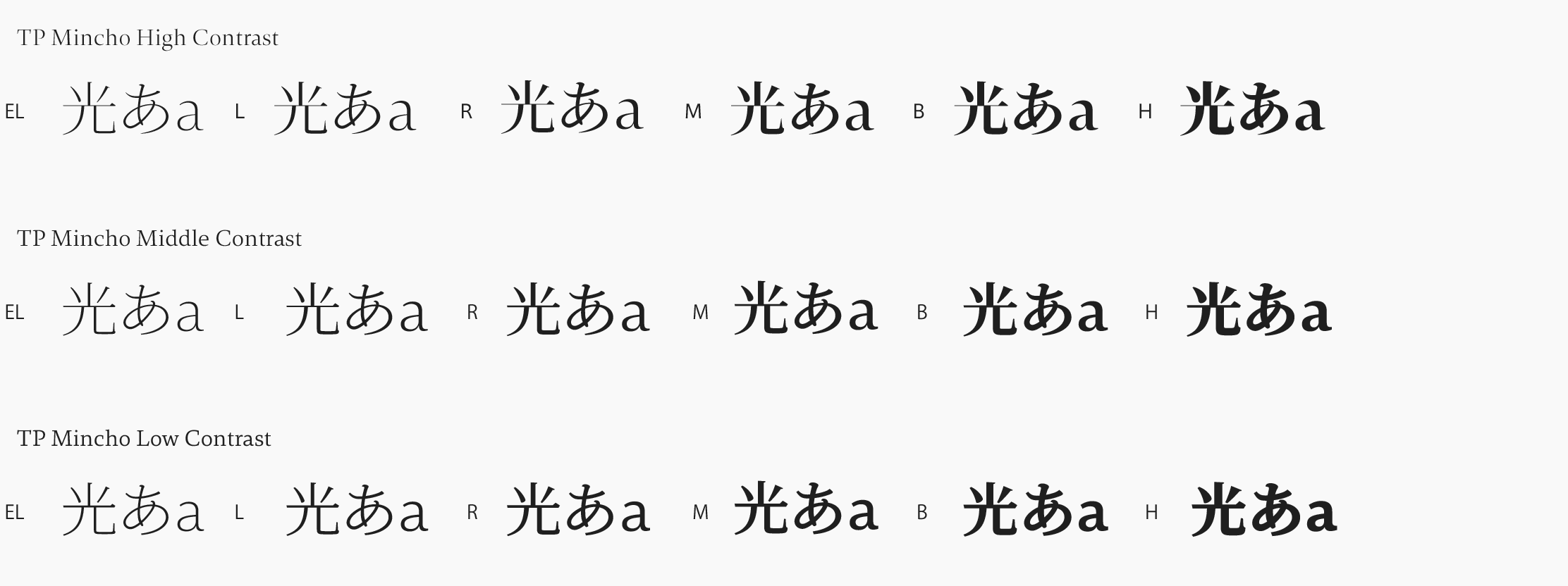
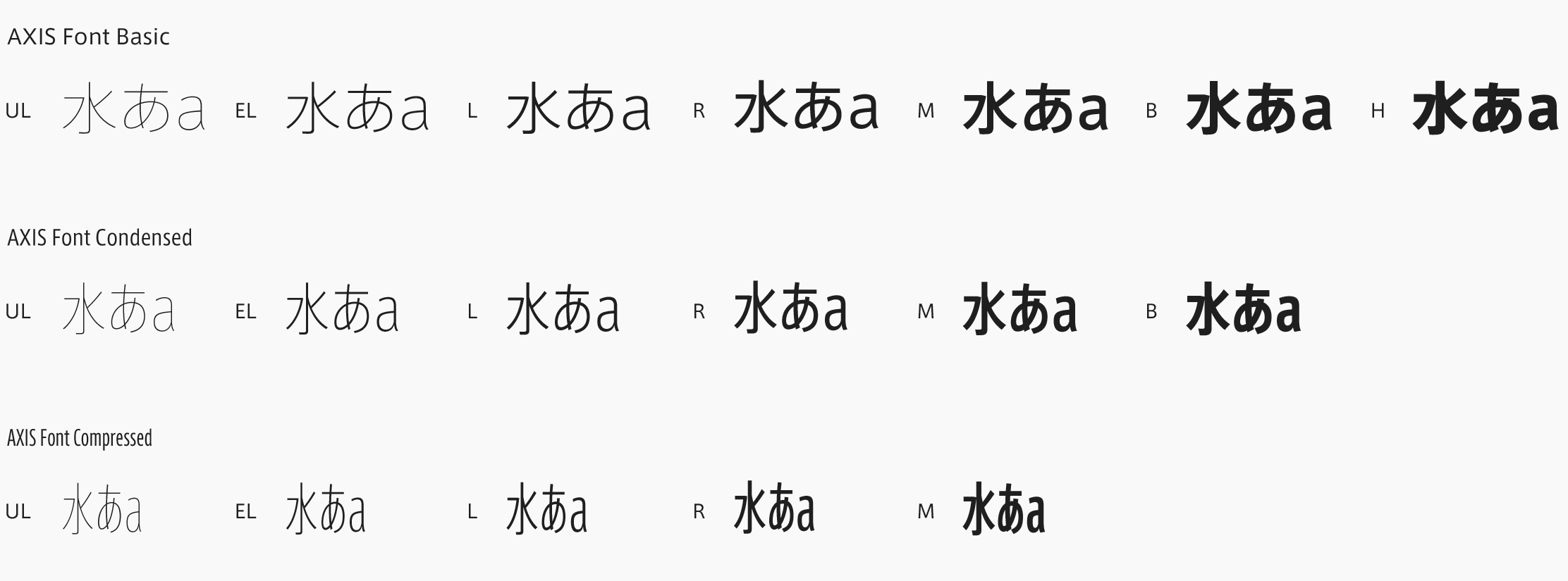
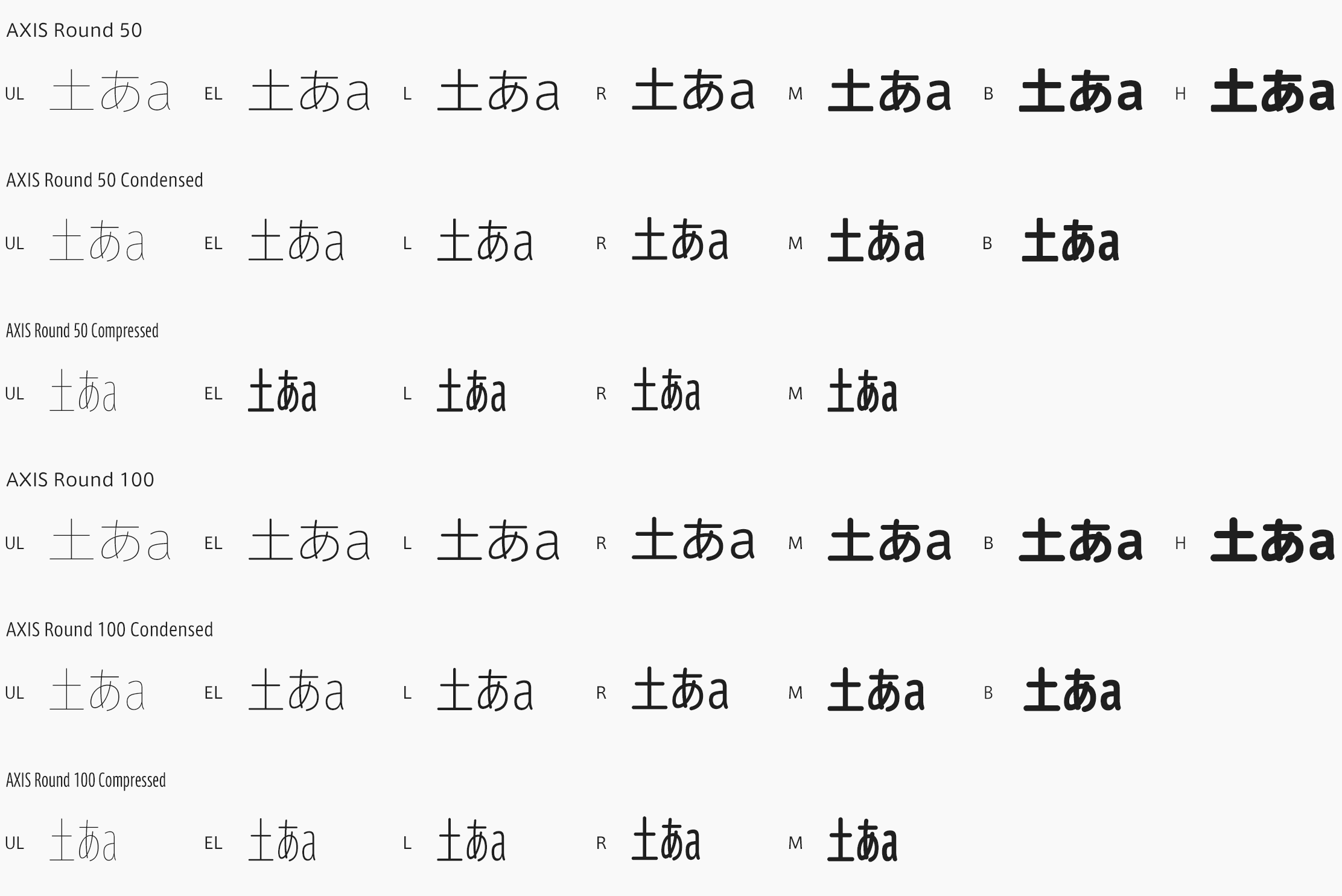
TP Sky Classic is the first Japanese font to implement the attribute of inside space between strokes in a family configuration. Kanji with tightened inside space between strokes, with peaks in the *block style of the first period of the Tang dynasty are positioned as the standard for Classic. Based on the concept of “a vast expanse of clear skies above us” that covers the entire family, TP Sky Classic aims at the expansion of applications in formal scenes, and incorporates a well-balanced block style proportion. The font family combines a compact and clear sans-serif typeface and proper classical block style.
https://typeproject.com/en/fonts/tpskyclassic

