2020.12/01
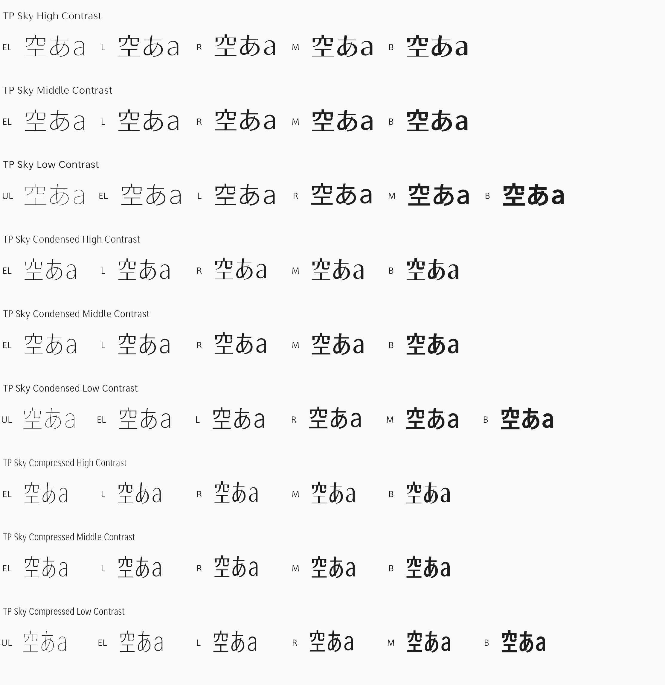
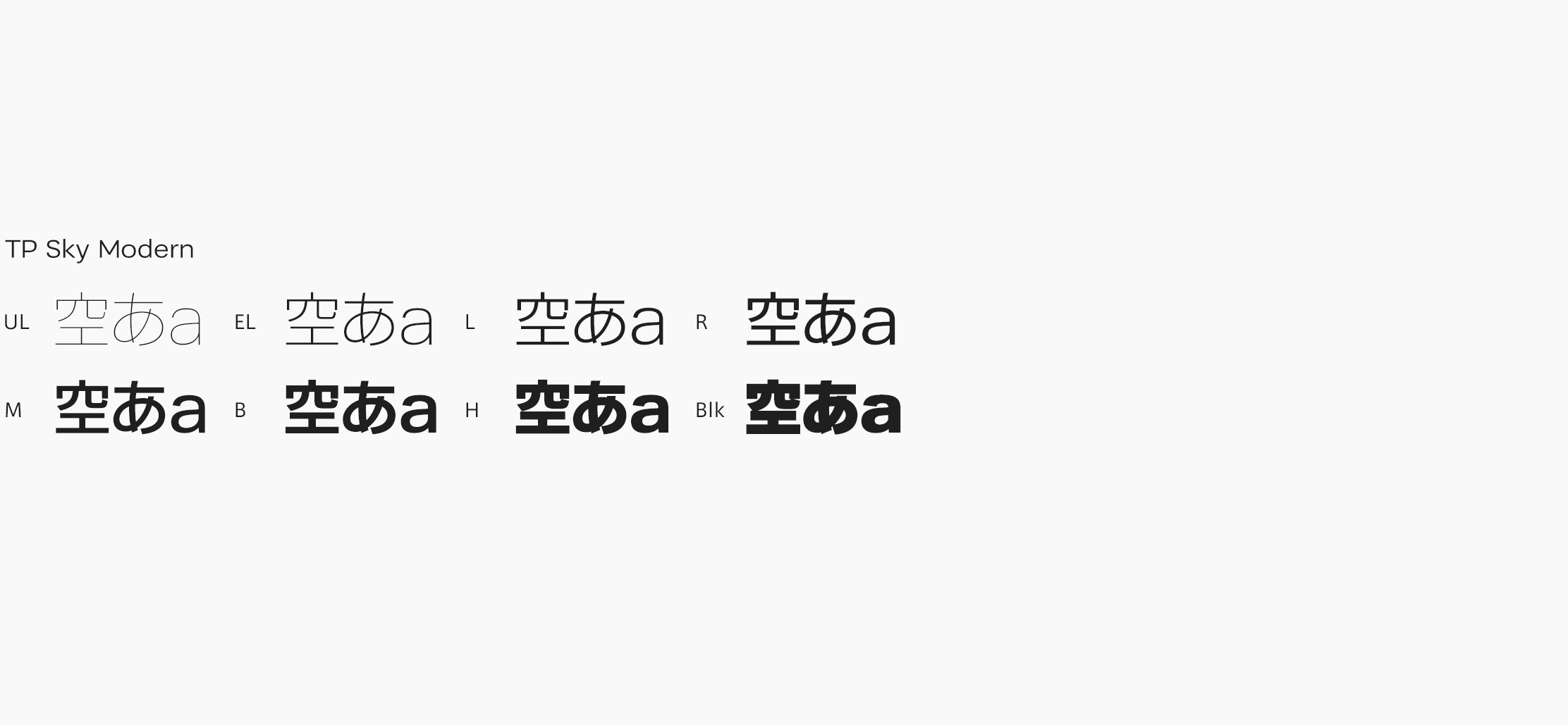
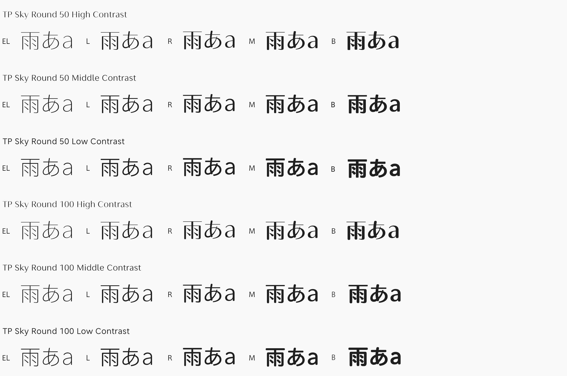
An extremely thick weight is achieved in TP Sky Modern Blk (Black) by widening the inside space between strokes. It manages both thickness and visibility by strengthening the contrast between straight lines and curved lines, and making strokes longer to allow a generous structure. Extra bold strokes have been repeatedly adjusted, so kanji, kana, and Latin with differences in the number of strokes can be seen in good order even when they are placed side by side. For example, kana, Latin, Chinese numerals with a few number of strokes, etc. of TP Sky Modern Blk are around 1.5 times thicker than TP Sky Low Contrast B. TP Sky Modern Blk has the widest inside space between strokes among the Type Project fonts, which leads to expansion of the modern typeface category.
https://typeproject.com/en/fonts/tpskymodern

