2020.10/15
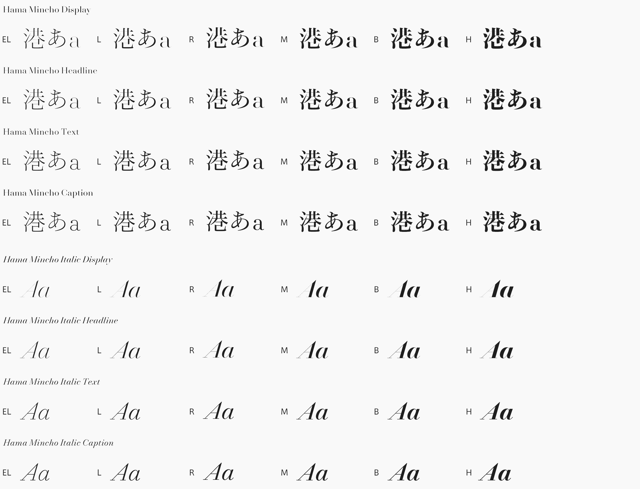
Hama Mincho Italic is designed to recall the wind and waves of Yokohama with an overall flow line shape. Although the typical Latin italic typeface is assumed to be used along with the regular Latin typeface, Hama Mincho Italic is created with the aim of playing the role of a display typeface even by itself. Harmonizing features by weight in the regular style, there are parts in which the shape and proportion of individual letters are intentionally changed from the regular style. In contrast with the design of regular that is close to a high contrast, simple kanji, the italic typeface is finished with the impression of kana, with the soft atmosphere of a remaining hidden ink brush connection.
https://typeproject.com/en/fonts/hamamincho

