2015.06/15
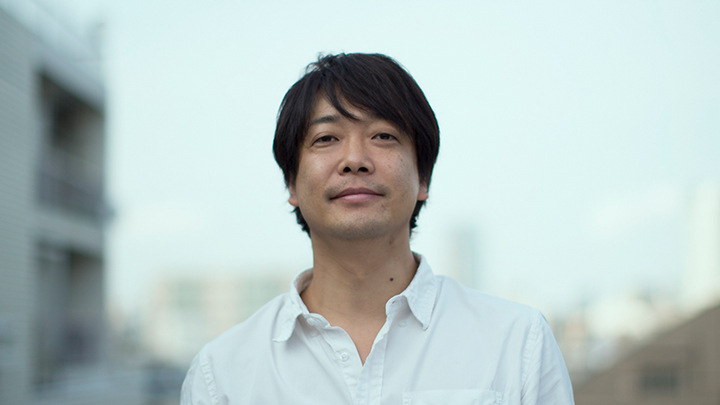
Manabu Mizuno
Born in 1972 in Tokyo. After graduating from Tama Art University, in 1998 he founded good design company. As the company’s creative director he has worked on the branding of numerous businesses and institutions. Among his best known projects are corporate identity for Japan’s Ministry of Agriculture, Forestry and Fisheries as well as branding for Nakagawa Masashichi Shoten Co., Ltd., and Kumamon, PR mascot of Kumamoto prefecture. He is a special invitation associate professor at Keio University.
http://gooddesigncompany.com/
Whither the Mincho fonts?
Manabu Mizuno, Creative Director of good design company and Isao Suzuki, Type Director at Type Project, became acquainted when both served as judges at a contest held in China. We give here a part of their conversation on fonts and design that was not included in the April 15th, 2015, issue of Pen magazine.
It makes sense that horizontal typesetting would be more difficult
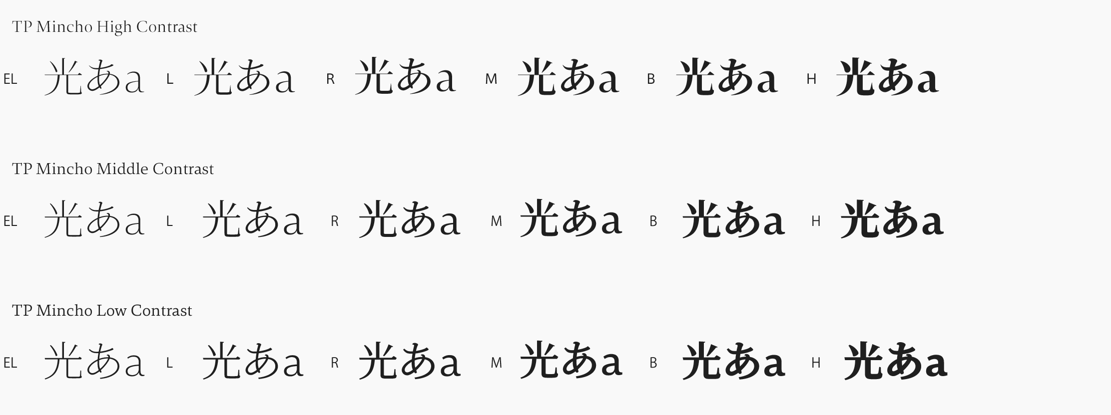
Mizuno:You wrote recently, “Nowadays characters are read more and more on social media, and almost all of these characters use Gothic fonts. I thought that we need a Mincho font that is suited for viewing on PCs.” When I read that, I thought that you were really spot on. If a home page is created using the default font then the result can only be insipid. But if you try to change things by using a Mincho fonts then the contrast is too strong and the thin parts of the characters aren’t visible, something with which we have struggled over considerably. So hearing about TP Mincho was like having the scales fall from my eyes.
Suzuki: I suppose that sometimes designers choose characters unconsciously and sometimes they choose them consciously, but I get the impression that the Mincho fonts has unconsciously been avoided for use on digital displays. I considered that a serious problem. If it were a question of conscious decisions, such as because one considered the Mincho fonts to be old or uncool or hard to use, then I could accept that. But I think people, including those who develop fonts, were rejecting them without particularly thinking about it. Naturally there is the technical constraint of resolution, and the Gothic fonts may have gotten picked because it was difficult to recreate the Mincho fonts in bitmaps, but even so I think about half of the reason that Mincho fonts are not used on display is due to those of us who develop fonts. Speaking of myself, about 10 years ago there were already a lot of Mincho fonts around, so I couldn’t see any reason for me to design one myself.
Mizuno:About 16 years ago, when I was using a phototypesetter, most of the work we did involved vertical typesetting. Block copy, and in particular newspaper copy, was almost all vertical typesetting. Horizontal typesetting was limited pretty much to magazines and posters. Horizontal typesetting was more difficult, and many times my boss made me do it over again. (laughs)
Suzuki:It makes sense that it would be difficult. That’s because the font is designed for vertical typesetting. It’s like forcing something that is vertical to be horizontal. From the era of metal type onwards, fonts for Japanese have essentially been based on the premise of designing characters within a square frame and then lining them up vertically, and that tradition has exerted a strong influence on today’s digital fonts. Certainly it’s a logical system and it constitutes what’s interesting about fonts for Japanese. But when I started thinking about how to provide characters that are easy to read on a digital display, then I thought that I needed to design characters exclusively for use in horizontal typesetting.
Suzuki:It would be fortunate if that happened more often. It was to bring that about that I designed TP Mincho.
Mizuno:If that font had been around back then, I wouldn’t have been made to redo my work so many times. (laughs)
Mizuno:Even I, who have been doing it for almost 20 years, sometimes go astray when it comes to horizontal typesetting with the Mincho font family. I often think, “Would it be better to raise up this character a bit or lower it a bit?” or a character doesn’t fit precisely into place even with kerning on a level of 0.01. When I think about it, vertical typesetting was easier. When it comes down to it, the Mincho font family simply wasn’t designed with horizontal typesetting in mind.
Suzuki:In particular Hiragana came about through the relaxed writing of Chinese characters (Kanji) while writing vertically, so it owes its very existence completely to vertical writing. There came into being a context of writing vertically by brush in a way that was fluid, pleasant, and beautiful, a way of writing that serves Hiragana both as a proof of its existence and as a lifeline, but if you put Hiragana together horizontally then you have to cut that lifeline once and for all. How to make Hiragana that are arranged horizontally both pretty to the eye and easy to read: that was the greatest challenge for us. As for whether TP Mincho truly succeeds in doing that or not, I think the judgment on that will become clear over time.
Mizuno:When you mention it, with the Mincho fonts when you write a street address, the Japanese postal code symbol (〒) is a problem. Unsure where the symbol should be made thinner or thicker to match the kana, I often end up creating one myself. Even though on a daily basis I was sensing these problems that are part and parcel of horizontal typesetting, I never actually put them on the table and talked about them.
Perhaps there’s never been a time that was as filled with characters as today is.
Suzuki:The Imitation Song in Song Dynasty that were created by carving in wood served as the predecessor to the Mincho fonts that we see today. Where the Imitation Song had brush strokes that rose to the right, in the Mincho fonts these were made horizontal, and places where the brush stopped were turned into triangles: in these and other ways the style of the Mincho fonts crystallized in a form that reflected the rationality and aesthetics that the period was seeking. What distinguishes TP Mincho is kado-uroko, the right corner part where the horizontal stroke connects to the vertical stroke. I think the serifs serve as arrows that draw the eye to the right, but I was concerned that for the contemporary period large serifs might be too noticeable and that so much decoration might not be necessary, so I made the serifs smaller.
Mizuno:If the serifs are large then the eyes will become confused and the right side will feel heavy. When did Gothic fonts for writing Japanese come into existence?
Suzuki:As movable-type printing technology spread during the Meiji period, bold Gothic fonts started to be used in advertisements, particularly in headlines and in places in the main text where emphasis was desired.
Mizuno:Then they didn’t come into existence in response to sans-serif fonts of the Latin alphabet? In European printing at that time serif fonts predominated, and sans-serif fonts were called “grotesque”, i.e., creepy.
Suzuki:There may have been some influence from European printing. Though originally they were intended as a font to catch the eye, today the situation is reversed, with Gothic fonts being used for the main text and Mincho fonts being used in large, prominent places.
Mizuno:Characters change, but of course language changes too. For instance the dropping of “-ra-” in the middle of words in Japanese is something that I think should be avoided not just in speaking but particularly in writing, but I’ve heard that young people today think it’s strange if “-ra-” is left in. Both in the spoken language and in writing, it seems that what’s newest is best.
Suzuki:At one time it was the spoken word that led and written characters were a bowl for serving up such spoken words, but now thanks to social media, etc., the two have come to be generated simultaneously. In real time the spoken word is made visual and expressed in a font. When the spoken word changes into something new then the font must keep up with it, otherwise a gap comes into being and the unity between spoken words and written characters is lost. That’s something that’s interesting for those who develop fonts: I think one needs to become sensitive to the feeling of speed and to the transitions in the spoken word that characterize the age.
Mizuno:While characters written in sound, i.e., spoken words, are decreasing, worldwide the number of characters in use seems to be numerically exploding. Perhaps no age has ever been as full of characters as the present age.
Suzuki:An important thing to consider is how you should look at the fact that people have stopped writing by hand. Fonts have filled up the hole left by the decline in writing. If you stop to think about where the characters that were being written up to now have gone, they have been absorbed into PCs and smartphones. In the future what will become of the lively characters that come from handwriting? That is one of the important questions facing font developers.
Pen magazine dialogue between Isao Suzuki and Manabu Mizuno
The role that “fonts” play in design.
“The TP Mincho font that you designed offers a distinct image. A bit formal and serious yet not stiff, all in all a likeable font, don’t you think?” (Mizuno)

