2013.10/15
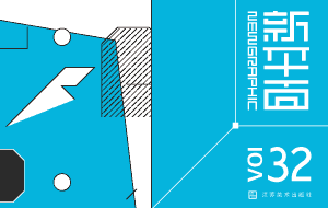
New Graphic誌(中国)
New Graphic誌は中国SeeCoo社より国内外の現代グラフィックを紹介し研究する雑誌として発行されています。専門家としての視点からグラフィックデザインの精神とその意味を探求し、中国国内の産業の発展と開発および新しい作品や新進のデザイナーにフォーカスした記事も多く掲載されています。
1.Please briefly introduce the development of Japanese typography design.
We mainly use Adobe Illustrator to create Kana characters. For Kanji characters, we use some software applications and programs including original tools. It has taken 18 months to 24 months so far for four designers to develop Adobe Japan 1-3 font set that contains 9,354 characters in total. In many cases I ask myself what the desired font design will be like in three years time, even what the most commonly used fonts in the market will be like in ten years time. Speaking from greater perspective, I consider the historical development of typefaces.
2.“To broaden the potential of written characters. This is the central motivation behind Type Project.” Please tell us more detail about this central motivation.
We face many situations where typefaces should be more utilized and/or it would be much better if they are used in a more effective and practical manner. We believe there is immense potential here.
3.Please talk about one of your favorite or most memorable typography works.
The most memorable one is a poster of the characters”代/dai”and “典/ten” which were dynamically trimmed by Ikko Tanaka. I saw it at the Nara Prefectural Museum of Art in 1988 when I was a university student.
4.What are your options for hand-made typography and computer-made typography while you are working?
Although I am sketching ideas by hand on a daily basis to develop new designs of typefaces, I use a computer for more than 90% of font development work.
5.More and more people are getting used to typing on keyboards and mobile phones instead of writing a letter by hand. What do you think about this phenomenon?
It is difficult to change the flow of society, of course. However, it is a very interesting challenge for me, as a typeface designer, to convert the excellence of handwriting into digital form.
6. Is there any difficulty to work on different structural characteristics of Kanji, Hiragana, Katakana and even English characters?
There is a lot of difficulty here, but it can also be said to be a fun part of my work.
7.It’s my imagination that typography design’s property protection is strictly protected and implemented in Japan. Could you please share the current status with us?
In Japan, I think copyrights of typeface designs are controlled by the morality of users, rather than protected by law. To prevent illegal copying, technical protection should be considered fundamental. We will soon have a better method of solving illegal copy issues, and this method would at the same time limit potential inconvenience to our users.
8.Typography designs in China didn’t receive effective commercial promotion and development. Please express your views and suggestions on this phenomenon.
Even if commercial or economic problems lie ahead, I believe that personal strong thought brings breakthroughs like 顔真卿/Yan Zenging, 蘇東坡/Su Shi and 黄山谷/Huang Tingjian did in Chinese calligraphy history. Acknowledging their meritorious improvements, it is my belief that there is a way of thinking that adverse circumstances improve words and typography. It might encourage you.
9. The City Fonts design is being applied around Japan, it is very beautiful! While in China, the application of font designs and uses in urban landscapes and public buildings is not uniform, what do think about this? Any suggestions?
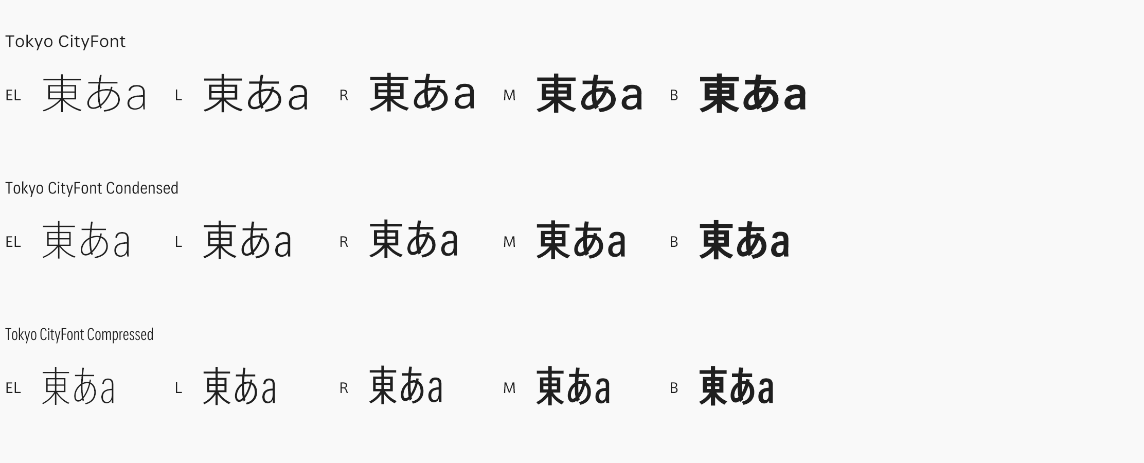
Thank you for your words about the City Font project. Most of the cities, if not all, have various adjectives to describe them. So it is difficult to represent a city with one typeface. The hint of how a city is trying to portray itself can be understood from the structure of the font family. Appropriate choice of font family is an important key for showing the personality of a city. Some cities’ dedicated use of certain fonts render a strong connection for me between font and city. When I designed Kinshachi Mincho, I imaged a young wealthy lady in Nagoya city. And I imaged people’s voices, which were familiar with older culture and customs of Nagoya city for Kinshachi Kuroji.
10.How do you consider the typography design applied on applications nowadays?
If you consider the unique ability of digital font thoroughly, I believe there are big possibilities. New challenges always seem to come with technical difficulty, so it is indispensable to have the support of excellent engineers.
11.How do typography designs influence social culture and commercial environments?
Common typefaces used in everyday life tend to not get enough attention especially if they are superior. But a decade later, you will be able to understand that they were an important element expressing aerial feelings and preferences of the times.
On the other hand, typefaces in commercial environments are required to have the effectiveness of getting more attention in a short period of time. This is determined by the demand of the times and I believe there are typefaces that are created for certain times only.
The value of typefaces from a monetary and/or admiration perspective, whether for social and/or commercial reasons will differ from individual to individual.
While I’d prefer to think about history and/or culture as the background of my typefaces design, I generally don’t develop a font without considering the commercial environment. The reason is that it is difficult to separate the social culture and commercial aspects.
12.What are the next-generations typeface designs?
There will be a desire for more rich and gorgeous typefaces. On the other hand, the trend for versatility of simple and purposeful font will continue.
13.What social responsibility should font designers have?
Social responsibility is necessary for font venders. I always consciously consider my cultural role as a font designer and technical progress in cooperation with engineers.
14.Do you think nowadays’ student are eager to learn about font design? Do you think they can share the responsibility of future font design?
For the past few years in Japan, there has been enthusiastic interest for font design. As a result, the number of aspirant font designers has increased. However I believe there are only few people that are aware of the difficulty of font development and the economic problems of the font industry. About 90% of font development is quiet and challenging. Some people enjoy such work, but others can’t tolerate it. One thing that I can say however, is that some designers feel the significance of their work and enjoy it even though it’s tough.
Respondent: Isao Suzuki

