2019.03/20
Useful type with an edge
Type Project interview with Jean-Baptiste Levée.
1. Tell us about your company.
Based in Paris, Production Type is a digital type design agency. Our activities span from the exclusive online distribution of our retail type for design professionals, to the creation of custom typefaces for the industrial, luxury, fashion and media sectors.
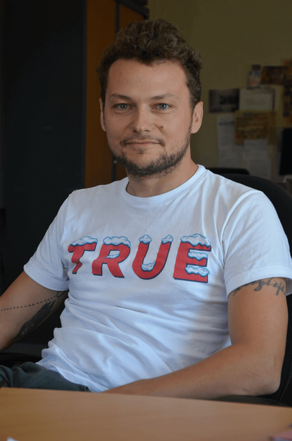
Jean-Baptiste Levée, founder of Production Type, works methodically in a process where history and technology are approached altogether within the nuances of artistry. He manufactures functional, yet versatile digital platforms for designers to build upon. Levée has designed over a hundred typefaces for industry, moving pictures, fashion and publishing. His work has won multiple awards and has been shown internationally in group and solo shows. It is featured in the permanent collections of the French national library (BnF) and the National Center of arts (Cnap); of the Newberry Library in Chicago, and several printing museums in Europe.
2. What is (are) the main/leading font(s) of your company?
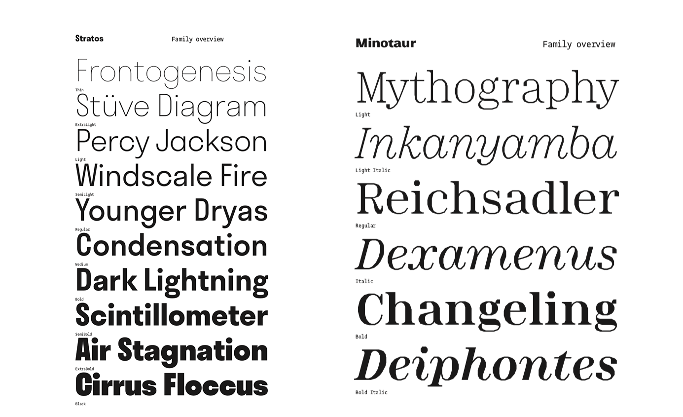
People seem to enjoy Stratos and Proto Grotesk. We’ve recently expanded both in the Cyrillic and Greek scripts. We also see a fair share of use of the less discreet Minotaur and Mars.
3. Is there any newly released typeface from your company?
This past Fall, we’ve been able to release PVC by the French designer Hélène Marian. It’s a fun series of 4 styles directly informed by her sign painting work. This year, we are focusing on expanding the “Proto” family, with Proto Grotesk Mono, a Cyrillic and Greek expansion, and Proto Slab Condensed.


4. What is the ratio of your work for original design fonts and custom order fonts?
It’s a moving target, because you have to define custom orders. We do customize a lot of our catalogue, for instance. We try to rely less on projectbased incomes and more on products. This has worked well so far.
5. Can you tell us about your customer(s)? How do they use the font?
In the best unexpected ways I must say! When we design type, there is always a “cloud of possible uses” in mind. We wouldn’t be able to design anything without such projections. But we are always so far from the actual field! I’ve stopped being dogmatic about how to use type, and became more and more agnostic. Openness is key and is the perfect way to be pleasantly surprised.

6. What kind of device(s) your customer has (have) embedded the font(s) with?
Anything from TV set-top boxes to sports cars… if it has a screen that displays type, there are good chances we’ve put one of our fonts in it.

7. In which country will an end user be able to purchase your font(s)?
We sell online, so virtually any person can purchase our fonts.
8. Can you tell us about what you are working on right now and what you will like to work on in the future?
We are expanding our retail catalog towards a broader offer for magazines and brands. That means we’ll have some more families released later this year. We are also working on custom fonts, as usual, which we’ll reveal at some point… or not.
9. What do you think about your company positioning, for its raison d’etre in the font design/development industry ?
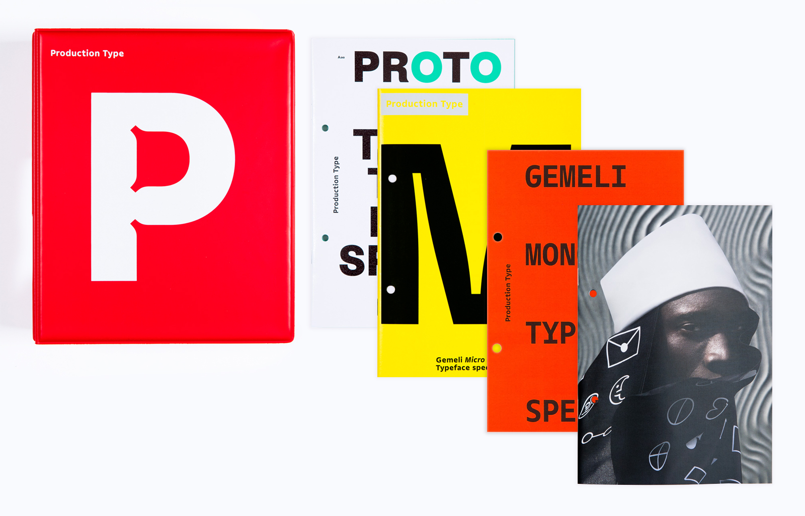
I like to define it as “Useful type with an edge”. But another significant part, for me, and probably the lesser known, is our activity of publishing type specimens which also act as a documented essay on a specific part of type design culture.
10. What is your opinion about open source font(s) and free font(s)?
Their existence is justified by the needs they address. I acknowledge they can prove to be value-creators if handled wisely.
11. What do you think about Type Project and do you have any expectation for us?
I a big fan of how you approach design! I expect us to have a stronger cooperation in terms of mutual understanding, and joint-offer for both our customerships.
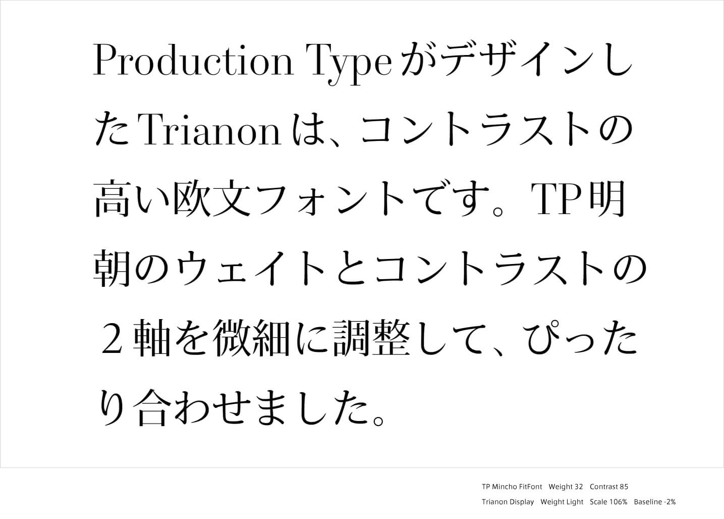
12. What do you think about FitFont service?
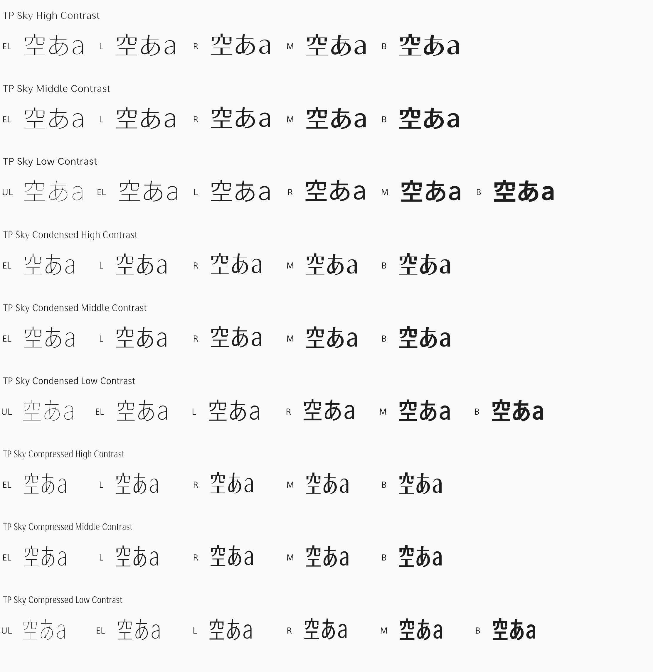
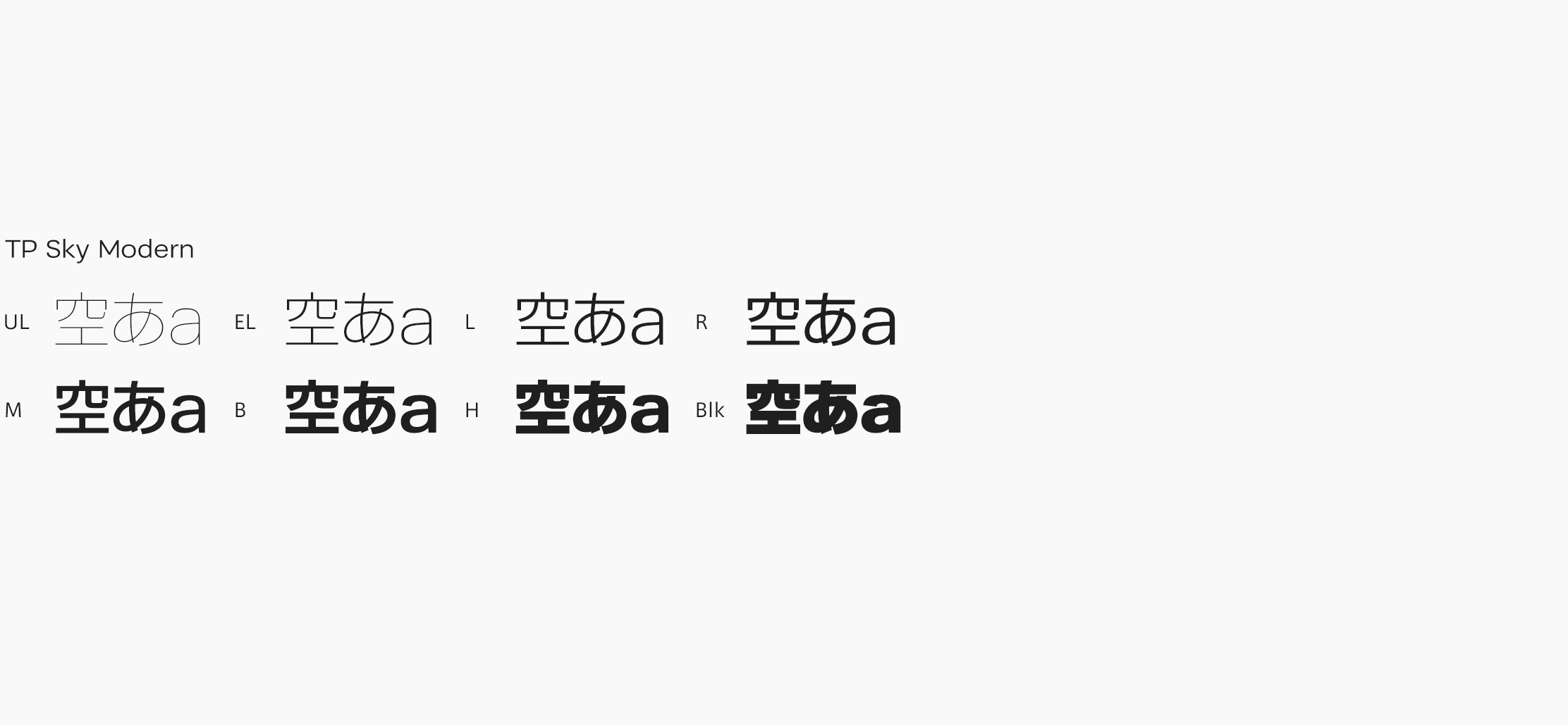
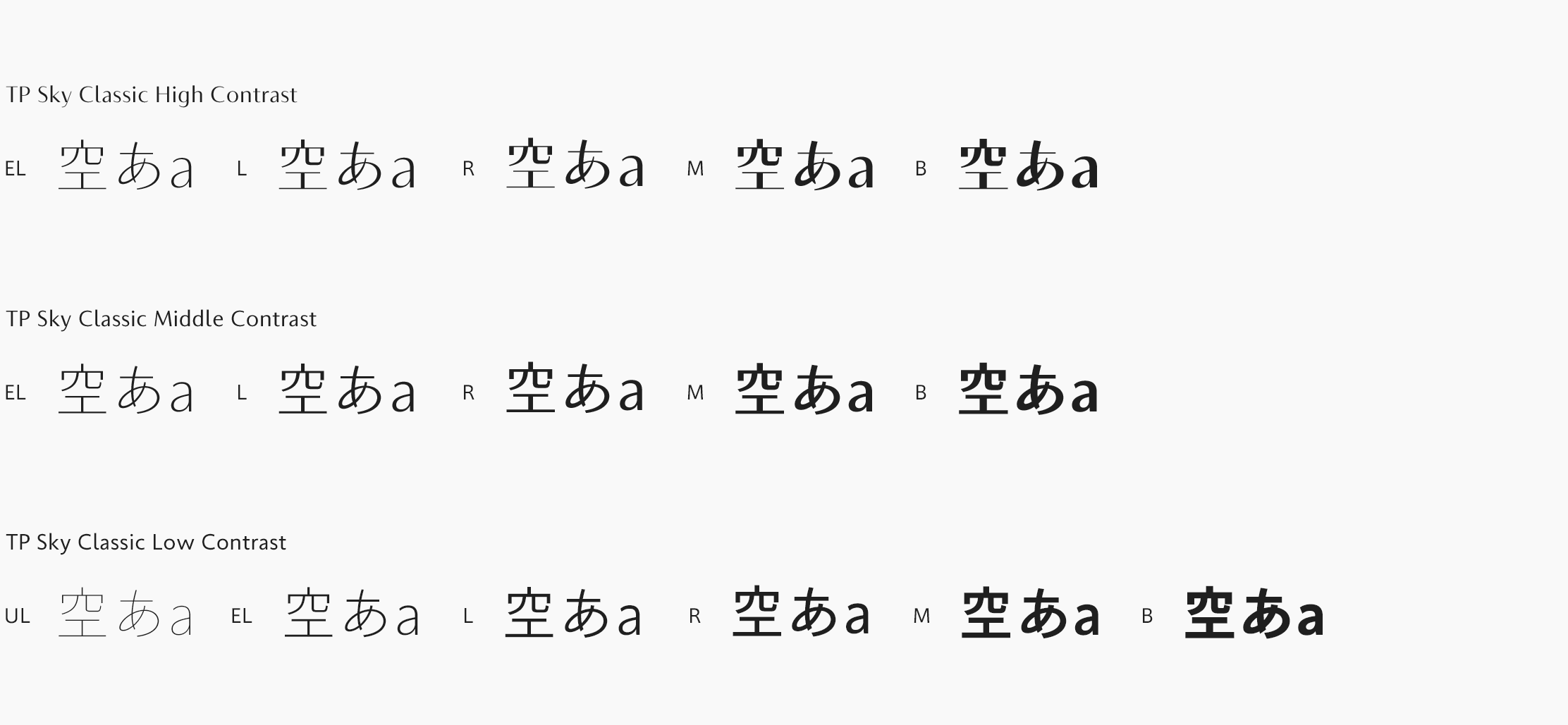
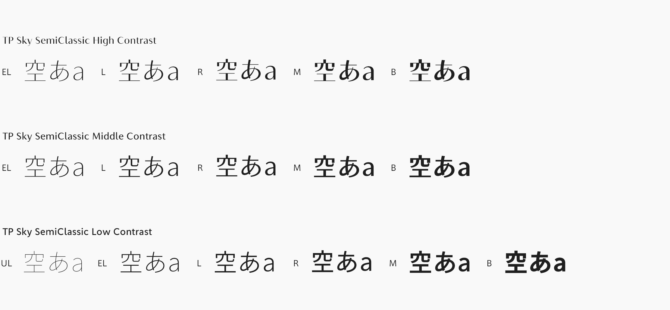
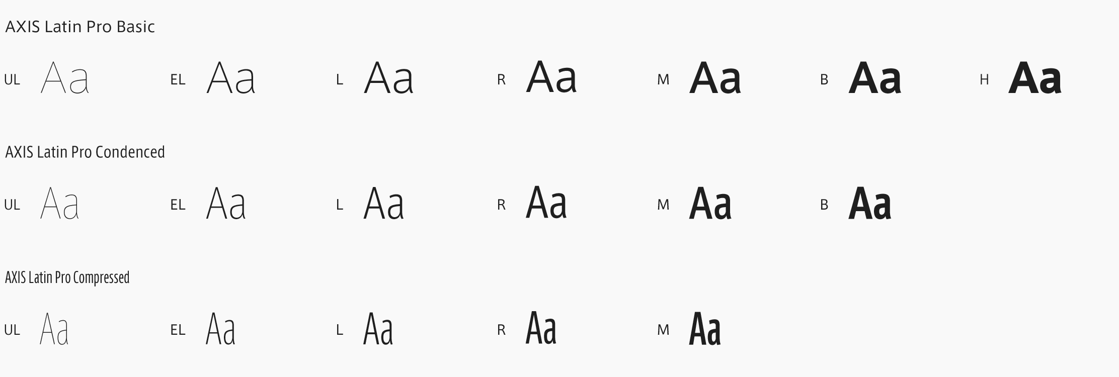
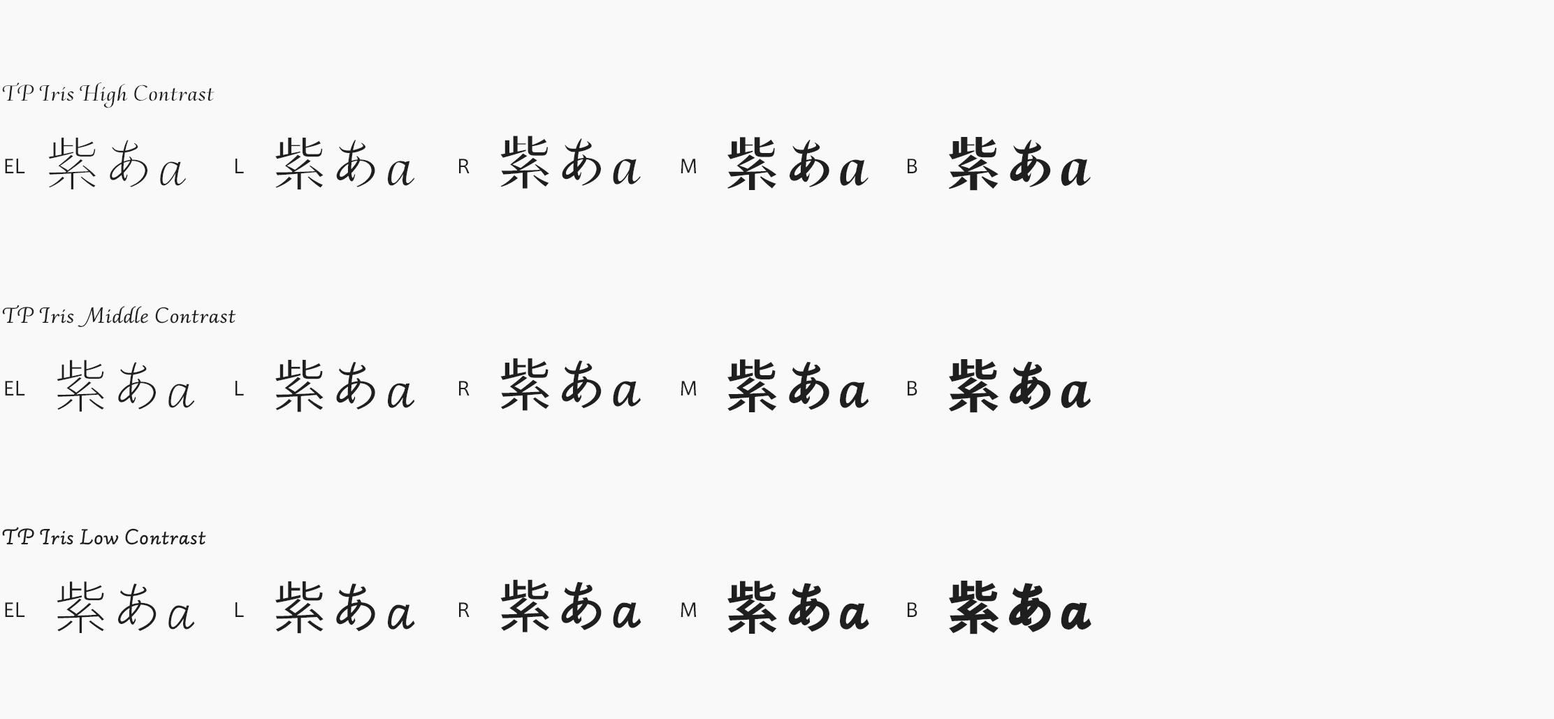
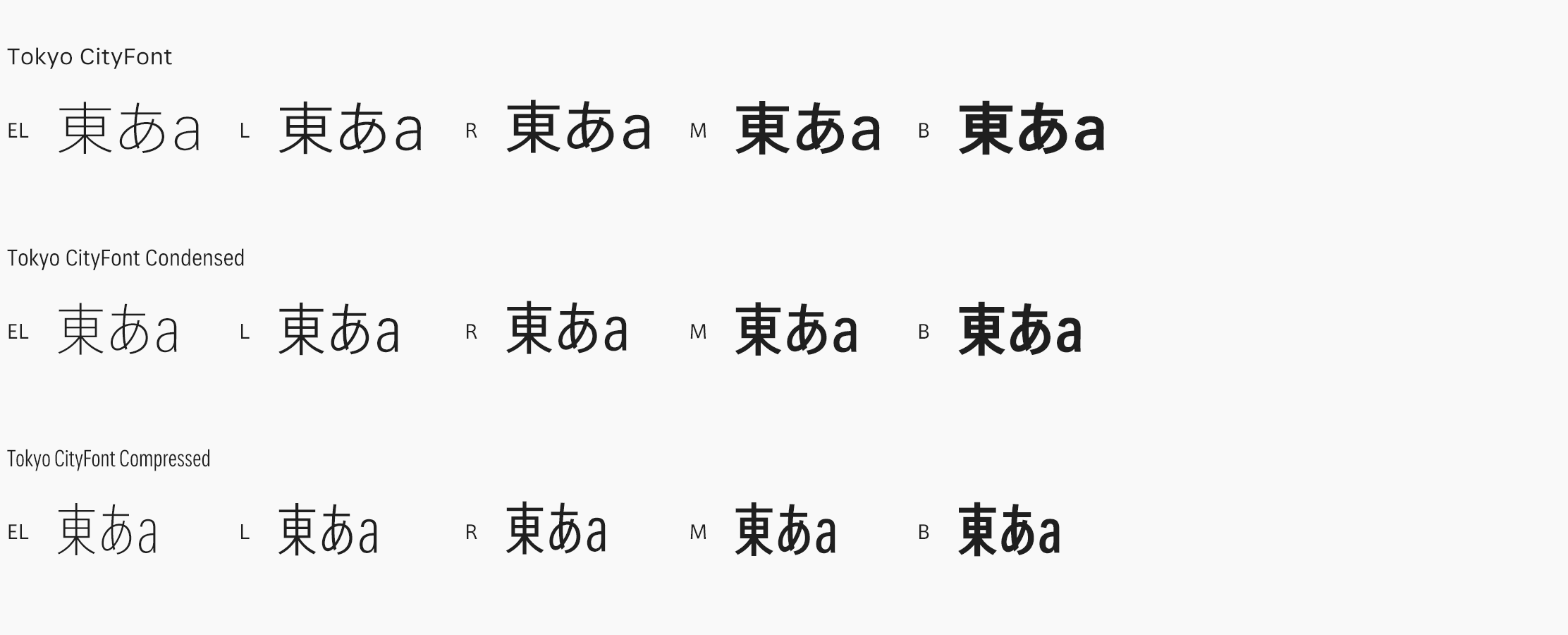
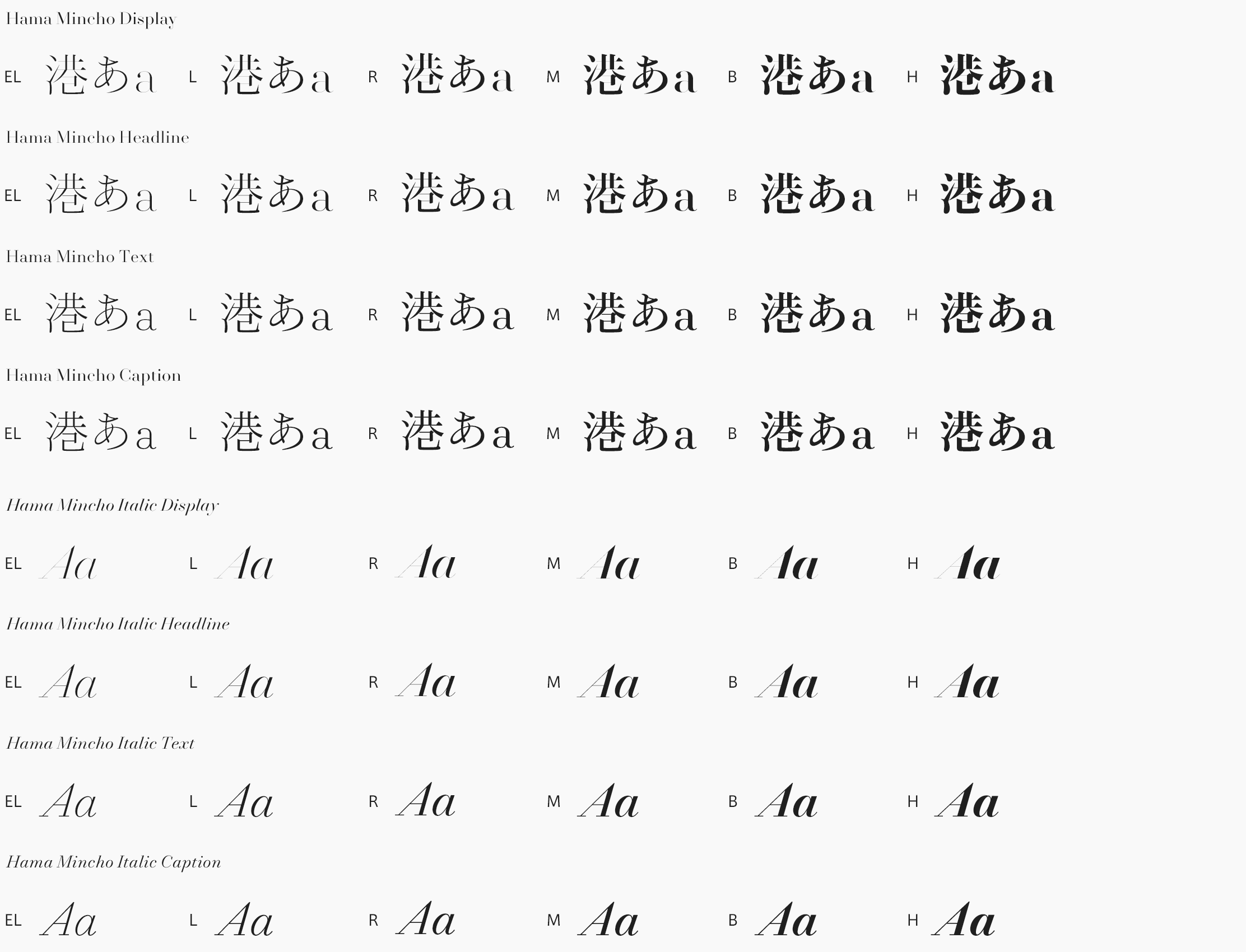
That was a key factor in establishing brand consistency. FitFont enabled us to offer a perfect solution for our client, with the best of both the retail and the custom world, at a reasonable price. In the end, we were able to extend the brand voice in Japan while maintaining our quality standards.
Pictures: © Charlotte Robin © Julien Lelièvre © AvantPost

