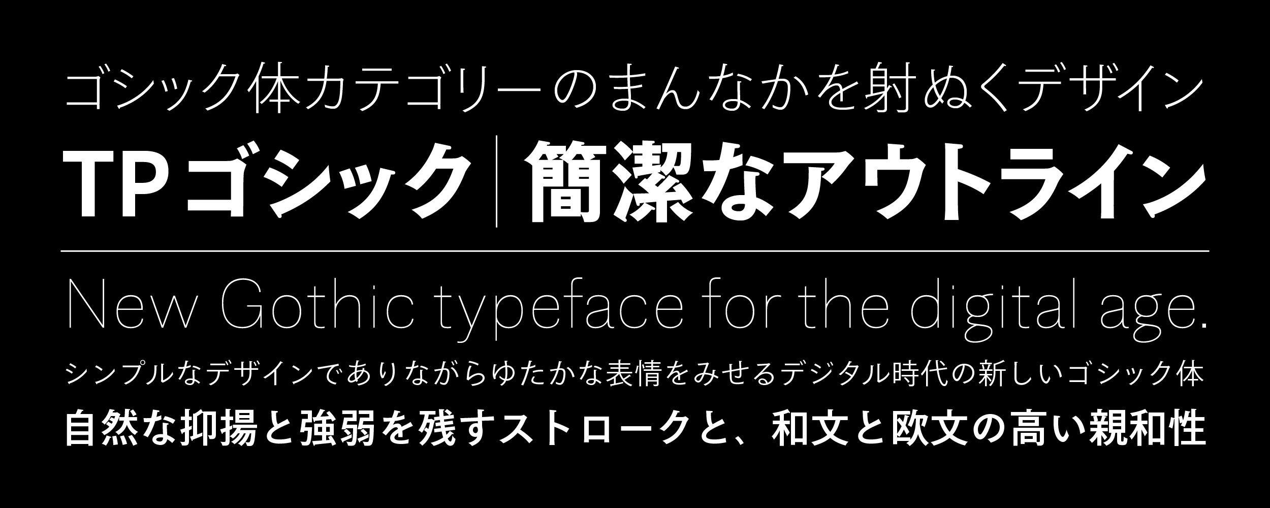
-
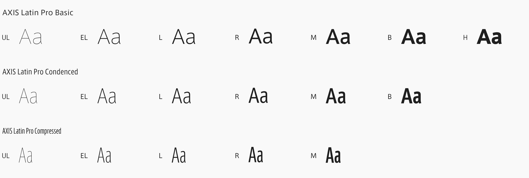
A Basic
-
A Condensed
-
A Compressed
-
TP GothicBasic
UL
タイププロジェクト初のゴシック体フォント 縦組みでも横組みでも安心して使える汎用性の高いゴシック体 A Gothic typeface with the most suitable design for the digital environment.
-
TP GothicBasic
EL
タイププロジェクト初のゴシック体フォント 縦組みでも横組みでも安心して使える汎用性の高いゴシック体 A Gothic typeface with the most suitable design for the digital environment.
-
TP GothicBasic
L
タイププロジェクト初のゴシック体フォント 縦組みでも横組みでも安心して使える汎用性の高いゴシック体 A Gothic typeface with the most suitable design for the digital environment.
-
TP GothicBasic
R
タイププロジェクト初のゴシック体フォント 縦組みでも横組みでも安心して使える汎用性の高いゴシック体 A Gothic typeface with the most suitable design for the digital environment.
-
TP GothicBasic
M
タイププロジェクト初のゴシック体フォント 縦組みでも横組みでも安心して使える汎用性の高いゴシック体 A Gothic typeface with the most suitable design for the digital environment.
-
TP GothicBasic
B
タイププロジェクト初のゴシック体フォント 縦組みでも横組みでも安心して使える汎用性の高いゴシック体 A Gothic typeface with the most suitable design for the digital environment.
-
TP GothicCondensed
UL
タイププロジェクト初のゴシック体フォント 縦組みでも横組みでも安心して使える汎用性の高いゴシック体 A Gothic typeface with the most suitable design for the digital environment.
-
TP GothicCondensed
EL
タイププロジェクト初のゴシック体フォント 縦組みでも横組みでも安心して使える汎用性の高いゴシック体 A Gothic typeface with the most suitable design for the digital environment.
-
TP GothicCondensed
L
タイププロジェクト初のゴシック体フォント 縦組みでも横組みでも安心して使える汎用性の高いゴシック体 A Gothic typeface with the most suitable design for the digital environment.
-
TP GothicCondensed
R
タイププロジェクト初のゴシック体フォント 縦組みでも横組みでも安心して使える汎用性の高いゴシック体 A Gothic typeface with the most suitable design for the digital environment.
-
TP GothicCondensed
M
タイププロジェクト初のゴシック体フォント 縦組みでも横組みでも安心して使える汎用性の高いゴシック体 A Gothic typeface with the most suitable design for the digital environment.
-
TP GothicCondensed
B
タイププロジェクト初のゴシック体フォント 縦組みでも横組みでも安心して使える汎用性の高いゴシック体 A Gothic typeface with the most suitable design for the digital environment.
-
TP GothicCompressed
UL
タイププロジェクト初のゴシック体フォント 縦組みでも横組みでも安心して使える汎用性の高いゴシック体 A Gothic typeface with the most suitable design for the digital environment.
-
TP GothicCompressed
EL
タイププロジェクト初のゴシック体フォント 縦組みでも横組みでも安心して使える汎用性の高いゴシック体 A Gothic typeface with the most suitable design for the digital environment.
-
TP GothicCompressed
L
タイププロジェクト初のゴシック体フォント 縦組みでも横組みでも安心して使える汎用性の高いゴシック体 A Gothic typeface with the most suitable design for the digital environment.
-
TP GothicCompressed
R
タイププロジェクト初のゴシック体フォント 縦組みでも横組みでも安心して使える汎用性の高いゴシック体 A Gothic typeface with the most suitable design for the digital environment.
-
TP GothicCompressed
M
タイププロジェクト初のゴシック体フォント 縦組みでも横組みでも安心して使える汎用性の高いゴシック体 A Gothic typeface with the most suitable design for the digital environment.
-
TP GothicCompressed
B
タイププロジェクト初のゴシック体フォント 縦組みでも横組みでも安心して使える汎用性の高いゴシック体 A Gothic typeface with the most suitable design for the digital environment.
About Product
Overview
TP Gothic is the first Gothic typeface font by Type Project. Type Project has been providing many sans-serif typefaces, such as AXIS Font, TP Sky, etc. Gothic typeface, which had been requested for a long time, has been developed as a full-fledged font family. “Sans” in sans-serif typeface means “without” in French; it indicates a typeface without the ornaments (serif) used in Roman typefaces and serif typefaces. Although sans-serif typefaces and Gothic typefaces may be regarded as the same category, Gothic in Japanese typeface is frequently attached with accents and serifs that emphasize the beginning of a brushstroke. Sans-serif and Gothic typefaces are therefore distinguished and handled in this way at Type Project.
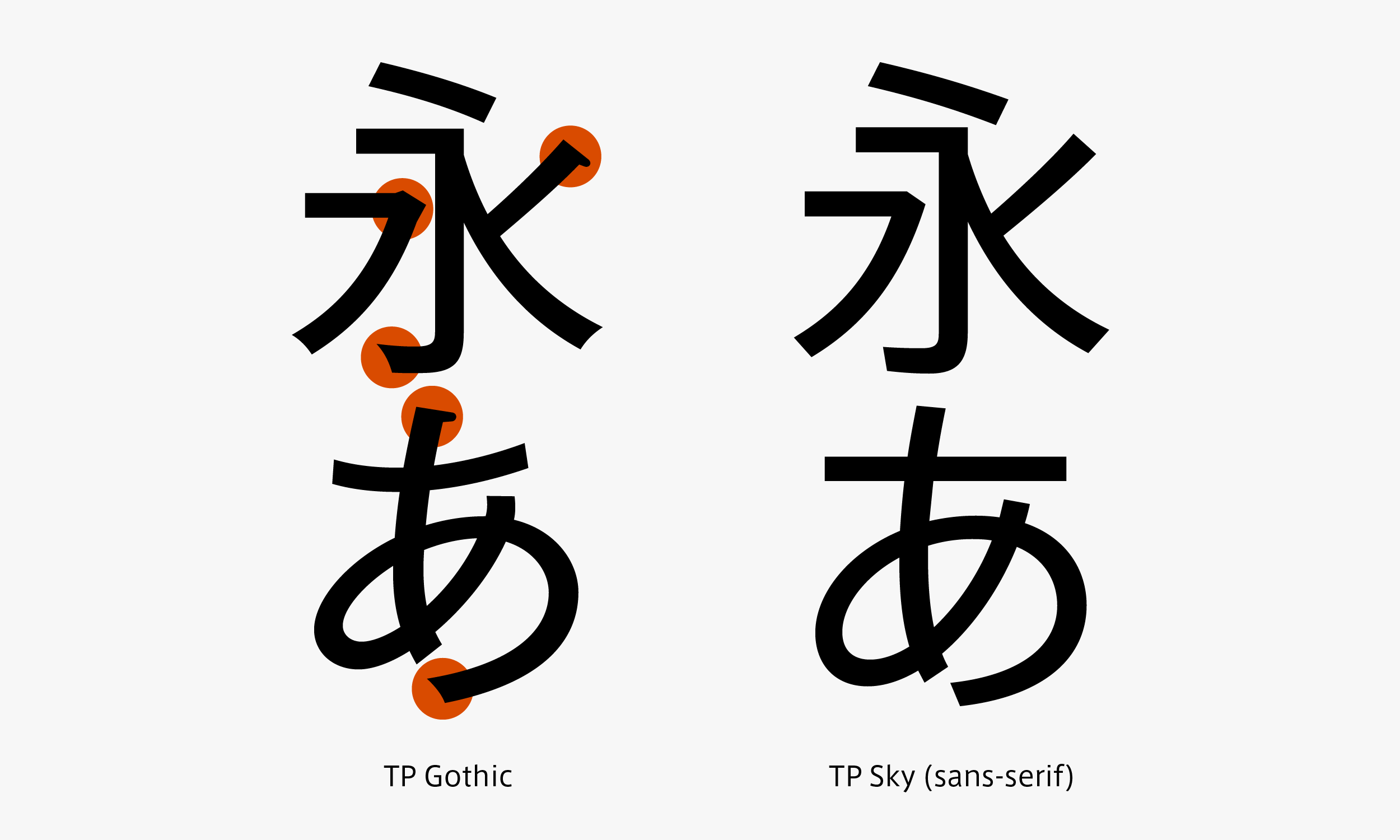
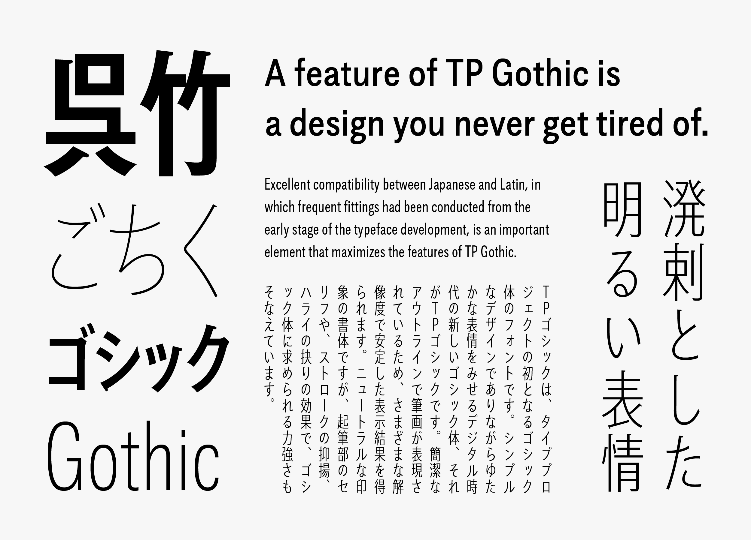
TP Gothic is a dependable Gothic typeface with high multiplicity that can be used in both vertical typesetting and horizontal typesetting; it has a lively bright expression that does not come too near Modern, with a line quality that is close to TP Mincho’s kana. TP Mincho’s kana has a modern shape as a Mincho typeface. TP Gothic, which followed the structure of TP Mincho’s kana to some extent, is a typeface with an impression that is more orthodox than AXIS Font and TP Sky. Also, TP Gothic’s kanji is designed with a narrowed tendency in the inside space between strokes. This creates an atmosphere that comes slightly near Classic.
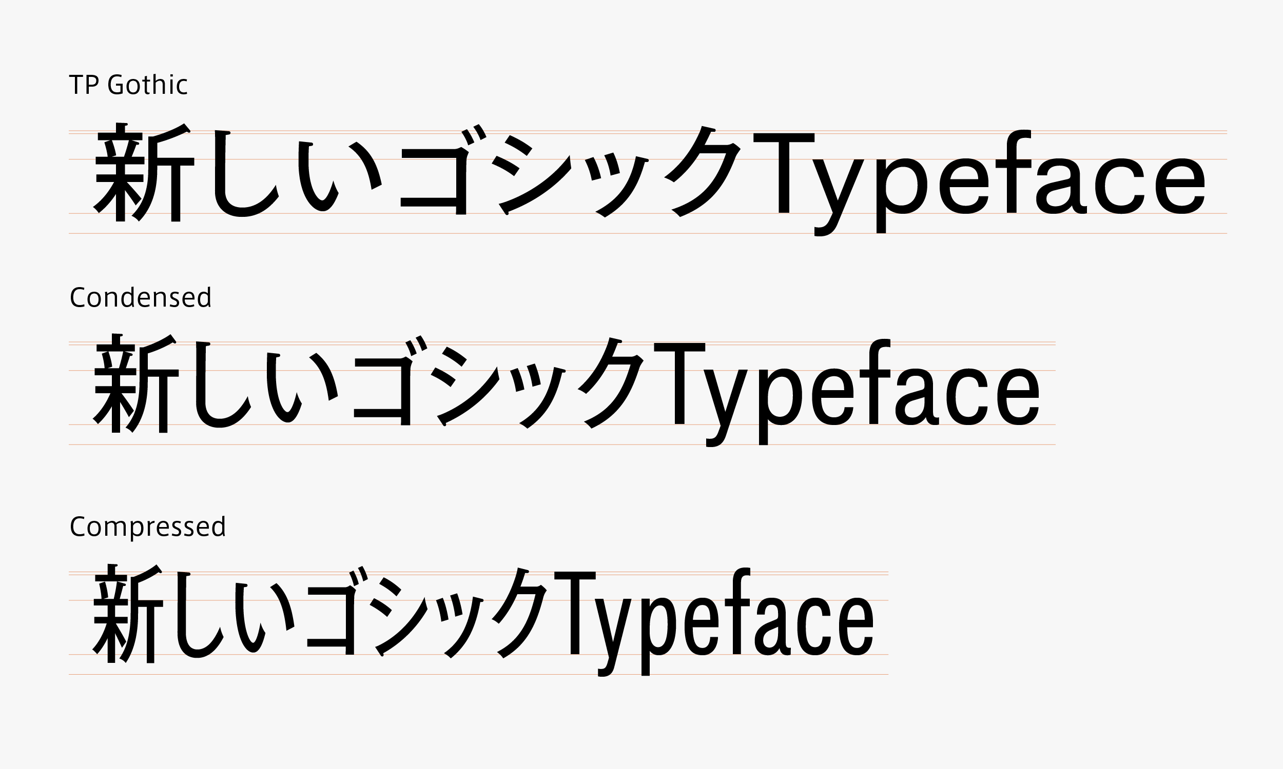
Gothic typeface, which often plays heading-style roles, is in the positioning for narrow font deformation in many cases, due to the limitations in line length. As Gothic typeface is generally created to show both vertical strokes and horizontal strokes at the same thickness, differences in vertical and horizontal stroke lines stand out in simple narrow font deformation. Also, as a heading application, Gothic typeface is often used in large character sizes. In this sense, it is also a typeface in which visual distortion tends to stand out. Therefore, Type Project believes that character width attribute is required in Gothic typeface categories in particular, and created a narrow series called TP Gothic Condensed and Compressed that inherit the orthodox design of TP Gothic Basic.
-
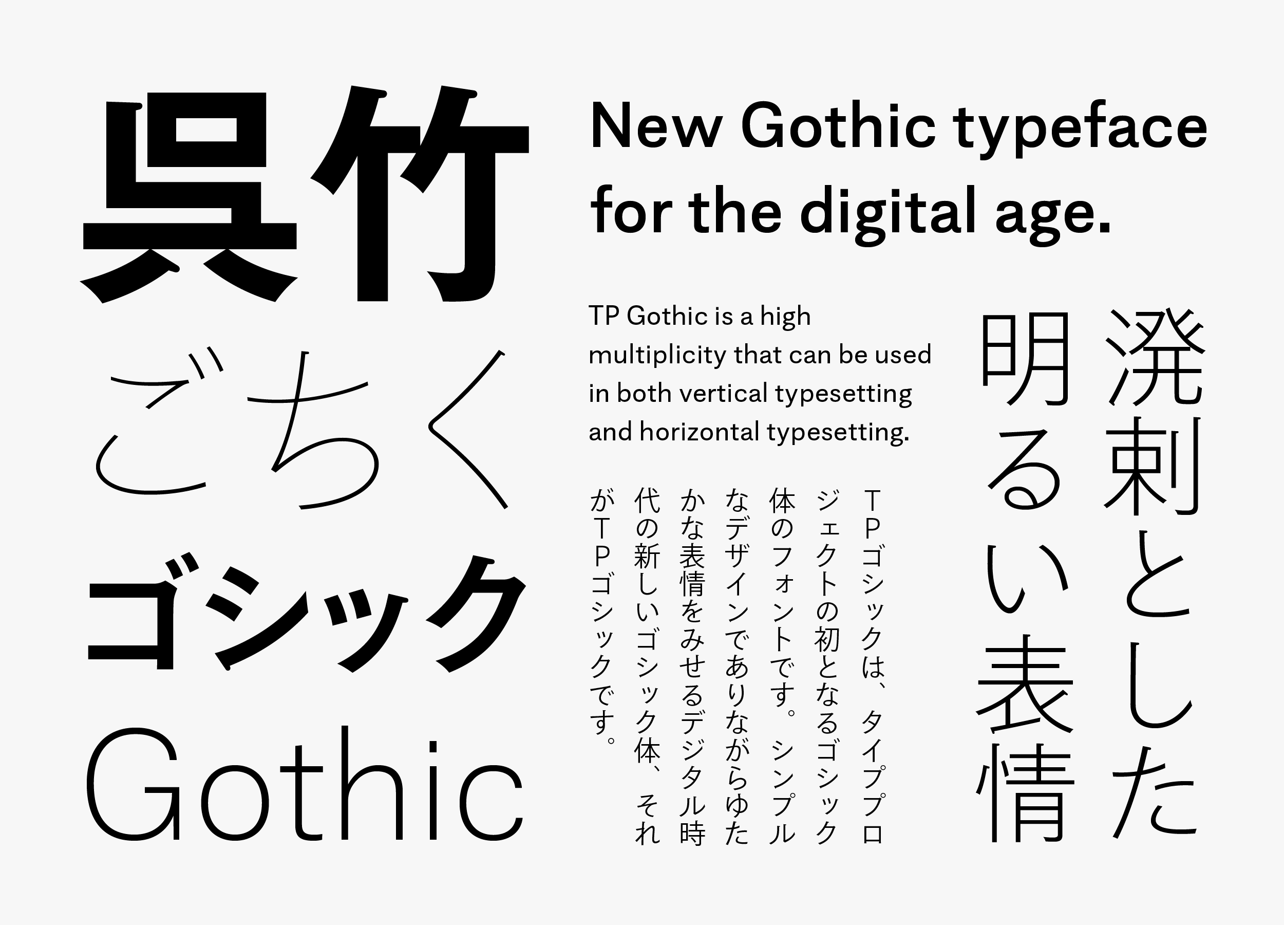
TP Gothic Basic
-
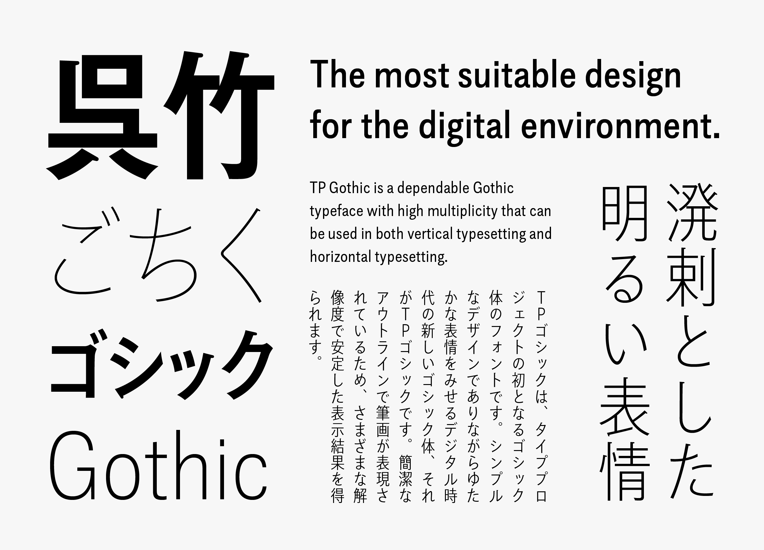
TP Gothic Condensed
-
TP Gothic Compressed
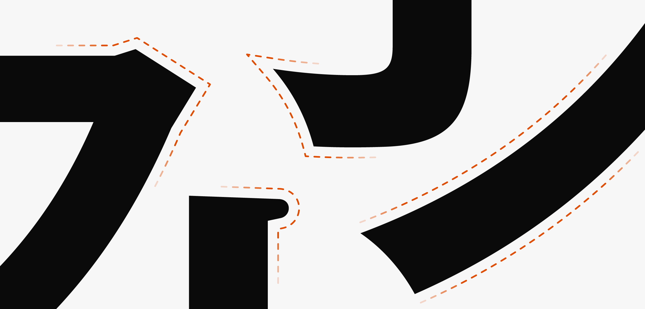
As strokes of TP Gothic are expressed with simple outlines, stable display results can be obtained in a variety of resolutions. The theme that is connected to Type Project fonts at a fundamental level – “The most suitable font family for the digital environment” – is achieved in the category of Gothic typeface. Although it is a typeface with a neutral impression, it also has the strength required in Gothic typeface due to the effects of the serif in the beginning of brushstrokes, modulation in strokes, and being hollow in sweep. TP Gothic is a new Gothic typeface for the digital age that is rich in expression while maintaining a simple design.
Concept
The theme of TP Gothic was to develop a Gothic typeface with the most suitable design for the digital environment. As we learned from a font market survey and customer questionnaire that a new, high quality Japanese Gothic is in demand, we believe this demand is met with a design that goes through the center of the Gothic typeface category. Therefore, TP Gothic aimed at high quality by adopting an orthodox typeface design. As a result, we created a typeface that is much easier to use than what we had first assumed. It can be said that this is a typeface with high multiplicity in particular among Type Project fonts.By adding Condensed and Compressed, and expanding to a higher performance family with the two attributes of weight and character width, it became a typeface with higher multiplicity. In addition to easy-to-use TP Gothic, the space saving effect distinctive of a narrow font is added, and functionality increases as a typeface. As a result, the utilization potential of TP Gothic is further broadened.
-
TP Gothic Basic
-
TP Gothic Condensed
-
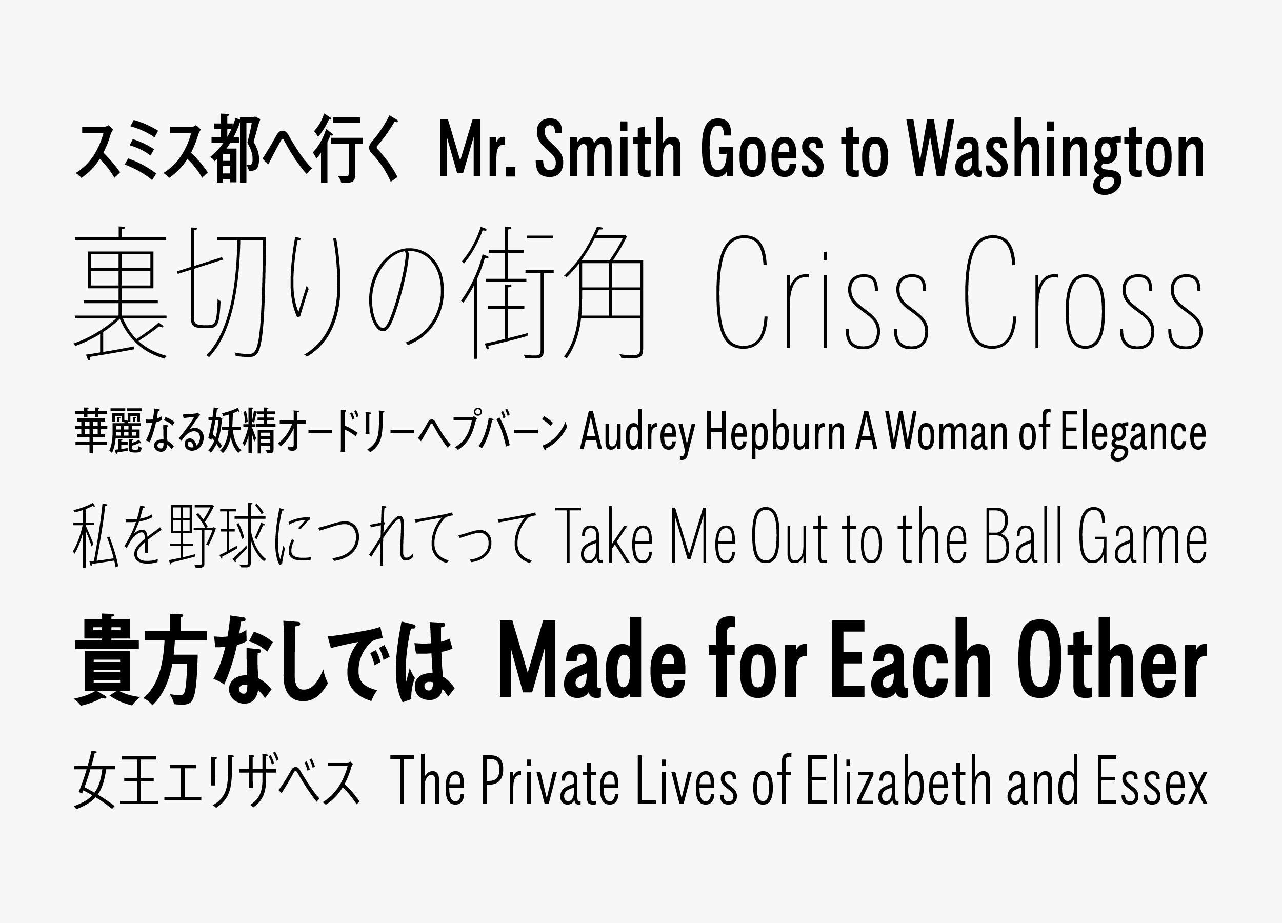
TP Gothic Compressed
-
Features
Based on TP Sky, TP Gothic’s kanji gives a proper and relaxed impression due to the effect of the slightly tightened inside space between strokes. Kana that match kanji are overall smallish typefaces with emphasis on the flow of characters at the time of typesetting vertically. In horizontal typesetting, which Type Project focuses on, verification has been made to accommodate both the kana brushstrokes and stable character alignment.
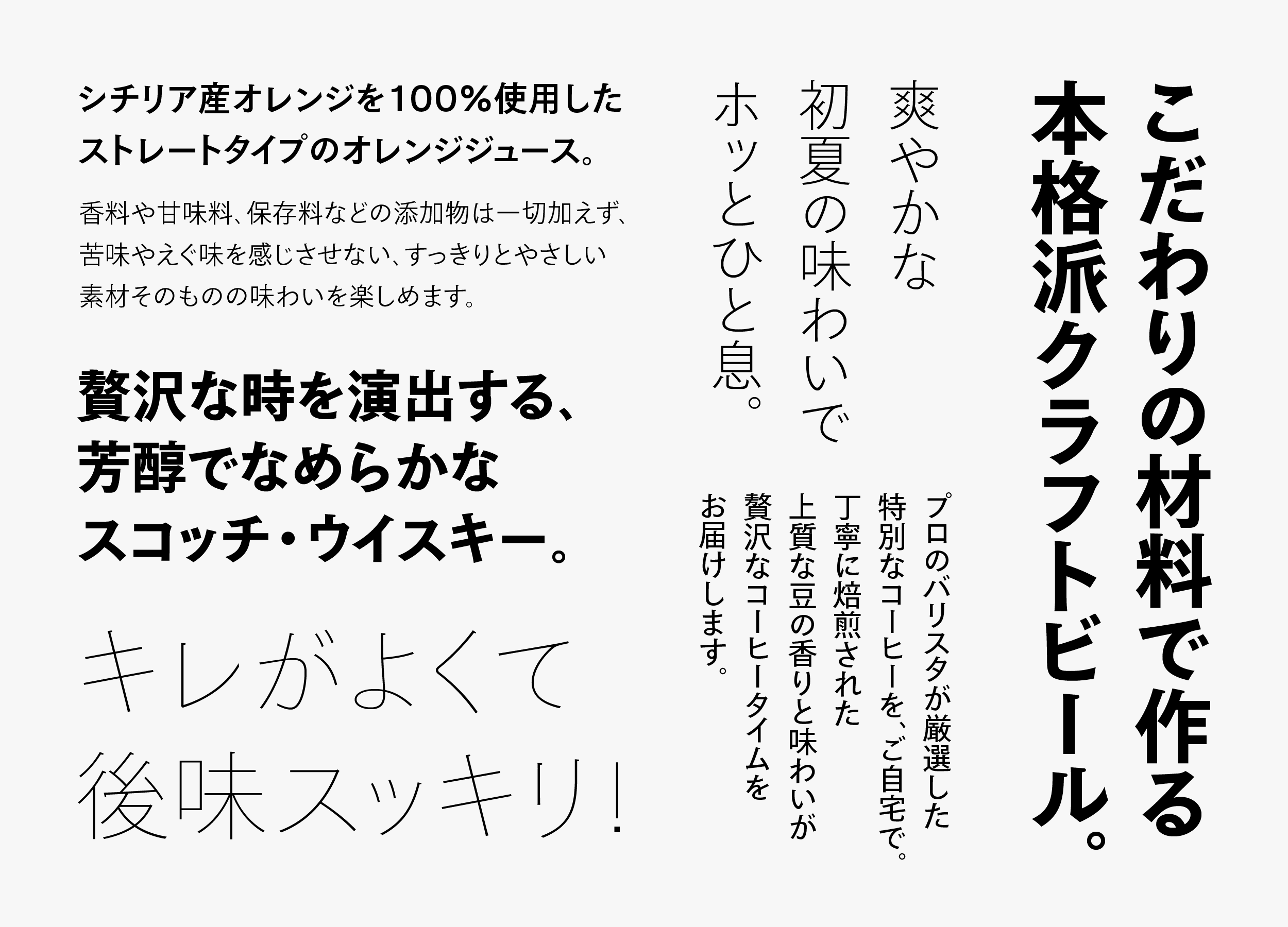
Without overelaborating the expression of stroke details and maintaining only natural modulation and intensity, the nuance that leads to the texture of typeface is valued. Excellent compatibility between Japanese and Latin, in which frequent fittings had been conducted from the early stage of the typeface development, is an important element that maximizes the features of TP Gothic. A feature of TP Gothic is a design you never get tired of.
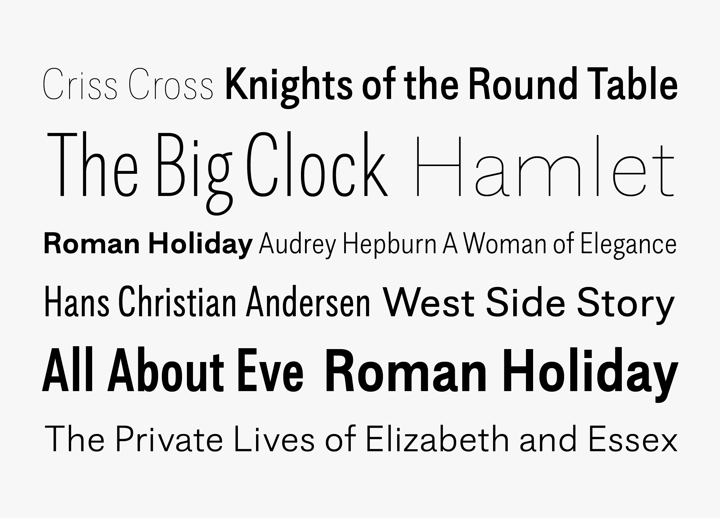
For Latin, it is a relaxed, orthodox grotesque sans-serif typeface (the earliest stage of linear sans-serif typeface, with strong regularity). By including nuances of hand writing in the structure to generate more space, it gives an impression of familiarity. By setting the *x-height slightly higher and the character width slightly narrower, readability is clearly provided as individual Latin characters. It is designed with the awareness of excellent compatibility with Japanese, with tightened inside space between strokes. As the character width is set narrower even in Basic, compatibility is also excellent when used along with Condensed and Compressed. It brings out functional space saving effects, and is an easy-to-use typeface with natural development in the font family.
* x-height: Literally, a term originating from the height of the lower-case letter “x.” This forms the standard height for the lower case letters “a, c, e, x, z,” etc. in typeface design.
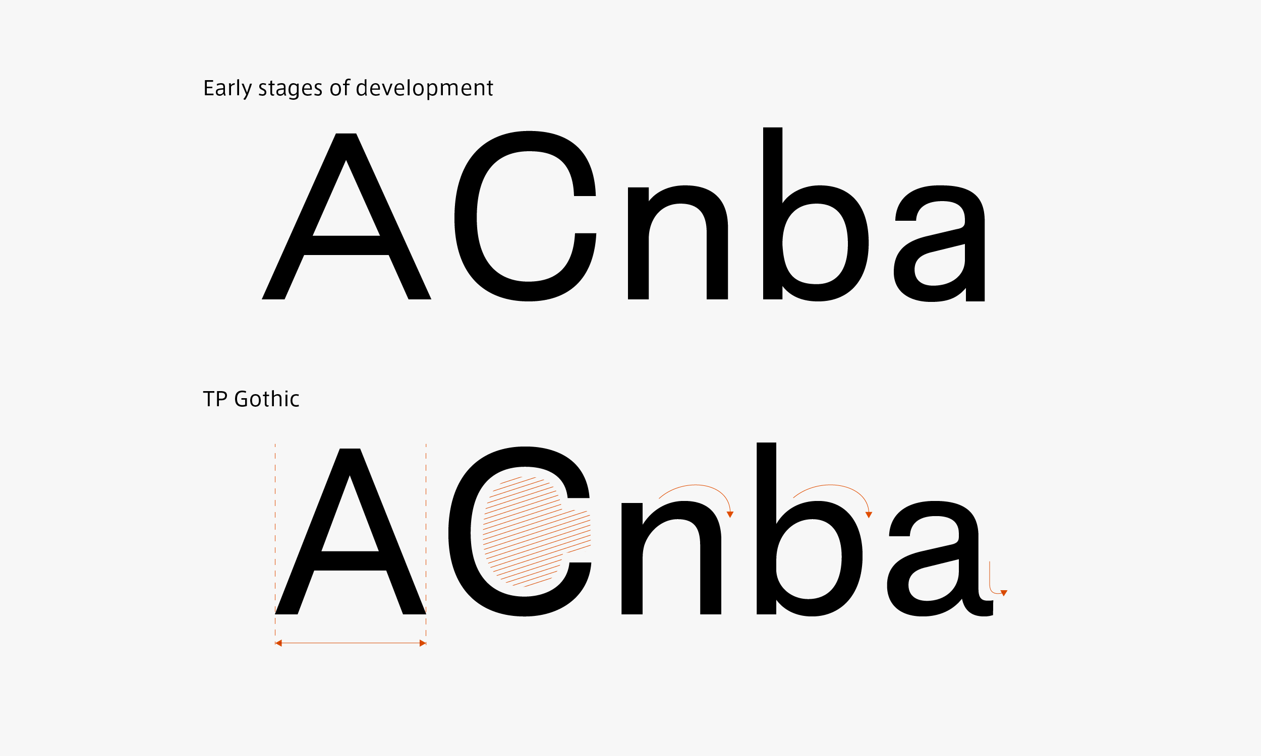
In the early stages of development, the shape is symmetrical, giving a slightly mechanical impression. In the retail version, utilizing handwritten structure, “C” and “G,” in which the beginning and ending of the brushstrokes are close with a closed impression, are spacious, compatible even with Japanese, and have a softness to them.
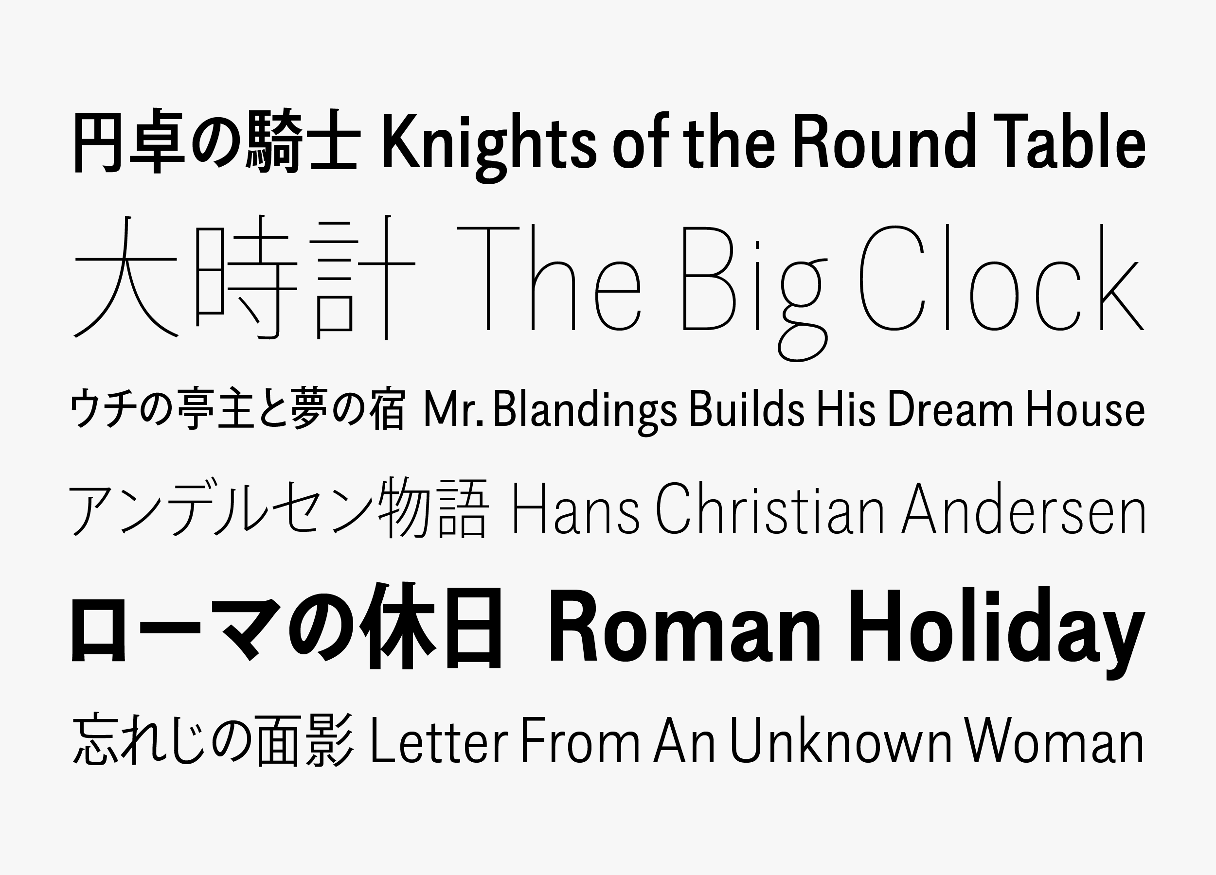
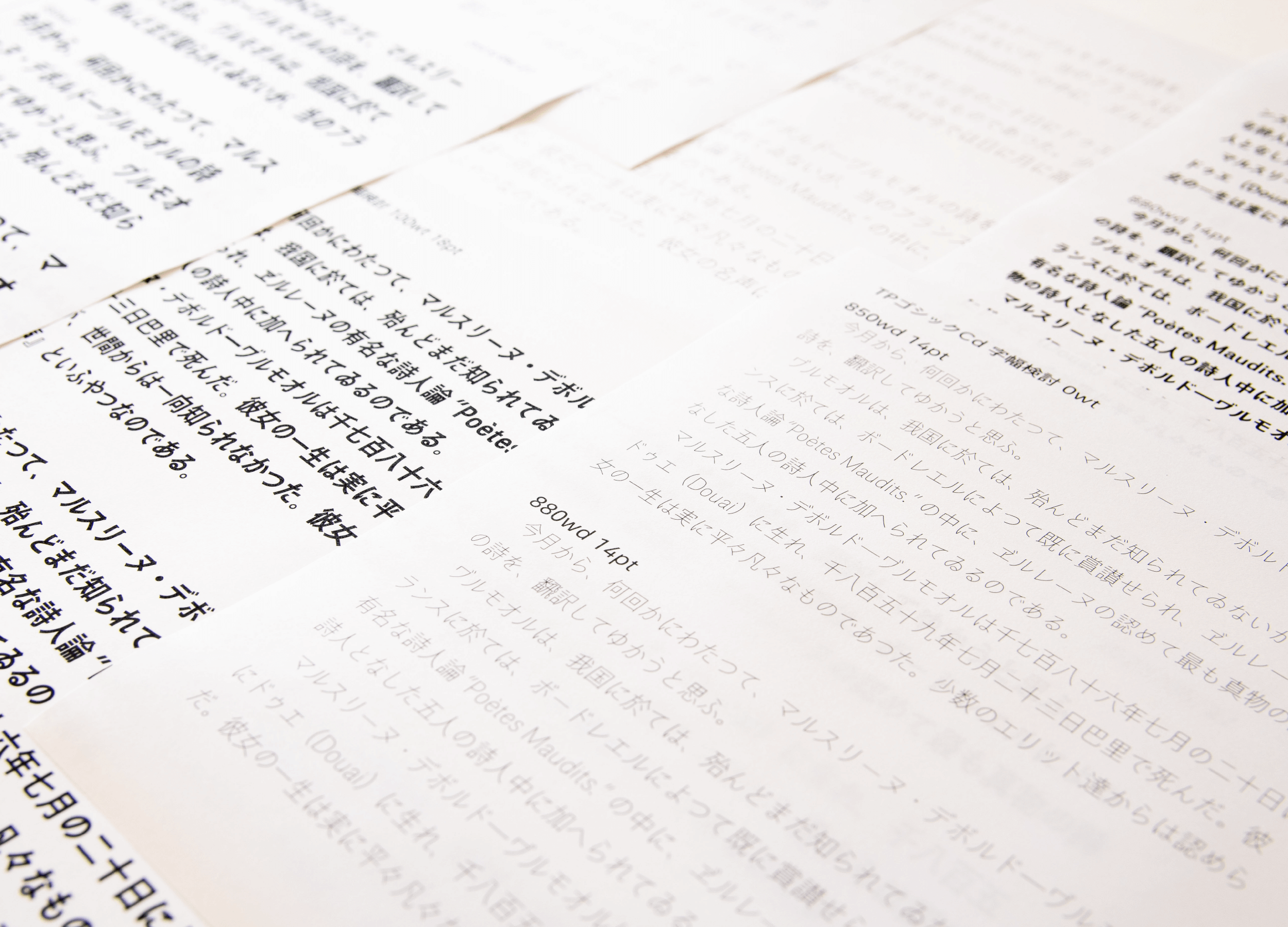
TP Gothic Condensed and Compressed bring out space saving effects required of a narrow font. At the same time, it has high readability required as a practical typeface. A detailed test showed that the optimum narrow font ratio is judged as 85% for Condensed and 70% for Compressed. We attempt to design with the intent to maintain the natural character shape, and design is reasonable enough so as to establish Basic, Condensed, and Compressed as a family without any feeling of being incorrect.
For Condensed and Compressed, the orthodox and fresh expression of TP Gothic’s distinctive quality is consistent in either character width. Condensed and Compressed are designed to naturally adapt to vertical advertisements on phones and websites, as well as digital signage in the city. Maintaining a shape specific to the character, Latin typesetting is high quality and high density. This is a font family distinctive of the Type Project that sparkles with excellent compatibility between Japanese and Latin.
Family
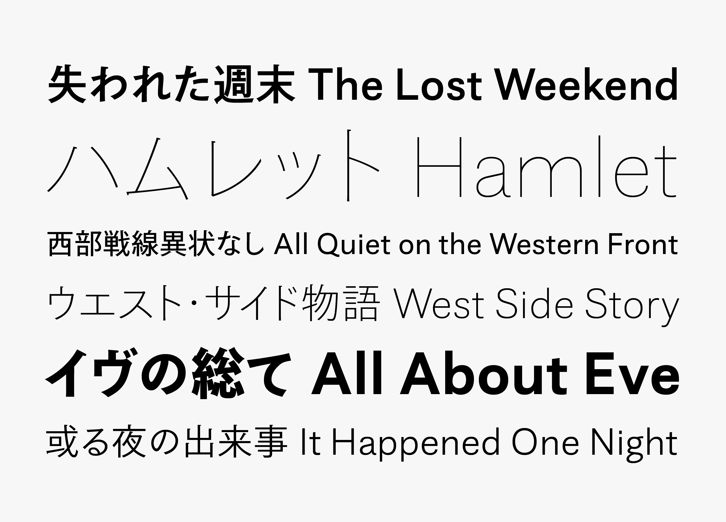
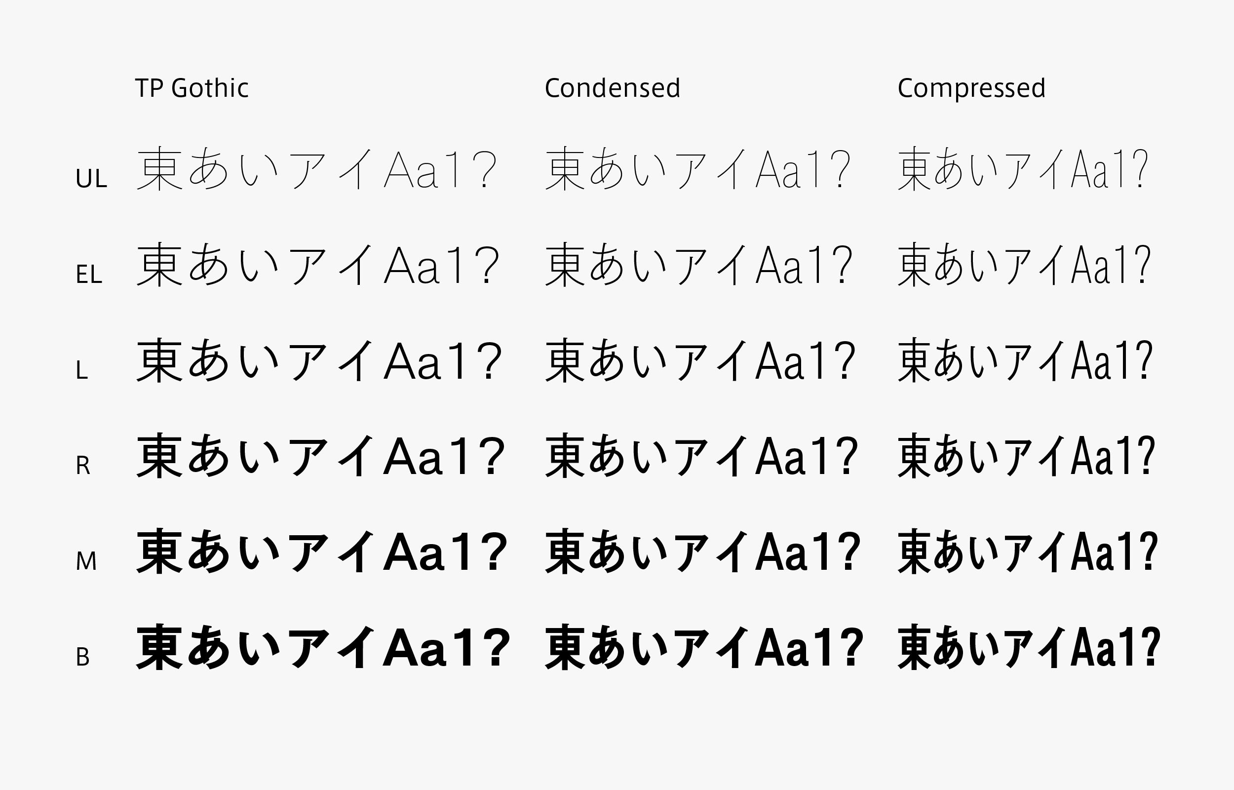
The TP Gothic weight family consists of 6 weights: UL (Ultra Light), EL (Extra Light), L (Light), R (Regular), M (Medium), and B (Bold). The thicker the weight, the larger the stroke’s modulation and stronger the impression it gives. However, even the thin weight creates an atmosphere specific to Gothic typeface. Because the design of the major strokes is simple, hollow of hook/sweep and rounded uroko give a contrasting effect, making an accent of this typeface. For UL and EL in both Condensed and Compressed, the capacity of extremely thin font creation cultivated by Type Project to this point is utilized to complete this unique and high perfection typeface. L and R are weights with natural expression that make you forget it is a narrow font. M and B are the weights in which the distinctive quality of TP Gothic is clearly shown; both weights fully bring out the role of Gothic typeface required for headings.While being an orthodox Gothic typeface, TP Gothic produces a fresh air – it is a font family of the digital age that can be utilized in a wide variety of applications.
Specification
| Main feature |
OpenType font Cross platform Extractable outlines PDF embedded Kerning information Dynamic download No resolution restrictions |
| Supported operating system |
macOS Windows 10/11 |
| Font set |
Standard(StdN) 9,499 characters (Adobe-Japan 1-3, with custom glyphs added) |
| Languages | Japanese font (Std/StdN) almost fully covers 30 languages shown below. Japanese font based on Adobe Japan 1.3 covers all ISO-8859-1 proportional characters and Š, š, Ž, ž, Œ, œ, Ÿ. Then AXIS Font Japanese version can be used as multilingual font when you compose text using proportional characters. However, not all corresponding half-width characters are included, only Latin font is covered by half-width characters. Japanese (main script and covers JIS X 0208:1997) / English/ Icelandic (íslenska) / Irish (Gaelige) / Afrikaans (Afrikaans) / Albanian (Gjuha Shqipe) / Italian (Italiano) / Indonesian (Bahasa Indonesia) / Estonian (Eesti keel) / Occitan (lenga d’òc) / Dutch (Nederlands : U+0132 “IJ” and U+0133 “ij” shall be divided into I/i and J/j) / Oromo (Oromiffa) / Galician (Galego) / Swedish (Svenska) / Scottish Gaelic (Gàidhlig) / Spanish (Español) / Swahili (Kiswahili) / Danish (Dansk) / German (Deutsch) / Norwegian (Bokmål) / Norwegian (Nynorsk) / Finnish (Suomi) / Faroese (Føroyskt) / French (Française) / Brasilian Portuguese (Português Brasileiro) / Breton (Brezhoneg) / Portuguese (Português) / Latin (Latina : Classical orthography, without vowels with macron) / Luxembourg (Lëtzebuergesch) / Rhaeto-Romance languages (Rhaetian) / Walon (Walloon) *Full width version of Greek uppercase/lowercase (24 characters for each, excluding ending form of sigma) and Cyrillic (Russian) uppercase/lowercase (33 characters for each) are included as JIS Row6 and Row 7 (These characters are defined as full width in JIS spec) |

